About Those Streetcar Stops
Why not a dramatic uniform design for them? Well, because.
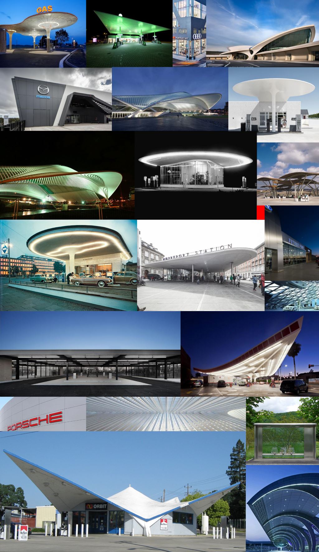 They swirl, zoom, flow, are lighter than air and glow in the dark. Travel portals are buoyant, happy places that sweep through space. Gas stations, train stations, bus stations and airports look forward rather than back.
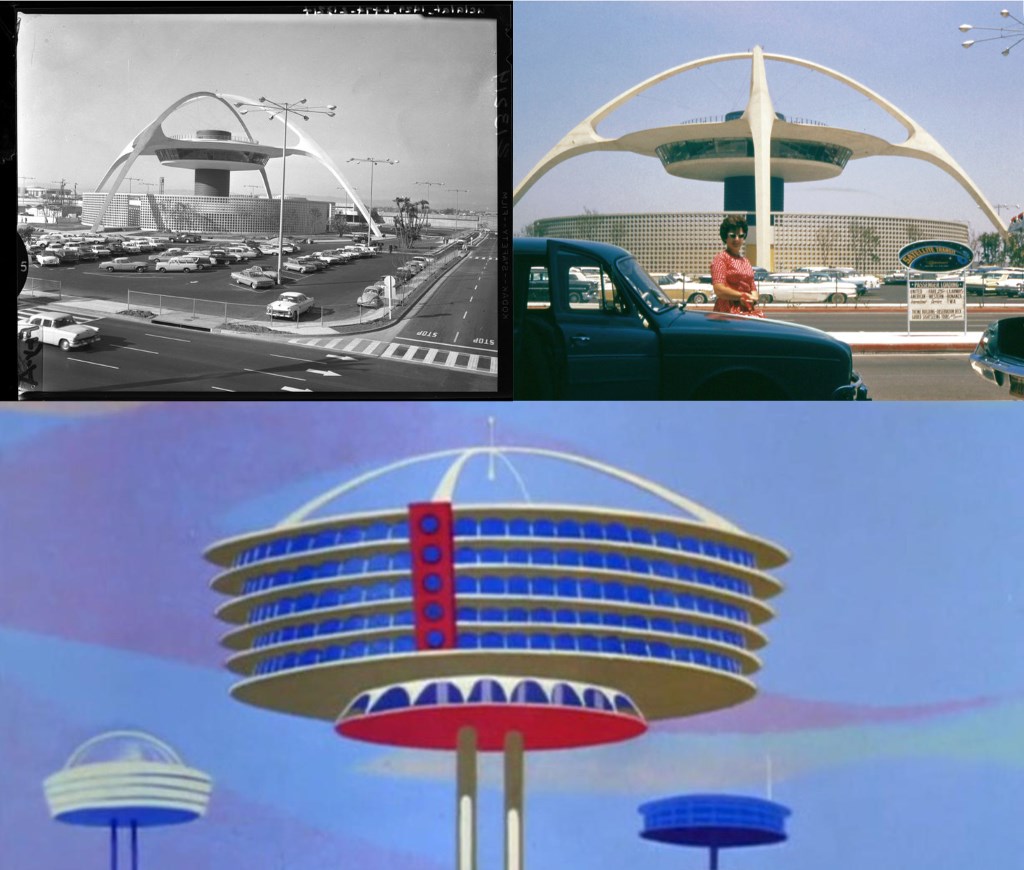
The home town of TV’s “The Jetsons,” the space-age 1962 counterpart to the stone age Flintstones, looked like the “theme building” of the Los Angeles Airport built in 1961.
Which brings me to Milwaukee’s plans for our new transportation architecture. Here is Ashley Booth from HNTB, the national infrastructure firm handling the design work for our streetcar stops, making a presentation to at the historic Third Ward Architectural Review Board.
Ald. Bob Bauman, the chairman of that Board, “suggested the shelter could take its design cues from the Public Market itself, with its screens and exposed structural elements, adding that the building and the shelter in this instance could truly be integrated,” as Michael Horne reported for Urban Milwaukee.
The streetcar stations should have “maximum flexibility for the designs,” Bauman said, “which could incorporate neighborhood attributes …. sponsorships and custom design elements…. the sky’s the limit.”
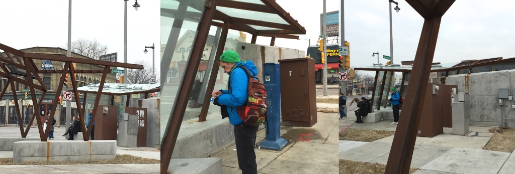
Following this line of open-ended thinking Alderman Tony Zielinski oversaw the spending of $258,684.37 on a bus stop that was supposed to link Bay View to its industrial past. In this case “maximum flexibility” means no seats at all.
This atrocity offers a couple lessons to consider in designing the streetcar’s stops. First, a design process with no limits is no design process at all.
Second, grabbing symbols from the city’s past, industrial or otherwise, may be a mistake. Transportation systems are usually not nostalgic. There’re about looking forward, going someplace, the future.
Third, who’s in charge? Council members need supervision, especially when it comes to architecture and urban design.
This time around it’s Ghassan Korban, the Commissioner of Public Works. According to Bauman, because of the political hostility surrounding rail transit by state Republican leaders, the project was dumped on the Department of Public Works to get it done under the radar. The less design the better. The quicker the better.
Consequently, there is no review by the Department of City Development, as there routinely is for buildings. And no structured design process I have been able to understand other than Korban listening to various stakeholders who are likely to have no expertise or experience in transit architecture and design.
According to Korban, the stops start out as a simple shell for sponsorships and advertisements. The city is going to sell the name of the stations to the highest — or maybe only — bidder. So you could end up with something like the Panda Express or Gruber Law “One call that’s all” downtown stop.
Finally, the design of the streetcar stops will be determined by a lack of money for this, which might keep amateur add-ons at bay. Bauman still thinks he is going to get his doodads reflecting the Third Ward. Korban is not so sure. The Third Ward will need to ante up or some advertiser, say Broken Bat Brewery, may win the name.
This process, such as it is, leaves no place to ask the question — should a metropolitan light rail system have a uniform metropolitan design? After all, public transit is about weaving neighborhoods into a greater whole. A strong design could help do that.
But everyone knows the sky is not the limit in Milwaukee. Funding — and political goodwill — is limited. The future will have to wait for the expansion of streetcar system, if that ever happens.
Political Contributions Tracker
Displaying political contributions between people mentioned in this story. Learn more.
- March 22, 2017 - Robert Bauman received $50 from Ashley Booth
- May 19, 2016 - Robert Bauman received $100 from Ashley Booth
- April 14, 2015 - Robert Bauman received $100 from Ashley Booth
- March 27, 2015 - Robert Bauman received $40 from Ghassan Korban
- September 10, 2014 - Robert Bauman received $50 from Ashley Booth
In Public
-
The Good Mural
 Apr 19th, 2020 by Tom Bamberger
-
Scooters Are the Future
 Dec 19th, 2019 by Tom Bamberger
-
Homeless Tent City Is a Democracy
 Aug 2nd, 2019 by Tom Bamberger







Thanks, Tom, for your bringing this to light.
After all the money and effort invested in the streetcar, are Milwaukee officials really going to leave the design of streetcar stops/shelters to whoever wants to fund them?
“According to Korban, the stops start out as a simple shell for sponsorships and advertisements.”
No design review process? No real design consistency? And no discussion of the needs/wants of those who will presumably use these structures (and thus ensure the success of this effort)?
Milwaukeeans deserve to live in a grown-up city where public infrastructure is not just a simple shell for advertising, where thoughtful design and funding goes into creating something that truly serves the community.
Mere low-functioning afterthoughts won’t cut it.
After seeing the underwhelming livery on the vehicle itself and a logo with some graphic design problems (line weight and hierarchy issues, though not too bad), I am concerned about these stops. When I have expressed this to people–even people supportive of the streetcar–they either mock or misunderstand the importance of good design. This is a very Milwaukee thing to do.
I would love to see a scheme that is uniform and iconic. Especially as the system expands, as I hope it will, the visuals should have consistency. The transit stop helps to make the place, not merely the other way around. Otherwise we will end up with a piecemeal approach and one (as the author notes here) with hokey corporate overtures and one that, frankly, shames riders by bombarding them and passerby with ugliness as it seeks to shave a few dollars off of operational costs.
Are there any adults with a vision in charge here? This sounds like a disaster waiting to happen. With all the pain and labor that has gone into making the streetcar happen in MKE the design of the stops deserves better vision and planning. The city may regret a …quick get it done at low cost approach… later.
I’ve written about this previously here on UM. I’m all for a “consistent and visually iconic” design for the streetcar stops. Simple, sleek, functional for riders in all seasons, and easily identifiable as a streetcar stop from a block or more away—day and night. This does not need to cost the world but, for cripes, invest a little bit folks. Bamberger’s right: futuristic, sleek, modern is best for transit. Bauman has absolutely the worst instincts on this. And, the whole idea of some sort of company (co-)naming rights for individual stops is just ridiculous. Stops should be named only for streets, intersections, or significant adjacent sites (Cathedral Square, Intermodal Station, etc.). Load the stations with advertising. I’ve never been at a bus stop or train station that doesn’t maximize its free space revenue-producing ads. Some transit ad campaigns get pretty creative.
Lastly, WTF with the streetcar’s drab design? I kept looking at it yesterday trying to convince myself that it worked, but the best I could come up with what that at least the taupe on bottom half of the car won’t show dirt or salt so much in the winter. Do I have to take Amtrak up there and do all of this myself? 😉
if you want see how train stops are done right, Come down to Chicago and visit the Richard B. Ogilvie Transportation Center
Think the Milwaukee market with a rail station on the roof
When are we going to stop letting these dinosaurs try to design the city. Milwaukee has a gap in creativity when it comes to the people that make the decisions. On one hand you have the old boys club that must be color blind because anything they come up with is gray and rusty and somehow more expensive. On the other hand you have the Newaukee-ans that have creative designs but have no money to implement them. Although I am excited for the street car, I have been leery from the beginning, because it feels like its being pieced together the whole way. After losing out on the TIGER grant and the underwhelming appearance of the new cars, I’m becoming disappointed with this whole thing. It looks like its going to just blend into the rest of the city instead of standing out and being a staple of the community.
Another absence of creative thinking and problem-solving by people who should know better, and have demonstrated their shortcomings over and over again. There are highly qualified professionals locally who could bring expertise and excellence to this challenge and generate a modestly priced but effective and attractive theme and scheme for these “stations.” Establish the parameters and let them do their job … create something attractive, inviting and memorable that creatively represents the city in some way, shape or form.
Good god DO NOT sell the names of the stops to anyone.
Frankly, can’t we just haul out the architectural equivalent of the Bat Signal and appeal to Rinka Chung for help with this? They were doing pro bono work with the public museum six months ago in planning for its eventual new home.
Rinka Chung designs never say “wow” to me, but we are talking streetcar stops, here. What RC does seem to do really well is attractive, functional, 21st Century design that no one will be embarrassed by 30 years from know. I’ve often thought that RC will be known in the future as the firm that helped to stitch back together the fabric of Milwaukee. Think a simple, adaptable RC design with a bit of flourish. I.e., lighting.
“Ohhh, Rinka Chung where are you, now…when everything’s gone wrong somehow…?”
Yes, the streetcar shelters provide an opportunity to serve the greater good through effective design. It does not need to cost a fortune but does need the professional expertise of architects and landscape architects/urban planners.
And while officials are at it, let’s hope they “get out of their silos,” as suggested by the CDC’s former community planner, and think about how this public infrastructure can be thoughtfully designed, in concert with others, to help promote community health.
https://urbanmilwaukee.com/2018/03/16/10-ways-to-design-healthy-communities/
I agree with most of the sentiments expressed above, however, I will reserve judgement on the stops until I see actual renderings and not just pictures of renderings. While I agree that the stop design should look towards the future, I don’t think it’s entirely fair to include photos of mostly much larger transportation hubs or buildings with futuristic design that most stops could in no way accommodate. The photo in the article of a potential rendering is clearly a stop in the middle of the street that will be greatly impacted by available space. There are other renderings that this image is taken from that seem to be more appealing than the one provided and ultimately the final design might be completely different than all the renderings we’ve seen. I really hope the stops are not named after corporate sponsors and that the design isn’t impacted by who the sponsors are. The stops needs to be named after the street or nearest landmark: Intermodal Station stop, Ogden Ave. stop, Public Market stop, etc.
One major takeaway from this article (aside from the need for good forward thinking design) is that nobody should listen to a thing Tony Zielinkski has to say about the streetcar being a waste of money when he is fine spending $258,000(!) on a hideous bus stop right at the entrance to Bay View.
Whoever did the bus stops around the Northwestern Mutual building did a very nice, classic job that blends well with NM tower architecture and is appropriate for the site & function.
Re: the Bay View art stop. It should be moved to 1st & KK/Mitchell where it would better reflect the building vernacular. At the same time, the bay view location should be restored to its pre-reconstruction building design: http://content.mpl.org/cdm/singleitem/collection/HstoricPho/id/8368/rec/2
What Virginia Small outlined above is the heart of good design….worldwide throughout history. Any investment by Milwaukee will prove to be the same. It is not a question of how much as it is a question of doing the right thing which will have an enormous impact as have other streetcar/trolly systems throughout the world have proven to transport people in exciting ways.
What is a shelter…what are the elements of design that should serve the rider’s needs throughout all seasons,throughout time?. The San Francisco trolly car system that served its residents to and from residential, commercial and tourist areas. A system that was conceived in 1869. remains a model to inspire shelters that are apart of the system.
Selling station naming rights is OK provided that the namesake is located near the station and provided that the original name remains.
For example, the NYC subway sold naming rights to its “Atlantic Avenue” subway station for $4 million (20 years at $200k). That station is now called “Atlantic Avenue–Barclays Center.” I assume that when the sponsorship ends, it will become just plain “Atlantic Avenue” again.
On the Hop, I could see “Wisconsin Avenue–Marriott” or “Water Street/Benelux” as possibilities. And “Water Street/Wicked Hop” would be interesting.
I suggest including a radiant electric heater at each station (like what you find outside the Intercontinental Hotel on Kilbourn). They would be turned on by waiting passengers and turned off automatically either by a timer (after, say, 10 minutes) or when a streetcar arrives before 10 minutes. They could be set so they only operate at all when the outside temperature reaches a certain level (say, below 20º).
I saw timer-controlled bus shelter radiant heaters in Minneapolis/St. Paul in the early 1970s.
Even if they decide not to install heaters now, stations should include sufficient electric capacity to add them later (in case somebody wants to sponsor heat at a specific station).
Is the Milwaukee Transir Riders Union, or any other citizens group, involved in the planning of these stops/shelters?
http://www.transitridersunion.org/
I recall reading that this group was pointedly left out of the design process led by Ald. Zielinski that resulted in the now-infamous and rider-unfriendly “Art Stop” in Bay View.
An effective design process involves those who will use it–from the start–not just for check-the-box public engagement.
It’s noteworthy that Cleveland landed a national political convention after it spent decades as a community assessing issues about its “public realm” and then collectively making decisions to revitalize it, especially through transit and public spaces. Cleveland did so to make the city a great place to live, not to just land a big national event or two.
http://www.cleveland.com/architecture/index.ssf/2016/07/clevelands_revitalized_public.html
To be successful, they will have to do the EXACT OPPOSITE of what Zielinski did with Art Stop. They need to actually talk to transit riders, people who will actually use the Streetcar, about their needs for shelter and comfort during their wait. They need to consider the materials used in construction so it doesn’t turn into a rusty mess. Simple is most likely best, but please don’t let it be average and boring. Take it from us in Bay View…
Milwaukee is SO STUPID. Uniformity for things like street signs, bus stops , bus routes, or street lights help us to identify with something. It also should be easy to spot from a block (or more) away, and able to be recognized by both locals and tourists. Imagine going to another city, and each sign at an airport, or for a subway system was different in size, shape, or color?
In our climate, protection from the wind and rain is needed. It also has to hold up to constant use, abuse, and vandalism. While it should look nice, it needs to be utilitarian in design, or we will constantly be paying more to replace broken out glass and remove painted territorial graffiti on the art panels. Even seats in these things should be reconsidered. Many cities and high use venues like DISNEY and GREAT AMERICA utilize flip up or flip down bench “perches” that will support a person, but cannot be used for sleeping, putting your feet on, or setting your wine bottle or coffee cup on. I do not need my bus shelter to be an expensive individual piece of art. As MIDNIGHTSON said, why not go with something that is simple, sleek, and functional, and identifies with what it is for. Good Urban planning dictates the need to identify a building for its form and function. But we should not waste hundreds of thousands of dollars for something to make an individual statement at every corner two blocks apart.
There is so much creative and solid design expertise in MKE and so little of it among our public officials, who were put where they are for reasons having nothing to do with creativity. Please do not waste this opportunity to do something useful, practical, creative and functional that supports the streetcar system, encourages ridership, and adds to the downtown experience.