
Three MPS Schools Have Arthur Rackham Illustrations
Century-old, brick and tiled fireplaces are unique artworks. Part 2 of a series.
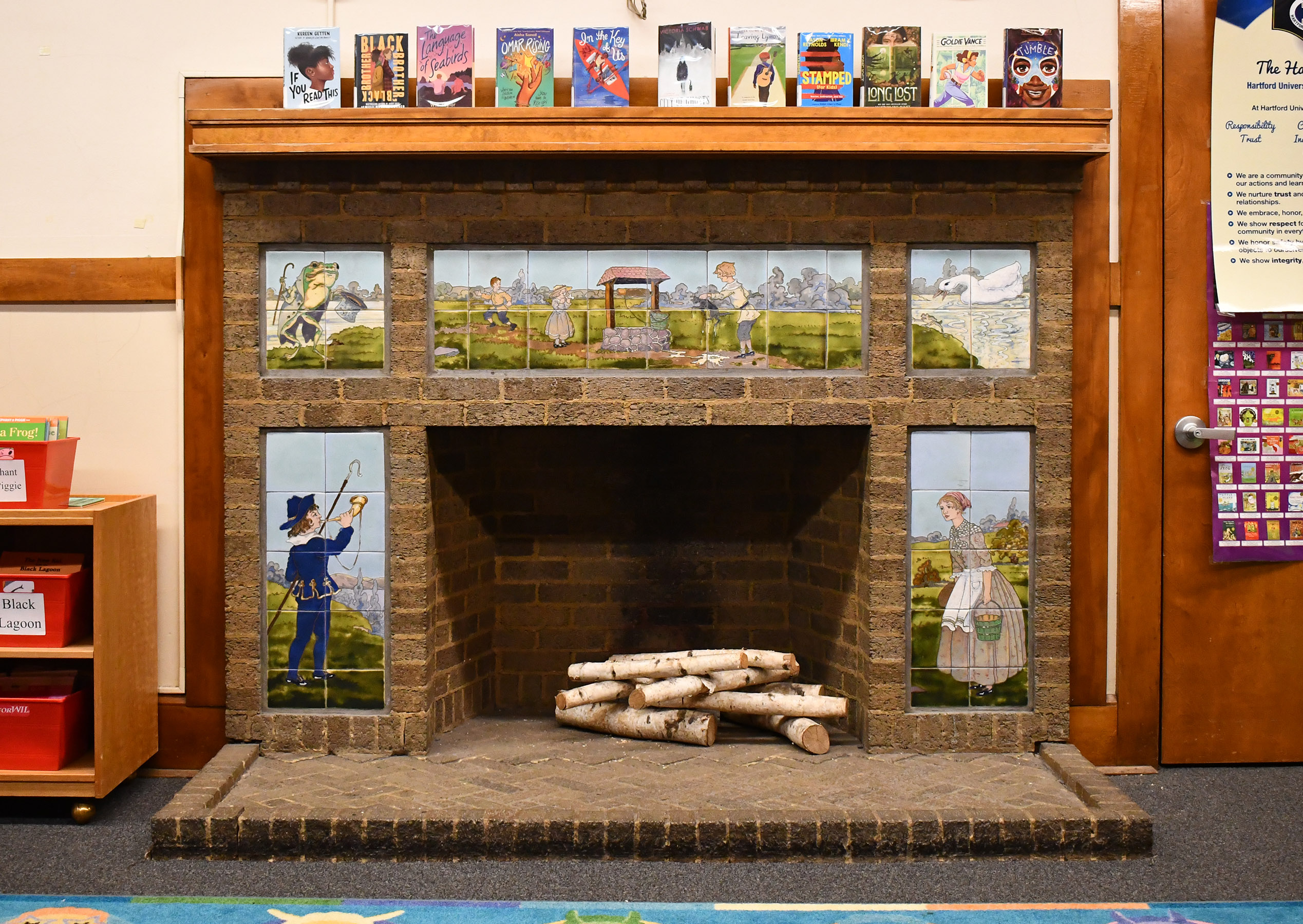
Hartford Avenue University School tiled fireplace. Photo by Ben Tyjeski.
In 1913, the Century Co. of New York published Mother Goose: The Old Nursery Rhymes with illustrations from English artist Arthur Rackham, one of the most celebrated artists of the British Golden Age of Illustration. Within three months, over 6,000 copies of the book were sold and since then it has been reprinted many times. Being an immediate success, the influence his illustrations had on the young readers of that generation can be imagined. In Milwaukee his illustrations took on a new form as Arts & Crafts tiles in the city’s public schools.
Three elementary schools in 1917 were built with brick and tiled fireplaces in the kindergarten rooms that were heavily influenced by Rackham’s style: Keefe Elementary, Hartford Avenue University School, and Green Bay Avenue School — which is now the M.P.S. Success Center. Each fireplace had 5 panels made up of 6” x 6” tiles, showing images of four to five different nursery rhymes. Most of them were based on illustrations by Arthur Rackham. Indeed, upon first glance the images on the tiles appear as if they were cut out of Rackham’s book and pasted on to the fireplace mantel.
This is particularly so with the tiles based on Rackham’s watercolor and ink illustrations, Hey Diddle Diddle, Little Miss Muffet, My Pretty Lady, and Little Bo-Peep. Overall these scenes appear to be mirror images of their source material, with subtle changes. Some characters face opposite directions such as Miss Muffet facing left toward the firebox instead of right, and the cow and dog in Hey Diddle Diddle are flipped around. The arrangement of characters in Hey Diddle Diddle have also been jumbled around and placed in a panoramic composition. Several variations occur as well, such as the fiddle being nearly the size of the cat whereas in Rackham’s watercolor picture the instrument is smaller, proportional to the feline.
While the characters are mostly spot-on to Rackham’s work, the illustrator’s dark, enchanted aesthetic has been replaced with verdant landscapes and multi-colored trees and thickets. The atmospheric watercolor effects of the skies are still captured in the backgrounds of the tiles, but the mood is less magical and gloomy. The mushroom fairies in My Pretty Lady are no longer peeping out from under the tree roots and instead the girl is near a cottage in the countryside. The giant spider in Little Miss Muffet is reduced in size and is missing its top hat and web. And Little Bo-Peep no longer consults ravens or anthropomorphic trees.
Yet if he dark mood of Rackham’s watercolor and ink illustrations is lost, it is made up for in the tile maker’s interpretation of his monochromatic lithographic prints: it seems as if the tile makers used their imagination to step into the realm of Rackham’s imagination and used their glazes to transform his silhouettes into colorful works of ceramic art. They look almost as though they were watercolor paintings completed by the artist himself.
The colorful landscapes and painterly skies are two motifs that reoccur in all the tiles based on Rackham’s illustrations. Rackham’s black lithographic print of the “cock that crow’d i the morn” from The House that Jack Built, inspires tiles that depict the morning sky. The bold, dark blue sky bleeds into glowing rays of sunshine near the horizon. The colors of the sunrise are even reflected in the bird’s feathers. The mischievous behavior of Tommy Green from Who Put the Cat in the Well? captured by Rackham as a silhouette now takes place in a verdant, pastoral landscape. The trees in the background have blueish-purple hues and the well is made up of red-violet rocks and a pink roof. Even in the tiles of Jack Be Nimble, which is the only indoor scene, the walls are mottled blue, purple, and yellow as if Jack was in the clouds.
Intricate attention to detail in color was also given to all the characters. The boy in Jack Be Nimble appears as painterly as ceramic glazes can be. Yellow and blue hues are blended into the gray shirt. Dark and light tones of color add volume to his clothes and locks of hair. His skin has rosy tones like those in his pink socks.
The dressed-up frog in A Frog He Would A-Wooing Go is rendered with six different glaze colors, while another eight unique colors are used for its attire. He also struts his fancy clothing by the edge of a river decorated with trees.
Although these tiles show Rackham’s illustrations in full color as if they were painted, the linear quality of Rackham’s drawings and lithographic prints were faithfully expressed in the ceramic process with tube-lining — in which a type of slip (a mixture of clay and water) was squeezed out from a tube or bag to outline the design of the tiles’ imagery. Between these designs glaze was then applied either by another tube or brush. It is impressive how well this technique captured the original contours of Rackham’s work and how glaze colors have brought these silhouettes to life.
One last panel to mention, the one of Mother Goose, could be based on the cover illustration for Rackham’s nursery rhymes, but it cannot be said for sure. Many illustrations of Mother Goose from the late 1800s and early 1900s appear very similar. While the overall color palette of Mother Goose in the tile appears very similar to Rackham, her appearance is very different. Rackham’s portrait of Mother Goose shows her in a comical way, with witch-like features, and her gander of geese diving toward a group of children. The tiles show the old lady and the gander in the sky again, but they are flying calmly and gazing peacefully at the moon.
While it’s clear that Rackham’s illustrations inspired the creation of these tiles, their maker remains a mystery. Many Arts & Crafts tile manufacturers from the early 1900s created tiles with illustrations of nursery rhymes. However, thus far I have not been able to identify these Rackham-inspired tiles in any manufacturer catalog.
In the specifications documents of all three school buildings, architects Van Ryn & DeGelleke specified that the fireplaces were to be “set in facing, tile panels of ‘Rockwood Faience Class B,’ decorated with special designs of nursery rhymes, as selected by the architects.” By “Rockwood” they meant Rookwood Pottery Inc., the pottery and tile manufacturer from Cincinnati, Ohio. While it would be extraordinary if these tiles were made by the highly-regarded Rookwood, unfortunately, this does not appear to be the case. The matte colors and textures do not resemble anything like Rookwood glazes.
The style of the tiles looks like work attributed to Belgian ceramist Carl Bergmans, who would later come to South Milwaukee to run a ceramic manufacturing tile business, the Continental Faience & Tile Company (1925-43). In 1917, he worked at the American Encaustic Tile Company in Zanesville, Ohio. During this time working for that company he was known for creating tiles in the squeeze-bag/tube-lined process that was also used for these tiles based on Rackham’s illustrations.
Another possibility that favor is the Mueller Mosaic Tile Company from Trenton, New Jersey. The owner, Herman Carl Mueller (1854-1941), was a prominent clay craftsman with experience in Ohio and started his own company in 1908 in New Jersey. My research of the Milwaukee area suggests that if Arts & Crafts tiles were installed in a home or building constructed during the 1910s, there is a good chance they were created by Mueller. As for the featured school buildings, the vestibules at Hartford Avenue University School feature decorative wall tiles from Mueller. But this alone does not mean the nursery rhyme tiles are by Mueller.
Another more compelling factor that attributes these Rackham-tiles to Mueller is that the ceramist had created many artistic panels with 6” x 6” tiles and painterly glaze effects. Some examples include the mural of Christopher Columbus on the St. Nicholas Catholic Church in Zanesville, Ohio, a pictorial scene of animals at the State House Annex in Trenton, New Jersey and tiles representing innovations in dairy products at the Rotolactor plant (demolished) of Walker-Gordon Dairy in Plainsboro, New Jersey, among many others.
Until there is any hard proof of the original manufacturer/artist of these fireplace tiles, the maker remains unknown. Even if that forever remains a mystery, at least these tiles should be esteemed for their masterful interpretation of Rackham’s illustrations in unique works of ceramic art.
Photos


Writer Ben Tyjeski is an art teacher who was named a 2023 Mildred L. Harpole Artist of the Year by the Milwaukee Arts Board.
If you think stories like this are important, become a member of Urban Milwaukee and help support real, independent journalism. Plus you get some cool added benefits.
Tile Town
-
Ornamental Owls are Mentors in Milwaukee’s Schools
 Oct 6th, 2025 by Ben Tyjeski
-
Handmade Tiles Found in 101 Milwaukee Apartment Buildings
 Aug 4th, 2025 by Ben Tyjeski
-
Secret Garden Unveils Classic Batchelder Fountain
 Aug 28th, 2024 by Ben Tyjeski


Had kindergarten in the Hartford classroom. The tiles are part of my memories of that class. Thanks for the article.
One of my fears is the loss of history. What does a Bay View High School math final exam from the 1930s? What were the textbooks like? Every year we throw out history without a second thought. Positive that someone is taking notice! Thank you!