
Committee Endorses Making People’s Flag Official, Despite Objections
Concerns about inclusivity of 2016 design contest continue to cloud process.
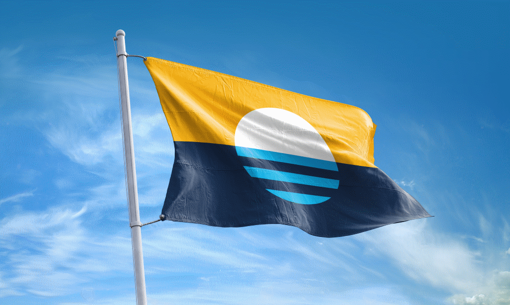
People’s Flag of Milwaukee. Photo from www.milwaukeeflag.com.
Eight years after it was created, Milwaukee could finally be on the verge of adopting the People’s Flag as the official city flag.
But despite the fact that Robert Lenz‘ “Sunrise over the Lake” flag is already flying in front of many homes, displayed on sports team uniforms and beer cans and embedded in all kinds of other places, approving the flag as a replacement for a 1950s flag derided as one of the worst in America isn’t being greeted with universal admiration.
The Steering & Rules Committee recommended adoption of the flag on a 5-3 vote Monday, with some members saying they just wanted to move on and others saying the community has already adopted it. The full council must next review it.
But Monday’s meeting reignited some of the same racial fault lines that ultimately doomed the 2018-2019 process to replace the city’s 1955 flag, a cluttered amalgamation of symbols, with the winner of a 2016 design contest.
Alderman Peter Burgelis, new to the council, is leading the push to adopt the flag. “I spent the month of August reaching out to constituents across the city,” said the alderman.
He received 1,448 written responses to his “unscientific, unperfect survey,” of which 1,296 were verified as city residents. Of the residents, 967 said they want to see the People’s Flag adopted.
“I think it’s time for the city to make it official and move forward to more important business,” said the alderman. He said the overwhelming feeling he received from emails, post card responses and in-person conversations was that people think the People’s Flag is already the official flag.
But Ald. Russell W. Stamper, II, who represents an overwhelmingly African-American district that is also the city’s most impoverished, raised the same concerns about Burgelis’ survey as he did with the 2016 design contest and its 1,200 entries. As he said in 2019, he wants “fair outreach” across the city and wants to see the process restarted.
Steve Kodis, who organized the 2016 contest with the nonprofit Greater Together, said an effort was made to reach out to Boys & Girls Club locations and schools in every area of the city. But he said he couldn’t recall specific locations off hand.
Two of Stamper’s African American colleagues, DiAndre Jackson and Mark Chambers, Jr., also expressed objections.
“I didn’t feel comfortable talking with people with real problems about this,” said Jackson of why he didn’t avail himself of Burgelis’ outreach offer.
In response to a question from Jackson, Kodis said the sun was white because that’s the color it appears when looked directly at. He also said white on flags is a symbol of peace or unity. Stamper said he wanted to see documentation of that and rhetorically asked who determined white the color of unity.
Chambers questioned if the flag represents the city’s majority-minority status, but Kodis said the imagery deals primarily with geography.
The alderman also said he concerned about the cost of replacing the city’s 18 existing flags. Burgelis said there are “17 to 18” known flags that would need to be replaced. A 2019 report said it would cost $3,000 to replace the flags and the imagery on city vehicles would be replaced as the vehicles are.
Chambers said he wants the city to make money from a new flag by maintaining the rights. The People’s Flag is licensed under a Creative Commons Zero license that allows anyone to use it.
Ald. Robert Bauman, who represents a district that runs from Downtown to Stamper’s district on the Near West Side, also opposes the new flag.
“I was not a fan of the design and I was definitely not a fan of the process,” he said. But he said he came to the meeting ready to approve it and move on, only for Stamper to reactivate the old debate.
Bauman said he didn’t see Milwaukee in the flag and suggested a representation of Milwaukee City Hall be added.
The idea of restarting the process was implicitly or explicitly floated multiple times throughout the meeting, and was met with concern from some council members, in part for the potential cost.
Burgelis said the city didn’t need a $1 million effort to pick a flag that wouldn’t be as popular as the People’s Flag currently is.
“The idea that we’re going to restart this. Just think about what the next year of your life is going to be like,” said Ald. Scott Spiker.
“The [Milwaukee Arts Board] is for that,” responded Stamper.
“Same Arts Board that wasted $90,000,” interjected Chambers, chiding the recently-unveiled Moving City reckless driving rolling sculpture.
“I’m really concerned about starting the process over because of the cost,” said Alderwoman JoCasta Zamarripa. She said she didn’t want to see the Arts Board maligned again.
Ald. Sharlen P. Moore also said she didn’t want to spend money on restarting the process.
Burgelis said it was important to move on from the 1955 flag, created by then-alderman Fred Steffan with elements from a design contest. Failed design contests to replace it were held in the 1970s and 2001.
The Arts Board, in 2018, voted to recommend the city adopt a new flag (though not specifically the People’s Flag), in part because of the depiction of a Native American head in war dress on the current flag. The warrior is believed to be a representation of the then-Milwaukee Braves professional baseball team.
Burgelis on Monday said the city has also moved past the need to depict a Civil War flag, the demolished Milwaukee County Stadium, a factory belching smoke and the “golden lamp of knowledge,” of which he said “no one can give me a good answer of what that means.”
“When I look at it, I look at is as history,” said Chambers, who said he thinks the headdress is an homage to the native land the city is built upon.
No one else publicly defended the current flag.
Lenz won a grassroots 2016 design contest, decided by an online vote, with more than 1,000 entries to create a new city flag. “The guiding principle back then was very simple, ‘Milwaukee is a great city and it deserves a great flag,'” said Kodis on Monday.
But the council balked at the 2016 process and never adopted the flag.
A council-approved request for qualifications in 2019 to design a new flag drew no formal responses. The council never again debated the issue, which was expected to include a six-figure funding request.
Now it’s moving forward.
Voting for the flag were Spiker, Zamarripa, Jonathan Brostoff, Marina Dimitrijevic and Council President José G. Pérez. Bauman, Stamper and Jackson voted against the designation.
The council will need eight votes to adopt the flag and, based on comments Monday, has at least seven: the five committee members, Burgelis and Moore, who told Urban Milwaukee after the meeting she is a likely yes vote.
That leaves supporters needing to pick up at least one yes vote from the four other council members: Milele A. Coggs, Larresa Taylor, Andrea Pratt and Lamont Westmoreland.
Mayor Cavalier Johnson, then an alderman, was a co-sponsor of the 2018 initiative to make the People’s Flag official. But on Monday, Johnson’s council liaison Amber Danyus said the mayor has not taken a position and would weigh community feedback.
The official explanation for Lenz’ design is as follows: “The sun rising over Lake Michigan symbolizes a new day. The light blue bars in its reflection represent the city’s three rivers (Milwaukee, Menomonee, Kinnickinnic) and three founding towns (Juneau Town, Kilbourn Town, Walker’s Point). Gold represents our brewing history and white represents peace.”
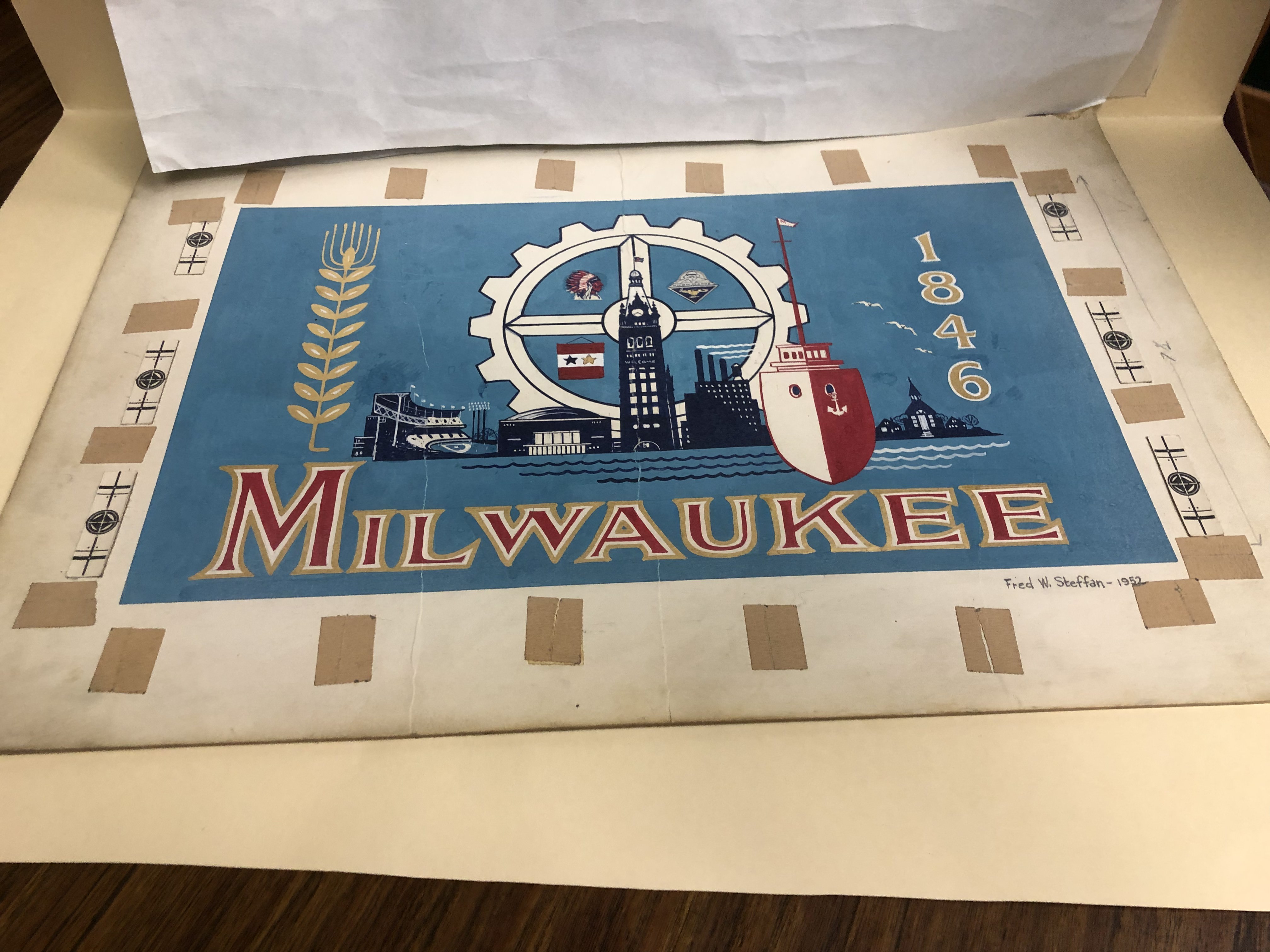
1952 Milwaukee flag design by Fred Steffan. Photo by Jeramey Jannene.
Disclosure: Urban Milwaukee’s sister business, Urban Milwaukee: The Store, sells merchandise bearing both the current flag and People’s Flag.
Legislation Link - Urban Milwaukee members see direct links to legislation mentioned in this article. Join today
If you think stories like this are important, become a member of Urban Milwaukee and help support real, independent journalism. Plus you get some cool added benefits.
Related Legislation: File 240407
More about the People's Flag of Milwaukee
- City Hall: Meet Milwaukee’s Flag Task Force - Jeramey Jannene - Jul 1st, 2025
- Council Reopens Flag Debate. Again - Jeramey Jannene - Jun 24th, 2025
- City Hall: Milwaukee’s Flag Debate Is Back - Jeramey Jannene - Jun 18th, 2025
- Council Puts Milwaukee Flag Debate on Ice - Jeramey Jannene - Nov 6th, 2024
- Council Could Send People’s Flag To April Referendum - Jeramey Jannene - Oct 15th, 2024
- Council Again Delays Adopting People’s Flag - Jeramey Jannene - Sep 24th, 2024
- City Hall: Committee Endorses Making People’s Flag Official, Despite Objections - Jeramey Jannene - Sep 9th, 2024
- Proposal Asks City to Adopt ‘People’s Flag’ - Jeramey Jannene - Jul 2nd, 2024
- Milwaukee Finds Its Original City Flag - Jeramey Jannene - Sep 9th, 2021
- City Hall: Who Wants to Design A New City Flag? - Jeramey Jannene - Apr 23rd, 2019
Read more about People's Flag of Milwaukee here
Political Contributions Tracker
Displaying political contributions between people mentioned in this story. Learn more.
- April 23, 2019 - JoCasta Zamarripa received $100 from Peter Burgelis
- March 4, 2016 - Cavalier Johnson received $35 from Sharlen P. Moore
- February 20, 2016 - Cavalier Johnson received $250 from Robert Bauman
- February 13, 2016 - Milele A. Coggs received $10 from Larresa Taylor
- May 5, 2015 - José G. Pérez received $10 from Cavalier Johnson
- May 5, 2015 - José G. Pérez received $100 from JoCasta Zamarripa
City Hall
-
Milwaukee Aims To Cut Food Waste By 130 Tons in 2 Years
 Sep 11th, 2024 by Jeramey Jannene
-
Federal Grant Boosting Energy Efficient Affordable Housing Program
 Sep 6th, 2024 by Graham Kilmer
-
Milwaukee’s New Tool To Fight Reckless Driving? Public Art
 Aug 14th, 2024 by Jeramey Jannene


Sun rising over Lake Michigan does not appear white. Is itnot reddish, like the setting sun? Most serious flaw is that there is no mention of the city’s name or identity to distinguish it from other flags.
@mpbehar – The actual sun is white. Here is an example https://www.flickr.com/photos/131226413@N08/33791447752
But the sun’s appearnace as it rises over The Lake (and sets) should take into account atmospheric conditions that accentuates the red’s and yellows. In fact, the sun’s appearance in the photo you’ve offered demonstrates it’s apparent colors from reddish orange to yellow to white. That is a more accurate representation, especially since the flag shows the sun emerging from the Lake in the “wrong” color (white)!!
A flag is never meant to be a photographically accurate depiction of a scene but a graphic design that provides a high-visibility, high-contrast presentation of symbols. In photography, the surface of the sun (do not stare at it!) is white and can be captured visually as a white disk using a solar filter. Our sun is a star, and an excellent example of white stars depicted on a flag is the US flag–its 50 white stars stand in a field of blue. The neutral white color makes that blue visual field pop with high contrast, as well as the red stripes on white stripes.
“Sunrise Over the Lake” demonstrates clear, meaningful, timeless symbology with a quality graphic design that works precisely as a flag should: meaningful symbols that can be recognized at a distance and many angles clearly and distinctly. It represents the natural environment of the lake and the confluence of three rivers, which is Milwaukee’s origin and setting. The rising sun symbolizes peace, hope, and Milwaukee’s complete four-season climate cycle. The gold represents the dawn of morning (I have photographed this gold light of dawn around the sun many times at the lakefront) but can also evoke aspirations toward prosperity (Milwaukee makers–products like wheat and beer) and success. The horizontal lines represent rivers and settlements as well as an embedded equality symbol. Like all symbols used in graphics, poetry, or literature, this symbology should never be taken to mean that only the things represented by the symbols exist in Milwaukee. A symbol is a timeless, beautiful expression that stands for a whole.
An excellent example of a flag is the national flag of Canada, which has a simple red and white design with a prominent maple leaf. This maple leaf is not rendered photographically accurate in terms of texture, shape, or colors, and it does not mean that Canadians think that their country contains only maple leaves, nor do Canadians think that Canada is the only place where maple leaves exist. The Maple Leaf flag is a timeless symbol of Canadians’ feeling of home. The symbol became imbued with meaning over time and is now widely immediately recognized internationally as Canada’s national flag. They do not need to write “CANADA” over it.
The “Sunrise Over the Lake” flag has already passed an open public comment and examination period, winning as the top pick from over 1,000 entries and five finalists in 2016. It faced scrutiny by a vexillologist (an expert in flag designs), a historian, public comments, graphic experts, and others. Since then, this flag has been widely adopted and used by the people of Milwaukee.
The City of Milwaukee needs to move on to important business, and recognizing this flag as official can be a simple, symbolic step toward moving on to address the many significant issues facing the city. The current official City of Milwaukee flag, replete with anachronisms and poor graphic design, should be retired with respect.
@John December, thank you for this wonderful explanation of what a flag is and the nature of symbol. This is the reason why politicians, elected officials, and the rest of us with no background or talent in design or the arts should be responsible for creating flags or judging what is “art.”
This said, the public–and in this case, the citizens of Milwaukee–can and should play a role in determining what the City’s flag looks like–by providing initial feedback and then in helping select from among a handful of options.
The sad fact is that this was not the case when Sunrise Over the Lake was selected by some people. The process was woefully inadequate in including those most underrepresented by prioritizing voting online and, as I recall, by missing the boat of going out into all neighborhoods. As a white person, I can tell you that this is a persistent problem when dominant (white) culture takes the lead on efforts like these without early representation from marginalized groups and then by blithely imagining that something like an online poll will suffice. (The early process did include school kid and B&GC workshops on flag design led by the now defunct Greater Together organization (which had a BIPOC leader), but that is mere dressing to covering the clouded window of an inadequate selection process.)
Can we white folk and others of privilege simply agree that we can all do better, and then do it?
So, here we are, years later. Alder Burgelis (keep your shirt on, Alder!), conducted an self-described “unscientific…unperfect survey” and took his roadshow out to eight locations to boost support. Window dressing. I read somewhere he even found a black man to support adoption of the flag (Sorry, I cannot find his name.) Nonetheless, window dressing.
I have a ball cap with Sunrise Over the Lake on the front and I wear it all the time. I’m almost certain I bought it at the Urban Milwaukee store! I frequently am asked down here in Chicago what my cap means, and I launch into the story.
I like the design, and I guess I would like it to be adopted officially, by my hometown and where my heart still resides.
Can we all just cop to the lack of a truly inclusive process, admit as dominant white people that we do not have all the answers, that we must co-create and execute processes like this with a true diversity of collaborators–and then actually do it?
Unless someone explains it the meaning of this flag is not apparent and besides that it is quite generic looking. I like the old flag, its kitschy and hard to duplicate. Take that counterfeiters!
I don’t dislike the design, but believe it’s one missing component is our actual identity with the name, “Milwaukee” or the abbreviated airport code, “MKE,” or the more esoteric “414”. I don’t agree that a white circle emerging from a dark navy blue representation of the Lake clearly represents the sunrise, since it’s emergence means it has to shine through a thick atmosphere and will look red or orange on the horizone, not white as it is shown. But that’s a detail I can live with. I somewhat agree with Franklin Furter’s comments about adequacy of representation by Black, Latinx, Hmong or other non-white folks, but will it ever be completed without criticism of the methodology involving soliciting input from enough of the diversity of those living here?
I love this flag and I do believe it represents Milwaukee (A Great Place on a Great Lake). There are obviusly flaws in the process which need to be corrected in the future, but starting over seems like a waste of time and money, especially since the outcome would probably be the same.
Kind of odd that a place renowned for excellent parks has no representation of green or parks, rather focuses on the lake, a valuable asset but one many of its lowest socioeconomic status resident have never seen. California has water and sun, and forced golden glitz analogies. Perhaps sunrise over the lake could be sunrise over the ocean for Santa Cruz? Replacing a logo is more than a few flags and cars as they become old. It’s letterhead and invoices and other associated things. Clean switches of official symbols where the public knows if something is official or not is best practice to avoid all kinds of confusion and potential tomfoolery. The old flag is lousy at best and offensive at worst. However, the priority of this compared to addressing other serious issues? No thank you.