
All Hail Milwaukee’s New City Flag
Robert Lenz’s creation is the winner. Will Common Council make it the city’s official flag?
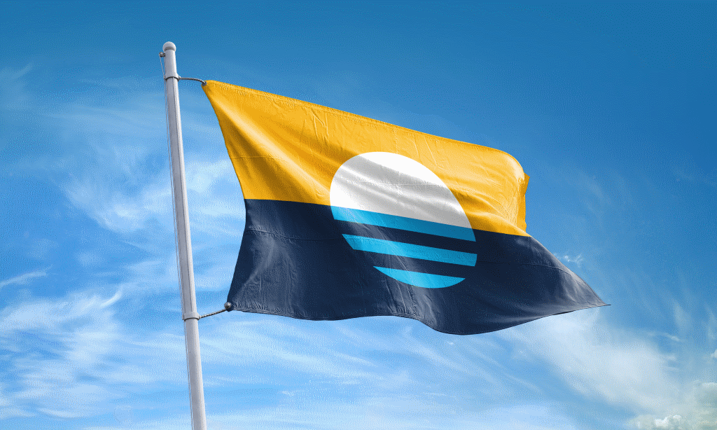
Peoples’ Flag of Milwaukee. Photo from www.milwaukeeflag.com.
Last night at the headquarters of 88.9 Radio Milwaukee, a new “Peoples’ Flag of Milwaukee” was unveiled, replacing the 1954 flag that Roman Mars bemoaned in his TED Talk as “one of the biggest train wrecks in vexilological history.” The older Milwaukee flag was designed by Alderman Fred Steffan, who cobbled together submissions from Milwaukee residents, squeezing together depictions of City Hall, County Stadium, a ship, a church, a factory, grain for brewing, a giant gear, and much more into one cluttered creation. It’s been called the worst city flag in America. At last night’s unveiling of the new flag, Commissioner of City Development Rocky Marcoux offered his own take down, deriding the old flag as “an inventory of what’s in the city that was dying under the weight of its symbols.”
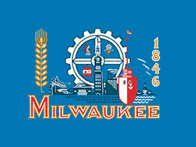
Official Milwaukee Flag
The project to design a new Milwaukee flag was spearheaded by graphic designer Steve Kodis, who partnered with nonprofit Greater Together. Greater Together is a subset of AIGA (a national association for professional designers) that works to promote racial and economic equity in Milwaukee. Both Kodis and Greater Together believed that a new flag would only get widespread support if the community itself was engaged in the design process. So Greater Together organized flag design workshops for youth around the city, both to introduce young people to the idea of design as a possible career path, and to convey how powerful design can be. They also organized panel discussions for businesses, encouraging them to tap into the talent of the inner city. Graphic designer Xavier Ruffin described the flag initiative as a “symbol of hope and togetherness,” and a way for residents to “take ownership of their city.”
In the end, 1,006 flag entries were received, from a mixture of the public, youth, and professional designers. These were whittled down to 45 semi-finalists and five finalists by a panel of five judges (local historian John Gurda, flag expert Ted Kaye, designers Ruffin, Kodis, and Jena Sher). The five finalist flags were flown in May at City Hall, and Milwaukeeans were encouraged to vote for their favorites.
Over 6,000 votes were cast before last night’s announcement, and the final winner was “Sunrise over the Lake” by Robert Lenz. His flag features a white sun emerging out of a dark blue lake into a golden sky. The bottom half of the sun is covered by three light blue horizontal stripes, which Lenz says symbolizes both the three rivers in Milwaukee, and the city’s three founders. The gold of the sky represents the city’s brewing history, and the white is meant to symbolize the unification of Milwaukee. According to Lenz, “This flag is all about unity and coming together within the city. The founding fathers didn’t like each other and built streets at odd angles to each other, but now we are coming together.”
Mayor Tom Barrett and Common Council President Ashanti Hamilton attended the unveiling of the five finalists in May, and Barrett has called the city’s current flag “outdated,” but it remains to be seen if the Common Council officially adopts the new flag.
During his speech, Marcoux declared, “Until you can travel the lengths of North Avenue and National Avenue from east to west and see the same relative level of affluence throughout, our work is not done. We need to continue to have conversations about inequity, and this flag is important because it is a symbol of diversity and togetherness.”
And also a heck of a lot more attractive than the old flag, he might have added.
Photos from the Event


More about the People's Flag of Milwaukee
- City Hall: Latest Effort to Adopt New Milwaukee Flag Going Nowhere - Jeramey Jannene - Dec 3rd, 2025
- City Hall: Meet Milwaukee’s Flag Task Force - Jeramey Jannene - Jul 1st, 2025
- Council Reopens Flag Debate. Again - Jeramey Jannene - Jun 24th, 2025
- City Hall: Milwaukee’s Flag Debate Is Back - Jeramey Jannene - Jun 18th, 2025
- Council Puts Milwaukee Flag Debate on Ice - Jeramey Jannene - Nov 6th, 2024
- Council Could Send People’s Flag To April Referendum - Jeramey Jannene - Oct 15th, 2024
- Council Again Delays Adopting People’s Flag - Jeramey Jannene - Sep 24th, 2024
- City Hall: Committee Endorses Making People’s Flag Official, Despite Objections - Jeramey Jannene - Sep 9th, 2024
- Proposal Asks City to Adopt ‘People’s Flag’ - Jeramey Jannene - Jul 2nd, 2024
- Milwaukee Finds Its Original City Flag - Jeramey Jannene - Sep 9th, 2021
Read more about People's Flag of Milwaukee here
Political Contributions Tracker
Displaying political contributions between people mentioned in this story. Learn more.
- December 23, 2020 - Tom Barrett received $500 from Rocky Marcoux
- December 22, 2018 - Tom Barrett received $500 from Rocky Marcoux
- December 29, 2017 - Tom Barrett received $500 from Rocky Marcoux
- March 1, 2017 - Tom Barrett received $400 from Rocky Marcoux


Well, after doing a half eye-roll when first hearing about this independent process, and then liking the two “star” banners most of the five finalists, I have to say that I really like this selection and hope the City adopts it.
It’s simplicity belies the rich symbolism behind it. And, I sure that, as Lenz suggests, the patina of symbolism will become more burnished over time.
Will I add it to my tattoo collection? Doubtful. Will I wear it on a cap or t-shirt? More than likely. More so that the occasional tourism slogans cities and states adopt, I believe this has staying power.
“The house of the rising sun”?
The one with the chevrons was much more dignified.
Don’t like it. At all. Looks too authoritarian to me. If they need to do anything, (I think the current flag is great and should be left alone), they should just use a small portion of the old flag and enlarge it. (The portion to be enlarged is the upper right quadrant of the geared wheel, to the right of the Indian. It looks like a guy in a flying saucer. That is way cool. Milwaukee should own that flying saucer).
I’m sticking with the old school one. I firmly believe its so bad that its good. This one looks like the Obama logo.
What’s wrong with just using the flag in the lower left quad?
Before reading explanations of the symbol nods, my first thought was that the lines suggested both transit (roads with bike lanes or perhaps rail paths; or it could represent a bridge) and the “equals” sign. Both seem appropriately aspirational for Milwaukee at this moment without the likelihood of becoming dated. I also appreciate the other refs the designer had in mind.
I admit I was not sure if a flag would have much impact but I’m on board. (And hey, the retro one can still live on “unofficially” if a new one is approved, like the old Brewer’s glove-and-ball logo, the best!)
Now let’s talk about reviving the slogan “A Great City on a Great Lake”!
Laura, can you tell us more about Robert Lenz and how he decided to submit a design?
All in all, it seems like it has been a productive process. Kudos to all!
this is a perfect example of time, talent and money wasted to create an outcome that is in no way better than the existing situation. our society does this over and over and over etc. we need to put our limited talents and resources to work on real problems and solve them with relevant solutions. help us all.
To this former Milwaukeean, It doesn’t say anything to me. Kind of pretty in a way, but if I had no idea what it was about, I’d STILL have no idea what it was about.
Looks like something dreamed up by a committee in a room with a long table on some upper floor.
And don’t get me wrong. The old flag is clunky and awful. I never liked it.
I like it. It’s the flag I chose of the group. I the natural setting depiction, our great lake and the wonderful moon rises. Okay!
A more boring design could not have been found. What about this says anything Milwaukee? Granted, current flag is a bit dated, but this is so bland beyond belief.
The purpose of a national flag is about uniting people into one nation in patriotic spirit. This does not seem the purpose of a municipal flag (if there even is one), which may be closer to establishing a “brand” in marketing sense. The old flag at least acknowledges what Milwaukee is (or was) about. Quick, how many other great city flags can you name?
In April 1898 Milwaukeean John Amberg won a contest for the design of a Milwaukee civic flag sponsored by the Milwaukee Journal. Mayor Rauschenberger, a Mrs. Ely and John Johnston were the judges. Like the current winner, Amberg created a very simple graphic design with the motto “Steady Progress”, but also included the name “Milwaukee” at the bottom. I’m not sure if there is reference in one of the local papers, I found a detailed article with portrait and the design in a Chicago paper. (19th Century U.S. Newspapers site)
Clark David- Baltimore, Detroit, NYC and Chicago have flags that are classy and residents take pride in and visitors recognize.
As Casey noted, Chicago’s flag is very popular among residents:
http://www.chicagomag.com/Chicago-Magazine/The-312/August-2013/Chicago-City-Flag/
“There’s a website devoted to pictures of Chicago Flag Tattoos. The flag is on T-shirts, hats, messenger bags, guitars, golf balls, coffee mugs, pillows, shower curtains and bars of soap. Sometimes, the standard is distorted into new shapes—shamrocks, hearts, pizza slices—or its stars are replaced with sports logos.”
Chicago’s love of their flag could be just a fluke but anything that promotes pride in MKE could be a good thing.
Here are ones Casey mentioned not included in the linked article:
https://en.wikipedia.org/wiki/Flag_of_Baltimore
https://en.wikipedia.org/wiki/Flag_of_Detroit