The Bus Stop That Isn’t
The Bay View “art stop” is neither art nor a good bus stop. For one-tenth the price, the city could have done far better.
Back in 2011 Ald. Tony Zielinski and business people decided to create an “iconic landmark,” public art that would beautify a “dilapidated” bus stop on the triangle near the intersection of S. Kinnickinnic Ave., E. Lincoln Ave. and S. Howell Ave.
Yes, it was all about beauty. Milwaukee County decided to help fund it, with board chairwoman Marina Dimitrijevic lauding the idea of creating something “beautiful and beneficial to us all.” Paresh Patel, owner of the Bay View Supermarket, donated $5,000 for the artwork, because “I would like to see my Bay View beautiful,” he said. As Zielinski envisioned it, the bus stop would so great it would attract visitors from throughout Southeastern Wisconsin, as well as Illinois, Iowa, Minnesota, Michigan, and Indiana.
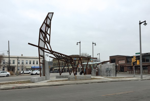
The result: an “eco-friendly” art work, by Roman Montoto, called Urban Counter-pose, which few seem to like. It cost more than $200,000.
It’s a lot of money for a bus stop, but cheap by art standards. The Milwaukee Art Museum recently bought an average photograph of an above-average photographer for $400,000. Jaume Plenza’s fountain in Millennium Park in Chicago cost $16 million.
Mayor Tom Barrett says this art-stop “beautifies” the neighborhood. Zielinski says it’s a “signature” or “focal point” for the neighborhood.
Putting the word “public” and “beauty” in the same sentence is a tricky business. Are the orange I-beams of the DiSuvero (at the east end of Wisconsin Ave.) beautiful? Not many people thought so when it was installed or later after the Calatrava was built when many thought it had to be moved.
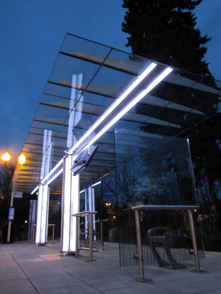
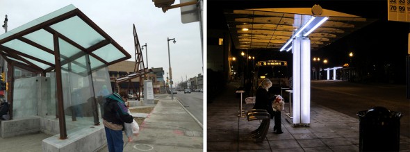
But we often agree that something can be more or less beautiful than something else. For example, I don’t think anyone will say Urban Counter-pose is more beautiful than this custom modular bus stop that starts at around $22,000.
You can find it in Milwaukie, Oregon. It’s made by Brasco, a Michigan company that has sold bus stops to Milwaukee County in the past. It comes in various sizes and configurations and can include concealed flex solar panels, programable LED lighting, and can even be heated.
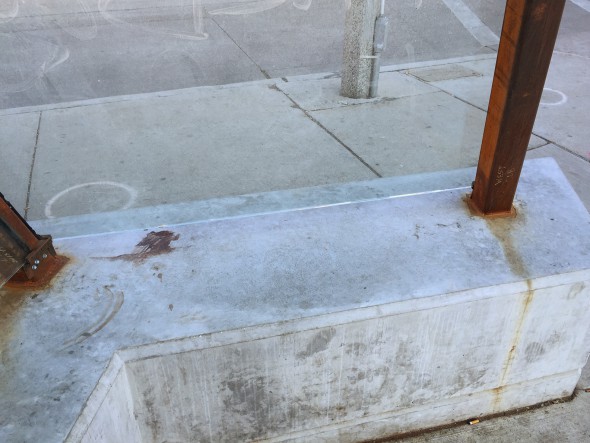
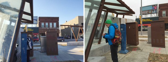
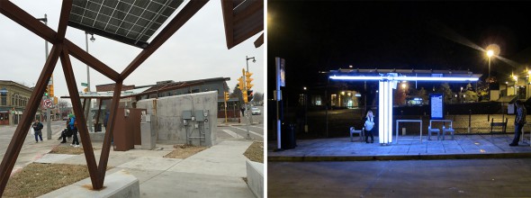
When Barrett called Urban Counter-pose a “functional” work of art, he must have meant the first meaning of the word — “no frills” or “soulless.” There are no seats other than the concrete blocks, which no one wants to sit on. It sprawls across a 120 foot triangle, yet its bus shelter is a cramped, 6-by-12 foot, walk-in closet, which no one likes to stand in.
The art-stop does not accommodate humans. Montodo’s makeshift assemblage ignores the contours of our mind and body. There is nothing to see but a confusion of shapes and materials. Nothing to touch — no finishes to glide your hand across. There is no place to be.
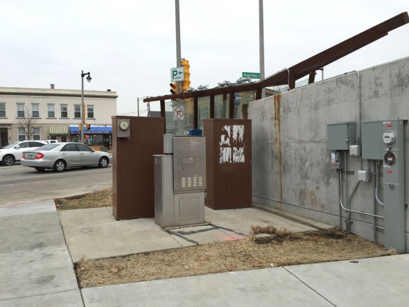
The art stop is neither art nor a bus stop. People wait for the bus in a eco-unfriendly disarray of rusty steel, poured concrete and exposed utility boxes. The solar panels and lights are just tacked on. You could say they were an afterthought, if there was any thought to begin with.
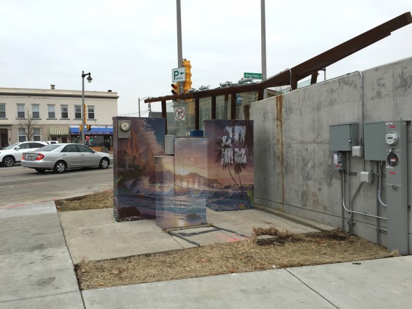
Seriously, isn’t this the kind of work that used to get a D in shop class? Or an incomplete? Zielinski told the Bay View Compass he is now working on a plan to cover the utility boxes with colorful murals.
There is no end to this process. Now we need more art to beautify the beautifier. One can imagine the result.
No place in Milwaukee needs this kind of frippery, least of all this prime urban fabric that flows across more angles than anywhere in Milwaukee.
Where E. Lincoln Ave, S. Howell Ave., and S. Allis Street meet up with S Kinnickinnic Avenue is really three intersections rolled into one that forms a dynamic triangle like Times Square in New York. It’s anchored by Collectivo’s new state-of-the-art coffeeshop-office-factory on the south and Cafe Lulu on the west. There are other coffee shops, lounges, clubs, taverns, a music store, a guitar shop, a smoothie cafe, supermarket, fitness club, barber shop, and comedy club.
This intersection was doing fine, thank you, before this head-on collision between failed architecture and art. This is Montoto’s first bus stop or work of public art.
Art isn’t easy. Santiago Calatrava and Frank Lloyd Wright never figured out how to make a chair one likes to sit in. Museums constantly change their contemporary art because even the best things made today quickly wear out their welcome. But public art is even more difficult; it becomes part of our landscape, has to withstand the elements and not try our patience over time.
Urban Counter-pose is a marketing strategy for a vacuous theory of urban development that married two things that really don’t go together. When used as an additive, art is usually just bad or beside the point. That’s why we don’t make artistic street lights or commission artists to draw the lines on the road. That’s why Tony Zielinski doesn’t drive an art-car to work.
Better to keep it simple. Under ideal circumstances it’s nearly impossible to make great public art. Meanwhile, any day of the week we can shop for a fantastic bus stop at one tenth of the cost. Stop trying to fake us out with signature sculptures that “brand” a place, and let the buildings do the talking.
See our past coverage of the ArtStop for more photos.
Political Contributions Tracker
Displaying political contributions between people mentioned in this story. Learn more.
In Public
-
The Good Mural
 Apr 19th, 2020 by Tom Bamberger
-
Scooters Are the Future
 Dec 19th, 2019 by Tom Bamberger
-
Homeless Tent City Is a Democracy
 Aug 2nd, 2019 by Tom Bamberger











To the Critic That Is: Yes, indeed
I’m really not one to criticize art, but I don’t understand the thinking behind this. I find it uninviting and odd. A hug opportunity was lost to create a true centerpiece for this neighborhood and something more comfortable for commuters.
I like the alternative picture in the article. However I think of something more along the lines of the courtyard at Kopps Custard on 76th and Layton would have been a better look for the space. Using some vegetation in a partially below grade space would have been a nice contast in an urban area. Additionally, I think the use of white structures adds a nice accent to the city. Like calatrava, 6th street bridge, intermodal station. The existing structure looks like it is in the process of being torn down or pathetically built and abandoned.
Nice article, Tom. This was a missed opportunity on so many levels… Bold thinking would have envisioned the triangular space as something useful as a place, connected to the city fabric (perhaps reconsidering traffic patterns to create a useful urban plaza). As designed it’s still an island, surrounded by fast moving traffic, that demonstrates little understanding of how people waiting for a bus actually use space. Bummer… And you wonder why Bay View is such a NIMBY neighborhood.
No criticism of the art criticism here, but let’s be sure our comparisons are fair:
“….custom modular bus stop that starts at around $22,000….”
Notice “Starts at”; what are the odds the one pictured for comparison actually costs that?
Every day I drive by this, and every day I shake my head. Thanks for putting my disappointment into words.
“… missed opportunity” cemented.
Zielinski just backed it because that stop isn’t accommodating to the planned light rail or BRT lines that would have made the triangles the gateway to Bayview businesses.
Given the number of “swanky” LED fixtures I’m guessing this “sculpture” is just a framework for mounting a
massive christmas tree experience. That’s where the money went. Its certainly not $200K of steel and concrete —
especially in a competitive market like Milwaukee.
More eye candy. Less art. Wired and tired.
Milwaukee’s obsession with public art reeks of insecurity. This is not a romantic or particularly beautiful place. It’s not a city with a strong art history or culture. That’s fine. Most American cities are in the same boat. Stop wasting money on embarrassingly out of touch “art” projects.
A place like this should embrace the working class/manufacturing identity. Focus on pragmatic, populist design. We’d have been much better off with 10 of those Brasco stops.
In addition to this crisp and accurate analysis, one is reminded that Tom Bamberger is a terribly underappreciated bit of brilliance in Milwaukee in particular and the arts in general.
As for the astonishingly foolish idea of putting “murals” on the utility boxes, one must ask two obvious questions: First, did no one *notice* that they were there during the design and construction processes? Second, will Alderman Zielinski need Ald. Donovan’s permission to engage in this sort of “graffiti”?
Bottom line: public art is a misnomer for the pet project of two artless, but ambitious, elected officials, who hatched the plot in secret and funded it with an act of government grave robbery.
It was said from the very beginning that the design for this “Art Stop” were uninspired and non-functional. It never occurred to the “committee” to ask an actual bus rider what their needs might be for a shelter, so the basic function of a bus shelter was not addressed, and now the need will go unmet as long as that thing is standing.
I’m no philistine, and I appreciate public art, but this looks like a brutalist’s rendition of a brontosaurus. Bay View is a great, indeed “artsy” neighborhood, and it does not need to be “beautified” by things of this sort. An aesthetically-pleasing but functional bus stop is a great idea. This is neither.
It lights up in the dark, though.
Tom, you nailed it. For a while after this thing was completed, I kept vainly hoping that maybe it wasn’t done… that there was some additional stage yet to come. Surely, I thought, they’ll at least cover the utility boxes or work them into the design somehow. Nope. Now we’re stuck with something unattractive that quite honestly isn’t all that much of an improvement over what preceded it. I mean, I’m glad it’s no longer a weedy mess, but the utility of the bus stop isn’t any better than the old one, and those utility boxes are still there for all to see. What a wasted opportunity to do something truly useful and beautiful.
I am no philistine but this looks like a brutalist’s rendition of a brontosaurus. Bay View is a great, indeed “artsy” neighborhood and things of this sort do little but detract from the surrounding businesses, etc. And a bus stop is meant to be functional, after all! Sure, its nice to have an aesthetically-pleasing shelter for transit riders, but this is neither aesthetically pleasing nor especially “sheltering.”
What a wasted opportunity. And sadly, one that we’re stuck with. Aside from all of the practical and aesthetic reasons that it’s a total failure, it remains a monument to anti-democratic decision making.
Mr Z. didn’t want to even hear from the neighborhood when this was planned, he shut them out. Then he went on a campaign to promote it. Thanks for expressing many of our thoughts. It’s an embarrassment to Bay View!
It’s all true. It’s all frustrating. And not even to mention those tacked on lights – did someone stop to think whether or not putting multi-colored blinking lights, in the middle of an already-confusing, high-traffic intersection, was a good or safe idea? Horrendous fail on every level, and a true embarrassment to a fine neighborhood.
Well said.
Our Bay View neighbor, PaulS, rightfully exposed the issues at hand:
https://www.youtube.com/watch?v=-E6zpJvvaxo
Thanks for the well-written piece that articulates what so many of us think about this sorry project and it’s awful result. It is indeed unfriendly and unsightly. What a bummer for us in Bayview!
There is plenty of room for critique on this project. But if I’m hearing Tom right – it sounds like he saying that it was futile to attempt to do anything special in this space and that we all just wasted our money. This space wasn’t doing “just fine” before, it was a huge missed opportunity for a highly public, highly visible locale in one of Milwaukee’s most promising neighborhoods. An attempt to forge a gateway/ identity in this location was warranted. Any random modular LED bus stop product would have done exactly nothing to address this need. Is not reaveling that in one of your images there is another Brasco bus stop down the street in the background? What neighborhood is that and where am I? Portland? Michigan? Or anywhere? The comparison is innocuous, and the Brasco product, though fervently plugged in this article for seemingly random reasons – is frankly mediocre and would not have addressed any of the issues relevant to this site. And I’m sorry Tom, but people do actually use “artistic street lights” and lots of other designed infrastructure to signify different types of spaces and places. The ‘shut up and eat your gruel’ mentality for public spaces that underlies this article does not offer a very promising framework for the future of Milwaukee – whatever we think of this specific design.
“That’s why we don’t make artistic streetlights”.
I enjoyed the article, but there is a long history of street lamps being designed as beautiful objects since the days gas lamps.
We have an historic example here in Milwaukee as the home of the ‘Lyre’ style street lamp design.
There are other issues that explain why the objectionable utility boxes were retained: namely various legal restrictions concerning blocking access, ownership of the hardware, possibly even right-of-way, or easement restrictions.
– Is there a major difference in the original versus completed design?
– Was the designer completely oblivious concerning construction restrictions at that site?
– can the Fonz statue be moved down to enhance the Bay View site?
– how ’bout an exhibition of the losing designs?
(I love the diSuervo even tho’ this wasn’t a steel town, and the Milwaukee harbor was always really an ‘innee’ and never an ‘outee’ so the Calatrava, in my eyes, is just about as appropriate.)
We really shouldn’t repeat the canard that the di Suvero “interferes” with the Calatrava…given that Calatrava knew it was there and *aligned* his building with it. Go ahead: Drive east down Wisconsin Avenue, and you’ll see.
Also: While I kind of like the prefab bus shelter shown here, the fact that it’s prefab and available anywhere rather defeats the purpose of having a unique artwork.
I don’t think the Art Stop is successful to that end – but it’s not off-the-shelf either.
The alderman spent much time as a champion of the Bus Art Stop, and was involved in many decisions that led up to this. The utility box situation is abhorrent.La Dallman’s Brady St stop works, and is constructed upon sound engineering and aesthetic principles The west end of the goofy N. OAkland and E North avenue stop was replaced with a basic stop after a car plowed through the original. The Bay View Currents reporting on the story is noteworthy.
Gary, allow me a clarification.
I should have made a distinction between “beautiful” and “artistic”. They are often used interchangeably, but most art is not very beautiful.
Also, regarding the utility boxes…. any good design would figure out a way to minimize their impact.
Brad — nice point. The art stop is a ruin before its time.
My apologies to the Bay View Compass. Anyway the paper followed this story from the start and in depth.The end result should come as no surprise.
Bamberger
Thanks, Tom. Well written, insightful.
This is long but I trust the dear reader will read it with respect to the thousands of bus riders who were never asked.
The Transit Services Advisory Committee (County Board appointed) did weigh in on Art Stop after we realized that the project design had issues as a bus top. We refrained from making an artistic judgment largely for reasons that you mention in the article; anyway it’s a task too difficult in a consensus body assigned the responsibility for comment on transit services. But we did weigh in with an analysis why this design was a badly designed bus shelter: http://www.milwaukeerenaissance.com/KinnickinnicAvenue/TheTSACAndTheArtStop
And the neighbors joined a discussion of the TSAC report. The neighbors in Bay View Town Hall: http://www.milwaukeerenaissance.com/BillSell/ArtStopOnFacebook
This discussion Googled “bus shelters” plumbing the Net for charming, simpler, and functional wind-rain protected benches.
The “public” process consisted of an RFP, some guidelines (stress on the “monumental”), a presentation at the high school with a miserable sound and video system. It was impossible to discern Urban Pose from the slides; they were all too dark for a poorly lit projector. And the audio was so bassy that it drowned out the recorded commentator’s explanation of the cute angles the artist presented as elemental to his concept. The stick model for UP was about 4 by 8 inches or less in size. And the meeting’s agenda was to go to a vote based on a 45 minute presentation for each of 3 finalists including Q&A; All Done In 2 Hours, Go Home. And suppression of discussion and suggestions from the ‘hood. Urban Pose got almost 50% of the vote, but – reviewing the ballots later – a ballot was later marked in favor of Urban Pose by making an assumption. No one had to vote; and many did not. Above the ballot were Liken scales to “weigh” the proposals for several factors. Citizens wrote on many ballots, probably a quiet protest of dissatisfaction about the heft of the Liken scales.
So the April 2012 public meeting broke up in shouts to “start over”; and many marked the ballot with those same words instead of voting for one of the three proposals.
Instead of counting votes then and there, the ballots were hustled out of the room. Urban Pose later declared the winner. And Tony hurried to get the seal of the City and was first dibs on the estate of the Public Worker’s last will and testament.
So much for public art. Public Art, A Performance.
The TSAC’s objections were based on closer scrutiny of the photos than this public meeting allowed. Chief among our concerns was safety. Two tall concrete walls that would effectively shield a perp from a waiting bus rider after the intersection quiets down in the wee hours (we hope we are forever wrong about this). Lack of rain cover (we had that correct). Poor wind protection (I guess it depends where you stand; those who sit during rain will get wet one way or the other). Faulty design, the bus shelter on the corner abandoned by transit was left in the design, while the shelter for two southbound buses had to bend to the artist’s ill-advised but very cute angles. I stopped at Art Stop after a straight down rain, the kind where a roof throws a dry shadow perpendicular to the sidewalk. The benches were wet; some too soaked to sit on.
Tony dismissed our concerns with words like “We will never get 100% agreement on art.” While I said we were concerned about safety, and we documented the issues with the concrete walls, he simply repeated his mantra about art; Art Stop was to be about art, and never getting to 100% – a useful mantra – keep it in mind should any dear reader wish to get into politics.
And Tony has some exceptional artistic judgment as well, as this monument to his ego will from time to time recount an embarrassing prequel. Back in January 2009 he finagled in the Common Council for an ordinance forbidding art on private property. The reason for his concerns was a rash of artistic initiatives in Riverwest which riled Tony’s exquisite sense of decorum. The productions, however, were gorgeous drawings, both unschooled and experienced, scenes painted on garages, fences. So captivated was he with his personal judgment about art that (and a video captured this for his resume) he stormed out of a CC Committee meeting after an alderman’s comment about First Amendment concerns.
The Streetcar referendum today is his latest contribution to the good life in Milwaukee.
I’m waiting for him to get back to cheerleading for business on KK. The Avenue will be uphill if he defeats the Streetcar. The strip is ripe for a streetcar (lots of people, no parking required). A transit that could have been a boon to Kinnickinnic Avenue will have become a memory. Kinnickinnic is a business district much longer than Mitchell Street, which took years of recovery from mistakes to become the vital strip it is now.
Its even worse at night with the “mood lighting.”
Tom, your really hit the mark on this.
So how much did the city invest in this and how much help/money did the county provide?
The intent to “improve” neighborhoods is not the problem, but the process for doing so needs to be professional and inclusive, not willy-nilly.
Who actually drove the decision-making process–Alderman Zielinski? What was the county’s role? Was any architect, landscape architect, landscape designer, or urban planner involved? Well-designed solutions can sometimes include :artistic” elements but “art for art’s sake” belongs in garrets, not on busy intersections. The utility boxes were always in the wrong place and now they are even more noticeable. We should demand that public spaces be designed to meet the needs of real people, not just personal egos.
Tom, You’re always ‘right on’! Who says this thing has to be permanent. Chicago is always reinventing their urban landscape. Milwaukee can do the same thing given enough public outcry.And if ther’s anything that should be removed and redesigned it’s this!
I appreciate the quality insights Mr Bamberger brings to our community. Thank you.
One of the designs was round, had cranks to light up flames. Looked sort of Native American. Was neither odd nor tacky. makes sense to have that one sine people can interact with it. Would be better tribute to this area than the total garbage this “art/bus stop” is. Just put some grass around it too. Would have been beautiful. I actually have to explain to out-of-towners what the current ridiculousness IS at that intersection.
Sorry! one other thought – if we must have artie Fonz, how about The Bay View “art stop” featuring a statue of Art Kumbalek? Or is he strictly north side? That’s my unsolicited vote and I’m sticking to it.
Thanks for the questions, Virginia. Let me try to answer.
City spent nothing from its budget. County spent $50,000 from the veto of a worthy statue in front of the Courthouse building. Yes, Tony drove the project. After the decision for Urban Pose was made by his privately hand-picked committee, he referred objections and suggestions to the committee. Bay View has wonderfully energetic and bright entrepreneurs populating this intersection; some caught in this storm learned some valuable lessons about participating in public – probably not the kind of lesson we would hope for.
There was no landscape architect. The “artist” who designed UP is an architect; one city-wide art committee refused to participate in the process once the design was picked – refused because they felt UP is architecture.
The TSAC offered solutions for the utility boxes that would have made them homes for movable (with a low risk for graffiti) art, maps, photos, etc. Now that the Art Stop is built almost tight up against the boxes, and you cannot walk around them, their functionality is reduced for creative postings. Did someone suggest a mural? I say, oh no, here we go again.
Mr. Barrett…tear down this di Suervo! I don’t care if it was there first. Takes away from the MAM. Move it somewhere else…maybe Pittsburgh.
Well I for I think this is a smart way to spend taxpayer money and that Zielinski would make a fine City Treasurer.
Bill: Thanks for taking the time to fill out the story a little better. I had heard from some folks who were at that meeting but had no idea about all the backroom machinations that made UP possible.
GT, I can see you typed your response in haste, let me correct it. I believe “Well I for I think” should be “Well, I for one think” and “Zielinski would make a fine City Treasurer” should be “Zielinski would make a fine City Dog Catcher”.
Cheers to spelin’ and gramar!
Tom, this thing is bad enough, and unsafe enough, to warrant removal. If there’s a movement toward getting this done, I’d appreciate hearing about it. Please keep us posted. Thanks — Mary
Bill, Thanks for your responses and all the details you provided. It sounds like the “public process” was haphazard and even hijacked. Even if “city money” was not spent (but county funds were) this type of public infrastructure should be given sufficient oversight by professional planners. It sounds like the needs of transit riders were not adequately considered.
And something seems sad about how the bequest of a devoted civil servant was handled.
When the RFP was originally announced, it called for an iconic sculpture that would be a landmark for the center of the Bayview business district. There was no mention of a bus stop or that a sculpture would have to accommodate riders waiting for busses. Of the eleven or so submitted proposals, the three chosen as finalists were all architectural and included shelters for transit passengers. So, how did this happen?
How did these finalists know what Zielinski and the organizers really wanted? If the RFP had been more forth-coming, far more legitimate architectural proposals would have been received and would have deepend the pool of “bus stop”possibilities. By the same token it would have saved the other sculptors and myself a lot of time and money working up ideas and building models to photoshop into the site.
Zielinski talked a good art game but proved he didn’t have the cojones to follow through with a great idea. As a result, Bayview is now saddled with a frightful symbol of rusting I-beams for their community…and not the progressive vision intended.
Because what we really need in this world are more negative and pessimistic opinions. Great article, Tom… NOT.
TZ’s anti-street car stance is building a foundation for his image as a fiscally conservative liberal in advance of a run at City Treasurer. The “art stop” needs to stay top of mind for when that campaign kicks off.
Checking out the link to the Transit Center Advisory Commission Bill Sell posted above I learned that the original title for this art installation was “Urban Posturing.” An apt name for the whole effort, perhaps.
It is an ugly piece of sh#t. And that’s putting it nicely.
Does Milwaukee actually pay to put up bus shelters? In the NYC area, advertising companies erect and maintain bus shelters at their own expense in return for the right to place illuminated ads on the shelters. (The ads are mostly aimed at drivers, not bus passengers.) In addition to erecting and maintaining the shelters, the ad companies also pay a small rental fee (under $100 per month per shelter). In the suburban county where I live (Westchester), that rental fee income is split 50-50 between the transit system and the municipality containing the shelter.
I know somebody will say “Milwaukee isn’t NYC”, but this business model is also being used outside NYC in places like Westchester County that have fewer people per square mile than Milwaukee County.
@Tom D: Milwaukee does not pay for bus shelters that have advertising on them. Those were originally installed by Clear Channel Outdoors, although I’m not certain if they still have the contract. MCTS does pay to construct the bus shelters that do not have advertising on them, which are typically located either at stops that Clear Channel didn’t feel were high traffic enough for advertising, or where Clear Channel’s shelters would have blocked the accessible path on the sidewalk, and therefore a thinner type of shelter would need to be used.
When the three final submissions for the art/bus stop were shown in the Bayview Compass they were so terrible that I wondered if there were only three total submissions. The nicest part of the triangle area is the garden outside Stone Creek Coffee; more of that would have been pleasant. This waste of money adds to the lack of appropriate bus stops around the triangle. It’s far from the monumental entrance to Bayview that Tony had hoped.
A heated/sheltered bus stop must have been out of the question.
Five months after the original posting, I noticed from my vantage point in a #15 bus that there hasn’t been any landscaping done at the site. That may be pending, unrealistic to expect, or not even a part of the original project, but there are a couple of weedy spaces (if not holes) that look like they’re waiting for either sod, or maybe pea gravel.
Maybe Bamberger can form up an Urbanmilwaukee guerrilla gardening team to make a short night of it; ask a Bay View area hardware store for sponsorship? I’m just sayin’.