
The Worst City Flag in America?
Milwaukee's is the absolute worst, experts say. But a new contest could change that.

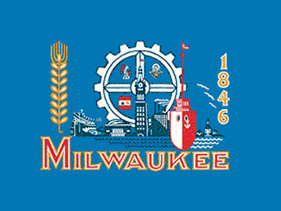
Two Milwaukee Flags (original on left)
The topic was vexillology — the study of flags — and a recent Ted Talk on this subject saved Milwaukee as as the absolute worst example of a city flag. “Nothing can quite prepare you for one of the biggest train wrecks in Vexillological history,” declared Roman Mars, to the audience’s laughter. “Are you ready? It’s the flag of Milwaukee, Wisconsin.”
“It’s a kitchen sink flag,” continued Mars, an expert who has edited a scholarly journal on flags. “There’s a gigantic gear representing industry, there’s a ship recognizing the port, a giant stalk of wheat paying homage to the brewing industry. It’s a hot mess.”
Mars was joined by Milwaukee resident and graphic designer Steve Kodis, who wants Milwaukee to adopt a new design for its flag. Kodis noted that the flag was created in 1955, and Mars and him marveled at the result:
Mars: “The city ran a contest and gathered a bunch of submissions with all kinds of designs.
Kodis: And an alderman by the name of Fred Steffan cobbled together parts of the submissions to make what is now the Milwaukee flag… It’s really awful…
Mars: But what puts the Milwaukee flag over the top, almost to the point of self-parody, is on it is a picture of the Civil War battle flag of the Milwaukee regiment.
Kodis: So that’s the final element in it that just makes it that much more ridiculous, that there is a flag design within the Milwaukee flag.
Mars: On the flag. Yeah. Yeah. (Laughter) Yeah.”
The Milwaukee flag, a collage of symbolic images representing various parts of Milwaukee’s history on a baby blue background, probably couldn’t be recognized by 99 of 100 city residents and isn’t flown all that much. Steffan took what he believed to be the best six designs, and combined various elements of each in order to create the flag. In 2001, another contest was held to try and establish a new design for the flag. Over 105 submissions were received, yet the Milwaukee Arts Board concluded that none of the submissions were better than the current flag.
Mars explained there are five principles to good flag design according to the NAVA (North American Vexillological Association):
- A flag should be so simple a child could draw it from memory.
- Use meaningful symbolism.
- Use two-to-three basic colors from the standard color set.
- No lettering or seals. Never use writing of any kind.
- Be distinctive.
It seems safe to say Steffan was not aware of these principles.
Kodis, who attended UW-Milwaukee and graduated in 2009 with a Bachelor of Fine Arts in Graphic Design, had been researching flags when he looked up Milwaukee’s out of curiosity. “I cringed a little bit,” Kodis says.
Kodis contacted Ted Kaye, a representative of NAVA, the North American Vexillological Association. Kodis originally wanted to propose a redesign of the flag himself, but Kaye suggested that a political issue should be resolved democratically. Kodis then decided a contest would be held once again in hopes of changing the flag. Kodis believes this contest has a better chance of succeeding.
“The biggest difference is that we have the power of social media and the power of a tightened community here where I’ve been having a lot of conversations with organizations that have a voice,” he notes.
While Kodis is paying for this project out of his own pocket, he is working with Gravity Marketing LLC to hopefully connect with a non-profit agency that will help with getting sponsors and getting the funding required for projects such as the manufacturing of the flags.
The contest has called for submissions from artists from October 1st until November 30th. There is no entry fee and anyone can submit, even if they aren’t a resident of Milwaukee. Kodis suggests artists consider using some of what is on the Milwaukee flag, but simplifying it.
“Our current flag, while it is very busy, there are a few things that I believe are very ‘Milwaukee’. The baby blue, the yellow golden rod color. Those colors instinctually feel ‘Milwaukee’,” Kodis says.
Kodis suggests focusing on just one of the many images the current flag has, such as the barley leaf representing Milwaukee’s many breweries, or the gear representing industry.During his Ted Talk, Mars suggested drawing a one- by one-and-a-half inch rectangle on a piece of paper and then fitting a design inside of it.
“A 3×5 foot flag on a pole 100 feet away looks about the same size as a one- by one-and-a-half inch rectangle seen about 15 inches from your eye,” Mars said.
The contest will be judged by Kodis himself and Kaye, who will either be flown in from Portland or will participate through online means. After three-to-five finalists are picked, Kodis plans to open up the final judgement to the public. His plan is to then start manufacturing the flags and build the public’s interest. He wants to do this “by tapping design-minded, local businesses, trying to get it to them first, so people start seeing it.”
Kodis will name the winner “the People’s Flag of Milwaukee,” since it won’t be official at that point. He hopes that after generating enough public interest, the Common Council will accept it as the new official flag.
“What this is about is giving Milwaukeeans a reason to unite and rally under a symbol,” Kodis says. “I’m so passionate about this city, and I believe that we deserve so much better, and we can have something so much better. We the people have a voice, and if we think (the flag) is not worthy of our pride, then we should change it.”
To submit a design, head over to www.milwaukeeflag.com.
Update: The Real Flag
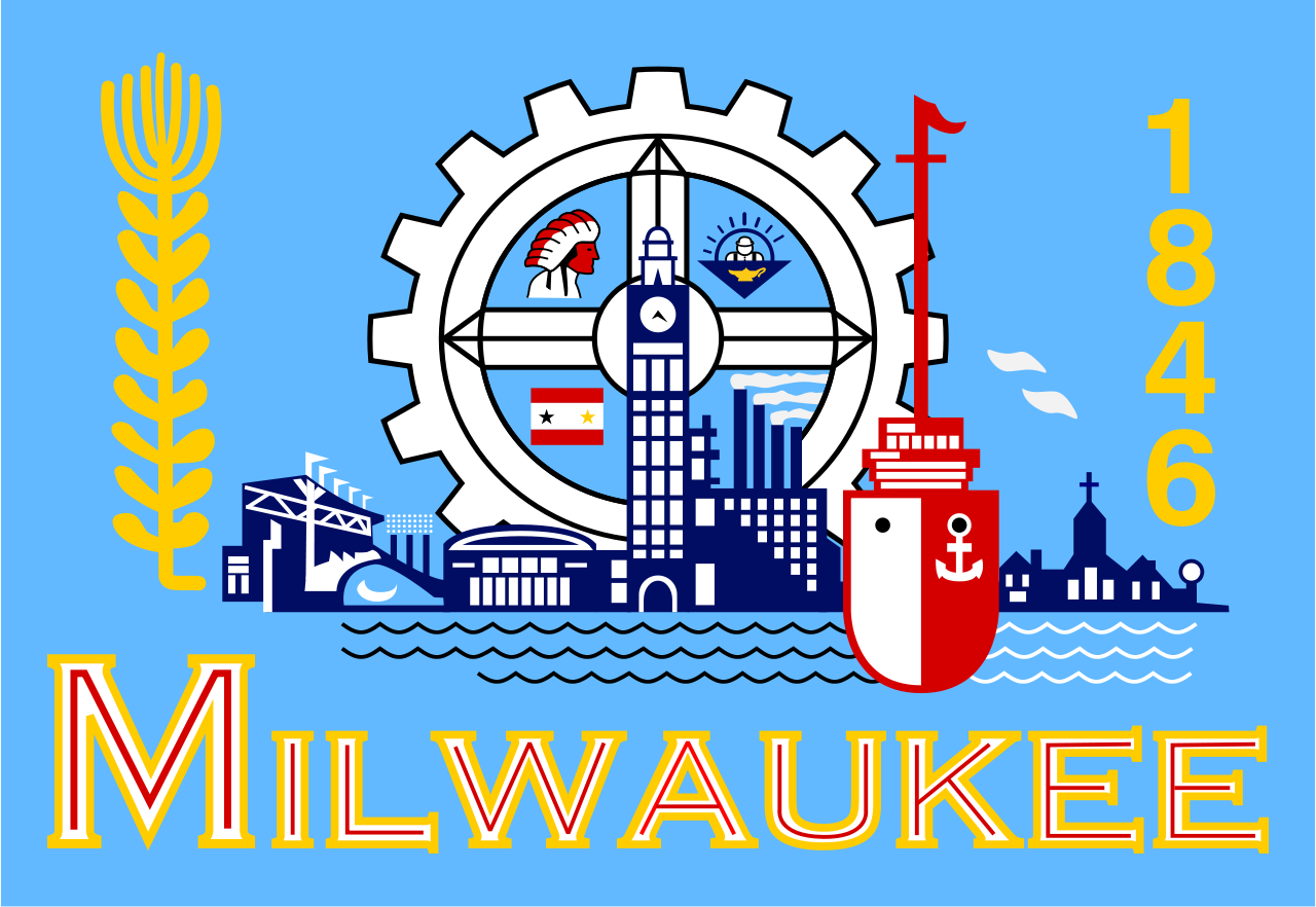
Turns out their is quite the controversy over what the real flag even looks like. As an active debate on Facebook and in our comments section has pointed out, the version we originally shared with this article is actually a knock-off of the original.
If you look closely at the flag above, versus the original version below you can spot a number of differences. Most notably, the iconic Milwaukee City Hall tower appears to have been substantially value engineered. Kudos to Matthew Prigge who was the first to point out this issue, as well authoring an article on the topic in July.
Confused? Even City of Milwaukee appears to be. In an article in defense of the flag on OnMilwaukee.com, Public Relations Supervisor Dustin Weis shows a photo of the updated, illegitimate flag inside the Milwaukee City Council chambers. – Jeramey Jannene
Original Milwaukee Flag
The “official” flag of the City of Milwaukee.
More about the People's Flag of Milwaukee
- City Hall: Latest Effort to Adopt New Milwaukee Flag Going Nowhere - Jeramey Jannene - Dec 3rd, 2025
- City Hall: Meet Milwaukee’s Flag Task Force - Jeramey Jannene - Jul 1st, 2025
- Council Reopens Flag Debate. Again - Jeramey Jannene - Jun 24th, 2025
- City Hall: Milwaukee’s Flag Debate Is Back - Jeramey Jannene - Jun 18th, 2025
- Council Puts Milwaukee Flag Debate on Ice - Jeramey Jannene - Nov 6th, 2024
- Council Could Send People’s Flag To April Referendum - Jeramey Jannene - Oct 15th, 2024
- Council Again Delays Adopting People’s Flag - Jeramey Jannene - Sep 24th, 2024
- City Hall: Committee Endorses Making People’s Flag Official, Despite Objections - Jeramey Jannene - Sep 9th, 2024
- Proposal Asks City to Adopt ‘People’s Flag’ - Jeramey Jannene - Jul 2nd, 2024
- Milwaukee Finds Its Original City Flag - Jeramey Jannene - Sep 9th, 2021
Read more about People's Flag of Milwaukee here


That is not the official flag of Milwaukee… its the knock-off that has been floating around the internet forever.
The man who designed this was an alderman and a graduate of th Layton School of the Arts. A very talented artist. Was a commercial artist, worked for Schiltz as a commercial artist, back in the day when artists were appreciated and valued. Died at a very early age in the 50s.
Matthew, do you have a link to an image of the real flag, then?
I believe it is the real flag. It has been floating in the air for years, since 1955, I believe.
This is the real flag. Subtle differences between the above. The fact that it’s difficult to produce consistently also proves the time has come to redesign it. It’s just too complicated to be a good flag.
http://shepherdexpress.com/imgs/media.images/10706/origflag.jpg
I tried to look for the flag on the City’s website and found none. Either they don’t care or are equally embarrassed to display it.
Next up, a trip to the real world and we’ll see what’s flying outside City Hall.
According to the five principals to good flag design, our Wisconsin state flag doesn’t fare any better.
This apparently is the flag…
From Wikipedia:
In the 1950s, Milwaukee leaders discovered it was one of only four cities with a population over 500,000 without a flag, and so the city held a contest for flag designs. Former alderman Fred Steffan combined elements of some of the better entries to create the flag.
In 2001, the Milwaukee Arts Board of the Milwaukee Common Council held a contest to attract designs for a new flag. Over 105 designs were submitted, but none met with the approval of the board, and the old design was kept.[1] In a 2004 poll conducted by the North American Vexillological Association, the flag of Milwaukee was rated the fourth worst of all major cities in the United States.[2] The symbols on the flag were common tropes of industry, manufacturing, and agriculture during the mid-20th century.
Since the contest, there have been numerous pushes to adopt a new flag, as most Milwaukeeans either dislike or are unfamiliar with it.”
Sounds like an uphill battle, but it’s worth running it up the flag pole and seeing if anyone salutes…
A larger issue may be other ways that Milwaukee identifies and promotes itself. But a flag is certainly a key symbol–if not widely used by our city.
Decades ago, the City of Milwaukee selected the winning proposal for the city flag;
It was quite attractive with bunches of barley representing the brewing heritage and three gears to represent heavy industry which was so important (then) in our economy. Unfortunately, all three gears meshed with each other so nothing moved– its symbolic meaning would be more fitting today.
I was on the committee that attempted to winnow down the 100-plus designs submitted in 2001…the process wasn’t helped by the subsequent conviction and sentencing (for campaign fraud) of Alderman Jeff Pawlinski who spearheaded the flag contest. As I recall, some of the designs, while perhaps not great, were an improvement on the current one.
City of Milwaukee should just adopt the County’s flag. Simple design. It’s shown the lower left quadrant of the gear in the City flag.
Other cities really have a lot of pride in their flag such as Chicago, Detroit and Baltimore but you’ll never see Milwaukee’s flag hanging from someone’s porch.
I think I’m mistaken. That isn’t the County flag but Milwaukee’s Civil War flag. But I do believe that flag is flying outside of the County Courthouse.
Yeah, I didn’t mean that the image was fabricated or anything, it’s just a digital rendering of what flies outside city buildings. I’ve got to admit a bit of laziness on my own part not to get a more detailed photo of the “actual” flag. I got to see one close-up at the library not long ago. It actually includes the “WELCOME” sign on City Hall.
Casey is right, we should absolutely adopt the flag shown in the lower left section of the gear. It’s simple, attractive, and has historical significance.
I like the image in the upper right hand corner of the gear. It looks like a construction worker in his little bubble top space ship. Just have that on the flag, maybe with the word “Forward” in big letters on the top (or bottom).
It would seem that reddit came up with an excellent alternative a year ago: http://imgur.com/74ZK8cH
@16 – i agree it’s much better but would still have one more change – get rid of the year.
I like it; its part of histoy it’s echt Milwaukee.
Well, it does need revising. First of all, get rid of the ship and the factories-industry has been in the toilet for decades. Lake Michigan is brown, not blue. The religous **** stays because some things NEVER change and the rest of the area can illlustrate an unfinished highway project and a an overpriced taxpayer funded Bucks arena
How often has Milwaukee redesigned the official flag?
Milwaukee held a Civic Flag Project in fall 1897. A prize for the winning design was given out in April 1898 to local guy John Amberg and his portrait and winning design were published in newspapers.
John Amberg (1844-1917) was a self-taught artist and musician who made an occasional living as a decorative painter, primarily 2nd tier decorative work in local churches. He was also a Civil War vet. (an underage enlistee). He painted battlefield scenes from memory and was also known for displaying the paintings at G.A.R. conventions.
His winning flag design is very simple: the words “steady progress” printed on a flowing ribbon banner, placed over a vertical spray of oak leaves, with “MILWAUKEE” printed below.
Well, a very simple design can easily have multiple interpretations. Flown horizontally, a big golden gear over the confluence of the three rivers flowing into Lake Michigan represents one possible meaning of Milwaukee’s name, the “Gathering of the Waters”; hung vertically, it resembles a flower, as the rivers now look like the stem and leaves arising from the “ground” (previously lake) — thus symbolizing the Flowering of Industry. No need to pile in the kitchen sink.
https://www.anony.ws/image/JOdf
I find some of your comments, mr. Kidis, to be very offensive to the family of designer of the flag. Look for other works of the artist. Where is your work? Besides your acid tongue. Okay, the flag might need a redo, but enough of the slamming.
Milwaukee’s flag should best represent what we Milwaukeeans are all about. The flag should depict thousands of homeless sex offenders, cops killing blacks, boarded-up rust-belt relic factories of a bygone era, a shameful, embarassing nonexistant downtown, a cryptosporidium, maybe Jeffery Dahmer’s face…
I dunno…just throwin’ some ideas out there…
I like it. Why would a simple flag be better? Redesigning it because it’s difficult to produce consistently ignores that technology is steadily improving and will make complex designs of various kinds more easy to produce by the year. Maybe as a foreigner I don’t have a say, but at least I’ve visited your nice city once, in 2000.
Why… the “original flag” is even worse than the long known rip off from the Internet as it has THREE flags on it, the Milwaukee Regiment, the US flag on the Tower’s top and the guidon on the ship’s mast that in the cleaner version is just a nice wavey line…
@Lars Finsen
Simple Flags are better because they strengthen the communal spirit through being present everywhere… the 99% invisible (it wasn’t an actual TED Talk if I think about the same presentation Roman Mars has given as this article mentions) video mentions the famous Chicago flag with two blue lines and four stars, that a lot of fans of police procedurals and movies about fighting crime will recognize from uniforms, but that also is EVERYWHERE in the City. It promotes pride in the community and identification. A bad flag that mostly stays shamefully hidden and never really flies can’t do that and a complicated design can’t really go out and be there with the people of the city.
Get some responsible journalists that do fact checking. The wheat is not for beer but for the grain exchange cash crop.