Our First Great Glassy Skyscraper
The Northwestern Mutual Tower is an architectural triumph.
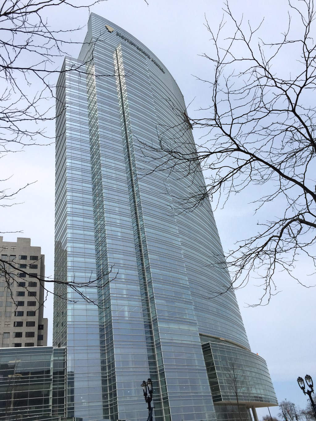 The Northwestern Mutual Tower sweeps around the bend at the end of Wisconsin Avenue. The arc of the building gathers momentum as it veers to the sidewalk of North Prospect Avenue. This has to be one of the most dynamic architectural encounters for the pedestrian in Milwaukee.
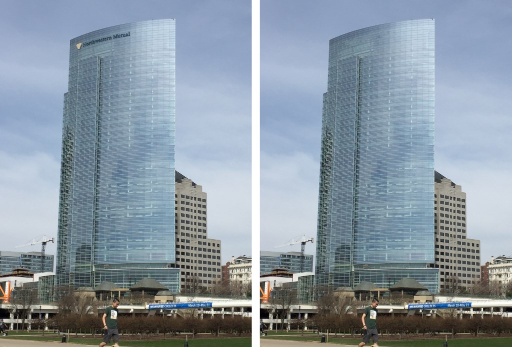
The left side of the front is anchored by perpendicular steps that harmonize the verticality of the building with its horizontal sweep. From a distance the southeast face of building flattens out. Depending on the light it can dissolve into a glassy cloud. It’s a very pretty, even delicate rectangle whose stature doesn’t just come from being taller than the other buildings on the skyline.
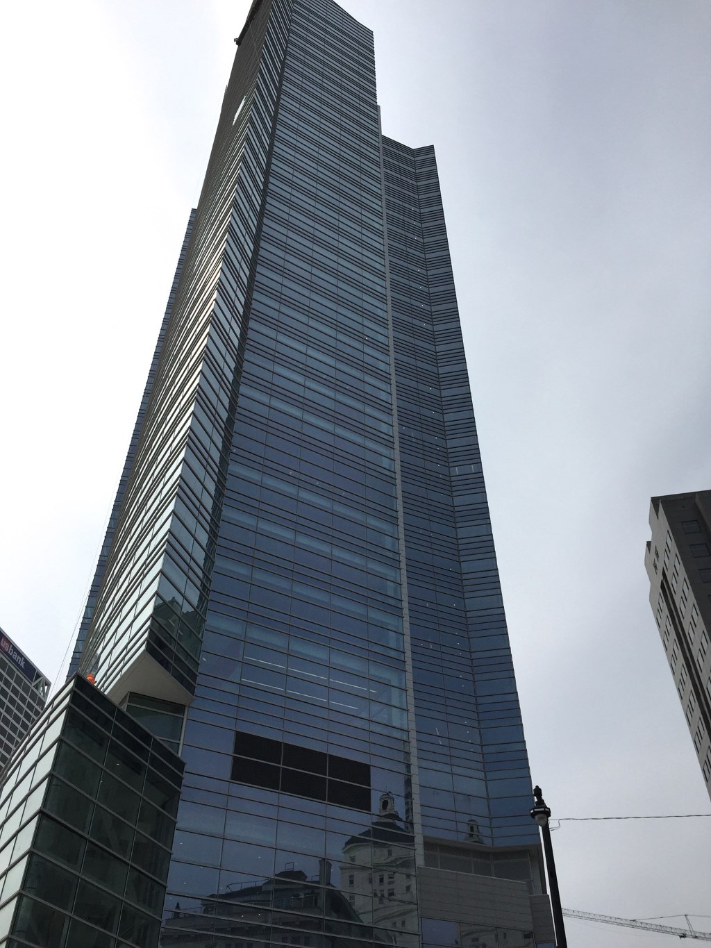
The west and north facades, the back of building, are densely layered stacks with a luxurious white granite spine. Looking up, the tower soars from the sidewalk but becomes almost ineffable from a distance.
The building seems to have only two sides that taper to an improbable paper thin edge, a line that optically flattens the building. Which is odd because buildings need at least three sides to stand up. Tall buildings in particular used to have four symmetrical sides before the computer liberated architects to make waves.
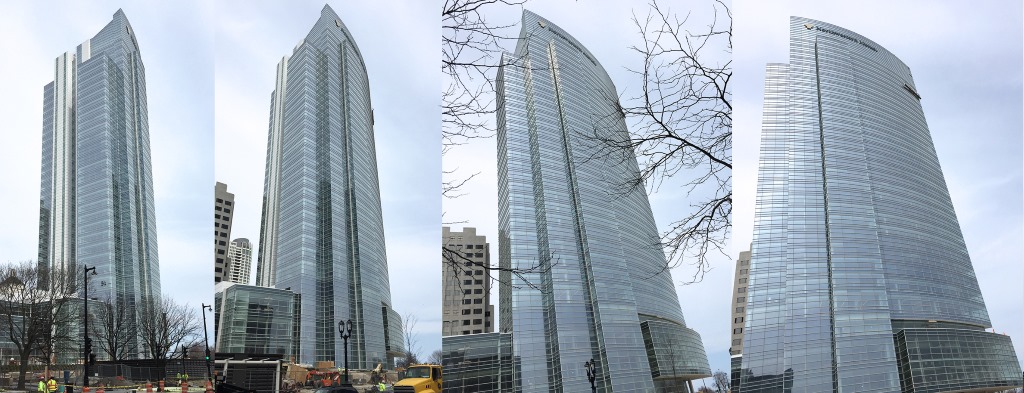
Buildings today no longer need to have a definite shape. The NM tower keeps changing according to where you stand. It miraculously re-composes into a new complete thought every thirty feet or so along Wisconsin Avenue and Lincoln Memorial Drive.
The tower is so crisp, yet its form seems to blur. You can’t really wrap your mind around it, which turns out to be its singular virtue.
At first I thought the composition could be simplified. There are more than 20 different planes. More ornamental vertical rectangles than any building I can think of in Wisconsin. But it isn’t overwrought. The clarity of the architecture is not obscured by the complexity of the design.
It’s about time Milwaukee got its own glassy tower that reflects the light of the sky and the lake. As it stands today, the NM Tower is the second tallest and one of the largest buildings by square footage in Wisconsin.
It took more than 100 years and several buildings to make a suitable companion to the company’s classical revival building next door. What a splendid addition to the skyline. And striking in comparison to some other tall commercial buildings in Milwaukee. I am thinking of real estate ventures sold more like fabric by the square foot — the 100 East Building, the Milwaukee Center, The Moderne.
The NM Tower isn’t about maximizing money. The company is looking to make a statement, to represent their strength and values in a building. This kind of ambition produced all the best buildings in Milwaukee: the three local bank buildings (M&I, Marine, and First Wisconsin, as they were originally called), the gas and telephone company buildings, MGIC and so on. Our City Hall and downtown Public Library were not built just to hold meetings and books.
To reach these heights a building needs an ego, needs to be a contender. Like a cathedral or the way we used to think of government, a corporation has to be something to believe in.
But that doesn’t need to be advertised. I can only imagine what the architects thought about pasting the company logo atop the building. This art work is undoubtably a fine letterhead. The brown symbol to the left of the lettering is a flowery caricature of the top of the columns of the 1914 building next door, which the company used to attach its identity to.
On the new building that image becomes a brown blob. It’s contrary to the sleekness of the design, to everything the building stands for. Northwestern Mutual unwittingly turned its brand into something one has to overlook to appreciate their new $450 million headquarters. Kind of like putting a milk dud on top of a creme brûlée.
But a small matter that can be changed in the future. Meanwhile, Northwestern Mutual’s headquarters has set a new standard for buildings that rise above the horizon in Milwaukee.
In Public
-
The Good Mural
 Apr 19th, 2020 by Tom Bamberger
-
Scooters Are the Future
 Dec 19th, 2019 by Tom Bamberger
-
Homeless Tent City Is a Democracy
 Aug 2nd, 2019 by Tom Bamberger













Maybe I am being a bit greedy but I wish it was even taller!
Love this buikding. Great description too.
Rose
Thoughtful review of a superb addition to Milwaukee.
Y’know, for all the hate Mr. Bamberger regularly gets for his opinions here, he does do a spectacular job describing architecture as art.
I also happen to agree with his appreciation of the great maligned boxes of our mid-century building boom. Two points of contention I have here, though: the sign really isn’t that bad a visual sin, and the west-facing side of the building is unfortunately jumbled and uninspiring.
Positive note: this sets the bar quite high should JCI pursue its magnus opus.
Didn’t the architects deserve to be identified?
Agree with Penrod about IDing the architects…
NM has a page with various fact sheets, including about the design team.
https://www.northwesternmutual.com/about-us/what-we-believe/we-believe-in-milwaukee/building-the-future
Pickard Chilton is listed as the Design Architect.
“Pickard Chilton is an international architectural practice noted for its expertise in the design of large, complex
buildings including corporate headquarters, high-rise commercial office towers, hotels, and academic and health
care facilities. Headquartered in New Haven, Conn., the firm’s recently completed projects include: 300 N.
LaSalle in Chicago; the CalPERS Headquarters Complex in Sacramento, Calif.; and The Pinnacle at Symphony
Place in Nashville, Tenn. Current projects include the ExxonMobil Office Complex in Houston as well as
commercial developments in Chicago; Washington, D.C.; Calgary, Alberta; and Kuala Lumpur, Malaysia.”
Gregg, as an FYI, somebody somewhere signed something that essentially keeps the First Wisconsin / Firstar / US Bank building the tallest building in Milwaukee, possibly all of Wisconsin. So, unless someone buys out that agreement, that will be the tallest building.
NML has more square feet of floor space though.
And i agree. I wish it were taller too.
I hope that I am wrong, but I fear that this building will kill many thousands of birds over the years. The uninterrupted sheath of windows looks like an extension of the sky to our poor avian friends.
You are absolutely right ….. I thought I had identified the architect, perhaps in an earlier draft. But there is no excuse. The omission is embarrassing. Thanks for adding it to the post.
@MarkM – There is no such agreement covering land not owned by US Bank (they obviously are free to enforce such a thing in a land sale on land they own). NM would have been allowed to build a taller building.
This looks even better than I expected. It changes from every angle and in every weather. It’s a great jewel!
I want to love this building, but I agree with Dudemeister about the confusing west facade. Traveling south over the Holton Street Bridge it is hard to discern just what the north and west sides of the building are trying to say. The other views are lovely, but I just can’t embrace the view I see daily. Maybe I will learn to appreciate it.
Now, if we could just convince the art museum to stop hanging gaudy banners on the Calatrava pedestrian bridge . . .
Amid the excitement of another human achievement, one message from David Coles goes unheeded. Throughout the year, birds will crash into this illusion and die. They better hire an extra housekeeper to sweep up the remains.
Matt: Great point about the banners.
And I agree with you all about the West side of the building, but it is the “back” of the building. Skyscrapers didn’t used to have backs or fronts. Now they do, just like people.
Agree with the taller comments! Being known and seen as the tallest is more of a statement and eye catcher than “most square footage. The additional height would help the south facing facade look less “stubby”. I think they could have done a little better with the signage as well. Its difficult to see the branding during the daytime and its only on one side.
One of the first things I said when I moved here in 2012, was that NML really blew a chance to have something iconic on that corner, like the original column building was/is. So many pictures taken of the art museum with that building as a backdrop. And here they had a brown box and that ugly prison looking building just north. YUCK! They really need to tear that thing down, even though they built it in the 90s. Their apartment tower is going to be a nice addition. On that note, I wish some of the units Mandel has been building along the river would be condos. So many apartment units going online but nothing to buy!!
Bamberger nails it again. And it does appear that a tremendous effort is being made with the landscaping along Prospect and Wisconsin. If this turns into a fabulous park space, the building will have achieved even more. Hope Tom gets ready to photograph those gardens when they’re done.
As David Cole mentioned, this glass tower located along a major migratory bird fly way along Lake Michigan will kill thousands of birds annually.
It is very ignorant and unfortunate that the architect and owner were so insensitive to the surrounding environment. Some mitigation could occur if lights are turned off during nighttime hours, but that is not likely to happen since a corporate entity will want to boast and show off their power. The building is a tower of ignorance and greed. It did not have to be so.
Good stuff» the building, NM, the article and the photographer/author.
What a wasted opportunity to FINALLY eclipse US Bank Center and build a new tallest in Milwaukee! What, they couldn’t have sprung for an additional ten floors?
Yes, it’s a nice addition to Milwaukee’s forgettable skyline. But it’s STILL forgettable! As usual, Milwaukee blew it!