Bucks Arena Design Is Anti-Urban
Its generic, well-mannered and probably won’t improve with “tweaks.”
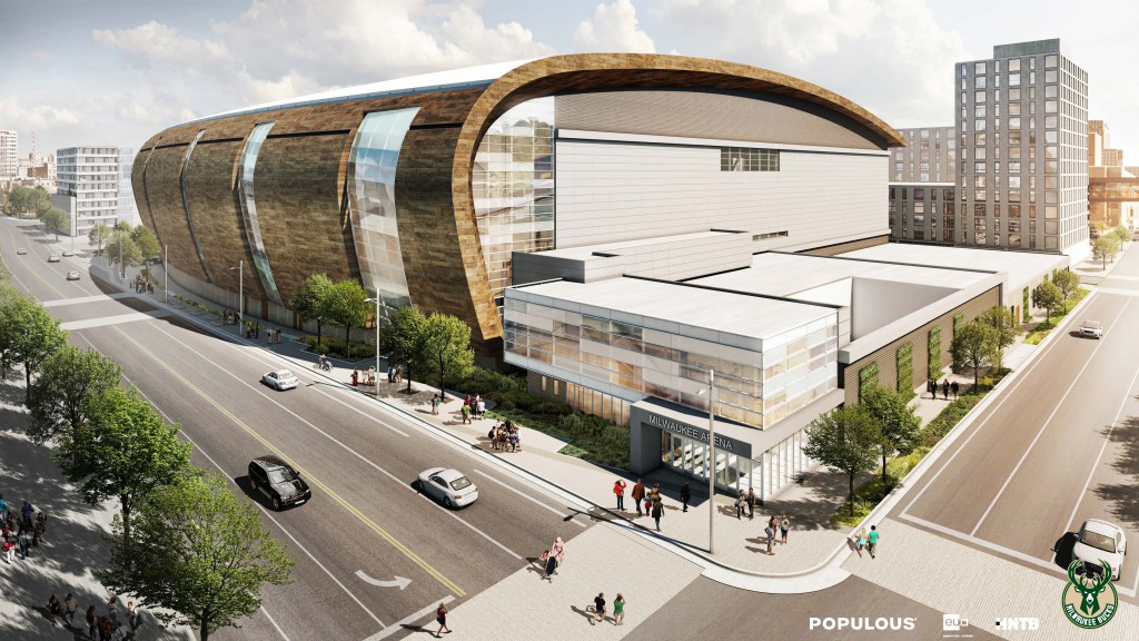
The form has a “powerful, simple geometry,” said Bob Greenstreet, dean of the School of Architecture and Urban Planning at the University of Wisconsin-Milwaukee. Greenstreet is the official validator of architecture in Milwaukee. “You are going to see these glass slots that go up six stories, that curve over your head,” said Greg Uhen of Eppstein Uhen Architects. They are the local firm working on the project.
Then there the politicians. Mayor Tom Barrett thinks the design is “fresh.” Alderman Bob Bauman believes “all the architectural principles are there.”
Public opinion has been mostly upbeat. People like the wave but the new arena could be a little nicer to pedestrians on the street. “Public space appears to be an afterthought and reveals a real weakness in this team’s approach,” Mary Louise Schumacher said in the Milwaukee Journal Sentinel. She suggested some landscaping and public art could improve things.
The building is more of a logo than anything else. The new arena is decorated like a wedding cake. It’s just packaging, big ungainly rectangles with swirl of “Milwaukee” on top. And sugarcoated in zinc to go down easy.
That would be the “hand-crafted zinc patina exterior,” according to the Bucks press release, part of a design “inspired by Milwaukee’s proud architectural heritage and bold outlook, coupled with the region’s natural environment of rivers, lakes and forests,” the release goes on.
Which means what? Put a big wave on a building near a Great Lake. And that’s it. Brad Clark of Populous, the architect of the arena told the Milwaukee Journal Sentinel, “We think there’s beauty to the region and water is a big part of that. We know that’s important to your community.” He should know, Clark lives in Kansas City.
These kinds of buildings are everywhere today, the mall-version of an arena. Not the Bayshore Town Center, but its equivalent. They are very efficient and of the moment. You buy them off the shelf and give them a local flavor. The arena is a highly functioning bunch of boxes with an clumsy motif draped over it that doesn’t quite stretch across the whole shebang.
It’s the product of a culture that lost its innate ability to produce stature in ordinary buildings. All you have to do is compare an old post office with new one to see how things have changed. Governments used to take pride in architecture, like the Federal Building on East Wisconsin avenue.
Today buildings get their mojo when local philanthropists want to impress their friends. And hire architects who don’t need to consult with alderman about the principles of architecture. It’s personal. The Milwaukee Art Museum’s Calatrava — with donations from many of the city’s wealthy people — is an example of this. The same could be said for Michael Cudahy’s Discovery World next door. But the three owners of the Bucks, Marc Lasry, Wesley Edens and Jamie Dinan, live in New York.
So we are left to worry about manners. Make the arena more congenial to all of us little people on the street. Tweaks they are called. Everyone has one — the City Planning Commission, zoning committee, the Common Council, and critics.
It’s painful to watch the city nitpick a generic design and make it worse. A few benches thrown around, a mural, and some trees will not do the trick. Adding texture to a blank wall to make it “friendly to the street” is just a hollow gesture. The solution of public art is almost insulting, especially considering its dismal record in Milwaukee. Really, how is a cut-rate, $30,000 sculpture supposed to blunt the force of a $500,000,000 building?
“It’s exactly what I was afraid of,” said Sebastian Schmaling of Johnsen Schmaling Architects told the Milwaukee Journal Sentinel comparing early and final renderings. “The more detail they put into it, the worse it gets.”
None of these tweaks matter. Manners are overrated in architecture. A city full of well-behaved buildings is no fun. Polite buildings are just insincere. When all you do is make stuff less rude you end up with Mequon.
The same firm that designed the Bradley Center is doing the new arena and architect Chris Carver admitted they failed the last time to make the Bradley Center a catalyst for downtown development. Why would they succeed this time? The company’s client isn’t the city but the team, whose main concern is building profit generators it controls. Like malls, the arena is fungible.
Inevitably, buildings like this are designed from the inside out. And that’s what Populous does. It is the one of the best firms in the world for innards of arenas. They were hired to put a highly functioning arena inside the Millennium Dome in London. But you wouldn’t find their buildings in dense urban areas like New York or San Francisco.
The arena is designed to look good at 60 MPH. It’s essentially a suburban building near a freeway. For people in cars rather than people on the street. The building is built for today, for the empty west part of Downtown that’s a problem, not the dense urban fabric you’re seeing created in areas like Brady Street, the Third Ward and Bay View, the Milwaukee of tomorrow.
But we didn’t have to give the Bucks 4th Street. Taking a right away from the public with all the constitutional rights that go along with it. The Department of City Development officials and the Bucks tell us it’s needed to better connect the area with their entertainment center and the restaurants and taverns on Third Street.
That’s what streets do in a city. People move to the suburbs so their kids don’t play, ride a bike or walk in street. The better the suburb, the less you see from the street. But in cities streets are an asset, functioning like the internet or the circulatory system in our bodies.
The one thing urban planners have figured out over the last 30 years is the grid is our friend. Violating it cuts off the oxygen supply in a city. It’s one of the reasons downtown malls (like the Grand Avenue) have withered and failed.
The Bucks could always close the street on game days or other festive occasions. In cities, it’s fun to play in the streets.
Architecture critic Tom Bamberger’s other stories for Urban Milwaukee can be found here.
Political Contributions Tracker
Displaying political contributions between people mentioned in this story. Learn more.
- June 21, 2018 - Tom Barrett received $3,000 from Michael Cudahy
- October 8, 2015 - Tom Barrett received $400 from Greg Uhen
- July 9, 2015 - Tom Barrett received $3,000 from Michael Cudahy
In Public
-
The Good Mural
 Apr 19th, 2020 by Tom Bamberger
-
Scooters Are the Future
 Dec 19th, 2019 by Tom Bamberger
-
Homeless Tent City Is a Democracy
 Aug 2nd, 2019 by Tom Bamberger












Some people will criticize anything no matter what it looks like. Arenas to some extent need to be a big box to accommodate the reality of what goes on inside. I’ll take this over the atrocity being built right now for the Vikings any day of the week.
My understanding is that the lack of street level accommodation at this building was the result of there being no ability to build a basement to house necessary stadium equipment due to utilities. Considering the greedy team owners already fleeced the taxpayers for hundreds of millions to build this, i can’t imagine them spending anything more to start moving utilities around.
Also, can this really be called a suburban building? Show me a building that looks like this in the suburbs. I’ll wait.
@Tom
Although I certainly agree this building is anti-urban in its design and is a complete failure on three sides I do have a point of disagreement. Go figure.
The concept that closing streets to automobile traffic is suburban is funny..
spoken exactly like someone who has no idea about how architecture works.
there’s a reason that post offices don’t look like they used to. nobody wants to spend $20 to mail a letter in order to subsidize neoclassical buildings.
it’s a large-scale building. can you name any stadium that would feel at home in bay view? i can’t.
do you feel the same about the pedestrian development at the cardinals stadium in st louis? in the summer it is teeming with people, no cars pass through, and it’s still urban.
i’m not saying the design is perfect, but it’s closer to success than this article is.
Everyone is a critic, so I hold off my judgement of what looks good because really I can’t point out one building in the city outside of city hall that looks “good” in my opinion. I’d say the same about the new arena, but as I just qualified in my last sentence, everyone is a critic so I take design critique with a grain of salt (including my own).
However, I digress on suburban undertones. 4th street will be closed to automobile traffic while the streetcar and (god willing) the new BRT system that appears to be in infancy by MCTS (rumor is Blue Line will be next once the Gold is converted on the Tosa route) that it will encourage more people walking and taking transit downtown.
“You buy them off the shelf and give them a local flavor.” Where’s the local flavor? From the designers that brought the KFC Yum Center…https://www.google.com/search?q=kfc+yum+center&source=lnms&tbm=isch&sa=X&ved=0ahUKEwjIpNfgoJHMAhXHnIMKHaklBh4Q_AUICCgC&biw=1327&bih=650
Tom, I agree with you especially about the violation of the city grid which is already seriously degraded on the west side of downtown.
As for the building design, it is difficult, but not impossible, to successfully incorporate an athletic venue into an urban neighborhood. The DC Verizon Center is urban. It also has the virtue of not being iconic.
BTW, I would defend Calatrava’s urban sensibility in that the Milwaukee Art Museum’s Quad addition lines up precisely with the center of Wisconsin Avenue. That decision violated Modernist guru Walter Gropius’ dictat against precisely terminated vistas. When I mentioned this to Calatrava he said he was aware of Gropius’ view and disagreed with it. He wanted his work to connect visually and physically with the fabric of the city.
What does “polite buildings are just insincere” even mean?
there’s a reason that post offices don’t look like they used to. nobody wants to spend $20 to mail a letter in order to subsidize neoclassical buildings.
I bet to differ. Why did we make buildings like City Hall? Out of respect for government and ourselves.
Isn’t this is the same architect that screwed up the Bradley center design? As I recall, they had to reconstruct the upper deck due to serious design flaws in the seating arrangement. I agree with the author; don’t pick a generic “big box” mall design. Give us something better for our millions.
Nailed it Tom. the Bel Air Cantina super-sized.
Dave Reid: “The concept that closing streets to automobile traffic is suburban is funny..”
Closing streets to create “pedestrian malls” was in fact a concept developed in the 1960s to mimic the popular suburban shopping mall experience. That turned out to not work (and nearly always depressed foot traffic) and that’s why 90 percent of all these contrived “pedestrian plazas” failed and reopened as streets. The only ones that work are part of college campuses or where there are masses of tourists day and night (Miami Beach, Times Square, Las Vegas). Milwaukee’s all gung-ho for a failed concept.
Opposition to closing 4th Street inspired some minor saving graces, even though opinions of experts like John Norquist were largely ignored. As one concession, the city retained ownership rather than ceding the public street to the Bucks, after it was noted that these street-closure projects usually fail, (including on Mitchell Street). That also will allow a streetcar someday, if the routes expand. The common council also acknowledged that you can’t turn over a street to a sports conglomerate to COMPLETELY do with as they please and call it a “public space.” So they “compromised” and let the Bucks just mostly do as they please.
Taxpayers underwriting it will have some vague usage rights “when it’s not being used for special events.” So come on down, Overpass Light Brigade and Black Lives Matter activists—just not during a game or whatever else counts as a “special event.” So, it won’t be a truly public space but public officials can pretend it is. Milwaukeeans don’t get all worried about whether public spaces are really public, not like people in Minneapolis, Chicago and other park-centric cities do.
James Burnett, the Houston landscape architect Bucks hired, can try to make an OK pedestrian mall but will it materialize masses of visitors outside of arena events? This will not be a plaza/square like in European cities or Savannah or Charleston that’s the center of a neighborhood teeming with life. This will be the center of the Almighty Bucks entertainment monopoly, more Disney-fied than New Urbanist. Wes Edens promises it will be the country’s biggest outdoor sports bar. That’ll put MKE on the map!
But at least the Bucks hired a landscape pro, and from Houston no less, a city that, no kidding, is “leading with landscape.” Our own brilliant “Urban Wilderness” maven Eddee Daniel learned recently that at a national conference in Houston. So maybe there’s hope on the horizon, that something green might take root around 4th Street—and not just more of it going into the Bucks owners’ pockets. Citizens can lobby for masses of trees, not just a few tokens.
http://www.milwaukeemag.com/2016/04/14/what-can-milwaukee-learn-from-houstonization/
I like it. Groundbreaking June 18, I hope to be there. I’m really excited! Everything is happening now. Great times!
Ughh. So it looks like a giant pacific beach taco stand. Don’t worry, we won’t have to look at it for too long. We’ll build em another off the shelf design before we’ve paid off this wart. Because they “need” it. Enough with this corporate welfare. They don’t care about us. Let them threaten another city and burden them with debt. No one goes anywhere else downtown when they’re here because who wants to pay 20 bucks to park 6 blocks from the restaurant. There’s gonna be more minimum wage concession jobs? Honestly, how many kids from the north side will even get to go to a game? Build it in Brookfield. We have a crazy train we have to pay for. Ridiculous!
There seems to be a lot of polite comments on this arena design by civic leaders. I wonder if their hearts sunk like mine when they first saw the renderings. Even the above rendering has a familiar Bradley Center feel – slap a glass atrium on the building and call it an entrance. It’s nice to have more windows than the BC, but why so narrow and in such a fashion as to give the design a beer barrel look. Given the importance and cost of this new arena to Milwaukee, we deserved a spectacular arena design not unlike the impact of the Calatrava on the lakefront. We surely didn’t get it and these architects let us down – again. Thanks for the honest article Tom.
Wow, it’s amazing how ungrateful you all sound. So who from MKE or WI was going to develop that no-man’s land in the city? How long had it been vacant? What’s been “activating” the area lately? Lasry and Edens bring NY money to MKE and you scoff at their efforts. Note to Wichita, Cleveland, or Omaha, if someone is bringing NY or LA clout to your town, be grateful.
Lasry and Edens have committed to improving MKE when most wouldn’t have. Had the Bucks left, you would have been left with an abysmal MLB franchise (ah, the glory YEAR), no NFL, no NBA, no NHL, no MLS, and no Power-5 college athletics (that includes no DI football). MKE is more a indoor soccer and roller derby-kinda town.
BTW, if some of you are unhappy with the design, what do you do when you think of Miller Park? Foam at the mouth and convulse? Regardless of what anyone says, it’s a dome and always feels like a dome. It’s a dome in the middle of a parking lot in the middle of nowhere. I love the logic that MKE sacrificed 70 stunning days of outdoor baseball for 11 bad ones. I caught part of the Twins, Pirates, Red Sox, etc. games this weekend and their fans sure seemed to be enjoying themselves and will all summer. Instead of balls splashing down in the water somewhere with a view of the downtown under the night sky, the Brewers play in the middle of a parking lot activating NOTHING.
Even though I live in Oahu, I love my city – otherwise I wouldn’t keep up with the goings on in Urban Milwaukee! But let’s be honest, MKE is probably the city with the most MLB-players having it in their no-trade contracts. Be grateful MKE. Will it set the bar? Maybe not. Will it be better than the no-man’s land that currently exists? Most certainly.
@Virginia No pedestrian streets/areas were not first created in the 60s. I’ll let you think on that.
PS I sure hope Houston is doing something because that is one awful city. It’ll take a lot more than parks to fix it (could actually contribute to the problem).
Jason (#15), you seem to be forgetting that Wisconsin taxpayers fronted a quarter billion dollars to pay for half this arena. We don’t have to be “grateful” for anything; the rich owners of the Bucks receiving public financing for their private business via the implicit threat of departure should be the grateful ones.
@Dave, of course streets are as old as cities and plaza/squares go back eons. I was referring ONLY to what urban planners defined as a “pedestrian mall,” a concept introduced by Victor Gruen in 1959 in Kalamzoo. Gruen was by then a big-time shopping-mall designer.
Urban planner Jessica Schmidt’s recent report called “Revisiting Pedestrian Malls” analyzing why only about 10 percent have succeeded, all in places with massive existing foot traffic.
http://nacto.org/docs/usdg/revisiting_pedestrian_malls_scmidt.pdf
This is from the intro:
“A pedestrian mall is characterized as a number of blocks of public downtown streets designated for pedestrian-only use and closed to vehicular traffic. The article examines why most pedestrian malls have been unsuccessful…
Why do pedestrian malls fail? They sound like such a good idea: getting people out of their cars and interacting with the environment and their community. Yet in practice, with a few exceptions, people have shunned them. Between 1959 and the early 1980s, more than 200 American cities closed part of their downtown street networks to vehicles. Hoping to compete with suburban shopping malls and reverse the decline of American downtowns, civic leaders and urban planners believed that by recreating suburban conditions in urban areas, shoppers and tax dollars could be lured back. Pedestrian malls appeared in every region and climate of the country with great fanfare. They varied in terms of length and amenities provided, but all followed the same premise: closing a main downtown street to automobile traffic so that pedestrians could walk from store to store in a leisurely manner.”
Closing 4th Street for the Bucks pedestrian mall is quite an expensive gamble. We’ll just have to see if Milwaukee can beat the odds and it becomes a boon for urbanism.
@Virginia Yup, I’ve read the doc. But thanks for proving my point. Or course pedestrians areas (mall, street, area whatever you want to call it) are not a suburban idea, nor new, they are in fact as old as cities.
“Closing 4th Street for the Bucks pedestrian mall is quite an expensive gamble.” It is? To be clear I’m not saying the Live Block will be a boon for urbanism or the city. I just can’t see how it remotely a suburban concept, as Tom wrote, or what the big downside is? (considering the Bucks deal is already done).
PS Pedestrian areas exist today in cities around the world. I’m partial to Vitosha Boulevard in Sophia (now that is one big urban city) and Plovdiv’s Knyaz Aleksandar I (biggest in Europe) is amazing, but I look forward one day to visiting Stroget Street in Copenhagen 🙂 Oh yeah and I know this one fits the criteria for a successful one in the US (though I think the report misses the point on why it is successful) but the Ped Mall in Iowa City is a blast.
We plebians grovel in gratitude at the feet of Lasry, Edens and our rulers for their generosity in granting us the privilege of gazing upon their sporting palace. I hear Emperor Walker is going to declare a triumph to celebrate his wonderful victory in securing funding for this wonderful palace. Ave, Imperator, morituri te salutant!
@Dave, I’m all for more places in cities that draw pedestrians and serve as gathering places, and have enjoyed many plazas in the U.S. and Europe. If we end up with a thriving “public plaza” I will be thrilled. How about UM doing a piece about what will help make 4th Street a successful pedestrian mall (plaza, area, whatever)? As you noted, there are reports distinguishing the successes from the failures. To me, it’s not about whether it’s “suburban” or “urban” concept.
The Common Council has decided to allocate many millions for this “public space.” What can be done to help ensure that public cash is not squandered?
What might make it–or any urban public space–most useful, appealing and even well-loved? It’s our money, our streets, our city. What do urbanists and other citizens want? It’s not just up to the Bucks or landscape architect James Burnett’s firm. The reason Brady Street is full of pedestrians, seating and such is that neighbors and businesses worked to make it that way.