
Will Milwaukee Choose High Line’s Designer?
James Corner is one of four finalists to create $30 million lakefront bridge. It’s a great design.
The city has launched a $25-$35 million national design competition to create a landmark lakefront bridge. There are four finalists for the competition, and given the need to attract donations for the plan, the winner is likely to be the biggest name, James Corner Field Operations, who also did the much-celebrated High Line in New York. His star-power should make it easier to raise private sector dollars from the community, and Mayor Tom Barrett has never tried to raise that kind of money for a major design project.
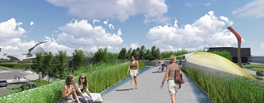
If Corner does win, that would be great, because his team, which includes Milwaukee’s La Dallman Architects, is clearly the best of the lot. Theirs is the only proposal that rises to the occasion.
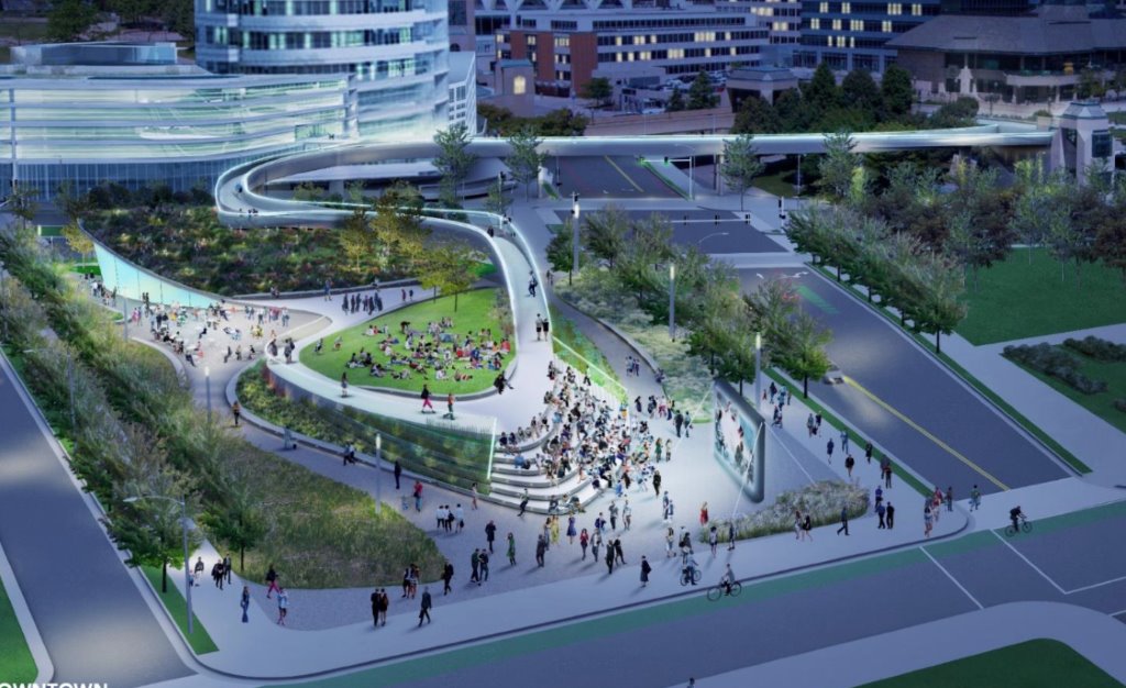
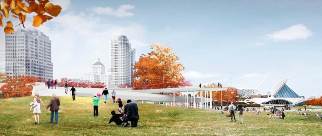
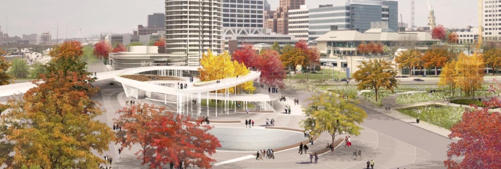
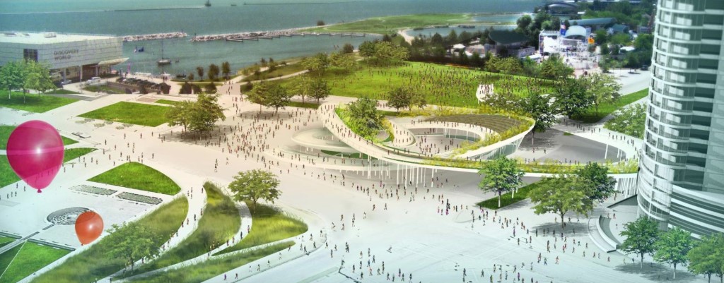
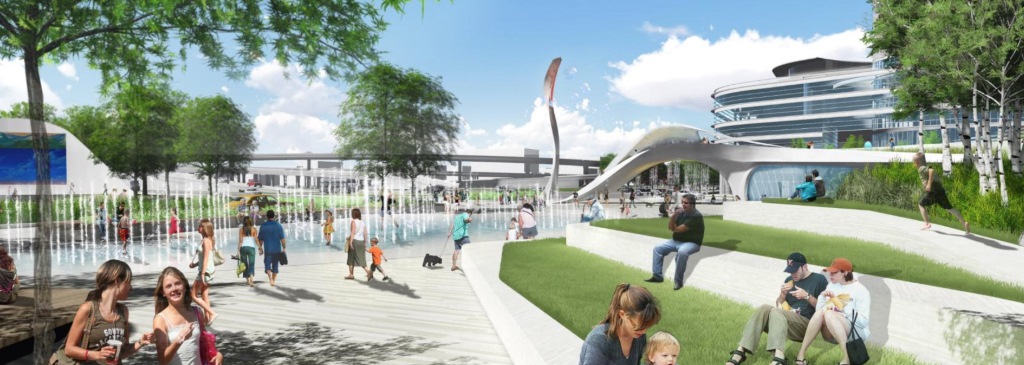
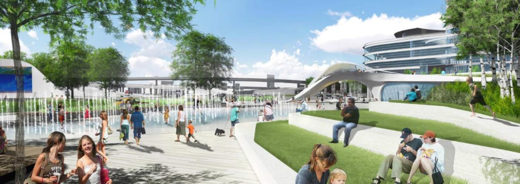
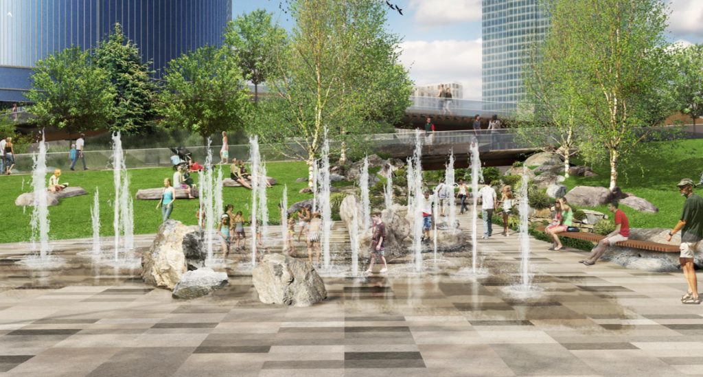
Their bridge flows to the lakefront across two nicely proportioned bluffs that are elegantly shaped and landscaped, then swings around inside itself in a figure eight to a ground-level plaza. On the northeast corner seven broad arcing steps go down to an circular fountain that is directly on axis with the Kiley, the adjoining rectilinear garden in front of the Art Museum.
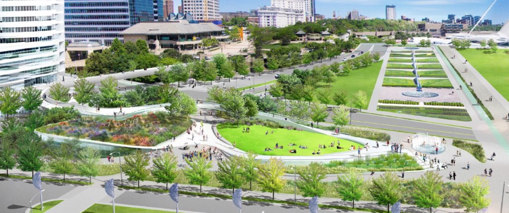
Incredibly, this is the only proposal that found a way connect their new piece of the puzzle with the most significant landscape architecture in the state, by international star Dan Kiley. It makes sense that a landscape architect of Corner’s stature would not miss an opportunity to nod to Kiley. All things being equal, failing to integrate the Kiley would be a deal-breaker for me. It’s too elementary a mistake to forgive.
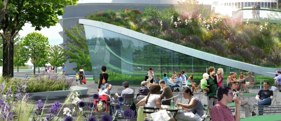
A sleek glassy pavilion tucked under the bluff at the corner of Lincoln Memorial Drive and Clybourn extends the urban fabric into the new space. This softens the relationship between the high rise buildings across the street and lake. It is also a genuine part of the landscape.
I really like how the volumes are effortlessly woven together. It’s robust yet calm. A natural solution and the only one of final four plans that has a convincing vertical dimension.

Marilu Knode, former director of INOVA in Milwaukee and present Executive Director of the Laumeier Sculpture Park in Saint Louis, is also on team. She is a great asset, someone to limit the damage so-called public art usually inflicts on public spaces in Milwaukee.
Along the periphery there are few thing that need to be reconsidered when this design moves forward. Corner’s team proposes a row of trees along Lincoln Memorial Drive that conflicts with the Kiley. An ersatz row of trees, which looks like an afterthought, obscures the beautiful rationality of Kiley’s landscape. I don’t think this is the final solution, or maybe I don’t understand the rendering.
And they have taken the array of Winds Leaves, by Ned Kahn, in front of the Discovery World and lined them up like lamp posts down the middle of the boulevard extension of Clybourn. The considerable charm of the work is being among the seven-foot stainless steel structures that turn into the wind like windmills. Their circular array multiplies the effect, creating an immersive experience that will be lost when lined up in the middle of a street.
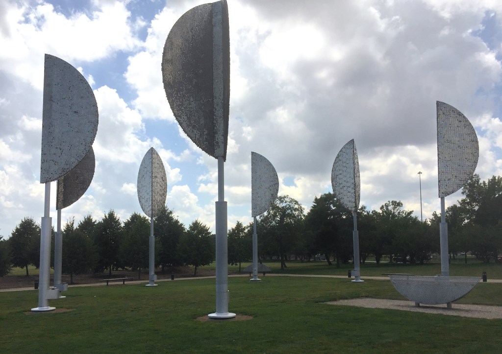
The Kahn may have to be moved to a new site. It doesn’t have to be in front of the Discovery World building.
It will also be poetic justice if this project gets built. You may remember La Dallman created our last significant public space, the Media Garden under the Marsupial Bridge, that was later bulldozed by the Barrett administration to make way for a few swings.
As for three other design entrants, my first thought was this might be a real competition. But the more I look at these proposals, the worse they get, some tragically so. None of the other three proposals are even in the same league. I will be shocked if the the Corner team does not win on their merits. Apart from the fund raising advantages of their resume, their design is so superior to the others I suspect they’ve already been chosen for this project.
Looking at the AECOM team’s proposal, it takes a while to see beyond the graphics of thin people of every gender, race, and class joyfully communing with each other and nature. Kids are either eating ice-cream cones or cavorting in fountains, all bathed in the wonderful special effects of light and shadows. Then an imaging program magically turns a day into night or a plaza into a winter wonderland. Which makes me wonder if there is a way to have architects make their renderings less “happy” so they don’t look like advertisements for cancer clinics.
The AECOM Team proposes an endless and senseless spiral bridge that swallows up its destination. The structure sprawls and is surrounded by an equally endless concrete plaza. They were so taken with the spectacle that their bridge actually takes you up before it goes down to the lake front.
AECOM lost sight of larger context. You don’t want to make something that competes with the visual drama of the place. This project is about a journey.
AECOM shouldn’t be a finalist for this kind of a project, which makes me wonder about what the “secret” panel was thinking, or rather if they were thinking about this site. The bridge is a monstrous piece of architectural kitsch that’s fine for an amusement park. It could be a skate park or water slide someplace else that doesn’t matter. Everything around it is a dead zone. AECOM does stadiums and sports arenas, introverted and self- absorbed buildings that don’t fit anywhere except inside themselves.
Another entrant, GRAEF, teamed up with Rinka Chung Architecture, the local architects of The Couture. Their plan is topped off by a sculpture that slithers out of a bridge that is really a pavilion. Or, a pavilion that is really a bridge. This adolescent structure has yet to make up its mind what to be when it grows up.
The sculpture changes color according to the weather. That has to be some reference to the past glories of the flame on top of the old Gas Building. It also swishes. What a cheap thrill. This phallic climax, which is in every view of plan, reminds me of hair you can still see in 1970’s movies and TV. shows. Primped and painfully stupid.

Here you see it again, genuflecting to the Calatrava.
And again.
And again.
It’s a relief when the thing finally stops following you around. Without it the scene is more spacious and the line of the Hoan bridge is much stronger.
Yes, the plan has fountains and a skating rink. All the goodies are thrown together like candy in a Halloween basket. The plan has no shape. It doesn’t create a volume like Corner’s proposal, or anything that adds up to something we would call a “place”.

This building on the corner looks like a place to drop off your rental car at an airport. And the blank green space to the left? There can be no other explanation or justification for this drive-by corporate landscape on the lakefront. Follow the money if the architect of the Couture ends up with this commission.

Last but not least, OJB or Office of James Burnett could have been a contender. It’s the only proposal other than Corner’s with an idea worth stealing. All roads don’t have to lead to Michael Cudahy’s Discovery World. Why not make the near useless extension of Clybourn Avenue, which is only 130 feet from Michigan Avenue, into something that can be used as a food truck destination in the summer?
OJB, which teams up with local firm Johnsen Schmaling Architects, is also the only team that conceived of the project as a space defining a bridge rather than the other way around. They minimize the impact of the bridge by folding it back upon itself along the western edge. This creates a buffer from Lincoln Memorial Drive and leaves room for a sloping lawn shaped like a giant putting green. I love putting greens.
Too bad one of the other finalists didn’t take this approach. I wonder if this was something the panel overlooked. It makes a lot of sense as a starting point for a good discussion leading up to a final design.
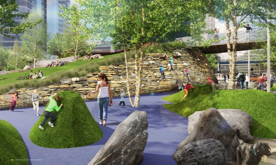
It doesn’t seem like the OJB team worked very well together. I find it inconceivable that the architect of this project, who makes exquisite Modern homes, would litter the landscape with slabs of rock that look like a set from a Flintstones movie.
Then OJB added a rustic playground. That blue stuff is not water by the way. Considering the context, this may be the last place in Wisconsin that should be “countrified.” We don’t need fake child-proof water on the shore of a Great Lake.
The winner of the competition will be officially announced some time this fall, but seems obvious from a design perspective. The real drama here is the money question. Are the “stakeholders” — neighboring institutions like The Couture, Discovery World and Northwestern Mutual — and the mayor going to raise enough money to make it happen? And will that change who wins? The answer could have a huge impact on the city and on Barrett’s legacy as a mayor.
Political Contributions Tracker
Displaying political contributions between people mentioned in this story. Learn more.
- June 21, 2018 - Tom Barrett received $3,000 from Michael Cudahy
- July 9, 2015 - Tom Barrett received $3,000 from Michael Cudahy
In Public
-
The Good Mural
 Apr 19th, 2020 by Tom Bamberger
-
Scooters Are the Future
 Dec 19th, 2019 by Tom Bamberger
-
Homeless Tent City Is a Democracy
 Aug 2nd, 2019 by Tom Bamberger


I like the ideas in the OJB and James Corner designs. But the space needs to be able to be modular. The place for food trucks and vendor stands is a great idea to activate a space when there are not major events or festivals. (or even when there are). Some aspects of the designs assume too much, that people will be flowing down this bridge to hang out on mounds of grass and wildflowers for no reason. The AECOM bridge, for example, is ridiculous… an overly long pathway that people will shortcut around. But I look forward to this project moving forward and the area becoming more bike and pedestrian friendly.
Wow! Thanks Tom. It’s great to have this all laid out so clearly. Very exciting. James Coner’s design looks wonderful!
There’s something curious about this story. If I didn’t know I would think that Rinka Chung was the lead architect on the GRAEF design. Oddly, the lead architect is left out. I wonder why? In fact the highly regarded Canadian firm PFS Studio is and this is very apparent in the design. Take a look for yourself http://www.pfs.bc.ca/
I don’t care for the AECOM design either, but to paint them as just a stadium developer to try and question the competition is curious. Take a look at the projects they are involved in. World Trade Center for example.
And I’ll add that it looks to me that the PFS design is the one that would actually be used by people whereas the James Corner design would look prettiest.
Clearly Tom, you’re not a fan of the beacon in the GRAEF proposal… but you also ignore a lot of positive elements in their design. I don’t think this will ever be a destination for large crowds by itself. With that in mind, having more intimate settings with an interesting flow for pedestrian traffic makes sense to me. I also think their water features and the design of their bridge bring an interesting element for those who just happen to wander by and might then decide to stop for a while. I also don’t have have a problem with the enclosed space (whatever it becomes.. coffee shop, skate rental, meeting space, etc) with it’s modern curvature. I think it reflects the couture design without copying it.
All of these proposals could use some tweaks and NONE of them should mess with the Kiley design or intrude upon it. However, I don’t think the James Corner proposal is the clear winner. The GRAEF proposal is the best choice to me, beacan and all!
Dave Reid, I completely agree with you on the opinion that the James Corner wins for prettiest and the GRAEF would win for most used.
Clarifying my post a few min ago, I’d be happy with either of those two designs winning. And worse things could happen than the AECOM… there are elements I like. The only clear loser to me is the OJB proposal.
Office of James Burnett is the landscape architect for Northwestern Mutual’s new headquarters. That could hold some sway with the “stakeholders.”
Good points about Corner’s design and the Kiley Garden. Overall, Corner seemed to unify the various spaces without trying to call too much attention to itself–unlike the weird color-changing sculpture.
Milwaukee would be lucky to work work with a visionary landscape architect like James Corner. Thanks for clearly outlining why his team’s design deserves to be selected.
When I imagine the possibility of creating a high-profile public spaces, I think about ways to get visitors to the area to talk about it back home. I would love the city a public city icon placed in of near that space. Detroit’s “Spirit of Detroit” comes to mind. I want to see something like that in MKE.
Mostly, I’m worried about the street level space for the new building at Michigan and Lincoln Memorial. If the bridge results in a lack of people on the sidewalks along the ground floor of the building, the entire project will be a failure. This should really focus on having/enticing/welcoming people everywhere on every level. If we give Lincoln Memorial over completely to the cars by giving up on the intersection at grade, then it will only continue to be more and more inhospitable to people. I’d just ask the design team to think about the space under the bridge too!
Re: use of the space: One key aspect of this project is that it’s supposed to tie various parts of the cultural lakefront together. There are already many places and amenities drawing people there. It’s more to make the whole experience more cohesive and to make it easier to transition between downtown and the lakefront. It;s as much a pass-through as a destination.
The new plaza space itself is only 1.5 acres and it is surrounded by spaces that are much bigger. If this project succeeds it will bring more people to the lakefront when perfect weather, the lakefront itself and various cultural venues are not already drawing crowds. Programming could also help, if there’s money allotted for that. One reason Millennium Parks is hugely successful is all the excellent free programming. But again, there’s already a lot happening around this part of the lakefront, especially in summer. So programming may not be as big a deal.
At first, I liked the natural look of the OBJ proposal, but then I noticed the playground. Do we really need to put jagged rocks in the splash pad area? A loose sandstone block climbing wall? Those are lawsuits waiting to happen, and frankly, just plain stupid. These people obviously don’t have kids they care about. However, they get major points for the Food Truck idea. This reminds me of Georgia St in Indianapolis, right outside the convention center. I would definitely make an effort to get over there for lunch once a week if something like that was built.
Overall, the James Corner proposal is the best, but I still don’t like how many times the bridge curves and spirals under its self. Maybe that’s the bike commuter in me talking. Unless they’re going to put in bike lanes / pedestrian lanes in there, I don’t want to slowly roll down this thing to weave through the crowds of pedestrians. On the other hand, having the path spiral under the bridge towards the intersection of Michigan and Lincoln Memorial will help keep that intersection and those streets included in the space.
Just don’t get me started on that weird alien proboscis sticking out of the ground in that other proposal.
“Most used?” What do you mean by most used?
Why not put the arena, a shopping center, or have bigtime wrestling on the Lakefront?
@Tom Most used, meaning more people will hang out there more often.
One of the things that the AECOM proposal got correct was the inclusion of the little hill on the South lawn. It actually connects the spaces together. Many of the things highlighted in the James Corner and OJB proposals can be executed as part of the South lawn. The other aspect that AECOM got right was the landscaping, low maintenance. I found the two phase Lake Pavilion in the James Corner proposal to be brilliant. It acknowledges that the site may well be a work in progress over a period of time and allows for functional use throughout. I believe that an indoor space is necessary for this project.
Overall I prefer the OJB proposal, mainly for its materials and walkway configuration. I understand consistency but I really appreciate the contrast in materials. I also think each group did a decent job of separating the east from the west of the site. Lincoln Memorial drive will produce considerable ambient noise and I think the OJB proposal best shields that innocuously. I agree with the author that the north edge of the OJB proposal needs considerable work. With the Couture, MAM, Discovery World and now the Lakeshore Park pavilion all being predominately white I think the materials need to be different for this project.
I agree that the Corner design fits the space space and acknowledges its neighbors the best, but that row of trees and messing with the Wind Leaves is a terrible idea that needs to be left on the cutting room floor. Did they not understand that the Leaves is an interactive kinetic sculpture that includes the playable marimba benches? Turning them into mock trees was just plain stupid.
Maybe there’s something more delicate to the AECOM design. I have to assume Mr. Bamberger cherry-picked the images to support his point. As it is presented here, the entire proposal evokes disappointment. It seems to cement the parcel as a divider rather than a connector.
I agree: the view on ground level northward is reminiscent of a cancer center pamphlet. Except those usually feature a modern, glassy building. In this case, the monstrous concrete overpass in center frame plays the role of cancer itself. In the south-facing picture, the concrete river delta begs the questions: Who will gather there? When? Why?
Beyond disappointment, the design evokes dread. The fall foliage lasts a month. Then what’s left? Concrete, dirty snow, brown grass, and cars flying by.
Cancer prevention is choosing another design.
I thought I’d add a link to all of the renderings http://city.milwaukee.gov/ImageLibrary/Groups/cityDCD/planning/plans/downtown1/Lakefront-Catalytic-Project/LGPCompetitionSubmissions.pdf There is a rendering of the PFS design of the corner building that Tom calls a “place to drop off your rental car at an airport.” Seeing this additional rendering makes it pretty clearly not (page 31).
Tom, I agree with you on the top design. I would rank them in this order: James Corner, GRAEF, AECOM, and OBJ a distant fourth. The JCFO concepts nicely ties in O’Donnell Park with the bridge and has a good overall layout and aesthetic. It would be interesting to see the second phase bridge connecting to to the MAM grounds. The GRAEF concept has nice park space, especially with the winter skating rink and relocates the Winds Leaves sculpture nicely. I think the AECOM is interesting and attractive, but too complicated and would be frustrating to have to walk in spirals to get across the bridge. The OBJ concept is just boring and mundane. My two cents…
It’s also worth reading the narratives/legends for each design, though some type is tiny.
The plaza’s siting dictates that the “Leaves” sculpture be moved. I imagine those involved will give the sculptor the courtesy of having input about its future placement and that something can be amicably worked out.
One thing about the AECOM design is that bridges are costly and the longer they run (as in this spiral) they pricier they get. I think any of these bridges is supposed to accommodate both bicyclists and pedestrians–makes sense–so that will also be a factor in what’s most workable. I think the point is to also make it fully accessible all year–which entails maintenance and other issues. The Calatrava bridge is accessible all year but is clunky for bikes.
In Chicago the Gehry bridge from Millennium to Maggie Daley Park is only for pedestrians and only seasonally (it’s made of wood.). But there is also a standard street bridge not far away that also links the two parks.
I think Corner has the best bridge, but this project is much more than the bridge. I like GRAEF best myself, but I don’t think the City can go wrongly with any of them.
I hope the LG project will also ultimately address other big access issues for pedestrians and bicyclists in this area. For example, there are gaps in sidewalks/trails along Lincoln Memorial north of MAM that make passage inconvenient and even dangerous.
I know they’ll need to take things one step at a time, especially for funding. But those issues must also be considered for this project to make the lakefront fully accessible and well-connected.
Now here… Graef did an excellent job at capturing attention, along with the actual bridge, and the skating rink… Something else different to do, while to the west , Mike Fascitelli and the rest of the Bucks’ management lay out 9 blocks of entertainment…. The beacon is clearly a great match to the Couture, and Calatrava’s so very well put together design of an art museum…. It would definitely place a signature to Milwaukee as a major city… The point that Walker, Barrett, and Chris A. are trying to make… Make the city a tourist attraction that would bring in more MONEY!! To the writer’s of this article; “Stop trying to use rhetoric to sway the crowd from a marvelous design that GRAEF has, all to bring more attention to that wack design Cornerfield has.” GRAEF is definitely getting my vote….
@Nolan B. Agreed the more I look at them the more I like the GRAEF (well PFS Studios) design.