Ordinary Beauty
Dohmen building’s redesign is a model for how to add value and grace while updating a 1960s creation.
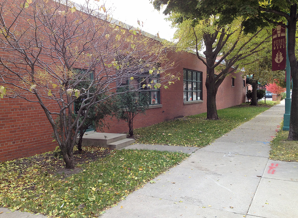
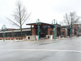
It was flat as a pancake. The building is 230 feet wide and only 10 feet high, filling the entire block in the Third Ward on Chicago street between North Milwaukee Street and North Jefferson. A red-brick Modernist-styled facade cloaked the building like brown wrapping paper.
Still, this was a perfectly respectable effort by Johnson Controls in 1963. The building sprawled like everything else at the time. We were building the suburbs and had no idea what an urban building looked like. The Third Ward was a industrial backlot for Milwaukee before fancy shoe stores and people moved into the neighborhood.
I say styled because the building lacked the clarity or character of Modernism, which tried to find a direct way to make coherent objects. Let a painting be just a painting, let a building be a building, and so on.
But it was good enough to sleep unmolested for nearly 50 years until the new headquarters of Dohmen Inc., designed by Kubala Washatko Architects, woke the building up. (They did the Milwaukee Public Market and the Colectivo in the Third Ward.)
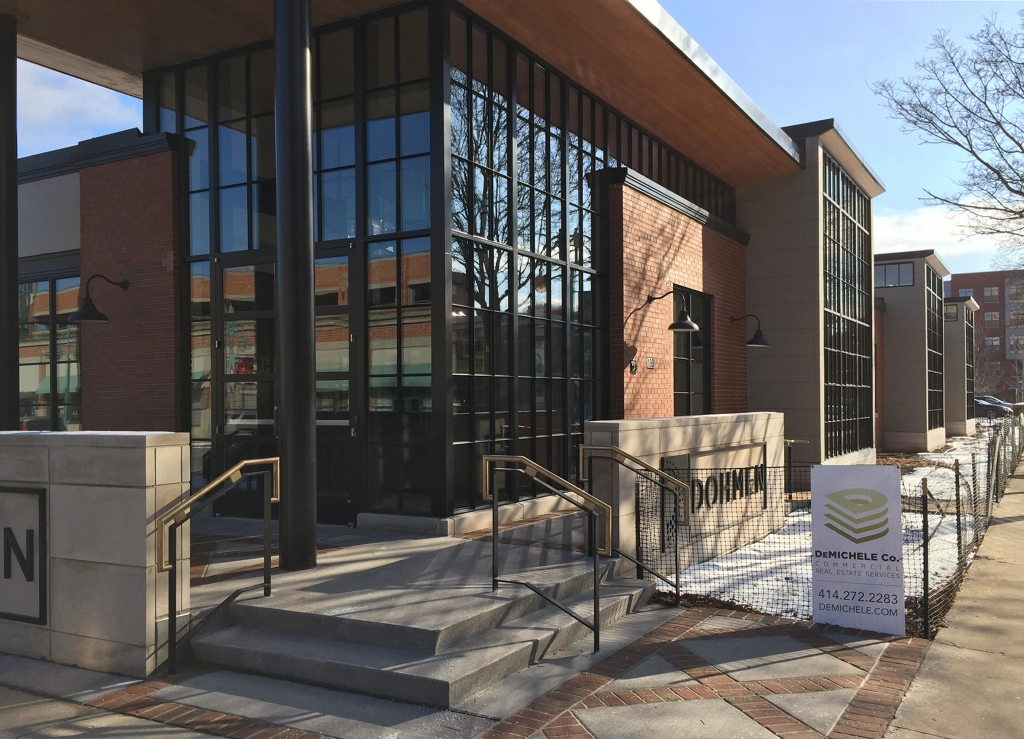
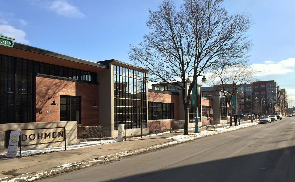
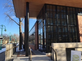
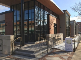
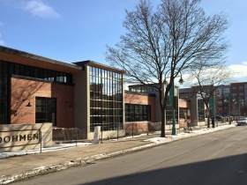
The entrance was moved from the middle of the block to the corner of Chicago and Milwaukee. They added a raised canopy along with distinctive hardware and light fixtures. The name and logo of Dohmen is embedded in two low concrete brick walls that flank the entrance.
Three large glassy bays facing Milwaukee St. rise above the horizon of the original building. These vertical rectangles give the front a rhythm and transparency that lightens the mass. The building flows up and out rather than just being stuck to the ground.
Contemporary urban planners and architects call this a “background building,” but it’s never made sense to me that a building should aspire to anonymity. And in this case, what’s in the foreground? Not the US Bank Building or the Art Museum when I drive down Milwaukee Street. Some buildings are more dramatic than others, but every one counts in a city. They are too present to be eclipsed by another building a few blocks or a mile away.
Buildings need stature, which isn’t just about height. Dohmen’s Headquarters is not formulaic like the Bayshore Town Center, which is tall yet tinker town. This building is real, it’s all in the details. The materials are robust and the finishes are refined. You can touch the building and not be disappointed. They punctuated the line which makes it a complete sentence.
Best of all, Kubala Washatko made it look easy. I suspect this had a lot to do with their client. Dohmen wanted their headquarters be something that represented their ambitions and values. Less still is more. They did just enough to turn the linearity of the building into a virtue. Kubala Washatko figured out how to bring the background building into the foreground.
In Public
-
The Good Mural
 Apr 19th, 2020 by Tom Bamberger
-
Scooters Are the Future
 Dec 19th, 2019 by Tom Bamberger
-
Homeless Tent City Is a Democracy
 Aug 2nd, 2019 by Tom Bamberger




Wow, I didn’t realize THIS was the building Dohman was using for the new HQ. I never would have thought a company would use that building for a HQ office… it was so blah. This block was so mundane and forgettable except for how isolated it felt. This redesign work helps more then I could ever have imagined. Amazing work considering what they had to work with!
Love this building. The entryway is especially appealing. Hard not to want to walk through the door. Hopefully, the landscape plan will be as imaginative. The back story on this company’s return to the 3rd Ward (featured previously on this website) is also pretty compelling.
This fine appreciation (and excellent photos) quietly but firmly underscores the need to value modernist architecture in a city where historicism has ruined a number of important projects (see the convention center) and undersold Milwaukee’s vibrant contemporaneity. Kudos. But I fear what the building of a new basketball stadium may bring….
I’m so happy to see a company putting thought and resources into updating an old building. It’s such a lovely spot and charming building, I always hoped someone would give it some love. With the avalanche of matchy-matchy development in Milwaukee, I’m heartened to see something like this. Lovely.
It is an incredibly well-done design, but why did they leave this as a 1 story building in the Third Ward. Would’ve loved to see them add an extra 3-4 stories.
Gregory Jay, I appreciate what a well done modernist or mid-century modern design can be… but the update to this building, I think, underscores the exact opposite of your point. A lot of those designs were absolutely terrible and it takes a major redesign to make it good. I think the intermodal station is another great example of this… the previous design was horrendous.
AG..did you miss Bamberger’s point entirely. The intermodal station is like putting lipstick on a pig. It’s just newer and glitzier, but still in all, bad design.
Hereiam — I think Dolman will, if everything goes according to plan, add a vertical element to the site in the future.
Tom, Thanks for profiling this inspiring project. The friendly, interesting building caught my eye the first time I saw it. I’m glad to see it just received a Mayor’s Design Award.