
In Public
Ordinary Beauty
Dohmen building’s redesign is a model for how to add value and grace while updating a 1960s creation.
Get a daily rundown of the top stories on Urban Milwaukee
Dohmen building’s redesign is a model for how to add value and grace while updating a 1960s creation. Back to the full article.
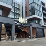
Photos - Page 2


Wow, I didn’t realize THIS was the building Dohman was using for the new HQ. I never would have thought a company would use that building for a HQ office… it was so blah. This block was so mundane and forgettable except for how isolated it felt. This redesign work helps more then I could ever have imagined. Amazing work considering what they had to work with!
Love this building. The entryway is especially appealing. Hard not to want to walk through the door. Hopefully, the landscape plan will be as imaginative. The back story on this company’s return to the 3rd Ward (featured previously on this website) is also pretty compelling.
This fine appreciation (and excellent photos) quietly but firmly underscores the need to value modernist architecture in a city where historicism has ruined a number of important projects (see the convention center) and undersold Milwaukee’s vibrant contemporaneity. Kudos. But I fear what the building of a new basketball stadium may bring….
I’m so happy to see a company putting thought and resources into updating an old building. It’s such a lovely spot and charming building, I always hoped someone would give it some love. With the avalanche of matchy-matchy development in Milwaukee, I’m heartened to see something like this. Lovely.
It is an incredibly well-done design, but why did they leave this as a 1 story building in the Third Ward. Would’ve loved to see them add an extra 3-4 stories.
Gregory Jay, I appreciate what a well done modernist or mid-century modern design can be… but the update to this building, I think, underscores the exact opposite of your point. A lot of those designs were absolutely terrible and it takes a major redesign to make it good. I think the intermodal station is another great example of this… the previous design was horrendous.
AG..did you miss Bamberger’s point entirely. The intermodal station is like putting lipstick on a pig. It’s just newer and glitzier, but still in all, bad design.
Hereiam — I think Dolman will, if everything goes according to plan, add a vertical element to the site in the future.
Tom, Thanks for profiling this inspiring project. The friendly, interesting building caught my eye the first time I saw it. I’m glad to see it just received a Mayor’s Design Award.