The Hotel That Isn’t There
The downtown Marriott made so many compromises in design there's barely any left.
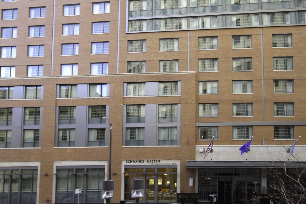
There are way too many moving parts to the new Marriott on Milwaukee Street, just south of Wisconsin Ave. Three interleaved rectangles ramble over the huge facade, but they are poorly conceived and proportioned. Lines don’t go anywhere. Shapes don’t relate or harmonize with each other. There is no negative space.
Your eyes don’t know where to look because no part of the design is more important than another; the relatively equal weights of the various elements cancel each other out. The developers varied the materials to create interest, but they don’t seem integral or inevitable; they just add to the noise.
All this visual language with no punctuation make what amounts to a run on sentence. The Marriott’s design is neither good nor bad, nor anything in particular. It’s not fake, like those faint suburban buildings posing as something else, but it is vaguer, less defined.
The building seems to be more about what it isn’t than what it is. It’s as if someone put a gun to the developer’s head (which is more or less what happened) and said, “Make sure this building is not… too modern, too glassy, too unrelated to nearby historical buildings,” etc.
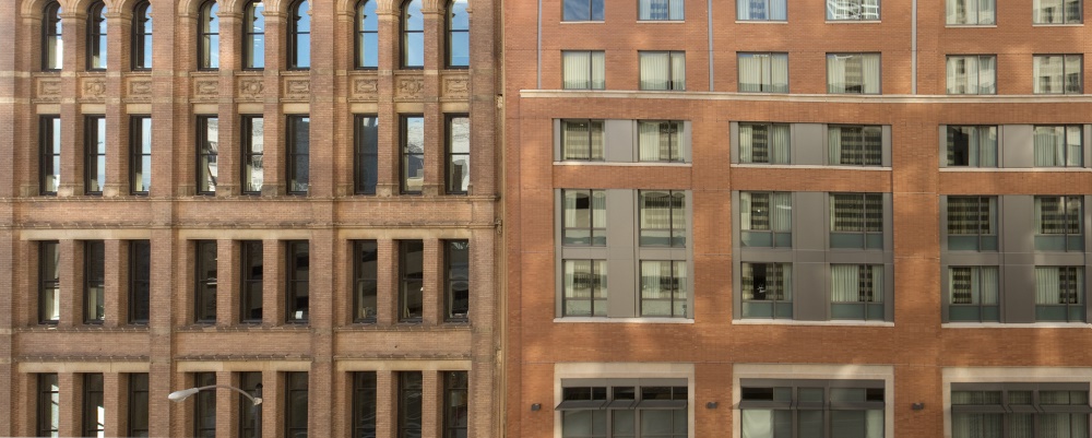
This void becomes more obvious when the Marriott meets up with the adjoining buildings, the McGeoch building (at the left) and the Johnson Bank (below, to right of Marriott). They are defined by a succession of strong and weak elements, accents and rests, repetition, classes and hierarchies. Elements are modulated and progressive. These buildings stand out because they have a sense of themselves. They are a composition.
By contrast, nothing gains your attention when viewing the new hotel. The Marriott is not hard to look at, it’s hard to see.
Typically, good developers hire good architects and make good buildings, and bad developers make bad buildings. A non-building is a whole other matter. For that, you need lots of committees and politics.
In the July 2011 issue of Milwaukee Magazine, I wrote a story, “Fiasco,” that described the process, or lack of process, that led to this design being created for the Marriott. There was a conflict between Mayor Tom Barrett and the Department of City Development, who wanted the new property tax base and jobs that would be created by a new hotel, and downtown Ald. Robert Bauman and the Historic Preservation Commission objected to the plan because it would tear down some buildings they wanted to save. (The building faces both N. Milwaukee St. and E. Wisconsin Ave., wrapping around the Johnson Bank building on the southwest corner of Milwaukee and Wisconsin.)
So a simple glassy design that would have replaced two historic buildings on Wisconsin Avenue was rejected in favor of a context-sensitive building that eliminated the glassy look on Wisconsin and blended with the surrounding urban fabric on Milwaukee Street by refashioning a historic-flavored facade. That was the first mistake. At best, blended-buildings lack an identity and can only be less bad than something much worse. Enough of this and the city can begin to turn into sludge.
Besides, what urban fabric are we talking about? That depends on which way you care to look. Right across from the Marriott on Milwaukee Street is the 411 Building, a 30-story precast cement building and parking structure that fills the whole block. E. Wisconsin Ave. has some of our best modern architecture. Why does a new building have to blend at all?
Under former Mayor John Norquist, his city planner Peter Park was able to figure out solutions that put design before politics. But today when these debates about historic preservation or the proper height of buildings in a particular neighborhood arise they inevitably seem to end up in design by committee.
Kahler Slater’s architects bent over backwards to make everyone happy with the Marriott’s design. More than one person was impressed how the building changed right before their eyes on the architect’s laptop. Details were fussed over like flower arrangements for a wedding. UW-Milwaukee’s dean of architecture and urban planning Bob Greenstreet was consulted and he added a few finishing touches from his hotel room in London.
It would have been so much simper to stick to basics, let the rectangle be a rectangle and a grid of windows be just that. But once these conflicts arise, there is no place to have this conversation, or to point out that good buildings don’t stand in the way of prosperity. They are a cause and consequence of prosperity.
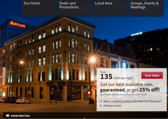
All things considered, it’s perhaps not surprising the parent company seems to deny the existence of their new building. Their online ad lists the hotel’s address as 323 E. Wisconsin Ave., but you can’t see that part of the building, as its covered by the hotel’s rates. Nor can you see the hotel’s Milwaukee Street facade, with its context sensitive design, which created the fuss to begin with. There’s simply no view for the hotel’s owner to brag about, so we instead are shown Johnson Bank, with the neon Marriott sign looming in the background.

In Public
-
The Good Mural
 Apr 19th, 2020 by Tom Bamberger
-
Scooters Are the Future
 Dec 19th, 2019 by Tom Bamberger
-
Homeless Tent City Is a Democracy
 Aug 2nd, 2019 by Tom Bamberger


Great article. The picture of the Johnson bank building is in the Marriot add is hilarious. I’ve always thought the glassy structure on the original design that faced Wisconsin Ave, would have been a great modern addition and blending of old and new on that street.
How anyone could look at those two designs and say, “oh yeah, this is the good one” astounds me.
I actually appreciate the work they did to save the facade’s on Wisconsin Ave. These were really the only part of any structure included int he project that had any historical character and significance left.
What they did to Milwaukee street is disappointing… but I admittedly find myself relieved they didn’t do anything worse. That doesn’t say much about my expectations on this project once it started getting out of hand.
Hahaha, it’s actually really funny that the bank makes the picture while the Marriott hotel just has the sign to identify it. If you go downtown and say “the blue building”, everyone knows what you mean and where it is on the map.
Design by committee, what a pity.
Kahler Slater should have been encouraged to do a building which was of this time. The National Historic Preservation guidelines call for infill buildings to be aesthetically different, as ersatz buildings actually detract from the preservation intent.
Imagine a world were every new building simply disappeared into the context of those around them. Preserving the past does not mean being stuck in it. It seems that sometime our collective good intentions do in fact pave the way to undesirable places.
Bauman’s lording over development is tiring. Nothing is more disappointing than watching elected officials play architect.
@Steve To me Ald. Bauman was upholding both the laws of the City of Milwaukee, and the Mayor’s own downtown plan as these buildings were long historically designated. Further, despite how it may have seemed this project moved quickly, not slowly as some portrayed it. Quite frankly, I don’t think the glassy Wisconsin Ave. design was particular special anyhow, and am very happy they saved some of the our history which actually allowed the Marriott to create a unique Milwaukee space (the restaurant) tying old and new together. Personally, I think this project is better than originally proposed, not worse (sorry Tom).
Dave, don’t be sorry…. never be sorry for disagreeing with anyone.
I don’t think we are talking about the same thing. Saving the Wisconsin Ave building is ok with me.
But that doesn’t mean you have to have the non-design for the rest of the building.
I don’t think the so called glassy design was special…. it was something rather than nothing. Who knows, perhaps the Marriott was marginally improved by retaining some of the old architecture. But this is a joke, no? How low do our expectations have to sink for this to make sense?
This sort of building has no future…. I mean, made so that someday a guy like you Dave can come along and save it.
Regarding Bauman, he is filling a vacuum on two fronts — following the law as Dave suggests and doing design review.
Both are important, except Bauman is much better at the law than architecture (as he should be). Milwaukee needs someone other than a part-time dean of a school to work with developers.
I think Tom is spot on here. Design by committee rarely works. Remember our city flag, which was created when an alderman combined multiple designs? Look at how that aged.
Anyway, when I think of how old and new can complement each other grandly, I think of the Spertus Institute building on Michigan Ave’s famous “street wall” in Chicago. It’s a bold and glassy structure with some interesting geometric dynamics, yet it sits right next to a traditional red brick building more typical of those blocks. And while I don’t have an architect’s training or vocabulary, even I can tell that the Spertus Institute is visually captivating yet somehow also respectful and harmonious with what’s around it. It’s possible to make these things work.
Milwaukee’s Marriott just seems so muddled and lost. As Tom perfectly puts it, it’s a non building. In a city like Milwaukee that has great core density, we have to figure out a way to “balance” history without balance meaning committee-style cut-and-paste collage that is afraid to do anything except smear styles together into unremarkable blurs.
Why doesn’t Milwaukee have a City Planner anymore?