Why the Art Museum Addition Must Not Be Built
This could be the biggest architectural mistake Milwaukee has ever made.
 I never write about architects’ renderings because the building inevitably changes. Renderings are really sales tools that leave a lot of important unanswered questions and problems to be solved. Renderings evolve while buildings are final — we have to live with them, and learn from our mistakes.
But sometimes the stakes are too high to wait, as with the proposed addition to the Milwaukee Art Museum. The museum complex is not just a postcard we send out to the world. It’s a place where art and architecture lives today. It’s the focal point and the DNA of Milwaukee’s transition from a 19th to 21st Century city.
Just next door Northwestern Mutual is adding a tower with a million square feet of office space that will be just 32 feet shorter than the tallest building in Wisconsin, the U.S. Bank Center building located across the street. Just east of the U.S. Bank will be two more new neighbors, the 18-story 833 East and 44-story The Couture. And all of this will be interwoven with parks and pedestrian bridges, over a reconfigured Lincoln Memorial Drive, that unites Milwaukee with the art museum and the lake.
The starting point for the museum’s proposed building is the Kahler addition, built in 1975, not the best of times for architecture in America. It’s a big box that unfortunately became a huge pedestal for Eero Saarinen’s War Memorial, thereby grounding a building that used to float sublimely on the horizon off a bluff overlooking Lake Michigan.
It wasn’t until 40 years later, in the late 1990’s when the Calatrava was conceived, that our culture demanded something better. And architects responded, as they do, and started to learn how to build additions to art museums.
The original design by Jim Shields for the proposed museum addition attempted to rectify the excesses and missteps of the building boom that brought us the Calatrava. The Calatrava expansion tragically filled in the cantilevered east face of the Kahler building. Making more room for art turned the under-appreciated and spectacular east face of the of the Kahler building into an ugly stub.
Shields’ design sought to heal that wound and deal with the bulk of the Kahler building by creating a diaphanous cloud with gradated transparent glass. That softened the rectangle and provided a lovely contrast to the density of War Memorial and figurative whimsy of the Calatrava. The new building would be irradiated by the atmospheric conditions of the lake, adding a little zen serenity to the complex.
Still, it was going to be a humble if self assured addition that didn’t compete with either the Saarinen or the Calatrava, or Shields’ resplendent Discovery World Museum just to the south. But the addition, as he conceived it, did rise to the occasion.
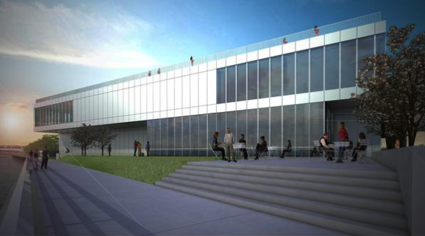
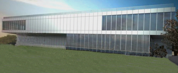
The new design for the addition, just released Monday, grew out of Shields’ work, so to speak. But in reality the museum took over the project, and began changing it much as developers might do for a routine condo. You figure out where the granite counters, closets, and home entertainment system go. Then fit it into a box. You design from the inside out, except this is a museum, so you have to do something extra. Ah, reinstall Kahler’s idea and cantilever it like Saarinen’s War Memorial. That’s it, you’re done.
The museum addition will likely be the only new building in this rarified neighborhood that will not have an architect’s name attached to it. Now I don’t want to suggest that an architect’s name assures the building will be great. But having your name on building means someone is responsible. There are consequences. Good architects are embarrassed by their mistakes. But a committee-built building can simply point fingers in every direction.
As some have noted, the new design for the museum bears a striking resemblance to MECCA, the downtown convention center that was reviled and then torn down. It could also be one of those new buildings in the Menomonee River Valley, an above-average industrial park.
Remove the happy foreground from the museum’s rendering and this is what you get. It might be a nice printing factory, international call center, or some other anonymous facility tucked away at the end of cul de sac. Like “nice” people, these sorts of buildings don’t stand out, or stand up for anything.
The proposed addition is a business decision to make something just good enough. But it is not good enough to build on any prominent street in Milwaukee, much less in proximity to the most important architecture in the city. What looks okay on Moreland Road or South 27th Street should not be on the lakefront.
I don’t understand how the Art Museum, which successfully avoided disaster and fought Michael Cudahy’s goofy original plan for the Discovery World, can now turn around and offer up this nonentity with a straight face.
Buildings are an action with a moral dimension because they affect other people. Did the board know what they were doing when they approved this? They are the trustees of this institution, who should be considering how the institution serves this community.
If the board has approved this design, then they should tell us why and not hide behind press release talking points. We will have to live with the building long after the current management goes on to their next jobs, and all the board members have been succeeded by others.
The idea of creating an addition that doesn’t compete or detract from the Saarinen and Calatrava is not a bad one. But this design reduces that theory to the lowest common denominator. This is like putting a shed up in the middle of Paris and then saying you didn’t want to upstage the fine architecture. It is a monumental blunder and cannot, must not be built.
In Public
-
The Good Mural
 Apr 19th, 2020 by Tom Bamberger
-
Scooters Are the Future
 Dec 19th, 2019 by Tom Bamberger
-
Homeless Tent City Is a Democracy
 Aug 2nd, 2019 by Tom Bamberger


Amen to that.
There would be a long list of rival contestants for the title of biggest architectural mistake Milwaukee has ever made.
Might someone publish what Jim Shield’s design looked like?
For comparison, is there a rendering of Shield’s original proposal?
I think the article is a bit misleading…”the U.S. Bank building next door, which itself is building an 18 story addition”. I assume that’s referring to 833 East? If so, that’s not part of the USB building, right? And if it’s referring to the proposed addition along Wisconsin Ave, that’s not 18 stories, right?
I agree with this editorial. This is a terrible design and will embarrass Milwaukee for decades should it be built. Not only is it an ugly, boxy building, but it will COMPLETELY obstruct views of the Calatrava from the north. Who in their right mind would think that this is ok for Milwaukee’s Lakefront?
This Murphy’s Law has the Shield’s earlier proposal http://urbanmilwaukee.com/2014/04/07/murphys-law-top-architect-quit-project-for-museum-addition/
Another fine slamberger piece. I totally agree. I was surprised how much more I liked the original Shield render compared to this business-park slab. This design-by-committee reinforces that it’s the back entrance to the art museum and not much more.
Dan,
I am sorry I said this building is being designed by committee. That was shorthand. There are always lots of interests that go into a building, and lots of committees at work feeding information to the designer of the building.
That’s a good thing.
But there is always someone at the top, the client, who is usually the CEO or Director. The problem here is with the client.
It is so ugly it defies description.
I am flabbergasted Bamberger, I totally agree!
Tom,
Can you offer clarification on the “18 story addition”?
Thanks,
Craving more and better space to hang art, the museum team seems to have lost sight of the benefits (to the lakefront, to the city, to their brand) of communicating art through architecture. It’s like saying: “Oh, we checked that box with the Calatrava.” This time, a decent industrial park building will be good enough. It’s actually almost impossible to consider plucky little guys like the Racine Art Museum or the Wisconsin Museum of Art arriving at the same place: unlike MAM, they realize their life depends on expressing their artistic values, inside and out.
I suppose they spent all their money on that expensive, GIANT LOBBY – the Calatrava building. Now they have nothing left for a structure in which to put the art.
The Calatrava addition was supposed to and did succeed in putting Milwaukee on the map for all to see an architectural attraction. The addition, as planned, will either remove us from the world’s view or make us the laughing stock of the world’s architectural critics. Disband the committee.
I definitely agree with Tom that this addition should not be built as shown. It looks like a banal office or factory building in an industrial park. Although a better design, I’m also not sure if Jim Shields’ design goes far enough. There is a lot more design work that needs to be done to find an acceptable solution for this iconic location…
I’ve never seen a spot in MKE more ripely in need of the direction of Zaha Hadid. She specializes in buildings that serve in part as a facade to the rest of the world.
The Calatrava is beautiful, not very functional for showing art the other thing here is ugly, looks like cheap prison but is functional. Who will donate to this turkey?
I agree that it would be great to have some stunning architecture here, but to Todd’s comment, although I really appreciate Zaha Hadid’s work, her work is becoming the “saveur du jour” of this decade, like Gerry was in the 90’s. I just think that we need some good, solid architecture that compliments the Calatrava and does not try to compete. Just my $.02…
Disheartening. That’s what the proposed building is. Difficult to believe anyone connected with the arts could be responsible for this.
I don’t often agree with Mr Bamberger but I do agree strongly on this cop-out of a structure that does this city no good other than to fill a space. I couldn’t understand it’s milk-toast design from the very first concept drawings I saw earlier. The MAM should admit it’s short-coming on this project and start over.
I could not agree more. This will be a mistake second only to the first “box” addition that ruined the effect of the original Saarinen structure. It is sad that such a valuable piece of land and an iconic Milwaukee landmark will be further ruined. If this goes ahead I hope they include a good amount of ivy to cover it up!!
The Calatrava was completely paid for by generous donors!
How a “world class art museum” such as the Milwaukee Art Museum could conceive an addition designed by committee is unacceptable! The lake front entrance is an important feature and requires a dynamic and thought provoking façade that must be done by an equally talented architect. Cost has never been a factor with the Milwaukee Art Museum. Design has been paramount. Design must take center stage!
The original sin was the Kahler addition. Instead of building a proper museum they added on to a war memorial to save money and mooch of the significance and relevance of the memorial. Born in 1977, I never knew until recently in photos how amazing the original Saarinen was before it was ruined by the addition. Even the calatrava does little to resolve this mess. The calatrava actually makes matters worse by cutting off the lake and offering little in the way of gallery space for 150 million dollars. Now broke, the museum must sadly settle for a 15 million dollar solution for its space needs.
Solution: tear down the Kahler, rebuild the Saarinen exactly as it was, and have a competition for a third building that provides gallery space and links the Saarinen and calatrava for less than 60 million.
The dialog and discussion is essential for the community and compliments the strategic work over years that went into what is now known as the Calatrava . The board of the museum is of such size that is is really not a working board but rather the executive committee is the working board . Trustees have the responsibility , leadership is required to facilitate and use the trustees well however any one on the board can raise the questions — not popular but responsible . Foresight is what is potentially missing governance seldom does their job in all institutions but were it is exercised lovely results can be rendered . If you want to gain insights to foresight come to MSOE next Wednesday 7 am pre meeting for beginners and 7:30 general session and dialog , in the student union meeting room and see what thoughtful leaders in the area have to say about it and join in the discussion .
I agree with much written….but YES design from the inside out! Of course…It needs to be a safe place for ART!
Most of the money is going for necessities…and hardly all….so skimping can be blamed on all of Wisconsin…who do not see the necessity to pay for a total updating inside and out! The needs are immediate and those in the know at the museum are doing there best with the lack of finances! Easy to pint out issues…but the last addition brings in people and is so loved by all that experience it…Now it is up to you and others to help fund raise so the inside and outside are both great…The museum was so damaged i think all are sad but know compromising had to be made or more galleries would be closed, more floors bucked would be block, dripping windows would continue to damage art and personal safety.. how do I k now…i am a volunteer and docent and there many days a week and I wanted a quick fix….so that is why I feel the design and etc. was scaled back..NO FINANCIAL SUPPORT IN A TIMELY WAY: SHAME ON THOSE IN POWER, the city, county, and the war memorial controllers!