Russell and Kinnickinnic Avenues
There lots of activity and businesses, but the traffic needs slowing and a roundabout would help.
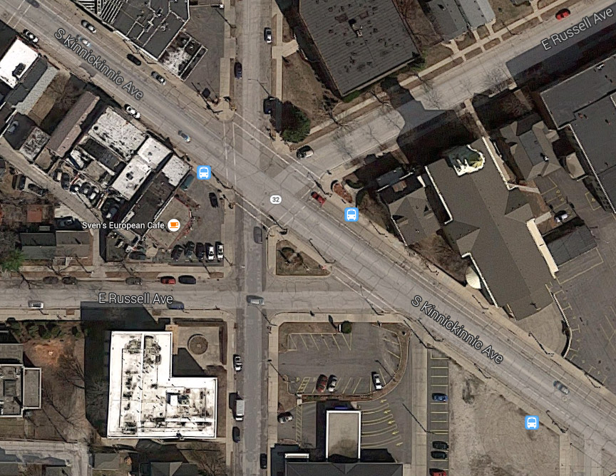
Bay View is a neighborhood known for its laid-back atmosphere, popular restaurants and music scene. A bit off the beaten path for downtown Milwaukeeans, west siders or college students, Bay View feels like something of a secret jewel and when I lived there, I certainly enjoyed the peace and quiet. But one thing I did not enjoy was the intersection of E.Russell and S. Kinnickinnic avenues. If you’ve ever come across this intersection—whether by foot, car or bicycle—you’re unlikely to forget it. It’s a haphazard convergence of six different roads going every which way, confusing drivers, perplexing pedestrians and generally inviting mayhem into what should be a quiet commercial intersection. That may be a bit of an exaggeration, but truly, this space is ugly and poorly designed, and could be so much nicer with just a little effort. There’s no need for pretension or glamour in this friendly, residential neighborhood, but with schools and seniors around, an attempt to calm the traffic should be made, along with a few improvements to create a more inviting place.
What Works
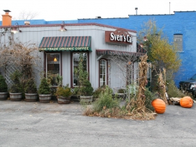
While the infrastructure is lacking, the businesses in the space are successful and significant. First, there’s the popular Sven’s Café which serves up coffee, breakfast, and deli fare in a community setting. I’ve spotted families, students and elderly people gathering in this place, amongst cozy chairs and posters for all manner of neighborhood events. This is truly a neighborhood coffee shop. Meanwhile, Hue Vietnamese—a Bay View restaurant so successful it just opened a branch in Wauwatosa—is also near the corner providing excellent noodle, rice and soup dishes with a similar neighborhood coziness. There’s also a bank to the south, a church on the eastern side, and an apartment and liquor store to the north. Overall, the intersection fulfills a lot of needs.
What Doesn’t
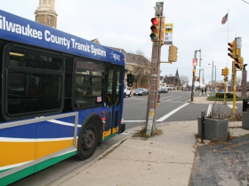
Let’s start with the collision of streets. Down the middle is the central thoroughfare of Kinnickinnic. The #15 bus runs along this corridor and just north of this intersection along Kinnickinnic are several well-liked local businesses offering a variety of food, drink, clothing and other neighborhood amenities. Then we have E Russell Ave, coming at Kinnickinnic from two different angles, both from largely middle-income residential neighborhoods where families and seniors reside. On top of these four non-gridded streets coming together, we have S. Logan Ave, which enters the intersection from the north and south creating an odd triangle with Russell, and confusion for everyone involved.
It was bound to be messy, but did it have to be executed this poorly? It seems strange and unnecessary to have this ugly jumble of streets in such a calm, residential neighborhood, especially when many people passing by this intersection are simply headed to school, to the lake or to the Outpost grocery store down the block. This traffic arrangement is unsustainable and undoubtedly driving the neighborhood nuts. Attempts at mitigating this situation include stoplights, stop signs, and painted crosswalks.The stop light forces cars to stop (provided that they hit a red light). For cars coming from the southeast, they’ve been speeding along Kinnickinnic passing mostly residential blocks and suddenly they encounter the stoplight at this intersection, giving them a moment to take in the commercial district along this street. However, while the traffic light was presumably installed to calm the traffic in the area and allow pedestrian access between neighborhoods on either side of Kinnickinnic, it’s not working very well.
To get to the other side of the street as a pedestrian you’re almost guaranteed to have to wait for at least two different stoplights, and similarly, in a car you’ll probably have to stop at both a stop sign and a stoplight, in the span of just a few yards.
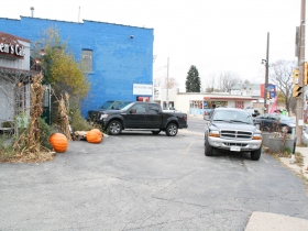
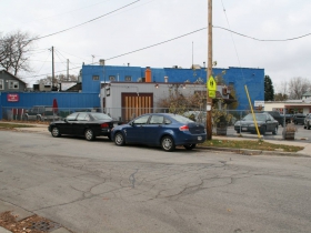
Unlike other intersections profiled in this series, Kinnickinnic and Russell doesn’t have any vacant lots or buildings and I wouldn’t make any changes to the current occupancies, but the intersection does have underused space. Most of the businesses are fronted by overly large parking lots, which create an unattractive and uninviting environment.
Instead of drawing customers with eye-catching window displays or creative signage, these parking lots turn away non-drivers, and they decrease the amount of traffic from passersby. They also make it more dangerous for pedestrians who must jump out of the way as cars enter the lots from multiple points and cross the sidewalk. That’s an especially important issue in a neighborhood with school children and families. Finally, they decrease the amount of eyes on the street and take away from the neighborhood feeling of the area. I’ve seen plenty of people walking to the liquor store or Sven’s; there’s no need to make the parking lot the prominent focal point of each business.
How Can We Improve it
One idea that has been thrown around is to make this intersection a roundabout. If Milwaukeens were able to get over the foreign nature of this traffic devices, I think a roundabout could be quite successful here. There’s already a neat statue on the triangle between Russell, Kinnickinnic and Logan, so it’s an obvious choice for a centerpiece. Additionally, the intersection probably has enough road width to accommodate a traffic circle. Ideally, a roundabout would make every car entering the intersection slow down at a similar rate, enter the circle at a comfortable pace, then exit similarly slowly. While the slower traffic associated with a roundabout would create a guaranteed increase in safety, clear signage and walk signals would also be necessary to accommodate pedestrians sufficiently.
Then, in order to address the parking lots and unwelcoming, strip-mall feeling that comes with them, an ultimate goal might be moving the businesses forward and putting the lots in the back. But even before such a major project, some small steps could be taken to make the space more welcoming and connected to the rest of Kinnickinnic. Sven’s has made an attempt at beautifying their parking lot with planters, chairs, tables and an awning. Similar work could be done in front of the liquor store and the church. It’s getting to be holiday season—these lots would make a perfect place to sell Christmas trees.Benches would also be a particularly welcome addition since there are bus stops on two of these corners. The sidewalk, especially on the southwest side of Kinnickinnic, could stand to be widened, and businesses might want to extend the walking area into their lots too.
Overall, this intersection doesn’t struggle with productivity or atmosphere; with several successful, diverse businesses and residential options, it’s got those bases covered. What it needs is a rearrangement of traffic patterns and parking lots to accommodate that productivity more invitingly.
The Intersection
About Intersection
As part of new Milwaukeean Rachel Quednau‘s exploration of Milwaukee, she will be exploring how the city can take better advantage of its many significant intersections.
Intersection
-
The Bermuda Triangle of Milwaukee’s Northwest Side
 Feb 19th, 2026 by John O’Neill
-
The Port of Milwaukee Interchange Is an Overbuilt Mess
 Nov 16th, 2025 by John O’Neill
-
6 Changes Needed on Commerce & North
 Aug 25th, 2017 by John O’Neill












I used to live very close there and would frequent Sven’s and I think a roundabout would be the absolute worse thing there. Would it make auto traffic flow better? Yes it would but round abouts are difficult for pedestrians to cross especially with small children in tow.
I always thought that increasing the size of the small triangle where the memorial is would be a nice way to calm traffic. Do it in a way where it would function as a sort of town square.Perhaps end Russel at Logan or end Logan at Russel thus eliminating a conflict point. Build in the surface lots with minimal set backs and suddenly the place feels tighter. Add clearer/more visible cross walks
Move the buildings forward, hack the parking, eliminate the Logan section and put up a streetcar stop there. Imagine what a boom it would be with a rapid transit light rail line going down KK, to first and connecting Walker’s Point, Third Ward, downtown, the Eastside and the northshore while eliminating the need for car ownership to go to any of those areas (and the land it would free up for more development).
Plus it would keep the boom going down KK, slow traffic with less lanes and provide access into Cudahy to help regrow that downtown area, which is in sore need of help.
Not a fan of the round-a-bout for this intersection. Bay View needs to find ways slow traffic down on KK. I think turning Russel and Logan into bike blvds would be a good start.
I don’t really understand the argument that traffic needs to be slowed down while also mentioning the number of stop signs and red lights that drivers face. Specifically, you say “For cars coming from the southeast, they’ve been speeding along Kinnickinnic passing mostly residential blocks and suddenly they encounter the stoplight at this intersection” making it seem like cars have been driving at 50mph for 5 miles since the last stop light. There is no “suddenly”. Cars coming from the Southeast have passed intersections with lights at both Ellen and a couple of blocks prior at Clement. I think there is also a strong argument to be made that a traffic circle would actually make things more difficult and potentially more dangerous for pedestrians at this intersection. From my experience with the 6th street roundabout people think its easier to run across at any given point than actually follow the proper path for pedestrians.
Exaggerations and hyperbolic statements do nothing to help your argument. All you’re going to get are eye rolls from those who don’t agree with you and cheers from those who do. If you really want to change minds you’ll need a more realistic approach. There’s absolutely nothing wrong with making the argument that an intersection needs to be redesigned to be more convenient for pedestrians and businesses. There’s absolutely nothing wrong with making the argument that an intersection is confusing for drivers (even if I don’t necessarily agree with that one). You don’t always have to throw in the “speeding cars” issue because it isn’t always the case and many times those who are really speeding will choose to do so regardless of changes. In this case, it’s really weakened the entire point of the article, which is about an intersection that actually would benefit from some type of redesign.
The safety of a pedestrian crossing any road, regardless of the intersection control, can be enhanced in many different ways. Signing and marking the crossing is usually the first step. Shortening the crossing distance is another. The safest shortening method is a median that permits pedestrians to cross one direction of traffic at a time (two-phase), like at a modern roundabout. This is particularly helpful for the youngest and oldest pedestrians. Enhanced markings include advance stop bars where any half of the crossing has more than one lane. This helps reduce the double-threat collisions on multi-lane crossings. Raised crossings slow traffic right were pedestrians cross. If emergency access is a concern, placement of speed cushions in advance of the crossing are a solution. Electronic warnings, like rapid flash beacons, increase motorists’ awareness of pedestrian activity. Hybrid beacons (with a red indication) or full signals are usually reserved for locations with the busiest traffic or pedestrian uses (due to cost). One advantage of beacons is they usually rest in off, so auto traffic is only delayed when pedestrians need the extra help crossing. With a menu of ways to improve crossing safety, choosing the best one depends on local conditions. However, each of these options is moot if there are not laws in place, or enforced, to clearly identify who has the right of way to begin with.
I am pleased to see this article and the comments here at the very time that BID 44, the KK BID, is working on a plan for Streetscaping & Beautification of KK. The committee involved is considering crosswalk designs, plants, trees, seating, public spaces, banners and seasonal decorations. We are currently seeking two new Board members and members for several committees. Please check out our website referenced above for requirements, This could be your opportunity to help shape decisions that have an impact on this great neighborhood.
The intersection is S. Kinnickinnic and E. Russell avenues. All Milwaukee streets have a directional prefix.
I am pretty sure that this intersection does not qualify for a roundabout.Roundabouts work when there are similar levels of traffic of at least two roads that go into an intersection.
Roundabouts do work well for moving traffic…but they’re *not* very good for pedestrians. The whole point of a roundabout is to keep traffic flowing (and prevent head-on collisions): that point is defeated if you have traffic signals for pedestrians. Plus, you can’t have a bus stop in a roundabout (unless it’s an enormous one where the bus pulls off to a separate lane).
What should happen is the intersection should be simplified: Get rid of the spur of Russell that joins KK at an angle, relocate the statue a little ways further southeast along KK, have Logan meet the easterly part of Russell more directly, and widen it to allow for left and right turn lanes with through traffic to Russell in the middle…and since Logan to the east is mostly residential, maybe turn it into a cul de sac so it’s more residential and less of a through road.
I think the space might be small for a roundabout, and the concerns expressed about pedestrian crossing are valid. That doesn’t mean those concerns are insurmountable.
Mainly, however, I am very happy to see this article and the debate it generates, and look forward to further “Intesections.”
I would like to submit one messy crossroads I think is a perfect candidate for some kind of creative solution: the junction of W. Keefe, W. Atkinson, N. Martin Luther King/Green Bay, N. 6th Street, and, tangentially, N. Port Washington Ave. There is a lot of vacant land around this convergence of arterial streets, and a well-designed (and pedestrian-friendly) traffic circle could be the centerpiece of needed neighborhood revitalization. Traffic definitely needs calming there, too; there’s a lot of speeding and aggression.
This is a high pedestrian area. A roundabout is a terrible idea.
@Urban Dweller I absolutly think there is tremendous potential for the 5 points in Wmburg Heights. I live on 6th and Vienna and would really appreciate some significant development that would draw people out and make the whole area more attractive. I appreciate why type face is about but the instalment they have on that triangle is poorly designed. It’s another example of a great intersection that could be turned into a town square especially if some sort of day time workforce could be present on the north side of Keefe.
I think of all the intersections around town the 5 points and the 27th,FDL and Center St intersection really deserve more attention and conversation.
Mr. Travlerr,
All modern roundabouts have median islands separating incoming and outgoing auto traffic. Pedestrians don’t have to find a gap in two directions of traffic, just one. This is safer for pedestrians, especially for younger or older ones, because they only have to concentrate on one direction of traffic at a time. This is what is meant by two-phase. Cross the first half, pause if you need to, then cross the second half. On multi-lane crossings pedestrian beacons or signals are often added if the auto (or pedestrian) traffic is too numerous. Here is a video example: http://tinyurl.com/rabPHB . The signals can also be two phase, requiring the pedestrian to push a second button when they get to the median. The median can also have a Z path to reorient the pedestrian to view oncoming traffic. Also, the signals usually rest in off, so they are only activated if a pedestrian needs the help crossing. This way only motorists that need to stop are delayed.
As for public opinion:
Glen Falls, NY: http://tinyurl.com/6csqxbt
Edmonds, WA: http://tinyurl.com/Edmonds5corners
Does the intersection have the volume of pedestrians that a tourist destination might have?
Clearwater video: http://www.youtube.com/watch?v=EIwsAb1lHKo
Glen Falls, NY video: https://www.youtube.com/watch?v=zLMMGclhbEY
How stupid to put in a round a bout which is nothing more than an accident waiting to happen. There is a reason why new jersey took them out. This intersection has been like this for years no reason to change. Same amount of businesses are there and have been there for years. Save some money do nothing!!!
Mr. Kowalski,
Many people confuse other and older styles of circular intersections with modern roundabouts. East coast US rotaries, large multi-lane traffic circles (Arc D’Triomphe, Dupont Circle), and small neighborhood traffic circles are not modern roundabouts. If you want to see the difference between a traffic circle, a rotary (UK roundabout) and a modern roundabout (UK continental roundabout), go to http://tinyurl.com/kstate-RAB to see pictures. And here’s another site that shows the difference between an older rotary and a modern roundabout: http://tinyurl.com/bzf7qmg
Mr. Bamberger,
You’re mistaken. Your statement would not be accepted if you replaced the word ’roundabout’ with the word ‘signal’. The solution to unbalance flows is the same for both types of traffic control. Increase lanes, or change the operation of existing lanes, to accomodate the higher movements.
Mr. Kowalski,
New Jersey has never removed a modern roundabout. If you know of a location, please let us know.
Many people confuse other and older styles of circular intersections with modern roundabouts. East coast US rotaries, large multi-lane traffic circles (Arc D’Triomphe, Dupont Circle), and small neighborhood traffic circles are not modern roundabouts. If you want to see the difference between a traffic circle, a rotary (UK roundabout) and a modern roundabout (UK continental roundabout), go to the Kansas State web site (k-state.edu) and search for their roundabout page.
Living close to this intersection, I agree that improvements can be made. Do I think it needs to be as costly as putting in a round about or moving buildings forward? No. I think there are lower cost steps that can be taken to improve the situation first. Additional signage and larger pedestrian crossing lines to alert drivers of the busy intersection would be a start. There is a “No turn on red” sign for Russell and KK if you are coming from the SE. Adding similar signs to the other directions would help the flow of traffic. Another challenge is the small section of Russell that runs between Logan and KK (parallel to BMO). I’ve witnessed many cars who do not stop to realize that cars on Logan do not need to stop before getting to the intersection. Signs that say “traffic from the opposite direction does not stop” would be helpful. Altering the parking zones along Logan near BMO Harris to increase site lines would also help avoid accidents.
Aesthetics is brought up in the original article. Visible parking lots make my community feel safer and assists with taking the load off of residential street parking. Businesses have been making improvements each year to increase the aesthetic appeal of their business and to improve the neighborhood. We need to encourage this versus proposing drastic costly measures.
Jessica- so you enjoy the aesthetics of the open/surface parking lots along the streets?
Lots of great dialogue here. I especially appreciate the input of people who live in the neighborhood. I was definitely going out on a limb, suggesting a roundabout, but something drastic needs to happen at that intersection. It’s ridiculously complicated for both cars and pedestrians. Another option would be straight-up closing streets and putting buildings in their place. I’d be happy with that.
Thank you to Scott Batson for bringing up the fact that roundabouts can, in fact, be much safer than traditional intersections. That was my line of thinking,and I should’ve brought up those salient points in my article, anticipating that people would make this argument.
Many great ideas shared here. Thanks to everyone for you input.