All Hail The “People’s Flag”
Huge version of flag installed a block from City Hall just before vote on whether to adopt it.
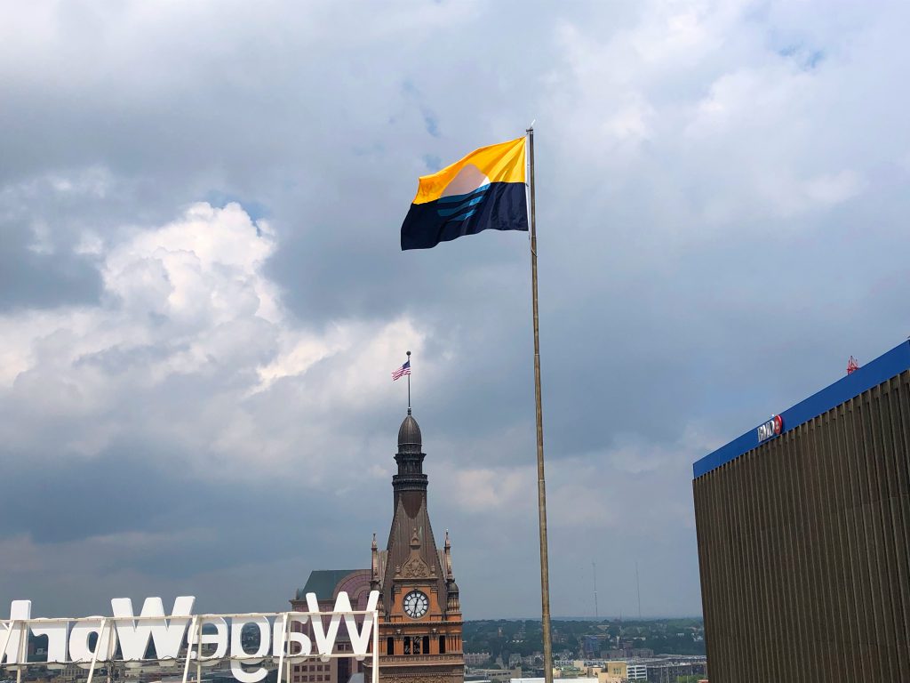
Just days before a Common Council committee is scheduled to vote yes or no on its approval, the largest “People’s Flag” in existence was installed atop CityCenter at 735.
The 15-foot-long flag was raised on the building’s flagpole Monday afternoon at the request of Compass Properties vice president Sheldon Oppermann. Compass, who owns and operates the 16-story building, just one block south of Milwaukee City Hall on N. Water St.
Oppermann is a supporter of the new flag. He tells Urban Milwaukee: “This is a great example of our city’s young talent hard at work, and if flying the flag encourages the debate and brings the process of adoption (or not) to the forefront, then, mission accomplished.”
Designed by graphic designer Robert Lenz, the new flag, known as “Sunrise over the Lake,” symbolizes a number of tried-and-true Milwaukee elements. The gold represents beer or wheat. The circle represents the sun rising over Lake Michigan. The blue represents the city’s connection to water, with the lake and Kinnickinnic, Menomonee and Milwaukee rivers. The three lines represent the city’s three founders, Solomon Juneau, Byron Kilbourn and George Walker, and how they merged their communities together to form Milwaukee.
The new flag, selected from a design competition led by Steve Kodis, would replace the hard-to-find city flag that dates back to 1955. Kodis, a graphic designer, was inspired to lead a contest to create a new flag as a way to engender civic pride.The Common Council’s Steering and Rules Committee is scheduled to consider a resolution to make the “People’s Flag” the official city flag at its Thursday afternoon meeting. If confirmed, the full council could approve the matter on July 31st. The measure was first introduced in late May, but a June meeting to consider the flag was canceled.
The measure is sponsored by Aldermen Khalif Rainey and Cavalier Johnson. Says Johnson: “Milwaukee needs a symbol that we all can be proud of and rally around.”
Ald. Robert Donovan was previously listed as a sponsor, but city records indicate he requested his name be removed on July 17th.
An amendment, drafted July 18th at the request of Ald. Robert Bauman, would effectively table the matter by creating a new city-wide design contest. The amendment directs the city’s Arts Board to establish and implement a process for “consideration, review and possible recommendation of one or more designs for a new official City flag, if the Arts Board determines that a new flag is necessary.” The amendment would prevent the immediate adoption of the new flag.
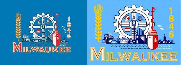
The 1955 flag was designed by then-Alderman Fred Steffan. He took elements from submissions to a design contest and mashed them into one very busy flag. Matthew J. Prigge attempted to dissect all of the elements in 2015, including County Stadium and City Hall, but the history buff found himself stumped by at least one element. Further compounding the confusion surrounding this flag, there are actually two versions of it, the original and one that was later revised, simplifying and removing some decorative elements of City Hall and other images.
It became the subject of national ridicule in 2015 when Roman Mars singled it out in a TED talk as the worst designed civic flag in America. “Nothing can quite prepare you for one of the biggest train wrecks in Vexillological history. Are you ready? It’s the flag of Milwaukee, Wisconsin,” declared Mars before playing a clip of Kodis critiquing the flag. The two jointly ridiculed how the complicated flag design even includes an image of a flag on the flag.
But even if the current flag’s design wasn’t so weak, there’s also the fact that it’s so unknown. Try to find design files for either version of the 1955 flag and the appeal of the royalty-free people’s flag becomes immediately apparent.
The 1955 flag does have some defenders, although Matt Wild, one of the most high profile critics of Kodis’ effort to change the flag, has recently given up.
The measure is slated to be reviewed by the Steering and Rules Committee on June 7th. The full council could adopt the flag at their regularly scheduled meeting on June 20th, less than a week after Flag Day.
“There is such great energy surrounding this new brand image for the city,” Oppermann says. “We’re totally impressed at the grassroots and collaborative nature in which this flag was chosen.”
If you think stories like this are important, become a member of Urban Milwaukee and help support real independent journalism. Plus you get some cool added benefits, all detailed here.
More about the People's Flag of Milwaukee
- City Hall: Latest Effort to Adopt New Milwaukee Flag Going Nowhere - Jeramey Jannene - Dec 3rd, 2025
- City Hall: Meet Milwaukee’s Flag Task Force - Jeramey Jannene - Jul 1st, 2025
- Council Reopens Flag Debate. Again - Jeramey Jannene - Jun 24th, 2025
- City Hall: Milwaukee’s Flag Debate Is Back - Jeramey Jannene - Jun 18th, 2025
- Council Puts Milwaukee Flag Debate on Ice - Jeramey Jannene - Nov 6th, 2024
- Council Could Send People’s Flag To April Referendum - Jeramey Jannene - Oct 15th, 2024
- Council Again Delays Adopting People’s Flag - Jeramey Jannene - Sep 24th, 2024
- City Hall: Committee Endorses Making People’s Flag Official, Despite Objections - Jeramey Jannene - Sep 9th, 2024
- Proposal Asks City to Adopt ‘People’s Flag’ - Jeramey Jannene - Jul 2nd, 2024
- Milwaukee Finds Its Original City Flag - Jeramey Jannene - Sep 9th, 2021
Read more about People's Flag of Milwaukee here
Political Contributions Tracker
Displaying political contributions between people mentioned in this story. Learn more.
- February 20, 2016 - Cavalier Johnson received $250 from Robert Bauman
City Hall
-
Menomonee Falls Could Get More Milwaukee Water
 Mar 11th, 2026 by Jeramey Jannene
-
Mayor Signs ‘Sanctuary City’ Resolution, With Key Caveat
 Mar 9th, 2026 by Jeramey Jannene
-
City Tows Hundreds With Unpaid Parking Citations
 Feb 25th, 2026 by Jeramey Jannene


I know it’s a HUGE improvement over the current flag, but I just can’t get excited about the design. The yellow and blue are so muddy! There’s nothing bright and fresh about it.
I support Ald. Bauman’s amendment. I do not like this flag.
A small part of me wants the ‘peoples flag’ to become official so we can stop frickin talking about the damn thing.
However, most of me just wants this damn thing to disappear into hipster city love obscurity.
I like the Milwaukee People’s Flag and I’m apparently not alone. I find it is the hipsters who, once challenged by the prospect of a new Milwaukee flag, suddenly fell in love with the “old-timey-ness” of the old flag. So, too, with those iconic Milwaukeeans who disagree with absolutely anything new. (I challenge anyone to prove that this is not a near indelible trait of Milwaukee area residents.)
And, there are others who say that, the new flag doesn’t work because you have to explain it. News flash: Most every flag or symbol requires explanation to get its full meaning. Its the nature of symbol, and I believe the new flag works just fine in this regard.
This also goes for Chicago’s wildly popular flag, which is found on every other t-shirt and ball cap and tattooed on every third arm in the city.
http://www.chicagomag.com/Chicago-Magazine/The-312/August-2013/Chicago-City-Flag/
A “pure white sun” emerging from a muddle of color is not the appropriate symbol for a city which is the country’s most segregated and has a long history of racism.
Oh please…just get a flag with a picture of a giant paint brush and paint us all the same color.