Northwestern Mutual Plaza Is a Triumph
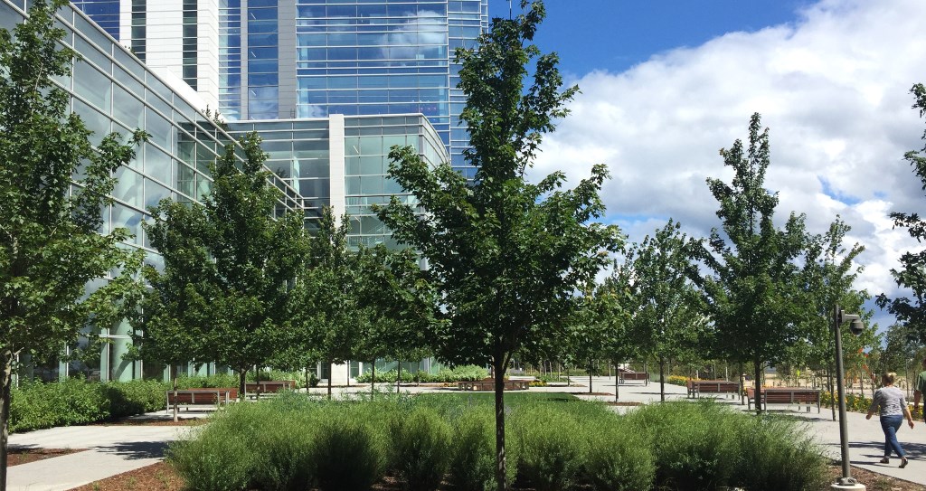
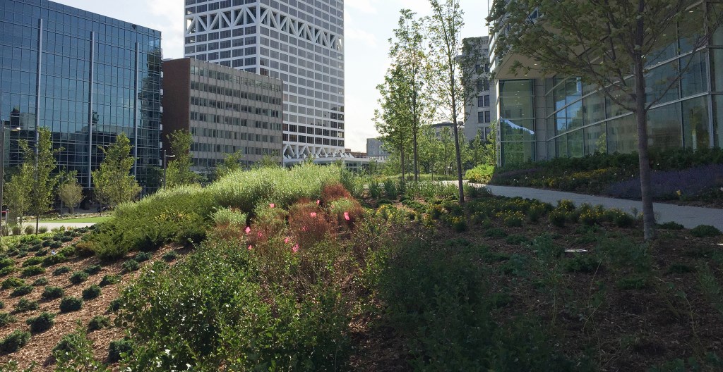
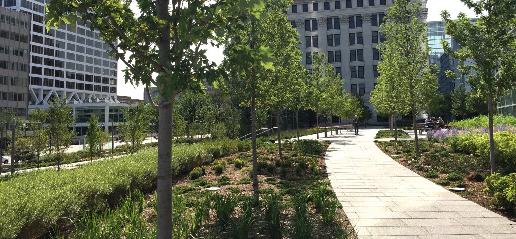
Gardens and landscaping for NM Tower and Commons create a strikingly urban campus.
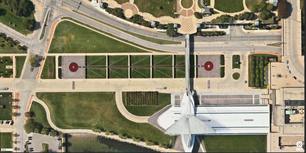
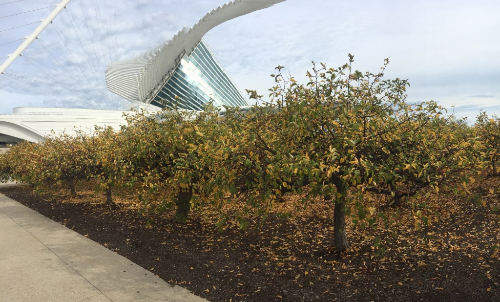 It’s rare to find a rectilinear landscape in Milwaukee. There’s Dan Kiley’s grid of Horse Chestnut trees just south of the Marcus Center for the Performing Arts (1969). And Kiley’s master plan for the Milwaukee Art Museum (1998): a straight-lined 600 foot fountain set into a grid flanked by two groves of trees. Now we have the new Northwestern Mutual plaza, which can’t be fully appreciated without considering the influence of both Kiley and Frederick Law Olmsted.
Dan Kiley (1912-2004) started out in his profession in 1930 as an unpaid apprentice for Warren H. Manning, an associate of Olmsted. He went on to work closely Eero Saarinen, the designer of our War Memorial, and rose to become probably the most influential landscape architect of the 20th Century, and really the only Modernist working with straight lines and 90-degree angles during America’s postwar building boom. (A retrospective of Kiley’s work is currently on view thru January 12, 2018 at the UW-Milwaukee School of Architecture and Urban Planning.)
In the late 19th Century, Olmsted designed a system of parks and boulevards in Milwaukee. His landscapes were conceived as relief from the suffocating pollution and depravations of mid-19th century American cities.
Olmsted’s fabricated nature was an antidote to the afflictions of urban life. Wavy lines and pods of grass stood apart from the grid. His legacy is enshrined in Lake Park’s undulating pathways and soft rounded open spaces.
To Olmsted, nature was good and cities were bad.
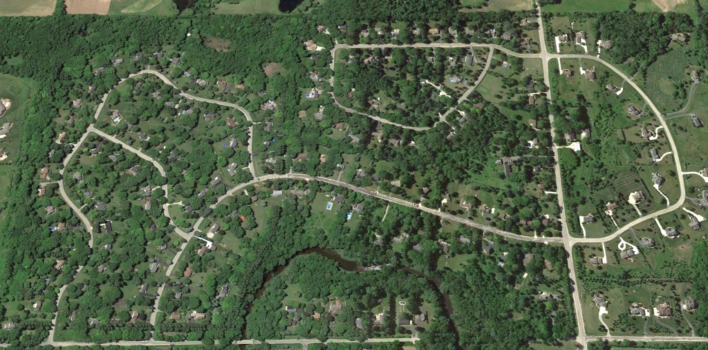
An adulterated version of Olmsted’s acadian landscape dominated America in the 20th Century and became the backdrop for office parks and suburbs built after WW II.
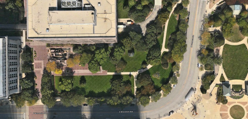
A typical green space in America, like the former corner park in front of the Northwestern Mutual building on Wisconsin Avenue, used walls of trees to buffer the green space from the buildings and the street. In Milwaukee’s building and zoning codes, there are 58 mentions of “buffer” defined “as a wall or landscaping that provides a visual barrier between uses.”
The suburbanization of the city began to wane as people started moving back to urban Milwaukee with a different set of values and concerns. Connectivity became a virtue. No more walls of trees. Urban spaces became more open and started snapping back into the grid.
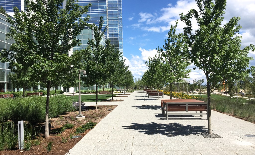
The commissions of Olmsted and Kiley, who were each pre-eminent landscape designers in their time, were examples of rare ambition for Milwaukee. Now we can add James Burnett of OJB, a highly regarded landscape architect who designed the green space that sweeps around the new Northwestern Mutual building. (While there may still be some tweaks to it, the work is largely finished.)
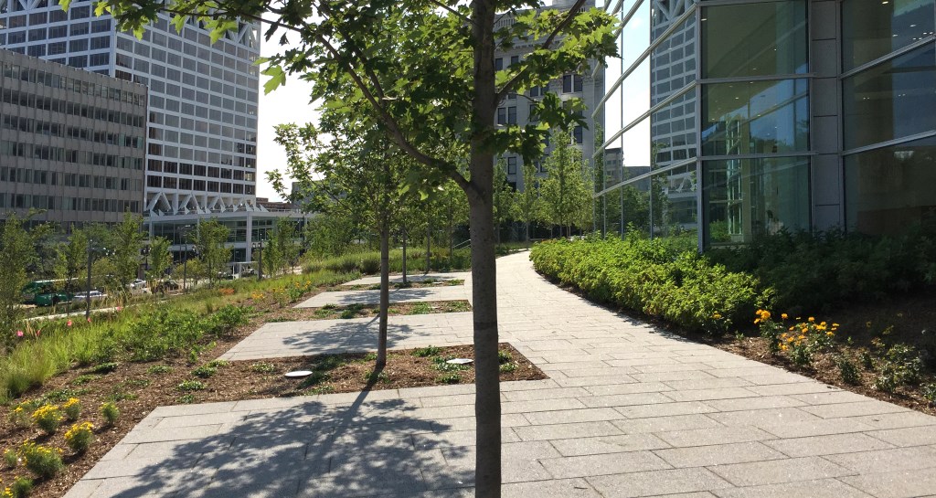
Like Kiley, Burnett’s landscape has a lot of straight lines.
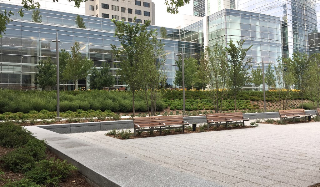
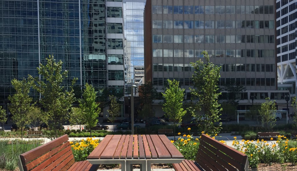
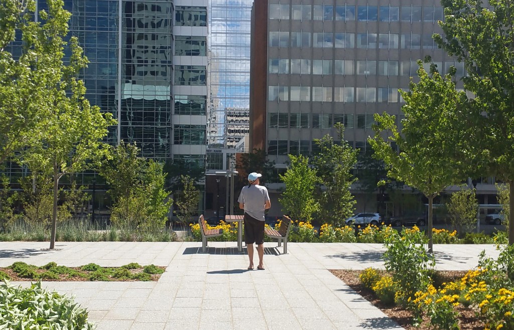
The Gardens, as it the company refers to its new plaza, grows out of the urban fabric of Milwaukee, celebrating the geometry of the city instead of diffusing it.
The geometry doesn’t stop here.
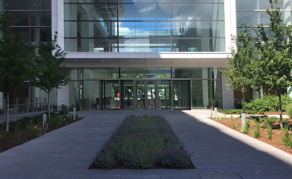
The rectangles from the landscape run up into those in the building and echo each other.
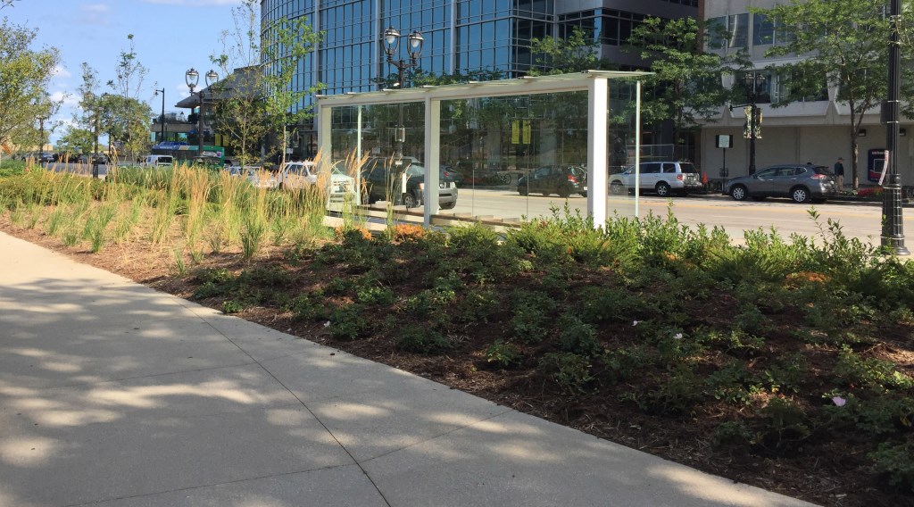
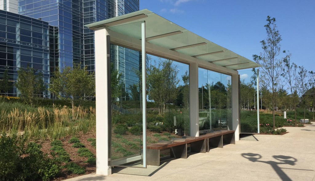
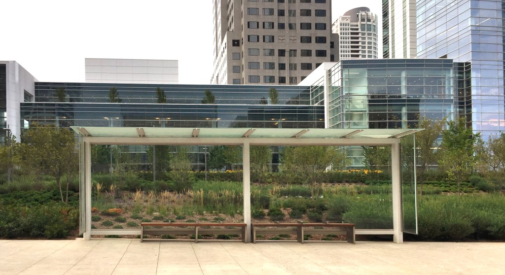
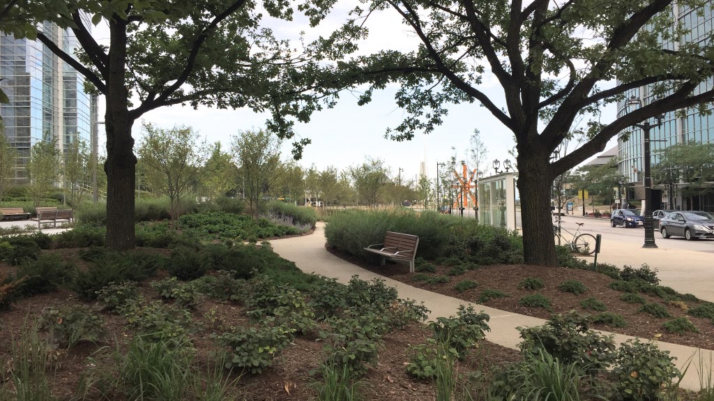
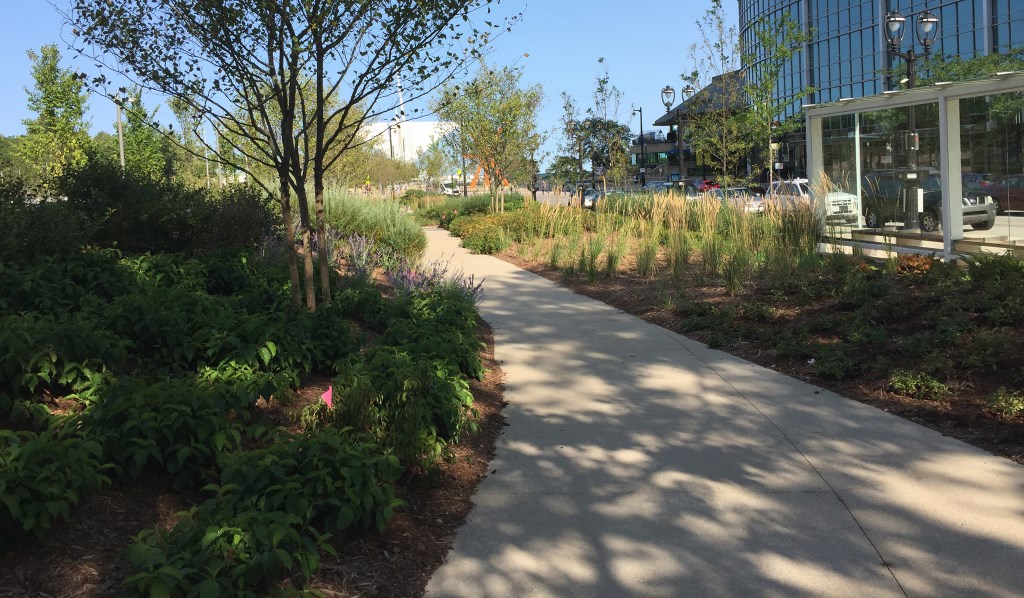
The rectilinear grammar of the building extends to the most beautiful bus shelter I have ever seen in Milwaukee. The structure’s transparency and form is lighter than air and luminous in its own right.
(Note to readers — architects do better bus stops than artists at one tenth the cost.)
Staggered layers — the foreground, middle ground, and deep background — are optically compressed into an illusionary cross-section; an ambiguous space that collapses the distance between the street and the building, flips the horizontal plane on its head, and sets the building on a pedestal.
The lateral planes of The Gardens drop out of the picture until you walk up into a grand plaza, which is a solid piece of stone work. As the trees mature, the plaza will become an open negative space and the fulcrum for The Gardens.
The plaza felt a bit leaden and lonely during my recent visits—too formal and desolate for my taste. It was probably designed to accommodate public events; a great place for something like a wedding.
In an earlier rendering, the plaza was an amorphous grass lawn, which would have softened things up and probably made The Gardens a little mushy and unfocused.
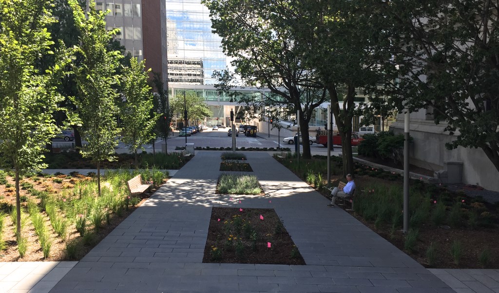
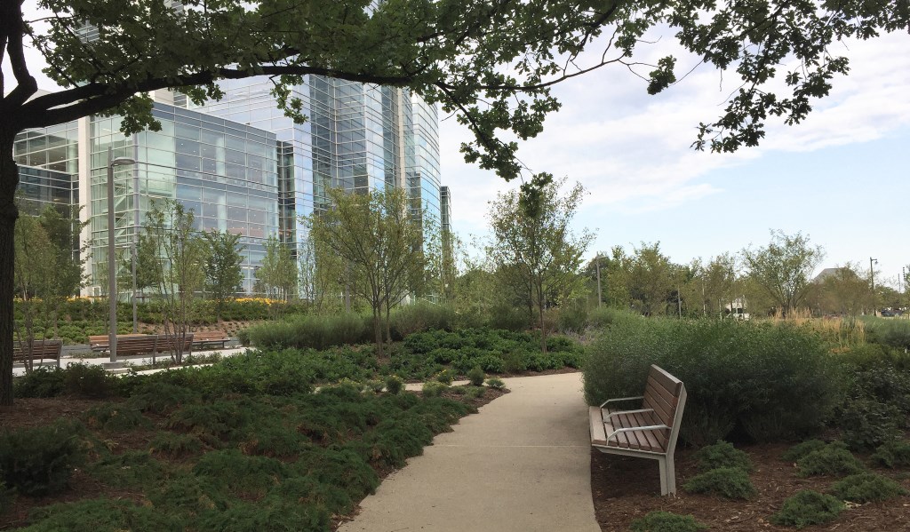
The zig-zagging path on the left side of the rendering has also been redesigned for the better. The new path meanders somewhat, finding its way like a creek to the main stream of Wisconsin Avenue.
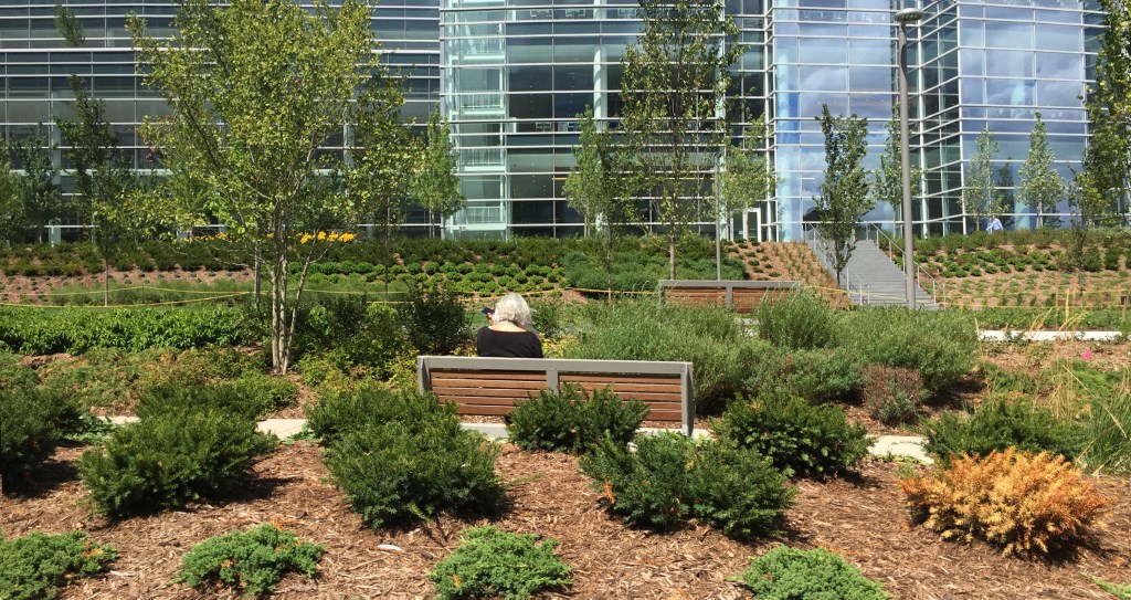
This, the coziest part of The Gardens, tempers the spectacle of the site and the building. The intimate scale and gentle curves take the edge off the connection to the street and add a ripple to the layering of the place.
This nook would make Olmsted happy.
Finally, the Gardens had to follow the architecture around the arc of the building.
The Gardens is all about structure—the classicism of Bach and Kiley rather than the romanticism of (late) Beethoven and Olmsted. From this slight elevation the landscape expands in all directions and is embroidered into the fabric of the city.
Burnett’s rigorous configuration of plants will require a lot maintenance. That’s as it should be. The Gardens is not about nature. It’s about our nature to create order — the beauty of which is reassuring yet wakes us up to the world we’ve created.
Photos by Tom Bamberger
In Public
-
The Good Mural
 Apr 19th, 2020 by Tom Bamberger
-
Scooters Are the Future
 Dec 19th, 2019 by Tom Bamberger
-
Homeless Tent City Is a Democracy
 Aug 2nd, 2019 by Tom Bamberger







A recent opinion I’ve formed is that the city lacks trees. I’m not talking about wooded areas in parks where no one walks, or fountained centerpieces that frame a conpany’s name, but heavily trafficked areas where the greenery inspires us to slow down and chat with others and the environment. We need more esplanades where tall buildings are scraped by old-age maples and oaks. I hope this space grows into one of those.
Agreed Tom. The bus shelter is both aesthetic and functional. Given wait times, it would help to have a bit more enclosure, especially how close this shelter is from the Lake – its a ‘Porland-esque’ shelter. Despite this aesthetic, the shelter won’t change the fact that in the depths of winter bus riders will be facing temperatures more similar to the North Pole than the Northwest. Going with a shelter with limited wind exposure like this would be more palatable for bus riders, if it included heat (Boston has some great examples).
All things considered, I definitely second the point that this is an improvement over the failed attempt art bus stops. Now if only Architects were, themselves, bus riders (or short of that at least consulted with bus riders).
Thanks for this analysis, Tom.
Yes, it’s great to have a highly visible garden along a Wisconsin Avenue corporate campus–and more trees. And I agree that the bus stop is truly beautiful and hope it serve transits riders well.
However, I’ve never seen any writings by or about Olmsted that indicate he thought “cities were bad.” He was a huge champion of then-burgeoning cities and worked nationwide to help make them livable through appealing parks that provided access to nature. He also asserted that parks helped promote economic development and increased property values near them. He was the first to collect data that proved that fact, which he used to secure support for Central Park’s expansion. And he was obsessed with connectivity.
More than anything, Olmsted was concerned with democracy and equity, and succeeded in making urban parks that supported those goals (and still do).
http://www.pbs.org/wned/frederick-law-olmsted/learn-more/persistence-olmsteds-influence/
In terms of design, Olmsted’s Milwaukee parks have permeable borders, most evident along the western border of Lake Park. But yes, some urban parks have been “walled off,” a trend now being overturned in many places.
Kiley cited Olmsted as a major influence (as well as Le Notre). Kiley also integrated nature into functional urban landscapes, which is sometimes overlooked because of his formalism.
Virginia…. chick out The City Beautiful Movement, which brought Olmsted to Chicago.
A square block of fine townhouses and mansions enclosed a courtyard of buildings accessible by a small alley from the street–where poverty, crime, illegitimacy, and TB swarmed over its inhabitants, unknown to the upper-class homeowners who resolved to live in the urban center. In 1897, 303 of these alleys housed 18,978 people. The conditions found in the city center of Washington D.C. was not unique; the squalor and hopelessness of city life for immigrants and the poor throughout the country has been recounted numerous times by writers such as Theodore Dreiser, Stephen Crane, Riis, and Frank Norris.
http://xroads.virginia.edu/~cap/citybeautiful/city.html
Sorry Tom, the World’s Fair, spawned the City Beautiful Movement, and therefore was AFTER Olmsted.
Olmsted would never have considered that the Fair should be a model of urban planning and his job there was coordination of the overall design “on the ground”. The Wooded Island was the only real Olmsted design and gave a respit from the glaring “White City”.
The World Fair, in fact, was to have a deleterious effect, on many Olmsted parks, as monumental architecture and formal parks replaced Olmsted’s simple, rustic, landscape creations. Virginia is absolutely right, Olmsted did not think cities were bad, in fact he felt that cities, when planned correctly, were an advancement in civilization.
To be clearer I should have said Olmsted hated 19th Century of American cities while at the same time embracing the progressive and cultural possibilities of cities.
Olmsted opposed the traditional grid system, lack of organic structure, and abuse of space which dominated schemes for American cities.
http://www.nybooks.com/articles/2015/11/05/frederick-law-olmsted-americas-green-giant/
Like- wise, the ‘‘restraining and confining’’ condition of city streets compels people to ‘‘walk circumspectly, watchfully, jealously . . . [and] to look closely upon others without sympathy.’’20
Olmsted, ‘‘Public Parks and the Enlargement of Towns,’’
By introducing nature to the urban scene, he offered respite from the pathogenic influences of city life, “the symptoms of which,” he wrote, “are nervous tension, over-anxiety, hasteful disposition, impatience, [and] irritability.” Such symptoms could be reversed through exposure to pleasing rural scenery: “It is thus, in medical phrase, a prophylactic and therapeutic agent of value….”
https://www.harvardmagazine.com/2007/07/frederick-law-olmsted.html
he believed that these urban advantages are often accompanied by disadvan- tages such as sickness, poverty, and a ‘‘psychosocial environment inimical to the mental health of the inhabitants.’’96
Irving D. Fisher, Frederick Law Olmsted and the City Planning Movement in the United States, 2nd ed.
(Ann Arbor, MI: UMI Research Press, 1986), 96.
From S.B Sutton’s introduction to Olmsted’s book Civilizing American Cities…. “As a landscape architect he tried, above all, to civilize the city; his parks simutlated nature in response to the needs of the urban population.
http://www.nytimes.com/books/99/06/13/reviews/990613.13lessart.htmlhttp://www.nytimes.com/books/99/06/13/reviews/990613.13lessart.html
Thanks for clarifying, Tom.
Here’s a great PBS doc about why and how Olmsted was America’s “genius of place.”
http://www.pbs.org/video/frederick-law-olmsted-designing-america-frederick-law-olmsted-designing-america/
Although Olmsted “fabricated nature” in some parks (when there was not much to start with), he also fought for conservation of natural resources–starting with Yosemite in the 1860s. He fought for 30 years to preserve the scenic beauty of Niagara Falls, calling for the removal of all the ugliness that had arisen around it. In Milwaukee, Olmsted consulted about the choices of the park commissions first seven parks. He advised about natural assets that could be preserved and enhanced, including Lake Michigan, the Milwaukee River, the ravines that became Lake Park, and other established woodlands, such as in Humboldt.
Milwaukee also benefited from the wisdom of Horace Cleveland, who designed Juneau Park in 1870. Cleveland was Olmsted’s lifelong friend and he later was the visionary force behind Minneapolis’ park system and the preservation of its natural resources.
And Warren Manning continued consulting about Milwaukee’s parks for a decade after he first came here as part of Olmsted’s team. Besides being the expert plantsman for our Olmsted parks, he also designed Kosciusko and Mitchell and is considered America’s first “environmental planner.”
The whole project I find to be real enhancement to both skyline and street level. I only wish the designers could have found a way to incorporate alternative energy, particularly solar. An opportunity missed.
I’d like to add the opinion that City Beautiful was a result of the Chicago World’s Fair and demonstrated the impact of a ‘planned’ city (with architects, landscape architects, planners working together) especially juxtaposed with the ‘unplanned’ or more organic growth of cities prior. The first organized expression of this was the plan for the McMillan Plan for the National Mall where FLO Jr. was the acting Landscape Architect.
I also invite anyone who is interested in learning more about Milwaukee’s designed landscapes to join me on a walking tour this Saturday 10:00-11:00 am where we will discuss the work of Dan Kiley – meeting at the grove of the Marcus Center and continuing to the Art Museum. As a Landscape Architect and Professor of landscape history and theory, I hope to offer insight into how these spaces came to be and what influenced their design.