
Guided By the Light
Jim Shields’ iridescent addition to the Art Museum gets better the more you look at it.
The new addition to the Milwaukee Art Museum comes with a lot of history. The museum started out with Eero Saarinen’s War Memorial in 1957, an important work by one of the greatest architects of the 20th century. David Kahler’s addition in 1975 was a welcome expansion that accommodated the growing collection, except many thought it replaced Saarinen’s perch on a bluff overlooking Lake Michigan with a large concrete pedestal.
I think that is debatable. The big problem was the addition put the main entrance of the museum in the back of building facing the lake. As a result most people entered through the side door of the War Memorial to get to the museum. Not a grand entrance, to say the least.
The Calatrava addition in 2001 brilliantly connected the lakefront to Downtown and provided a much needed front door to the museum that became the new logo for the city. The museum was finally “on the map” but its new entrance, a cathedral in an of itself, pushed the entire art collection of the museum into a dark shed hanging off the back of the building. The Calatrava was all about Calatrava and left little room for anyone else.
To make a matters worse, Kahler’s lake entrance was closed and the east face filled in to make room for a few more paintings, which is what museum directors do when left to their own devices. Kahler’s architecture was turned into an anonymous slab out of sorts with the rest of the complex and unworthy of its site. As it turned to face the city, the museum had turned its back on the lake.
All of which left architect Jim Shields with some major issues to consider with his new addition to the museum.
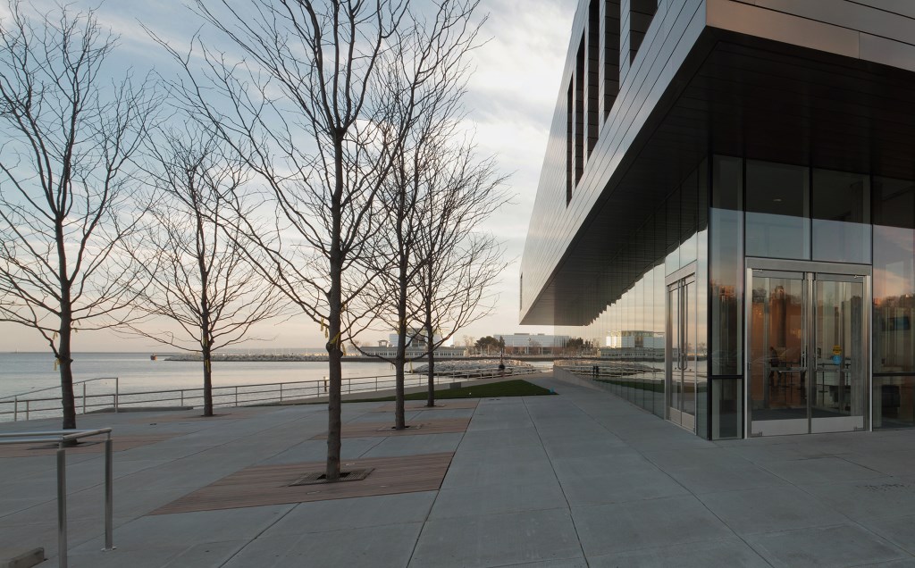
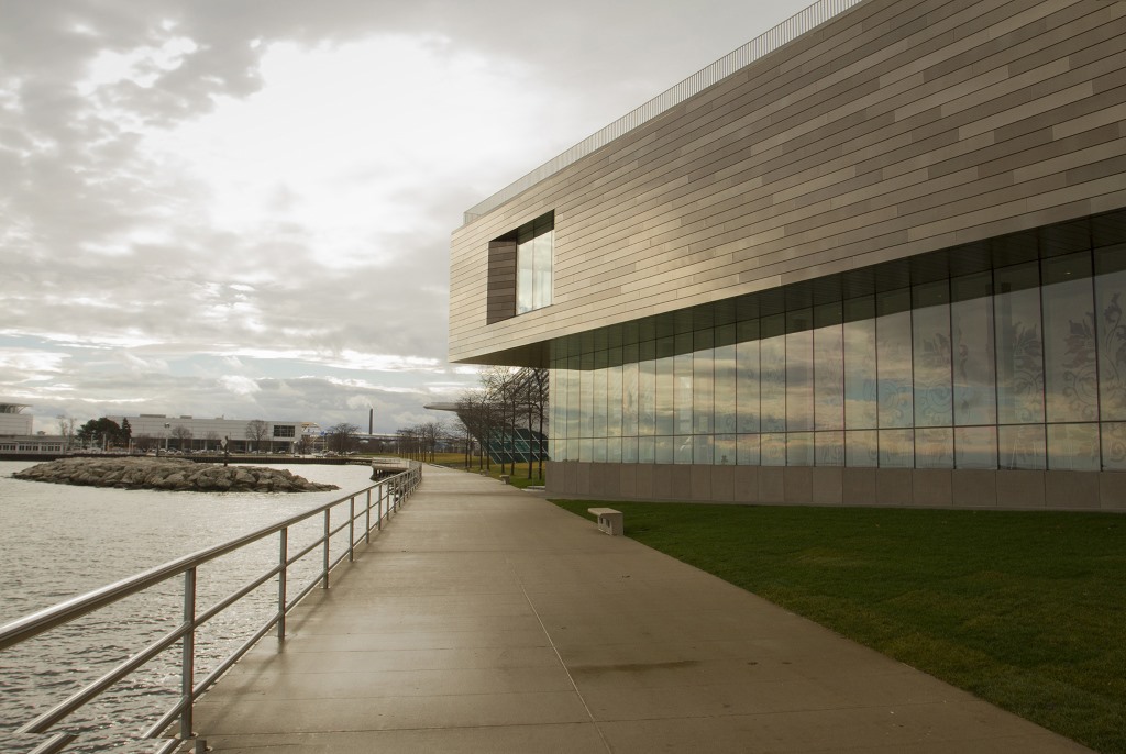
The doors at the corner of his new building are a calm and restrained counterpoint to Calatrava’s sumptuously ornate entrance facing downtown. A plaza with a grid of six locust trees continues Dan Kiley’s pristine landscape architecture from the front of the Calatrava that flows along the pathway along the lake.
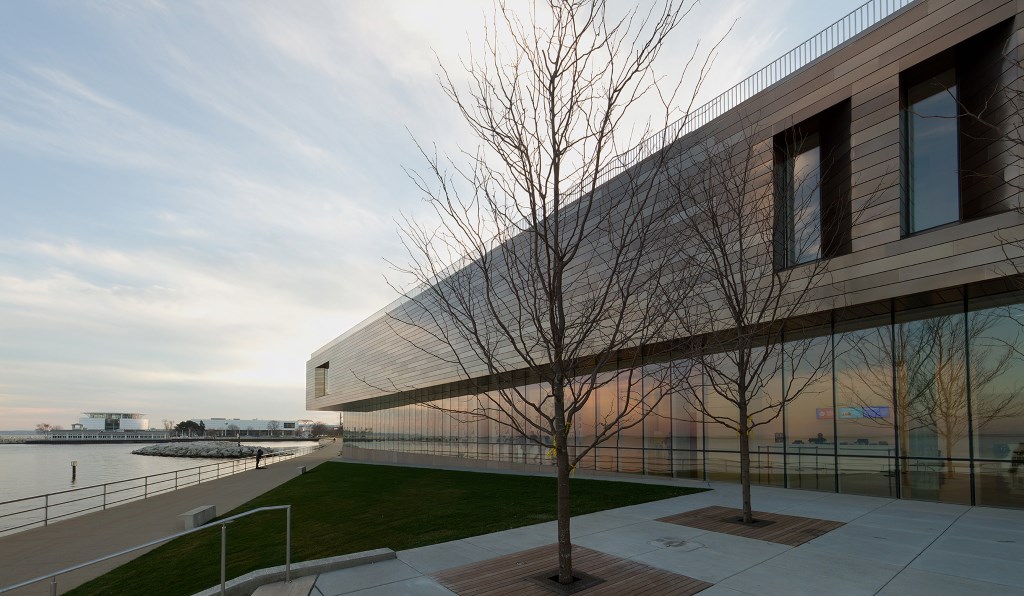
Like the Kahler addition before it was bastardized, the second floor of Shields’ new addition is cantilevered, a gesture to the Saarinen looming above. But the reference is neither literal nor earthbound. The windows around the corners veer to the right and the left. They give momentum to the elongated rectangle that almost dissolves when viewed from oblique angles. The building is atmospheric, like the lake.
Every shape matters, tilts the imagination, and becomes part of a greater whole. I can’t explain how simplicity of this building adds up. There is no formula for it. It’s a knack that must have something to do with proportions.
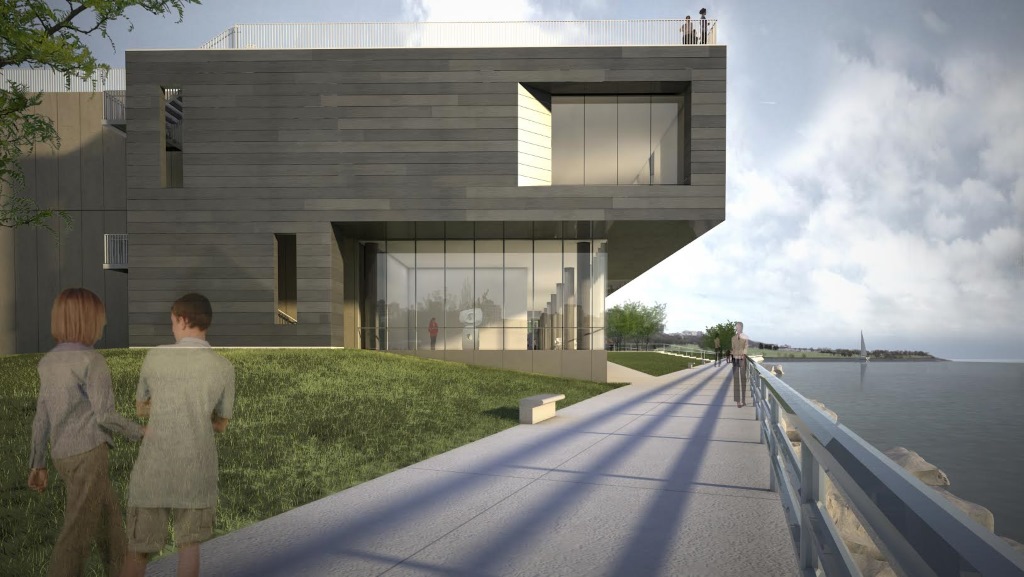
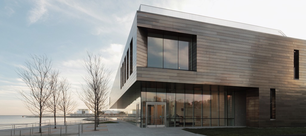
There’s a reason I loathe to review computer renderings. At their best they leave out more than we imagine; objects that reflect light, the tangible reality of the building. Even a photograph can’t fully represent the iridescence of this building that changes minute to minute according to your position and the weather.
The Light Interference Coated panels scatter light across the surface of the stainless steel much like a rainbow. The effects are rather stunning. This picture happened when a ray of light suddenly burst through the clouds on a December afternoon.
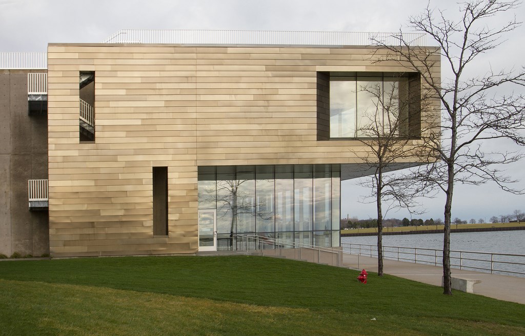
A low iron oxide glass, which gets rid of the muddy green tint you find in most buildings, reflects the coalescence of water and sky. Though the building is polished to a high sheen, it feels elemental — poised exactly where scenic nature meets the industrial forms of the city.
The bulk required to extend the Kahler building was the biggest formal problem Shields had to deal with. From the north it’s still a very long, low- swung hunk of concrete with a parking lot in front. One of these days we will have to figure out how to take this surface parking lot off such prime public real estate on the lakefront. The whole area just north of the museum is remnant of another time when we just dumped stuff by the lake. That includes a deflating war memorial, a sculpture of sorts added just south of the lagoon in the 1990s.
The rest of the views are all sharp and articulate. The way the building meets the path along the lake is dynamic but doesn’t feel cramped. The area between the lake and the building forms an elegant triangle of grass, a small plaza that supports the geometry of the building. The south face is the most taut expression of the grammar of Shields building, which sets it apart from the other buildings on the complex.
The new building redefines the area just to the south (and just east of the Calatrava), which now needs some work. The two sculptures located there look like an afterthought, which is progress I guess because they were just placeholders for some future development.
Finally, how does the new building fit with the Saarinen and Calatrava? That depends on what you mean by “fit.” This is often a topic of cocktail conversation but buildings are not an outfit; this is not about what shoes to wear with the navy-blue blazer and black pants. Remember that Saarinen’s War Memorial never fit in Milwaukee when it was built.
Most of what we hear about the way one building goes with another trivializes both. Shields had to make something Modern and something good.
His design is obsessed with the light of Lake Michigan. Its luster and diffusion are part of the building. You can’t blame Calatrava for missing the boat. He saw the lake more like a tourist, a postcard through a window. Shields has lived by Lake Michigan his whole life.
The building’s materials are rich and well chosen. There is nothing the least bit fussy that distracts or gets in the way of the match between two star architects, Calatrava and Saarinen. Clarity of purpose is a relief. Shields makes it look simple. Take the language of Modernism and sensibly deploy it. But easier said than done.
All photos by Tom Bamberger
In Public
-
The Good Mural
 Apr 19th, 2020 by Tom Bamberger
-
Scooters Are the Future
 Dec 19th, 2019 by Tom Bamberger
-
Homeless Tent City Is a Democracy
 Aug 2nd, 2019 by Tom Bamberger


Nice building. Too bad the photos don’t do it justice. I’m all for artsy but the architect’s design intent to capitalize on the play of light on the building sure doesn’t come through in these photos.
Interesting article. I love the Shields addition. I would like to read more about what it feels like to be inside the building, not just how it looks form the outside. That seems the real success of this project and how most people will experience it, esp. since visitors will largely still enter through the Calatrava pavilion in one way or another.
I agree with M.
I am planning to write another article about this inside.
But let’s undervalue the outside of a building. Many more people experience the outside of buildings than the inside.
Sorry, let’s NOT undervalue the outside of a building. Many more people experience the outside of buildings than the inside.
That’s great to hear you’ll write about the inside. I love the fact there are seating spaces beyond the lobby, and not just horizontal museum benches. Taking in a lot of art on a jaunt can be tiring…
Agree that building exteriors are important. With good design, they are equally satisfying. Especially important for buildings with (quasi) public use or high visibility.
I appreciate the substance of the review and largely agree with Mr. Bamberger.
Urban Milwaukee ought to invest in a copy editor, however. It is disappointing to see a publication like this post an article full of grammar and usage errors. Perhaps I seem overly picky, but there is no excuse for such sloppy writing from an architecture critic, particularly one who is otherwise so perceptive of and attuned to detail.
Nice!
I like the addition too. If I may refer to each building as an entity, that seems to be where we are going with the complex and I like that, I have never liked the Kahler. I am one who felt it was just a big concrete box for the Saarinen to sit on. It took away the airiness that Saarinen accomplished originally. I never read what he felt about the addition, but I can’t think he liked it very well.
I actually love the Saarinen. I believe it is a perfect expression of Milwaukee. Mundane concrete with a few pretty touches intrepidly reaching for the sky. I got to see it before the Kahler was built although I was a child. It always felt like a worthy war memorial indeed. It was never about the art museum. Calatrava changed that.
The Kahler never seemed to be more than a warehouse. Shields fixed that, some. The Saarinen was never meant to be a museum, but the city decided that was what it was going to be. It would have been better if it could have been lifted higher above the Kahler somehow or the Kahler lowered or better still, have been completely different.
Regardless, the MAM has to be one of the most eclectic architectural messes there is, in a good way. Clearly it isn’t finished yet. There still needs to be something to unify the parts. Those parking lots on the north side just piss me off. More to be done and to look forward to.
“… One of these days we will have to figure out how to take this surface parking lot off such prime public real estate on the lakefront. The whole area just north of the museum is remnant of another time when we just dumped stuff by the lake. …”
The area covered by asphalt directly north of the concrete paneled addition once displayed at least 3 or 4 large pieces of metal sculpture. I remember a bright red one, a sky blue one and a rusty one.
I was sitting on the sky blue one, reading a book one summer day in the 1980s, until I was shooed off the piece by a museum guard.
@mbradleyc, Yes, more can be done to unify MAM’s campus. That calls for a landscape architect with the vision and ability to do what Shields did with this addition–to create an cohesive experience. Someone needs to look at the entire site as a whole and use design, way-finding, etc. to connect all the pieces of buildings and landscape. MAM’s just catching its breath after completing this wing, but I would imagine it’s on their radar.
The I.M. Pei pyramids at the Louvre are a prime example of architecture and landscape designed to make a building/campus that was not designed as a museum more functional and aesthetically pleasing. What had been a fortress and confusing maze was opened up and the entrance plaza around it became a memorable space to gather and to view from various vantage points.
At MAM, there are numerous landscape challenges. The fact that the sidewalk/trail abruptly ends north of the Saarinen makes the area very unfriendly to pedestrians or walkers. Maybe DOT will change that but an elegant solution will require more than just a sidewalk. If Milwaukee’s cultural campus is to serve as a gateway to the city and our exceptional lakefront, there needs to be a memorable passage from MAM northward to Veterans Park and the rest. The other piece is unifying it all with the entry through O’Donnell Park, That is reportedly MAM’s most-used entrance and place for viewing its campus, including the Kiley garden in front.
Redundancy Alert: make that “pedestrians or bicyclists”…
(The fact that the sidewalk/trail abruptly ends north of the Saarinen makes the area very unfriendly to pedestrians or walkers.)
A thoughtful and perceptive article. Like Tom B, I found the Shield addition to dramatically improve the Art Museum’s exterior. Having visited the museum many times before the Calatrava and before the Shield additions were constructed, I must also agree with Tom’s opinions regarding the impact of the Calatrava on the overall museum experience. A recent visit to the museum found the experience vastly improved — the organization of the collection seems to make more sense, and the interior is now far more comfortable, inviting, and art-friendly than it was before. Jim Shields, and those who dealt with the interior design, certainly got a lot of things right!