The Design Competition That Wasn’t
Lakefront Gateway competition picked a team, not a design. So what will that mean for the lakefront?
The Gateway competition is over. A panel of prominent Milwaukeeans has spoken on the future of what could be the most important urban design project for this generation. The project that will be the centerpiece of Mayor Tom Barrett’s legacy, the one set in concrete. It’s price tag was supposed to be $25 to $35 million, though it’s open to question if anywhere near this amount can be raised.
The land where the proposed plaza would be built is surrounded by the densest concentration of cultural assets and wealth in Milwaukee, between the Milwaukee Art Museum and Discovery World, not to mention Summerfest just to the south. Together they probably constitute at least a quarter-billion-dollar investment which brings a couple million people to the lakefront each year.
The plan calls for a new bridge to span Lincoln Memorial Drive from the proposed high-rise, The Couture, to the lakefront. The linchpin of the Gateway project, the 44-story Couture will have 600 residents, high-end shopping, and a stop for the proposed street car. Just a block away Northwestern Mutual is adding a tower to their campus they say will bring 1,900 new jobs to Milwaukee; and a new high rise with 308 high-end apartments and 16 penthouse units.
Going into the competition, the heavy favorite to design the plaza was the team lead by James Corner Field Operations, an illustrious firm with the acclaimed High Line in Manhattan to its credit, and an international star in the field. James Corner’s reputation is much greater today than Calatrava’s, and he specializes in public spaces like our lakefront. Several of the “stakeholders” on the panel, as they were called, saw Corner’s interest in Milwaukee as a badge of honor, suggesting it was a measure of the success of the competition.
On paper it wasn’t much of competition. I thought Corner’s design was the most highly evolved, a category above the rest of the field. So did the design professionals I spoke with. It was like a college basketball team playing a high school. Corner teamed up with Milwaukee architects La Dallman and others.
Corner has designed waterfronts, plazas and parks all over the world. He has worked with the greatest gardeners in the world and spent years putting together the ingredients of public spaces. Corner was the obvious choice if either past work or the proposed design was the measure for what would succeed in Milwaukee.
Instead, the panel choose the home team, GRAEF, whose headquarters are just off the freeway by State Fair Park. GRAEF isn’t an architecture firm, but an engineering firm. They partnered with PFS Studio, a design firm out of Vancouver that has lots of experience with water features that were essential to GRAEF’s design. Jennifer Nagai of PFS wowed the panel, I’m told, though GRAEF’s proposal bears little resemblance to her firm’s past work.
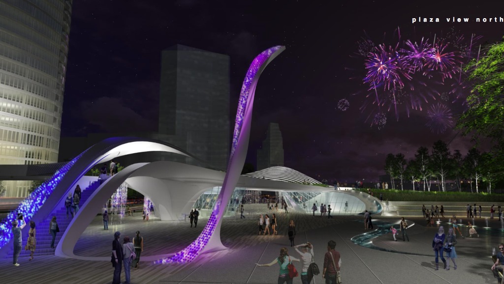
GRAEF’s conceptual drawings still look like a mess to me. There are no concepts. Its a pastiche topped off by a grotesque work of art that slithers out of the bridge over Lincoln Memorial Drive. They buried Ned Kahn’s Wind Leaves, a fine work of public art, in a grove of trees, which is an obvious mistake that will not stand. The north face along Michigan St.. is still blank, though I noticed on the corner there is a water feature, a shower encased in cartoon-like structure.
I should have noticed that GRAEF’s proposal has more water flowing through it than all the rest of projects combined. That turned out to be a big selling point. The east section of their design is filled up with trees that spill over the extension of Michigan Street to link up with the Dan Kiley landscape in front of the art museum. This turns out to be awkward because GRAEF never figured out how to meld their swishy design with Kiley’s rectangles. They lost sight of the forest for the trees.
The panel members I interviewed said the designs shared with and voted on by public were not as important as the people on the team. In fact they didn’t refer to or even seem to remember the details of the submissions. Everyone emphasized they were only a starting point. In fact, I heard over and over again how all the finalists were equally fantastic. On paper it was a tie, which seems incredible to me.
As increasingly happens with architectural competitions, the design is just a brochure that gets you in the door where the real sales pitch begins. The panel members liked what they heard. Ron San Felippo (representing the Historic Third Ward) was impressed by how well GRAEF “understood Milwaukee.” Panel member Greg Patin of the Department of City Development noted that GRAEF had the most trees and water in the design. Said panelist David Marcus: “We picked the team, not the design.”
When I mentioned GRAEF’s sculpture to panel member Bob Greenstreet, Dean of the UW-Milwaukee School of Architecture and Urban Planning, he said, “Oh, that is just a placeholder.” He agreed the slithery art feature had to go. So much for the dominant motif of GRAEF’s proposal.
It clearly helped that GRAEF was local. Greenstreet said GRAEF was “reliable” and “predictable,” and had a “proven record of success in Milwaukee.” The panel was looking for someone they liked, a known quantity.
Not to mention that, according to Greenstreet, the panel was aware of the fee structures for the teams. Corner was obviously more expensive than GRAEF. The money issue, the fact that there is none so far, hung over the deliberations.
Panel member Don Smiley, CEO of Summerfest, thought highly of GRAEF’s “phasing approach,” which means you wouldn’t have to do it all at once. That, too, was a selling point with panel members. Barrett has never raised anywhere near $30 million dollars for a public space. No one would be surprised if only half of the project gets built.
Joe Ullrich, vice-president of US Bank, said he “felt comfortable” with GRAEF and thought they would be “easy to work with.” “They understood the nature of the people and the local landscape.” Referring to the Corner proposal, he said, “That might work in New York, it’s cool and it grabs my attention but it is not practical. Milwaukee has its own personality and you don’t want to force it to be something it is not.”
GRAEF also teamed up with Rinka Chung Architecture, who are the architects of The Couture, the linchpin of the project, which according to their website will include “plazas and parks, a stop for the streetcar, and pedestrian bridges.” All of this was decided before the competition even started. In other words, it appears as if the public is providing free land to complement The Couture and then funding the completion of a plaza on the land. Though, at this point, it’s not clear how much public money will fund the project.
Greenstreet called Rinka Chung “rising stars in Milwaukee.” They just finished The Moderne, the last tall building in Milwaukee by the same developer, Rick Barrett, as The Couture. Local architect and panel Greg Uhen was an influential proponent of GRAEF in this competition, and has done work for Summerfest.
It all sounds pretty cozy. But I believe the panel members, all of whom thought everything was completely above board, took their responsibilities very seriously, and were impressed with the process (and, you sensed, with each other).
As one panel member described the process, “we worked together like a corporation.”
“It wasn’t personal,” Smiley said, “I was representing Summerfest, voted what would be good for Summerfest.” Joel Brennan, CEO of Discovery World, seconded that idea: “you are representing your institutional interests.” Other panel members include Sandy Botcher, a vice-president at nearby Northwestern Mutual and Marcus, who runs Marcus Investments and whose family runs the Marcus Corp, which funded the Marcus Amphitheater at Summerfest. (Marcus was chosen because he is a board member of the Betty Brinn Children’s Museum.)
But what’s good for the stakeholders, for say, Summerfest, may not be what’s best for the public. When asked about the difference between Corner and GRAEF’s plans, several of the panelists talked about traffic flow on the pedestrian bridge. Corner’s proposal tilted the bridge north toward the art museum and east to the lake. GRAEF looked south, providing two off ramps to Summerfest.
Stakeholders, as you’d expect, looked at the Lakefront Gateway more as a pro-development real estate project rather than a public space. The flow of people from downtown offices and residences to Summerfest was more important than the rest of us who on a whim wander the lakefront. (It also places Summerfest above the Calatrava, which is often used as the new symbol of the city; the art museum’s leader, Dan Keegan, voted for Corner, a panelist told me.)
Yet the role of Greenstreet and Uhen, two of the three architecture professionals, may have been decisive in the process. Panel members all raved about these two. “They are experts,” Smiley emphasized. From the beginning Greenstreet and Uhen favored the GRAEF proposal, panel members said. And Uhen’s company, Eppstein Uhen Architects, says on its website that it has done work with GRAEF on the Bayshore Town Center.
GRAEF’s plan looked to me like a suburban capitalist solution to an urban socialist problem. But who knows what will happen? GRAEF team member PFS does really good work, which was not reflected in the plan submitted to the panel. No one I talked to knows who the client will be (Barrett, Department of City Development Commissioner Rocky Marcoux, or…?) who will manage this project and who will be the executive who can tell the GRAEF team that slithery purple monstrosity in the proposed design has to go.(Greenstreet told me that he would.)
All the panel members raved about all the development happening near the lakefront and how the area is being transformed. The optimism is palpable. But at this point the only money mentioned has been a $3 million city tax incremental financing district. There is still a good chance that nothing will happen or the project will be greatly reduced in cost and scale. Nor is it clear the stakeholders chosen for this panel will pony up any money. When I asked Ullrich if his bank was going to contribute, he said, “it’s not on our radar” and noted how much his company already pays in property taxes.
The art museum raised more than $100 million in donations for the Calatrava addition by exciting philanthropists with a design. At this point the Gateway project will mostly be selling a team. After all the hubbub about the design competition, we don’t really have a design. Until we do, raising that money could be tough.
Political Contributions Tracker
Displaying political contributions between people mentioned in this story. Learn more.
- December 23, 2020 - Tom Barrett received $500 from Rocky Marcoux
- December 27, 2018 - Tom Barrett received $1,000 from Rick Barrett
- December 22, 2018 - Tom Barrett received $500 from Rocky Marcoux
- December 29, 2017 - Tom Barrett received $500 from Rocky Marcoux
- December 13, 2017 - Tom Barrett received $1,500 from Rick Barrett
- June 21, 2017 - Tom Barrett received $400 from Joel Brennan
- June 21, 2017 - Tom Barrett received $500 from Don Smiley
- March 1, 2017 - Tom Barrett received $400 from Rocky Marcoux
- March 21, 2016 - Tom Barrett received $400 from Joel Brennan
- February 29, 2016 - Tom Barrett received $250 from Don Smiley
- December 21, 2015 - Tom Barrett received $400 from Joel Brennan
- November 2, 2015 - Tom Barrett received $2,600 from Rick Barrett
- October 8, 2015 - Tom Barrett received $400 from Greg Uhen
In Public
-
The Good Mural
 Apr 19th, 2020 by Tom Bamberger
-
Scooters Are the Future
 Dec 19th, 2019 by Tom Bamberger
-
Homeless Tent City Is a Democracy
 Aug 2nd, 2019 by Tom Bamberger











I’d just quickly point out that three of the four teams involved local companies, not just the GRAEF team.
La Dallman, on James Corner’s team, created Milwaukee’s well-regarded Marsupial Bridge. Several other teams had ties to current lakefront projects, some of which were local.
The process and “stakeholders” narrowly focused views of their roles (lobbying for institutional interests) reveals that the wider public, including potential visitors, were not considered “stakeholders” in all this. Even “design experts” repped limited interests. One architect’s firm (Uhen Eppstein) did the original rough sketches for the Gateway project, besides other alliances with Graef. And Bob Greenstreet is a longtime City Hall insider/consultant, thus stacking that deck.
Dissing James Corner because he’s done landscape design projects in New York is telling. He’s a native of England, taught in PA for years and is working all over the country, including on redesigning Chicago’s Navy Pier and Cleveland’s Public Square. He’s known for honoring local aesthetics and promoting community engagement.
Two key takeaways: 1) Big-picture thinking seems to have played little, if any, role in this competition–which was supposed to be about “unifying” a lakefront suffering from piecemeal planning. 2) Public spaces are of low value to MKE’s civic “leaders.” Greenstreet wrote a forceful op-ed that O’Donnell Park would be better owned by a for-profit corporation and redeveloped—apparently he’s not a big public-space advocate. Teig Whaley-Smith, head of admin services for the county and LGP committee member, told a lakefront forum audience that O’Donnell Park, downtown’s site where most tourist photos are taken, is low on his totem pole.
Finding donors beyond this project’s narrow “stakeholder” base will be a hard sell.
Mr. Bamberger’s love of James Corner’s design has apparently affected his ability to unbiasly evaluate the other designs. Not only did he admit to missing the strong water focus of the GRAEF design (which was a key component to the competition) he apparently didn’t notice that the design very much focuses on the Calatrava addition. The bridge takes a large sweeping turn towards it and has a ramp leading down directly to the entrance.
Corner may have been the obvious choice in his own head, but judging solely on the designs (Yes, I keep hearing the designs change and it was about the teams) the GRAEF design was clearly the best as a public space and brought the disparate parts of this intersecting area together. I hope the design retains most of their original proposal and full funding is available for the job. Absolutely love it!
I wasn’t a fan of either the Corner design or the GRAEF one that was selected. They both look kind of…sterile and dystopian to me. And even a bit confusing. One of the problems with the lakefront as it stands now is that it’s a jumble of non-space public spaces, areas you can look at but not really access or do anything in, strange dead spots, etc. All these two designs do, it seems to me, are shuttle people over a showy bridge (with dead space underneath) into some kind of plaza that no one would want to spend time in unless you want to sit on non-bench benches, look at unremarkable fountains, peer around a bend at hedges on mini fake hills, etc. I’m also not a fan of designs where you look at something and can’t tell, “Am I allowed to be on that part of it–or not?
These designs make things slightly better but not millions and millions of dollars better. Is that too cynical?
If I had to pick any of the finalists, I might’ve gone with the OJB on account of it being the least disingenuous and most…approachable? When I look at the designs, it’s the only one that isn’t off-putting and the only one that seems like something people would use for gathering and staying and not just passing from A to B. When I look at that one, I feel like I would have greater control over where I walk and how I explore and access the space. It makes more sense and feels more inviting.
Just my two cents from someone who’s obviously not a designer, just an ordinary dude who walks a lot.
Dave Reid makes a good point.
Not just 3 out of 4, all of finalists were in some sense “local”. The Corner design teamed up with LaDallman, a local firm. That’s the way you win competitions. The Calatrava had a local component as well.
I should have made clearer — the local angle to my story was not entirely my idea. I kept hearing it from the panelist I interviewed. Over and over again they said things like all things being equal, go with the local firm. Why not, they understand us, how things work around here, and the weather better?
Regarding AG comments……
“Mr. Bamberger’s love of James Corner’s design has apparently affected his ability to unbiasedly evaluate the other designs.”
You are not the first to suggest “love is blind”. My job as a critic is to open up my eyes, and yours if I am lucky.
It’s a sad world when “love” becomes just another twisted bias. I love Evolutionary theory which has not blinded me from finding it superior to creationism, for example.
Re…“I should have noticed that GRAEF’s proposal has more water flowing through it than all the rest of projects combined. That turned out to be a big selling point.”
The design specs called for some sort of compelling water feature and eye-catching art. Water and outstanding art and architecture are key elements that already draw people to the lakefront–and will do so regardless. More art and fountains (next to MAM’s Kiley Garden fountains) are also likely to be expensive, if done well. And Milwaukee is notorious for not finding money to maintain the basics of its public spaces, much less fancy fountains.
Any of these teams could probably come up with something to suitably meet some narrowly defined parameters for a one-acre plaza and a pedestrian bridge that runs through or next to The Couture.
The biggest disappointment of this project may end up being that the bar is set so low that we get little for a major outlay of money—and no money expended on how to have really great connectivity from Lakeshore State Park & Summerfest to Veterans Park. That seems to be a crucial point Tom is making.
Tom, I appreciate the sentiment… but as a critic I’d hope you’d look at each design as an individual piece. I fear you were so excited James Corner being a candidate that you let that influence your opinion and how you viewed the others. Not in an “I’ve seen perfection and all else pales in comparison” type way but rather in one that is clouded and biased where perhaps you didn’t WANT to like the others knowing Corner was an option. I’m not sure if I’m explaining that right… but I think you may get my drift.
It’s a shame that it often seems that for every step forward *Milwaukee* takes, it takes two steps backward.
What this committee has failed to understand is that the GRAEF concept is an ill-conceived mockery that neither speaks to the local landscape nor lends itself to practicality–if, indeed, that is the goal of public art and architecture. Okay. For agument’s sake, let’s say that it’s important to be “practical” when considering public space. Fine. Then think practically. But honestly, what things are more important to consider in this case are style and grace–which by the way, could also be referred to as *form* … which some say … *follows function.* The proposed Corner design is stylish and graceful, and, as is in the nature of something with these qualities–manages to be so without calling attention to itself. Maybe it actually occurred to the Corner team that there isn’t a need to be *matchy* or in this case, poorly riff off of what already exists, but rather to *complement* what already exists.
That having been said, just how does this purple worm work its way to being useful or meaningful in its current context? And the blue amusement park watery overhead swish? These *forms* might have fit in pefectly as an installation at La Cage in the early 90s (picture guys sliding down the sparkly blue whatever or climbing the purple worm), but between MAM and Discovery World? Seriously? Sure, if the goal is an hommage to Banksy’s Bemusement Park, Dismaland.
What really needs to start happening in Milwaukee is that these committees ought to once in a while consider that they may, in fact, not be the best ones to be making these kinds of decisions. Listen to outside voices, ladies and gentlemen, and realize that it’s actually good to truly think outside the box. (That’s one way that cities make progress, and become destinations instead of stopping places, or worse yet; places that are altogether avoided.) But first, you have to actually understand what that means–and that it requires *long* thinking.
For the record AG, I didn’t love Corner’s work. Even pointed out in the article several problems with their proposal.
I was relieved. I thought then and now the other three proposals were unacceptable. What happened in the meetings with the teams and panel, which turned out to be much more influential than the submission, is a whole other matter I was not privy to.
Now the ball is in our court. A great client can make an architectural team surprise themselves, and us.
T Haus, well stated!
AG, committee members largely said they picked a team–not a design. Bamberger’s comments were about the Corner team’s design (and the others), as well as Corner’s past work and overall approach to landscape design.
Did this committee in fact reject someone often compared to Frederick Law Olmsted because they did not want to his incur travel costs? Or did not want to consider prospects beyond known ideas and business connections? Besides, GRAEF’s landscape designer and some others on the team are also out-of-towners, so those cost savings could be a wash.
It’s good news that we may not get a light-changing cobra on the lakefront. But will we get some other hot mess that leaves the lakefront just as goofed-up, but with somewhat easier access to Summerfest and Discovery World—and of course to shops in the Couture’s atrium?
re: “Now the ball is in our court. A great client can make an architectural team surprise themselves, and us.”
Tom, I want to be hopeful, but what makes you think “we,” the people, are suddenly the client?
Do you think city officials etc. and others will embrace community engagement as more than a buzz phrase?
Marie, by “we” I meant the City. By the City I mean someone has to be in charge. That charge can be to get community input. It might be on the table to hire a consultant who has some experience managing these kinds of projects because I don’t know of anyone at the city that is really qualified. You are not going to get anything great out of committee of concern citizens without experienced leadership at some level.
And yes, our present leadership at the city uses community engagement for political gain (buzz) rather than as part of system that gets great results. That’s my opinion, I should elaborate it in article, you know, and not just state things. Maybe I will get around to it. The short of it is think you are right. But you all ready knew that. It’s in water here these days.
Everyone has been awfully quiet about The Couture after NM announced their new tower. Has it not occurred to anyone that putting NMs 300 high end apartments down the street might screw up The Coutures funding chances?
Tom,
I always appreciate your ‘right on’ insight. Once again I agree with your unveiling of this faux competition. Are we really surprised at the out come? I’m still young enough to see the final built (or unbuilt) project. This is really underwhelming.
You can’t help but be depressed to hear the language from some of the panelist’s seeking “predictable” and “practical” results. Imagine if that’s what Chicago was seeking when setting out to conceive Millennium Park? Make no small plans…
Once again, Milwaukee’s silo’d self-interests come into conflict with doing what’s best for the whole. A site that was being asked to do way too much demanded an simple, elegant solution that both connects and creates it’s own quiet sense of place. Instead we have a scheme that desperately needs an editor. It reminds me of an adolescent trying on different personalities in an attempt to find him/herself.
I’m confident that the selected design team is up to the task of doing better. But I have little faith that Milwaukee’s competing interests governing the outcome will come together to craft a solution that inspires and connects. I hope to be proven wrong.
This really is a tempest in a teapot. Let’s change the headline to read “My favorite design wasn’t chosen, I will now throw shade as a form of catharsis”.
It’s an understandable reaction if your favorite design wasn’t chosen and I might tell the world my thoughts too, if I had the megaphone of Urban Milwaukee at my beck & call.
It’s frustrating to compare the teams and their proposals with the caveat that their proposals didn’t actually matter in the end.
This does make me wonder though… what kind of reception the could gate would have gotten if it was built in Milwaukee. I fear we’re far more critical than we should be sometimes instead of embracing something different. But again… it doesn’t matter because the proposals we saw won’t be what’s built anyway…
So the impression I’m getting is, it was about the teams and their pitch… PFS and GRAEF won the day on that and being a practical choice (and to Tom’s point, maybe their connections), and we’ll never see any of the visions we were presented with anyway. If anything… ever.
I agree with Tom that these major public-space projects usually need strong leadership. It can come from a mayor with a vision, like in Chicago or Charleston, or a philanthropist, like with Boston’s Post Office Square. Or from civic nonprofits, such as in Cleveland or other cities.
At this point, it appears there’s no such leadership–just competing interests hoping to bring more bodies to profit or nonprofit ventures. Great parks and other public spaces actually produce great economic impacts. But they do so by serving broad public needs, not narrow private agendas.
This could all get sorted out if somehow someone with a big-picture vision plays a leading role. To help play traffic cop, that could well be a nonprofit entity in this case.
Thanks for the article. I hope the chosen team keeps working through the design process and will also be choosing to make it a priority to add in the in between features that will bring activity to the development for maximum community impact. Good luck to the Graef team!
In general, on a related but tangential thought…my hope is that our city can pay special attention to how other cities successfully bring vitality and economic development with exciting community spaces and creative projects for the places in between – and commit to doing so here. I believe what people get excited about on renderings and in considering design possibilities are the creative fabrications, surprise and delight that can happen through big vision and investment in not just the building project, but also it’s “places between places” to connect and enliven spots throughout downtown like many other cities do. Development or student vision project renderings often show these places illustrated but when the developments occur, budget may be cut and these spaces don’t fully realize the renderings’ depictions. While this seems a small point, it may be a critical one to vitality and walkability in a city. There are many large and small scale examples of in between connections and connected attractions to enliven downtown from other cities to learn from: Minneapolis pedestrian art walk, St. Louis’ CityGarden, Chicago’s Bean and surroundings, NYC’s Bryant Park, Detroit’s Campus Martius, Portland’s Pioneer Courthouse Square, public temporary art installments, swing parks among others. When the in-between is intentionally considered and funded, it gives a positive impression to visitors and also creates a sense of belonging and pride for locals when done well. Go Milwaukee! I have faith that we can get there.
Bayshore Town Center vs. High Line – enough said.
I’d like to point to the fact that the county and state are work’n together in this effort, not just the mayor… Do you not think that this project will indeed get accomplished??
Yea, I wanted the Graef design to win and the beacon was a major contributing factor.. Milwaukee is in an Atlanta like transformation and with unique points like the Quadracci Pavilion and the beacon that compliments the proposed towers in the NML office and residential tower, as well as the possible JCI tower or like development, Milwaukee is well on its way..
Lets not forget what the county executive, mayor, and governor could very well be aiming to do here, and that is turn Milwaukee into a tourist attraction… What better way to do it than to add aesthetic appearance to the entire lakefront area.. An outdoor ice skating rink {proposed by Graef) right near the state’s tallest high rise towers is an inspirational, soul compelling privelage… The fountains are a major piece of eye candy in that regard.. Then the Bucks entertainment district West in the Park East Corridor seals the deal