The Resistible Rise of Public Art
More and more of it is scattered about the city. But how much of it does anyone actually like?
Businessman Steve Marcus wants to put sculptures along Wisconsin Avenue. Art will also be a big part of the ”Creational Trails” project on Wisconsin Avenue and on a rail corridor in the Riverwest and Harambee neighborhoods. Art has been proposed or recently installed on Martin Luther King Drive and the lakefront, and in Burnham Park, Franklin Square, Sherman Park, the Menomonee River Valley, Bay View, Park East, Shorewood and the rail road bridges on the Milwaukee River
I’m sure I have missed a few. The RiverWalk and the Downtown convention center are full of art. The foot bridge across Lincoln Memorial Drive at Brady Street is artified as well.
All of this despite the fact a recent online poll found that 93 percent of Americans hate Modern Art. It usually bombs at the box office at the Milwaukee Art Museum and is the butt of more jokes than any other medium. As Tony Pettulo, long time donor and trustee of the Museum explained to the press, Modern Art “may be worth a couple million bucks, but I don’t get much out of it.”
“Any dope can marvel at a Rembrandt,” the Yale psychologist Paul Bloom explained, “but only an elite few can make any sense of a work such as Sherrie Levine’s Fountain (after Marcel Duchamp), and so only an elite few are going to enjoy it.” Speaking of Duchamp, when he was asked if anyone actually likes Modern Art he famously replied: “Oh, maybe ten in New York, and one or two in New Jersey.”
Yet countless local leaders and organizations in Milwaukee are convinced that public art, which is almost always the sort of Modern or Postmodern art that prompts such jokes, is an essential component to any “revitalization” or “place-making” efforts in Milwaukee.
Consider this sculpture, Tip by David Middlebrook, at the entrance to Gordon Park on E. Locust St. One simple test is to compare the park with and without the art work. If it looks better without it, that’s not a victory for the park or art.
Civic boosters thought this sculpture would give the Riverwest neighborhood an identity. Not good art, mind you. We are talking about good intentions. Riverwest Currents publisher Vince Bushell, one of the panelists that chose the work, hemmed and hawed when I asked if he really liked it. He went on to explain this art would be good for people.
I wonder how many people who drive by the park, or worse, walk between these butt ugly things, would agree with this assessment. The public art brought to you by the county, city, and community groups are like bowling trophies that clutter a home, functioning as signifiers of accomplishment for community leaders and but faintly idiotic for the rest of us.
The Stone Bracelet by Zoran Mojsilov in a pocket park in Walker’s Point is another example of civic ambition gone awry, like a bad nose job (22 tons of it to exact). Locals refer to this as the “rotting tooth” sculpture. When it was installed, Sue Potts, a community activist who served on the panel that chose the work, told the Milwaukee Journal Sentinel, “this represents the ageless quality of stone – something older than the neighborhood.” There are a lot of things older than the neighborhood that we would just as soon forget.
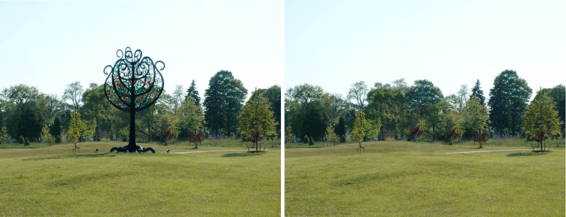
What can you say about Tree of Life, by Nancy Metz White in Mitchell Boulevard Park, just south of Bluemound Rd.? No green space in Milwaukee needs a $32,000 tree ornament. The aspirations for public art shouldn’t be lower than the grass it sits on.
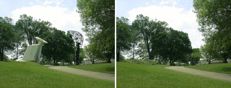
This sculpture by John Barlow Hudson, called Compass, overlooks the footbridge over Lincoln Memorial Drive at Brady Street cost less than 5 percent of what the Milwaukee Art Museum recently spent on a photograph. And it shows. Again, a simple question: Which view do you like better?
If more art is better, why not add Compass to this classic work by 19th century American landscape painter George Innes?
Compass and many other works of the same caliber funded by the county or city were completed about ten years ago. Public art is still seen as pixie dust, a catalyst that can “activate” place. The search for a gesture that could turn neighborhoods around created a whole new species of public art that flocked to cities.
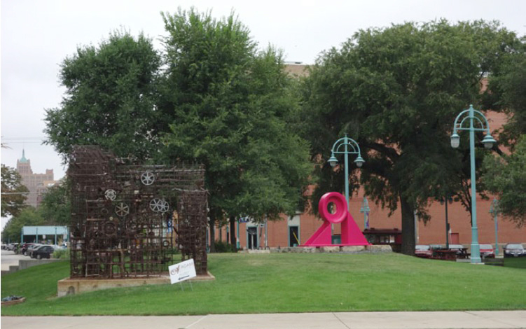
Recently the Pink Planet by Richard Edelman was unveiled in Catalano Square in the Third Ward. Never mind that Stratiformis (the rusty cage on the left) by Jin Soo Kim is a few feet away, yet another example of unsuccessful public art. “It’s been there for 15 years and people have gotten used to it,” explains Nancy O’Keefe, the Executive of the Historic Third Ward Association, so apparently more public art was needed.
O’Keefe likes the versatility of the Pink Planet: “You can do more fun things on it,” she tells me. “Put Christmas lights on it. Put your face in it and take a picture.”
Well, it looks like art. But no one would make the case this is good art.
“I know very little about art,” O’Keefe says. “Show me something and I will tell you if I like it or not.”
There are three more Edelman sculptures in the Third Ward. And there are more to come according to the artist: “I have worked a lot in the district. The Third Ward has been developing and upgrading parks and looking for sculpture. I have been putting things on loan and creating sculpture for these spaces as they come up.”
Really, as spaces pop up they are filled with sculptures? Art is not like money. More can be so much worse than less. That’s why we have museums to make choices of what art to accept (and even then most of it is put into storage). But with public art after you plop it down, it’s all but impossible to get rid of it.
Though most of this stuff is fantastically cheap by art world standards, it still adds up. Over the last 15 years various public entities have spent well more than a million dollars on public art, I would guess, on countless works now cluttering up Milwaukee.
Would it make a difference if public art advocates spent their own money rather than the taxpayers or foundation dollars? Most, if not all of the truly good works in Milwaukee have been funded with private money — the DiSuvero sculpture at the end of Wisconsin Avenue, the Beverly Pepper in Burns Common (the little triangle at Ogden and Farwell avenues), or the Juame Plensa sculpture overlooking the bluff at the end of Capitol Drive in Shorewood’s Atwater Park.
There is quite a difference in how the publicly and privately funded works are chosen. All the public art works pictured in this article (except those loaned to the city) were purchased through a process that starts with a request for proposals, which often attract certain kinds of artists, those who frequently apply for such funding. The applications are then reviewed not by knowledgeable professionals (as the city might buy, for instance, parking meters) but by a committee of citizen volunteers.
Privately funded public art, by contrast, is usually a curatorial process, which is just fancy word for intelligent shopping. An art professional, like Russell Bowman the former director of the Art Museum, who was consulted on the DiSuvero, Pepper, and Plensa, helps find the best possible “product” for the site and the budget. This search includes the best artists working today, who are too busy to be applying for RFPs or make the sort of low-cost work that inevitably gets purchased by government public art programs.
All three of the privately funded works I’ve signaled out each cost several times more than all the works pictured above. Perhaps the bargain basement price tag for civic art automatically lowers the standards of the panel members who chose it. But creating a “point of interest” is a very low standard to begin with. Street vendors or car crashes are points of interest. Art shouldn’t just be filler, a knickknack that brands a neighborhood. Unlike toilet paper, bad public art is much worse than no art at all.
Private money doesn’t guarantee a good outcome but it raises the bar. Plenza’s Crown Fountain in Millennium Park, which is worth a trip to Chicago, was funded by $17 million of private money.
When was the last time private money created public goods that are 10 to 20 times, even hundreds of times more expensive than what government routinely provides?
Most of the public art in town isn’t about a passion for the work or a place, but about civic pride, about community betterment, about elevating average citizens to understand that art is good for them. And if they don’t come to that realization? The answer, it seems, is to just add more art.
In Public
-
The Good Mural
 Apr 19th, 2020 by Tom Bamberger
-
Scooters Are the Future
 Dec 19th, 2019 by Tom Bamberger
-
Homeless Tent City Is a Democracy
 Aug 2nd, 2019 by Tom Bamberger


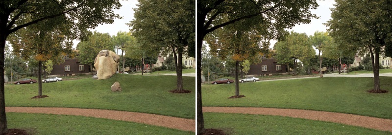






I love the addition of the with/without images, it totally makes your case. Though I do like that huge rock in Walker’s Point in spite of how ugly it is. There’s something about it.
Great piece!
I was waiting for you to get around to mentioning Chicago, one of the few cities that has really done public art well. And, of course, funded privately–and expensively. Whenever I think of public art, the first pieces that come to mind are Chicago’s Picasso, Calder and Miro. And then, I think of things like the Eiffel Tower.
What’s the difference between a monument and public art? That get’s me to my point that public art almost always works best when it is imposing and monumental. The public gets to engage it by walking through it or under it or in between its pieces. Anything less begins to approach tchotchke. Milwaukee’s Calatrava is both functional and monumental–and also graceful and whimsical when its working. Even the DeSuvero, (like it or not, and I happen to find his work tedious) is big enough to engage the public when it gets close enough to it.
Lastly, does anyone actually know what “site specific” means in a practical sense? I see and hear of pieces that are supposedly site specific but I can often see little evidence of it.
Lastly, behold some truly awful public art. Big, yes, but also literal beyond belief.
http://www.sfgate.com/news/article/S-F-struck-by-love-Cupid-s-big-bow-gets-rise-2751612.php
Cupid’s Span was a gift from The Gap company to the City of an Francisco. Now deceased company co-founder, Don Fisher, had an enormous contemporary art collection. Rumor was he donated this piece to SF to put it right outside his headquarters on the Embarcadero so that nobody in the future could block his view with a building. I believe it!
Thanks Tom for speaking out. City parks work best with no or minimal structure – perhaps a fountain, playground equipment or a bandstand at most. Like most successful urban parks Cathedral Square is enhanced by the continuous building line around it. Cluttering up parks with strange shapes is inconsistent with the work of great landscape architects like Olmsted or Dan Kiley. Public art, which is usually better described as “Plop Art” has been a big disappointment since it became fashionable as a quick fix for cities in the 80s and 90s.
Artwork can enhance a public space if it serves some practical purpose. When the old Henry Bergh w/dog statue was in front of City Hall it served as the center point of what amounted to roundabout at City Hall Square where Market, Wells and Water Streets joined. City Hall Square was where Lafollette, both Roosevelts, Billy Sunday and many others spoke to multitudes. After the Bergh statue was removed and the streets were reconfigured to accommodate drive thru banking for M&I, it was no longer quite City Hall Square- more like just another intersection.
“Placemaking” is the buzz word of the past few years. When it’s used to justify plopping abstract objects in city parks it might better be described as place breaking.
I find myself nonplussed to be in agreement with Johnny O. on anything but he hit the nail square on the head. I am amazed that a city that looks to find new and awkward ways to incorporate Flemish finials on public buildings the powers that be lean so heavily toward ugly modern sculptures that do not reflect the space they occupy, the history or taste of the community. You can travel almost anywhere in Mexico and they manage to incorporate beautiful public art that enhances the natural beauty of the surroundiing area and reflect the culture. Where is the public sculpture of the Native Americans that settled the area and harvested the rice that grew in abundance. We somehow made the leap from old white men on horses to hideous modern sculptures that no one understands. The DiSuvero is the most disdained example of what the “experts” have foisted on Milwaukee. At least Chicago had the good taste to hide their DiSuveros in a corner of Millenium Park hidden behind a stand of trees.
Art presence is good presence. You do not have to like it. If a discussion is elicited, great. I see the problem of quality art for the money in public space a result of a seeming need to satisfy the masses. What is that, a scary thought. Unfortunately the often choosers of selected work is often promoting personal gain, not selecting the best possible work. This may be the inevitable outcome. Vilifying abstract art is a slippery slope and speaks of an ill informed and backward community. That does not say that all ‘abstract’ art is thus good just as all representational is not quality. If you like doggies and ponies, fine, but there is a whole world out there that has expanded possibility. It would be interesting for Mikwaukee to join the new century. Two pieces not mentioned here that are satisfying is the new piece at the entry of Lincoln Park at Hampton … And the equally lovely piece at the Public Market in memory of one of the first movers and shakers in the Third ward. In all due respect, past mayors can look at the trees any time and ignore statements in iron, metal, or rock. We all appreciate Tony Petullo’s gift of ‘self taught’ artists. Is it surprising he is not comfortable with other work? …. Just sayin’
I think some of the best public art in Milwaukee is the organic art that one see sprouting up around the city. I love the Polish Flats in the 5th ward that now have mosaic tile and colorful abstract painting along the foundations, where the typically German and polish design of the building is now co-opted with a Hispanic flair.
I love the murals on the walls in Riverwest which fill up the vacant facades of old warehouses where local individuals have decided to beautify their local environs.
All of those pieces of art have an emotion, and a feeling and a connection to the community which the public art program lacks.
There is no meaning and thus no emotion behind the public arts program, the funding being spent does not represent a perspective, a history, or a viewpoint. The pieces in the public art program are vapid bourgeoisie vanity pieces which lack any connection to the community, and the environment. They cannot be embraced by the community because they lack the emotional connection to the community. They have no history, no past, and no future. At its core art is the expression of an emotion or idea, yet the pieces don’t evoke any deep emotions, and their ideas are shallow. They would never be found in a museum because no museum would take a piece of art which lacks a moving emotion or idea. The public art program is born out of publicly funded pork, as an earmark to those who wished to create a slush fund for their own use. At its core, it reflects a corruption of the art pieces where art is now about spending the money, it is a business and not a passion.
I don’t feel like normally I’d be the dissenter in this discussion… because for the most part I find a lot of this modern art as pointless and ugly as just about anything that was purposely erected in this city. However, I draw two major exceptions here that make me question the entire debate.
First, I personally really like the contrast that the di Suvero creats with the Calatrava behind it. I know people argue it blocks the view, but I think it just makes it more interesting. Also, the compass to me plays very well in it’s space. Looking out over the marina and the lake, it brings to mind the nautical/shipping aspect of our city… not to mention the highly metallic pieces juxtaposed against the natural rock portions means the blending of our city fabric into what nature created w/ our beautiful lakefront.
Now I’m no art critic… but if I find myself having those thoughts about the compass as I walk by it, then apparently it did it’s job. So that makes me wonder, how many of those other ugly pieces around the city have caused other non-art people to have similar thoughts? Love it or hate it, if it provokes thought, then did it do it’s job? Some might still say no… and I may be inclined to agree… because let’s be honest, a lot of these pieces do nothing of the sort that the calling and the compass do.
Agree with the article. To me most pieces of contemporary art could be summed up as “the Emperor’s New Clothes.” The artist cooks up some bizarre deeper meaning foists it on the audience with the implied suggestion that you’re unsophisticated if you don’t understand it, when it really is just a piece or even pile of trash. The Calling does absolutely nothing, in my eyes, for the Wisconsin Avenue sightlines beyond obscuring Calatrava’s masterpiece.
Great Article, and I completely agree that having art plopped in green space to createa a landmark is quite embarrassing and as a city that seems to be moving forward with a larger interest in the arts (as I would like to hope), we should be making better decisions on just what and where we place these items. If the city wants to fund art shouldn’t it be great art? Somthing that speaks to us or of us? I find it shameful that there are pieces selected by unqualified representation and then are passed off as great art to our city residents. It insults the intelligence of our community and it kills the apreciation of arts and cultur that we have work so hard to clultivate. We need to fostee a better understaning of art and culture not condeming it to a meloncoly exsistence.
Re: Hudson’s “Compass.” Isn’t this the piece that has “poetry” writ upon it? Didn’t anyone out there notice that the artist can’t spell? Least of all, those who selected the work. My vote for the absolute worst, is across the street from the Chalet on the River, in a little triangular plot of Milwaukee land. Homage to Postal Workers gets my vote for a dead letter delivery..
There are many good points made in the article, yet many questions are posed and unanswered. Who should public art serve? (The public, we assume). How often does it serve the artist and those who choose it more than it serves the public? Personally, I believe what is lacking in much of the more recent public art in Milwaukee is public awareness. With sad frequency, the rhythm of most public pieces in our fair city has been installation, followed by demonization or trivialization in the media. There has been a dearth of meaningful coverage preceding the installation of many public pieces, even from potential sources informed of upcoming new works. If the public had been served by introductions to these works which pointed out their stories and relevance to their sites, an informed public would have been able to argue their merits, or lack thereof, with an educated appreciation. With such knowledge in hand, the dialogue concerning any addition to our aesthetic landscape would be much more objective, would give the public the benefit of deciding whether or not the artist accomplished sending the intended message, and would elevate the ensuing discussion above the typical who can bash this the most donnybrook. An informed public is a much better source for a constructive forum. I refer readers to Eddee Daniel’s blog and recent appreciation of Mark Di Suvero’s work in San Francisco as a way to inform themselves before they attack his Wisconsin Avenue icon. Mr. Bamberger is correct in asking all of us to decide on the merits of any piece, yet those merits should have the advantage of an explanation for a fair trial.
Richard:
I don’t think explanations will save any of the art in my article.
Talk is cheap. The best art doesn’t “elevate the conversation”. It stops the conversation.
Regarding giving public art a fair trial …. You have the right to cross-examine.
Tom, yes, I agree that talk will not elevate the pieces you chose to question in the article to new levels, but my point is a broader one. The best art speaks for itself, of course, yet I sense in many responses to articles dealing with public art in Milwaukee opinions slung from decidedly uninformed viewpoints. If the media had taken the time to inform the public before a piece was installed on what the intentions of the artist were, these opinions would be much more relevant, more informed, and therefore more constructive. I might liken it to arguments on evolution. The arguments of those refuting evolution carry more weight when the opponents have studied some Darwin, rather than just acting purely on faith. An opponent of the Di Suvero piece will be much more convincing if he or she has taken the time to ingest some of Di Suvero’s reasoning behind the work.
On that note, some coverage of a new public piece preceding its installation will allow the public a more convincing opinion, one way or another. Installations of public pieces in other cities are often afforded much more coverage in the media than we see here, producing more meaningful discussions post-installation. With this in mind, I suggest our media give us information on the upcoming art you mention in the article for Riverwest, Burnham Park, etc., at an appropriate interval before the art is installed.
Kathryn Corbin responded to your article with praise for the Takashi Soga piece in Lincoln Park, a fine addition (in my opinion) to our landscape. Was there ever a mention of this piece in the media? There is a quietly profound aspect to this piece, and to all of his work, which will be more evident to the viewer if we heard the words of the artist in the media.
My challenge to you and to your colleagues is to balance the after with the before. Criticism is necessary, yet informed criticism will bring more meaningful results.
OK, you say it’s the “media”. What media? Pinning this on the media is just what the what the Republican’s have done for decades. But there is no “media” that we can blame these days. The media is you and me, what we are doing here.
So write an article, or get someone you know to do so.
Just to be clear –the problem with public art in Milwaukee is the art. I agree with Ms Corbin that an “art presence” is a good thing. Good art, that is. The bad stuff is like bad music, worse than no music at all.
How did art become so saintly, good for us without regard for quality?
speaking of your comment “becoming saintly without regard for quality,” give us your thoughts about the Mary Nohl house and the flap that’s caused when it was announced it’s being moved to Sheboygan. Why are folks running around wringing their hands?
This is a subject that Tom Bamberger has been zeroing in on in his writing for a number of years. Though I have always agreed with his point of view, until I read this piece I didn’t think he had quite made the case effectively. It is easy to look at critics, especially critics who themselves make art and dismiss their comments as personal or petty or both. Overcoming the ease with which his commentary could be disregarded has been the challenge.
Here, however, he has chosen all the right words and has combined them with a straightforward visual essay that can’t be refuted. Clearly, these visual insults to the Milwaukee landscape should just go away just as the photos illustrate. Unfortunately, as he states, it is really hard to get rid of public art once it has been installed. The answer is to quit doing any more damage.
I must say, I agree with every single word of this essay. So Tom, how about a tilt at another closely related visual scourge, the streetscape improvements funded by BIDs?