
Trump’s Dismal Record on the Economy
The data shows the worst performance of any president since World War II.

Official portrait of President Donald J. Trump, Friday, October 6, 2017. Official White House photo by Shealah Craighead. Photo is in the Public Domain.
The 2020 recession is totally different from previous recessions. Those grew out of the economy—a bubble in housing prices burst, the collapse of complex financial schemes, building a sector of the economy beyond what market demand could sustain—and people grew wary about the future. Responding to growing concerns, consumers cut back on purchases and businesses deferred planned investment and stopped hiring. There was a growing realization that the economy was not sustainable at its current level.
These recessions fed on themselves. When people fear the future, they cut back on spending to try to survive the uncertainty. As economists like to point out, one person’s spending is someone else’s income. Every individual makes decisions that are perfectly rational from the decision-maker’s viewpoint. When consumers cut spending, businesses cut their spending and lay off workers, and local and state governments cut spending in response to lower tax revenues. Thus, the economy retracts.The current recession is quite different from previous recessions. It is not the result of market instabilities. Rather, it results from the coronavirus and the attempt to control the spread of the virus.
The graph below shows the number of non-farm jobs in the US (in blue) and Wisconsin (in red) between 2007 and this January. On the left is the Great Recession (shown in yellow) and the current recession is shown on the right. One obvious difference between the two recessions is the rapid collapse of jobs in the current recession rather than the gradual reduction in previous recessions. This 2020 collapse was quickly followed by a quick but partial recovery.

Non-farm Jobs Since 2007
A similar story is told by the figure below showing the four- week average of continued weekly unemployment claims (the blue line) since 1967. The yellow bars show recessions during that period. One striking difference between the current recession and previous ones is the much higher spike as much of the economy shut down last March in an attempt to head off the spread of the coronavirus. In previous recessions, job loss was spread over a longer period, rather than occurring all at once. Maximum job loss usually came at or near the end of the recession.
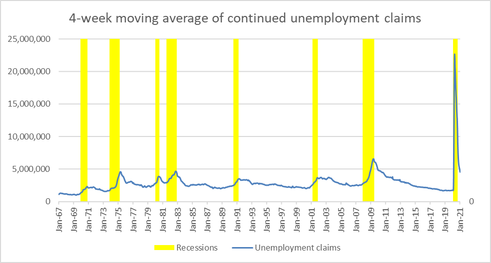
4-week moving average of continued unemployment claims
How should Donald Trump’s management of the nation’s economy be viewed? The next chart shows the number of American jobs between February 2010 and January of this year. The vertical green line indicates the start of the Trump administration. Until the start of 2020 when COVID-19 hit, the plot is almost a straight line. Despite the continual attacks that Trump made on his predecessor, this suggests that the Trump economy for his first three years followed the Barack Obama glide path.
It is hard to find any indication that Trump’s Tax Cuts Act, shown as a purple line, had a discernible effect on job growth. Thus, along with the George W. Bush tax cuts, this evidence supports suspicions that cutting taxes on wealthy people is not an efficient way to grow the economy.
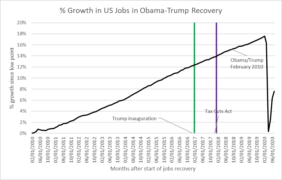
% Growth in US Jobs in Obama-Trump Recovery
For a number of years, observers have noted that on average the economy has done better with Democratic presidents than with Republican ones. A recent article by the New York Times’ David Leonhardt finds that this is still true. Entitled “Why Are Republican Presidents So Bad for the Economy?”, it rates presidents based on the economy’s performance at the end of their time in office compared to the beginning. It uses two measures, the change in employment and the change in gross domestic product.
By both measures, Democratic presidents cluster at the top, Republicans at the bottom. Trump strengthens this pattern. By both measures he is at the very bottom. In fact, he is the only post-war president to leave office with fewer jobs than when he entered.
Trump’s poor results are confirmed when other economic measures are used. The next graph shows the change in the unemployment rate over over the first four years of each president’s term. Bars pointed upward show an increase in unemployment, those pointed down a decrease.
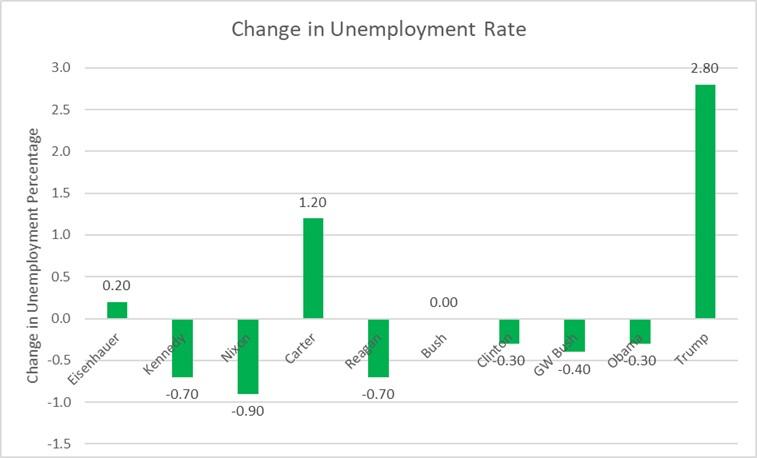
Change in Unemployment Rate
However, when asked by pollsters to rate Trump’s performance on the economy, voters typically rate him highly, often higher than in any other area. By contrast, his performance in controlling the pandemic is often rated poorest. What the voters seem to be saying is that on the economy we will look at the first three years of Trump’s administration. After all, the arrival of the coronavirus and the subsequent shutdown of the economy was not his fault.
However, the incompetence and inconsistent response to the virus—notably to the use of masks and social distancing — certainly made the pandemic worse, adding to the death toll and making an economic recovery less likely. How much of the poor performance was due to Trump and how much was beyond his control? That’s a question that may never be fully answered.
Data Wonk
-
Who Do You Trust to Conduct Elections Fairly?
 Apr 6th, 2026 by Bruce Thompson
-
Is Non-Citizen Voting a Real Threat to Elections in Wisconsin?
Mar 18th, 2026 by Bruce Thompson
-
How Global Climate Change Affects Milwaukee
 Mar 11th, 2026 by Bruce Thompson


one of the great things about biden’s presidency, is i do not have to pay attention to anything 45 says, does or what anyone says about him. he was never my president and now he’s gone. let him rest in peace.