
The Politics of the Pandemic
Republican push to reopen state economy depends on distorting the data.
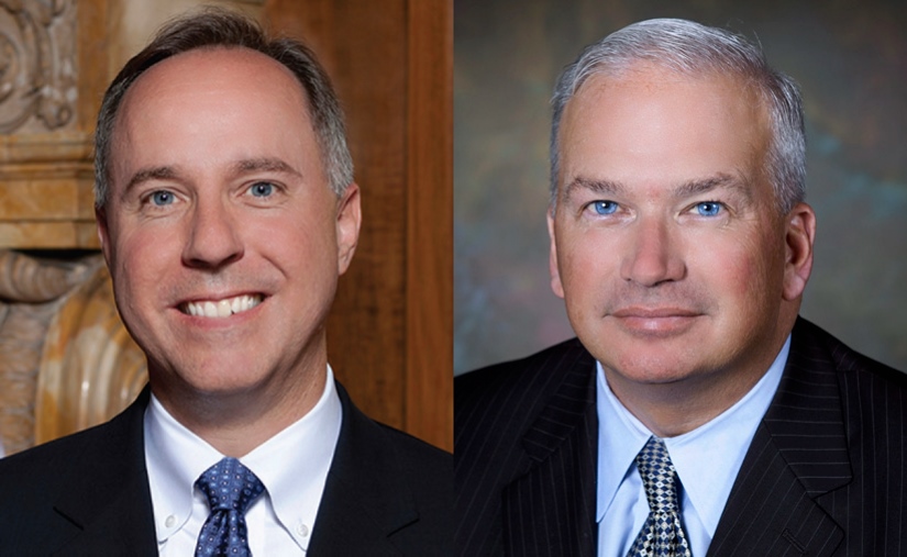
Robin Vos and Scott Fitzgerald.
In recent days, significant elements of the Republican party, including Wisconsin Assembly Speaker Robin Vos and Senate Majority Leader Scott Fitzgerald, have aligned themselves with the campaign to “open up” Wisconsin. It seems an odd decision from both a policy perspective and a political one.
Politically, it places the Republican leadership at odds with most voters, as Bruce Murphy’s recent summary of polling data makes clear. It also allies Vos and Fitzgerald with an element of the electorate that seems eager to go out of their way to antagonize their fellow citizens–attending public demonstrations carrying assault rifles and confederate flags and putting each other and the public at risk by ignoring the mandate for social distancing.
By suing Evers in the Wisconsin Supreme Court, Vos and Fitzgerald seem to throw their lot in with those demanding that Wisconsin open up regardless of the consequences.
From a policy viewpoint, that seems dangerously premature. COVID-19 currently sickens more than 200 Wisconsinites each day and kills more than eight. Wisconsin, like most states, is not yet able to test for the virus and trace those who have it at the rate that most experts believe is needed to keep the virus from exploding again.
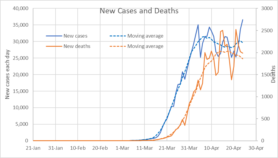
The chart below shows the number of cases from COVID-19 per day and deaths in the US from late January until late March. The number of new cases is shown in blue, the number of deaths in red. The solid lines show the actual data as collected by the New York Times. The dashed lines are seven-day moving averages, used for cutting through the daily variations and focusing on the overall pattern.
New Cases and Deaths
From the above graph, it might appear that nothing much was happening from late January to early March. While that might be said of the US government, which seems to have done little to prepare during this period, it is not true of the virus.
The next chart reproduces the first part of the previous chart, with much larger vertical scales. Although the numbers of cases and of deaths seemed small, what this shows is the virus was successful in establishing itself.
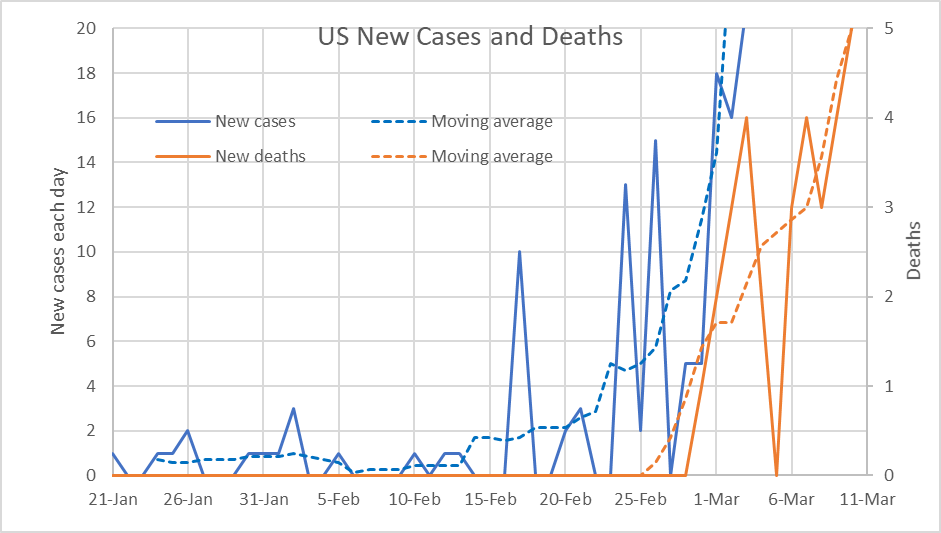
US New Cases and Deaths
In Wisconsin, the first reported case occurred in early February, but the second appeared more than a month later. As the next chart shows, the second case was quickly followed by an explosion of more cases.
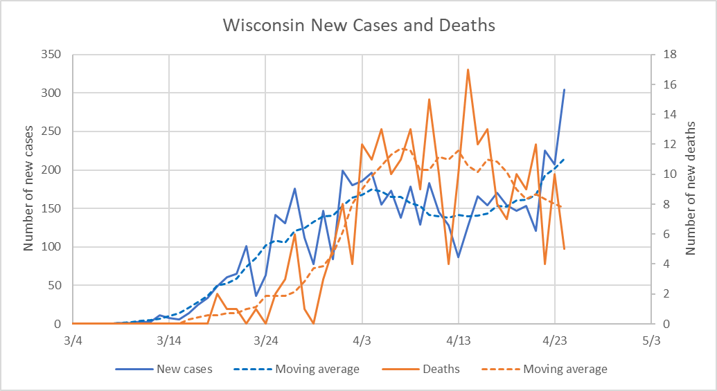
Wisconsin New Cases and Deaths
On March 13, Governor Tony Evers issued the first of a series of Emergency Orders — closing the schools. This was followed by more than 30 more emergency orders. The most expansive of these was the March 24 “Safer at Home Order.” It incorporated a number of recommendations (for example, keeping a 6-foot distance between people, closing restaurants except for take-out and delivery service, limiting travel) aimed at limiting opportunities for the virus to jump from one person to another. To a large extent, this order incorporated measures that businesses and individuals were already practicing.
The Wisconsin Department of Health Services (DHS) wrote, “Our model indicates that, without action, COVID-19 would cause 22,000 infections by April 8 and between 440 and 1,500 deaths.” It arrived at this projection by using an exponential model, based on its calculation that the total number of cases doubled every 3.4 days between March 3 and March 15 (equivalent to a growth rate of 22.6% every day, compounded daily).
The next chart plots the actual cumulative number of cases (in contrast to the new cases) over time (the solid line) versus the forecasted number (the dashed line) if there had been no intervention. If one accepts the model DHS uses, the intervention has saved a substantial number of people from getting sick with the virus and a smaller—but still substantial—number from dying.

Wisconsin Cumulative Cases
In the interest of making partisan points, the MacIver Institute turns the message of the data on its head:
Governor Evers has not been honest with the people of Wisconsin regarding our COVID-19 response since day one. His model predicting 22,000 infected and up to 1,500 dead by April 8 was built on false data …
Missing the predicted number of cases and deaths is, of course, the whole point of the exercise. MacIver is practicing a kind of strategic stupidity, missing the message—that social distancing works—to make a partisan point. For a further takedown of MacIver’s dishonesty, see this article in Urban Milwaukee. It is surprising that MacIver would be so eager to destroy its credibility to make this easily dismissed, partisan argument.
The bigger question is whether Wisconsin is able to safely “open,” whatever that means in practice. A look at Milwaukee County’s reported cases and deaths contains both good news and bad news, as reflected in the graph below.
After rising rapidly in March, the number of new cases peaked at around 90 per day in early April and fell to 60 most recently (I am using the 7-day averages). Deaths per day peaked at 8 per day, a week later than the case peak, and then declined to about five per day recently. While the declines are good news, the totals are still high.
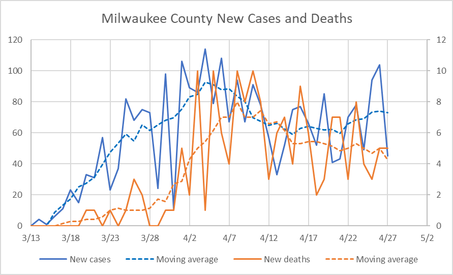
Milwaukee County New Cases and Deaths
In Wisconsin, the coronavirus hit Milwaukee hardest initially. As the next graph shows, in the early weeks, about half the state’s cases were in Milwaukee County. More recently, Milwaukee’s share of Wisconsin cases has steadily declined, reflecting both the decline in Milwaukee cases and the appearance of new hot spots.
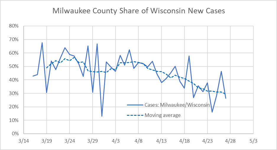
Milwaukee County Share of Wisconsin New Cases
The most notable new hot spot is Brown County (Green Bay), as the next graph shows. This appears mainly due to employees at its three meat-packing plants becoming sick. So far, the increased number of cases has not resulted in an increase in deaths, but that may be because of the short time that’s elapsed since these cases began.
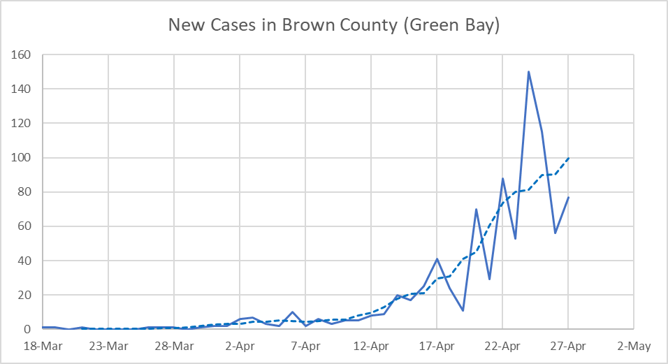
New Cases in Brown County (Green Bay)
This spread of the virus from heavily urbanized areas, particularly in the Northeast, seems to be ongoing. A Brookings Institution study of new coronavirus-heavy areas finds that:
During the first three weeks of April, new counties showing a high prevalence of COVID-19 cases are more suburban, whiter, and voted more strongly for Donald Trump than counties the virus hit first.
There is widespread agreement among experts in infectious diseases that successfully relaxing the restrictions on social distancing without increasing sickness and death depends on far more testing and tracing than has been possible so far. Such testing would have two parts. The first would be to test people who are sick to verify that they have COVID-19. Their contacts would then be identified to see who they got it from and to whom they may have passed it along. The second part would be testing a random sample of the population in order to better understand the enemy, particularly the role of asymptomatic carriers of the virus.
A study by the Harvard Global Health Institute recommends a daily testing rate of 152 tests per 100,000 people to identify most infected people. This is considerably more than is possible in Wisconsin and most other states today. However, the state is moving in the right direction. The table below shows Wisconsin testing, both expressed as the testing per day and as test per 100,000 residents. The graph below shows recent tests per 100,000 residents, according to the COVID Tracking Project.
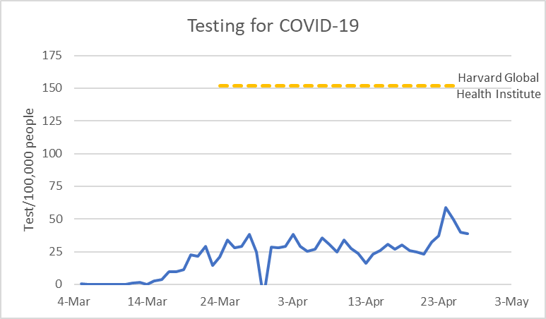
Testing for COVID-19
Wisconsin, as of April 28th, rates its laboratory capacity at 10,992 tests per day (189 per 100,000 residents), well above the Harvard recommendation. This led Vos and Fitzgerald to criticize Evers for waiting on more testing before re-opening Wisconsin. As a recent PolitiFact concluded, more lab capacity doesn’t mean that Wisconsin can sustainably test at this rate. One set of limits is caused by shortages in most of the supplies needed for the test. Another is that the largest lab, at Exact Sciences, is just now starting up.
This suggests that we are making progress on moving towards a time that we can safely open up more of the economy. But we are not there yet. For Republican leaders to suggest that we are is dangerous for us, for the economy, and, very likely for the health of their party.
Data Wonk
-
Who Do You Trust to Conduct Elections Fairly?
 Apr 6th, 2026 by Bruce Thompson
-
Is Non-Citizen Voting a Real Threat to Elections in Wisconsin?
Mar 18th, 2026 by Bruce Thompson
-
How Global Climate Change Affects Milwaukee
 Mar 11th, 2026 by Bruce Thompson


Just more left-leaning political drivel. This is the reason I dropped the Statesman and likely will drop this rag
You didn’t say why it’s drivel.
This is good reporting. The drivel is on the chin of Bellski. Incompetence in our federal government has resulted in too little testing. Testing and tracing will be necessary to retard the spread of this deadly disease. Forget the left leaning or the right winging for the meanwhile, and focus on defeating this deadly virus.