What a Difference an Architect Makes
Jim Shields’ new art museum design improves on his first, and saves the museum from itself.
Architects don’t just pluck entire buildings out of their brains. Designs evolve in fits and starts. Some ideas sit for awhile, ripen and are discarded. There were at least a dozen “designs” for the Milwaukee Art Museum’s Calatrava addition, all pointing towards the final building that would emerge from the shadows. With creative projects you are lost for awhile before you arrive.
This sequence is also a narrative of the relationship between the architect and client, who for better or worse take this journey together. They may or may not solve every problem. No building is perfect. We live with our mistakes to fight another day.
Each addition to the museum has left new problems for future generations. The museum was invisible, tucked underneath the War Memorial with its back to the city until Calatrava flipped it around and bridged the gap between the lakefront and Downtown. That was such an astounding achievement no one noticed or cared that other changes were made at the same time: Under the leadership of MAM director Russell Bowman, the east face of David Kahler’s 1975 addition, a formidable cantilevered concrete grid, was obliterated to make room for maybe 15 more pieces of art.
The gracious entrance from the lake Kahler had created became an anonymous wall, the back of the building no one was supposed to see, except that it still faced a path along the lake that is one of the busiest pedestrian pathways in the summer. Meanwhile the Calatrava, which contains very little art, placed the entrance to the building more than a football field away from the museum’s collection.
MAM Director Dan Keegan saw the need to make an entrance along the lake and included this as a problem to solve in a plan that would also fix the many maintenance problems of the Kahler and Eero Saarinen’s War Memorial. This would be more about correcting a design problem rather than building a new addition. Architect Jim Shields dissolved Kahler’s butchered concrete block in a pool of light and created a new entrance to the building from the lake.The airiness of new building created a negative space that deflected attention toward the two giants, Saarinen and Calatrava, looming in the background. That seemed like a fine idea and the design was embraced by the public.
The second design, released about a month ago, two months after Shields withdrew from the project, was now a real addition. The east face of the museum was flattened again to make room for more art. Shield’s spacious entrance for people and art was pushed aside. Like a horse going back to the barn, curators and museum directors always rush to grab more exhibition space. They know more about art than how people connect to it. Floor space trumps head space.
But has anyone ever left the museum hungry, complaining there were not enough pictures on the walls?
Keegan and his staff were were making the same mistake Bowman had, which created the problem Shields was trying to fix. The museum started out thinking like Apple and ended up with a Best Buy store.
But the good news is that the museum has reacted to the criticism it received and has brought Shields back. And now we have a third design that moves forward from the first.
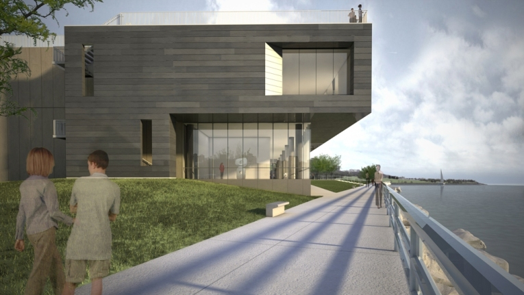
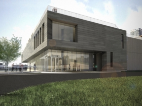
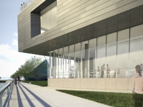
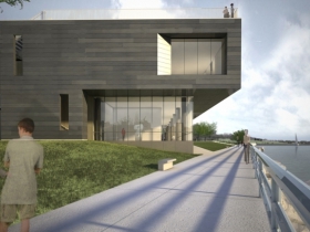
Shield’s new east face is a highly-articulated rectangle cantilevered over a transparent glass base, which goes back to and even honors the Kahler building. In the renderings you can see the distinctive concrete columns of the old building through the windows. Also like Kahler, Shields realized the site requires a large transparent space inside if you are going to embrace the lake.
His design retains some of the spirit and weight of the old building but has increased the width of the building so it wraps around around the Kahler stub, which resolved two problems that marred Shields previous design. The stairs that go up to the War Memorial plaza are now part of the structure rather than tacked on the side. More importantly, the new proportions streamline the building, whose effect is something like the average American shedding ten or fifteen pounds.
Shields also continues Dan Kiley’s series of locust trees and benches along the walkway in front of building, which are part of his master plan for the museum campus. Bringing Kiley back into the picture, the greatest American landscape architect of the 20th century, and someone Saarinen tried to work with whenever possible, is a sweet story. The museum has done everything to Kiley’s rectilinear fountain garden in the front of the building except maintain it, as I’ve previously written.
In retrospect Shields first design was too shy. Like a third child, it paid too much attention to the buildings that preceded it. The new design shows that any new addition needed to stand up to the drama of the site.
Looking south the pattern of two narrow cut outs and one inset window that slopes toward the lake is tense and elegant at the same time. A brilliant paragraph of architecture, its perhaps the most aggressive formal invention Shields has ever done.The choice of the material, a metal to be determined that ages, makes a lot sense, too, but you never know until you see it. That’s the problem with renderings. Compared to the real thing, it’s the difference between a Facebook friend and a person sitting across the table drinking coffee.
There are still a lot of unanswered questions. The plaza on top of the building is not shown in new renderings. That might be good thing because the rooftop garden in an earlier design needed a lot of work if was going to be anything other than a faint gesture in the right direction. In an interview on WUWM Keegan went on about spreading sculpture on the grounds as part of a master plan after this building is finished. Does he even know they already have a plan by Kiley that could be easily completed?
Another sticky point is the monstrous stairwell in the Kahler building. Keegan is raising an extra few millions dollars to get rid of it. Short of that, the plan is to dry wall it off according to sources close to the museum. It’s framed by thick concrete that is more refined than any material in the Calatrava building. I can’t resist running my hand along it. The butcher block wood floor of the stairs has been worn down toward the middle, the only thing inside the museum that has aged gracefully. Kahler’s stairs have become an icon of the richness of the material world in 1970’s America. For those of us who have been here for awhile, it’s a familiar path and an old friend.
Finally, if the new design is any indication what can be accomplished with a real collaboration of architect and client, let’s hope that continues in redesigning the inside of the building, where the conflict between floor space and head space becomes acute. This is an important moment, not just for art lovers, but for this entire city, which is justly known for the great architecture created for the museum.
Current Renderings
In Public
-
The Good Mural
 Apr 19th, 2020 by Tom Bamberger
-
Scooters Are the Future
 Dec 19th, 2019 by Tom Bamberger
-
Homeless Tent City Is a Democracy
 Aug 2nd, 2019 by Tom Bamberger












Tom,
The one aspect that I have not heard others mention and it may be something I’m alone in seeing, is that the latest Shields design echoes the Saarinen masses sitting above it. The negative spaces in the Shields design leave masses that cross, at least as viewed from 3 elevations. At the same time these masses are the negative of the Saarinen in that their ends are walled. I think it’s a very nice trick that is pretty surprising.
This view is based only on the renderings published here and in the MJS.
Well done MAM for seeing the error if it’s ways in time! And three cheers for urbanmilwaukee for telling em’!
Nice metaphor: “The museum started out thinking like Apple and ended up with a Best Buy store.”
Todd,
You are exactly right.
a beautiful informative piece of writing, Tom.
It’s strange how the office-park detour of the Shields-less second design somehow gave Shields the freedom in version three to draw anew from the DNA that connects the Kahler design to the Saarinen. Will he wind up thanking the art museum team for inadvertently giving this project a beneficial dose of artistic angst?
This is my first visit to Urban Milwaukee, so bear with me as I wrap my head around your raison d’être. I’m always interested in what Tom Bamberger has to say. Even when he’s cranky he’s interesting and thought provoking. And I’m glad to see Bruce Murphy as editor, that’s encouraging as well. (Although be it known there are a slew of typos in Tom’s article that hinder the flow of thought). I’m no architecture expert but can appreciate good design in whatever form it takes, and certainly context is everything, whether looking at a framed work of two dimensional art or a massive structure inserted into the landscape. Although this certainly isn’t the crux of the issue at hand, Tom’s comment that “… curators and museum directors always rush to grab more exhibition space” and that “they know more about art than how people connect to it”, while probably true, strikes me as an irrelevant and needless dig at those whose very mission is to show art in the best way possible within the constraints imposed upon them by bureaucrats, politicians and yes, architects. I can’t see faulting them for prioritizing the very reason for the architecture’s existence.