How Weʼve Abandoned Dan Kiley
The great landscape artistʼs work for the Milwaukee Art Museum is being diminished by neglect. Part II in a series.
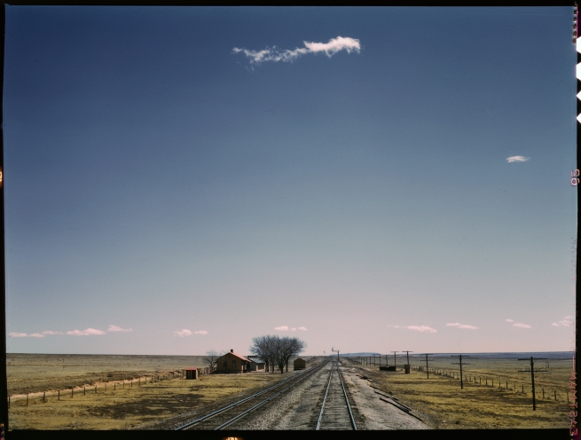
Jack Delano 1943 photo: courtesy of the Library of Congress
“Man has always made more or less straight lines,” landscape architect Daniel Urban Kiley once observed. “I’ve tried to make the spaces unfold, one into the other, like a walk in nature. Man — who is nature — is moving through the space too. So the organization of his mind and his movement are reflected in the landscape.”
Photo by Tom Bamberger
Kiley worked closely with and inspired the great Modernist architects of his generation, particularly Eero Saarenin. Saarenin, who designed the War Memorial (and was Calatrava’s mentor) often fought with his clients for Kiley’s radically simple plans. “There are plenty of good landscape architects,” the architect Harry Wolf said, “but there is only one Dan Kiley.”
Photo by Tom Bamberger
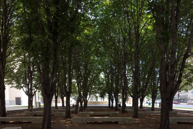
Perhaps you have luxuriated in the dense shade under Kiley’s horse chestnut trees off Kilbourn Ave. by the Marcus Center. “I have always thought,” Kiley says, “ it was some kind of superficial, sentimental, romantic corruption of man’s culture on the land, when he gets cute and throws trees around in a disorganized way.”
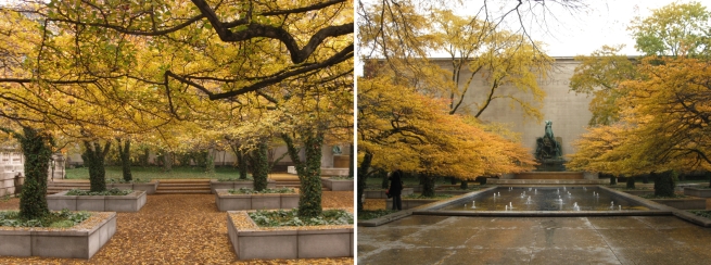
Dan Kiley, The Art Institute of Chicago (1967) Photos by Nancy Slade, courtesy The Cultural Landscape Foundation
Olmsted and Kiley were products of different centuries. Olmsted started Central Park before the Civil War and Darwin’s On the Origin of Species.
One of Kiley’s first big design jobs was to turn the Nuremberg Palace of Justice into a courthouse that tried Nazi war criminals in 1945.
Olmsted was steeped in the romantic English landscape painting based on the ideals of the beautiful and the sublime. Kiley is where Modern landscape architecture began.
The World Wars, Holocaust, and atom bomb had wiped the slate clean. Modernism was the result, the inevitable end of a series of failed marriages art had with gods, nature, the sublime, or anything else that saved art from itself. Art now had to stand on its own. Instead of importing meaning, Kiley simply made the thing itself.
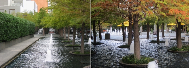
Dan Kiley, Fountain Place (1986) Photos by Charles Birnbaum, courtesy The Cultural Landscape Foundation
Clarity is serene. “To build is to imagine fresh possibilities,” Kiley told an audience gathered at Rockefeller University. “I’m always searching for the purest connection that holds us all together. Some form of sacred geometry.”
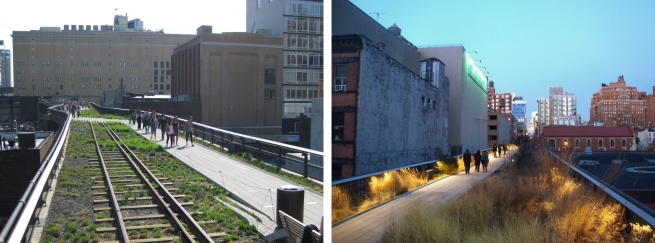
Photo Tom Bamberger The High Line, New York Diller, Scofidio and Renfro, Piet Ouodof, James Corner, L’Observatoire International, Pentagram Design, Inc.
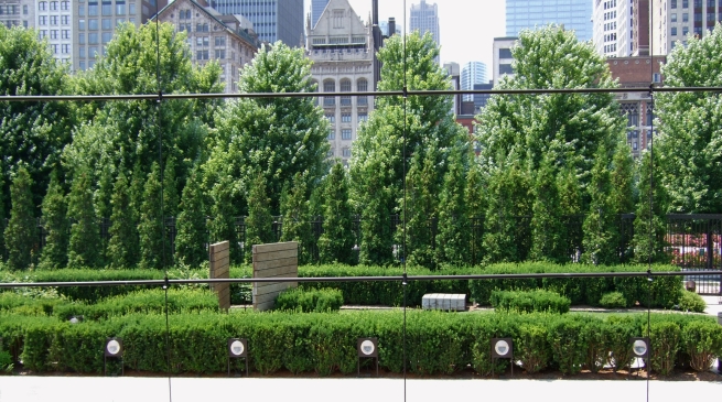
Photo Tom Bamberger Millennium Park, Chicago Gustafson Guthrie Nichol Ltd, Piet Oudolf and Robert Israel Jaume Plensa, Frank Gehry
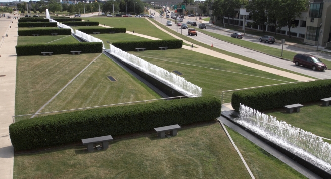
Photo Tom Bamberger Dan Kiley at the Milwaukee Art Museum
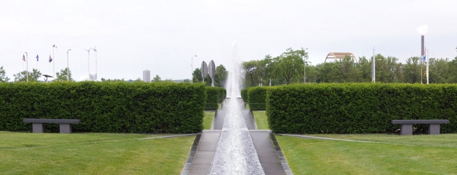
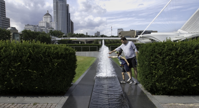
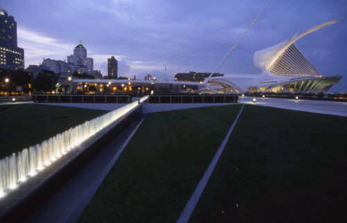
In Milwaukee, Kiley made a 470-foot horizontal line of water that runs between a series of “rooms” made of rectangles and triangles. On either side 50-foot fountains sprout in the middle of circles in a square plaza.
Tight geometric groves of trees flank the fountain. Different grasses were chosen to create depth.
His work is splendid as viewed from Calatrava’s bridge connecting Wisconsin Avenue to the lakefront, and dazzles as it races by at 30 mph on Lincoln Memorial Drive. Dan Kiley was 92 years old when he died in 2004, three years after this project was completed.
courtesy of the Milwaukee Art Museum
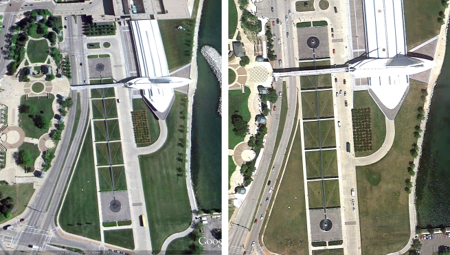
Kiley’s plan called for a third and larger grove of Nikko fir trees to run from Museum Drive to the Lake but it was never completed. There are no plans to finish the Kiley, according to Dan Keegan, Director of the Milwaukee Art Museum.
Photo Tom Bamberger
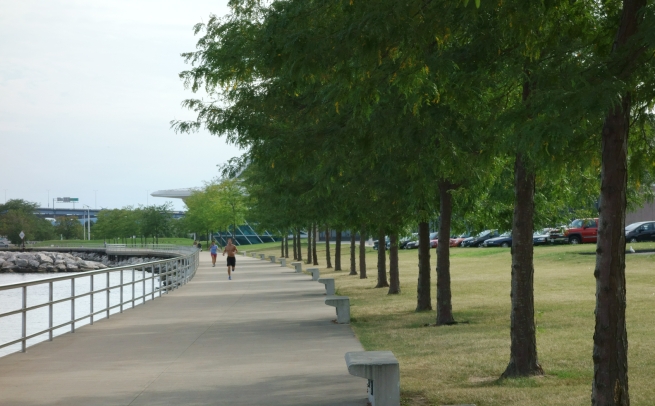
The paired honey locust trees and benches that modulate the path along the lake are Kiley’s too. We think Kiley’s work is just in front of the art museum, but actually his plan wraps around the entire Calatrava addition, from Lake Michigan to Lincoln Memorial Dr. and south to East Michigan Street.
Perhaps Kiley was inspired to contrast Calatrava’s Romantic symbolism with his austere Modernism. Whatever his thinking, they belong together now, each revealing the virtues of the other.
Photo Tom Bamberger
From Google Earth you can see just about everything went according to plan, except for the empty space where the third grove was supposed to go.
| 5.28.2010 | 8.30.2013 photos: Google Earth |
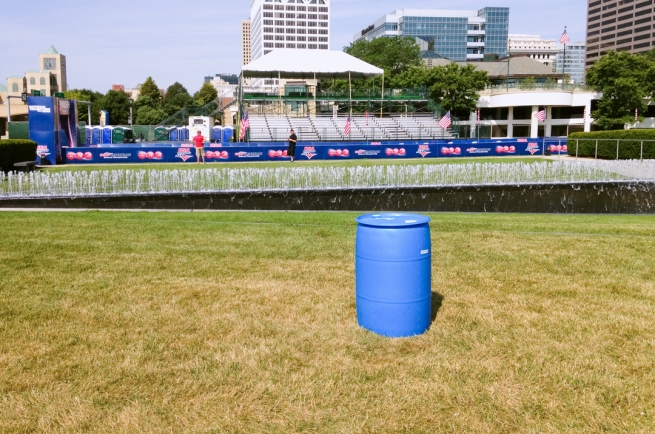
Why isn’t the grass of a master landscape designer given the same care as an above average suburban lawn? Plunking the Lake Festival of Arts on top of the Kiley every June has something to do with it. In September tents were set up for some other festival.
Photo Tom Bamberger
Photos Tom Bamberger
I have no recent memory of the fountain uniformly at the correct height, whatever that is. No one at the museum knows if Kiley left specific instructions.
Well, he always did. One of his instructions might read — replace the filters when the line of water becomes irregular. I just bought a vacuum cleaner with filters with similar instructions.
Courtesy Raycroft/Meyer Landscape Architecture
Sins of omission pile up. The fountain was originally illuminated, end to end. It was the most amazing line in Milwaukee until it stopped working in 2007. It hasn’t been fixed since.
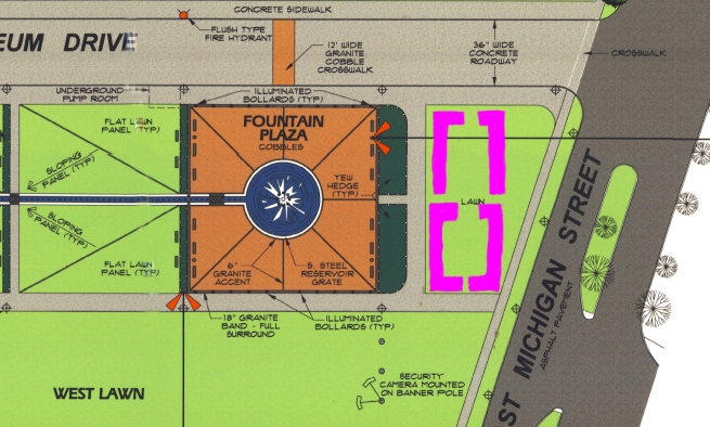
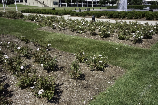
placement of rose bushes in Kiley’s fountain
Following that line of thinking, some Sunday painters might throw a splash of color on the museum’s Ad Reinhardt black painting. Like the spaces between trees in Olmsted’s parks, Kiley’s landscape doesn’t need anything else. Kiley called it a “lawn”. To add insult to injury, the Museum didn’t even follow his example and do a simple row.
Photo by Tom Bamberger
When Calvin Tompkins asked Kiley about flowers in a profile in the New Yorker, he sardonically replied, “flowers are wonderful, of course, but they are like finger nails on your body.” No, he wouldn’t have wanted rose bushes plopped in the middle of his work.
In fact, in a prospectus prepared for the Milwaukee Art Museum, Kiley wrote, “there will be no trees, no flower beds or other ingredients to relieve the elementally of the composition.” Like other minimalists, Kiley wants to re-calibrate our senses. The “unambiguous structure, the spatial energy will build up and be released. Minute variations of material, grade and light will become audible, much like the subtleties of poetry when one concentrates on the spare arrangement of words…”
Olmsted had a similarly dim view of what he called “decorative gardening.”
Thirty years after Calvert Vaux helped Olmsted to design Central Park, he observed to his ex-partner, “The great merit of all the works you and I have done is that in them the larger opportunities of the topography have not been wasted in aiming at ordinary suburban gardening, cottage gardening effects.”
Instead of filling in all the blanks with doodads, Kiley wanted “the scheme’s open nature” to let visitors “enjoy the energy of a unified spatial experience.”
That’s why one hires a landscape architect, by the way — to create a composition that is not improved by geraniums. The museum missed an opportunity to help people get over the design theory of our time that everything is better with a splash of color.
Photo by Tom Bamberger
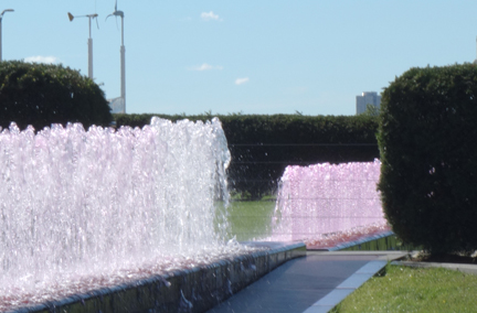
I wouldn’t color the water in the fountains or shine pink lights on a painting inside the museum. But Kiley’s landscape falls somewhere between an outdoor art work and a front lawn. Occasional playfulness like this isn’t going to hurt a great landscape.
Still, there is a limit, a line that is crossed where a work loses its stature and we lose respect for the art. After New York’s Lincoln Center replaced Kiley’s sycamores with fat pear trees, Kiley protested, saying this “severed the link between the architecture of the plantings and buildings that together form a civic space of integrity.”
“All those things have to be like a ski turn — correct.” Kiley said. “ I love the feeling that you should be like an athlete in everything. You should be in training, real, to be fully aware of what you’re doing.”
As for the decline of Kiley’s rigorously conceived and executed bushes and fountains, landscape architects I interviewed just sigh and say it always comes down to money. There are several motors (using lots of power) running the fountains, and filters to keep clean. It is no small job to keep nearly 500 feet of bushes pristine. To get the texture and shading of the grasses right requires proper fertilization and watering.
There is both a science and an art to maintaining this work, but most of all, someone needs to care. The museum paid $12 million for Kiley’s work, and it was one of the last great works by a great artist. Do we really want it to slowly degrade? To have a fully functioning and articulated landscape as Kiley intended would surely have great public relations value for the museum.
Ultimately, maintaining the character of great landscape is a test of our character as well. Living art often requires more of us than we are willing to give.
In Public
-
The Good Mural
 Apr 19th, 2020 by Tom Bamberger
-
Scooters Are the Future
 Dec 19th, 2019 by Tom Bamberger
-
Homeless Tent City Is a Democracy
 Aug 2nd, 2019 by Tom Bamberger









Wonderful article that hopefully gets some notice by the MAM powers that be.
I’ve often though the area just east of the south fountain plaza felt barren and ill-defined. Interesting to see that it was Kiley’s intent to create a grove of tress here. It would both create a gateway along Art Museum Drive and serve as a threshold along the lakefront path as you head south toward Discovery World. Seems like this omission could be easily realized with a little prodding.
Tom, one of your best pieces. Thank you.
It’s good to know that someone is keeping an eye on the ball.
If Milw wants to continue its positive press regarding one of our only contemporary landmarks, then the MAM has to address its lack of care of the landscaped area the complements the architecture. I’ve noticed the decline of the garden area. The money should not have been spent to build the Calatrava addition if it cannot be maintained in the manner in which it was intended. PLEASE ATTEND TO THE LACK OF LANDSCAPE CARE.
Great article. It reminds me of how important it is to describe/record the design intent of a project so that the owners don’t weaken the design ideas over time. Even then, there must continue to be local advocates weighing in on landscape evolution (Change is inevitable but must be guided in the right direction.)
There is a wonderful photographic retrospective of Kiley’s work on right now. It began at the Boston Architectural College and is now at the Building Museum in Washington, DC. It is sponsored by Cultural Landscape Foundation. I recommend it highly.