HSI/WiRED Properties Proposal Picked for East Library
The Milwaukee Public Library Board of Trustee’s Building and Development Committee met at the East Library on Wednesday night to hear final proposals from the three respondents to the East Library Redevelopment RFP. The committee heard presentations from Stonehouse Development, Gorman & Company, and HSI Properties, and asked a number of questions of each of their presentations. Following a closed session for deliberations, the Building and Development Committee voted to move the proposal from HSI Properties forward to the full Library Board.
Following a public meeting held by Alderman Nik Kovac (a Library Board Trustee) in September, all three applicants were previously granted additional time to refine their designs. This meeting provided each team with 20 minutes to use the projector to go over their design, and an additional 15 minutes for questions from the committee, and other trustees in attendance (as well as written questions from the audience as selected by Committee Chair John Gurda).
In attendance from the committee were Chair John Gurda, Vice Chair and Alderwoman Milele Coggs, Sharon Cook, Supervisor Theo Lipscomb, and Sam McGovern-Rowen. Also in attendance were Library Director Paula Kiely, Alderman Nik Kovac, and Board President Alderman Ashanti Hamilton.
What follows is an attempt to capture the highlights of each presentation, as well as the most significant questions.
Stonehouse Development
Stonehouse was the first group to present. Rich Arneson, Stonehouse Vice President, led much of the team’s presentation, with assistance from Mike Bahr and Scott Davis of Plunkett Raysich Architects. Arneson emphasized many of the firms green accomplishments during the presentation. He also highlighted Stonehouse’s experience with WEHDA financing, the route his firm proposed to go for their design.
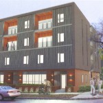
The architectural team highlighted the pocket park in their design along Cramer Street that would be available to the public. They also noted the library aspect of the project was supposed to be a modern interpretation of the facade on the former Pizza Man restaurant. The team has branded the window bays on the first floor as “windows on learning”, where children could sit and read. They noted that the tower piece on the corner of Cramer and North was inspired by the binding of a book.
The Stonehouse proposal included 80 residential units, 10 at market-rate, and 70 affordable units. The building was to be wrapped in eight three-bedroom townhomes.
John Gurda asked what was on the roof in the proposal, with Arneson noting the roof included solar panels, whose visibility could be adjusted.
Nik Kovac asked if a proposal of just market rate housing was considered? The response was yes, but that the funding as proposed in their response gave the best budget for the project. Kovac followed that up by asking about the mix between affordable and market rate, to which Arneson emphasized that the tax credits were a competitive process (a refrain that would be heard across all teams) and that to get the maximum number of points in the category a mix of 15% market-rate housing was needed, and that his firm had found a way to make 12% work.
An audience member, through a written comment, asked a series of parking questions. The response noted that parking was provided at a rate of one stall per unit, and that it would cost $60/month. It was also noted that the library parking would be separated underground from the residential parking. An additional question was asked about the proposed building’s height, to which the team responded it was a few feet below the zoning maximum at 54 feet.
A question about the location of the pocket park led the team to note that the building was designed to be built to the urban line in front, and that the park was used to break up the mass of the building.
Nik Kovac asked about the extra space in the building (1,200-1,500 square feet) as retail, to which the architectural team noted it was likely in the wrong spot for such a use, but could be redesigned.
- Stonehouse Revised Submittal (PDF)
- Stonehouse Revised Budget and Financial Projections (PDF)
- Stonehouse Original Proposal (PDF)
 |
 |
 |
 |
 |
Gorman & Company
The Gorman presentation was led by firm Development Manager and General Counsel Ted Matkom. Matkom noted that the firm has an in-house architectural team as well as general contracting and property management teams. He admitted the firm’s initial design was lacking. He noted that they have now teamed with Eppstein Uhen Architects, to which President and CEO Greg Uhen was on hand to assist with the presentation. Matkom noted numerous other projects they have completed including the recently opened Villard Square Branch of the Milwaukee Public Library.
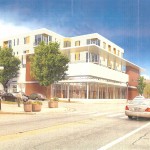
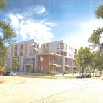
The design of the proposed 4-story building was shown to include a courtyard on the east side for residents, as well as town homes and all of the parking located completely below grade. The building was designed in a C shape, because of the uncertainty of what could be located to the east of the building in the future. A landscaped outdoor green space along Cramer Street was included for the library, as well as an optional second story patio and community room (would be converted to more units if the library elected not to purchase it). The goal for the project was to achieve a LEED Silver rating.
The building was to include (under their WHEDA funded model) 73 units, 57 one-bedroom units, 8 two-bedroom units, and 8 three-bedroom units, with a 68 to 5 split between affordable and market-rate units. The market rate proposal would have included 80 units in the form of 21 studio units, 43 one-bedroom units, 8 two-bedroom units, and 8 three-bedroom units. In both models, 85 parking spaces for the residents would have been included, as well as 41 for the library.
The truly unique aspect of Gorman’s proposal was that they were asking the library to pay $1,958,000 for the library space. This led to a series of questions for clarification where Ashanti Hamilton asked for a detailed explanation noting that “I must be slow”, and a follow-up question from John Gurda where he noted “I must be slower than Ashanti”, as well as questions from other members of the committee. Matkom noted that although on the face of it giving the land away (valued at roughly $2 million) for in exchange for a roughly $1.5 million library shell makes sense, in reality the value of the land is never realized by the developer because the library shell goes back on the land. Matkom noted that the rents would feasibly only cover the cost of construction, and that they had worked hard, but couldn’t make the numbers work. In response to a question from Hamilton, Matkom noted that yes, it is as “bad as it sounds”, the bottom line is that the library would need to come up with $2 million for this deal to work.
For posterity’s sake, Gorman broke down the cost of the library shell as follows.
- Cost per SF: $75
- Shell construction cost: $1,233,000
- Rooftop improvements: $125,000
- Library underground parking: $600,000
- Total: $1,958,000
Milele Coggs asked a question about the “band” that wraps the front of the building, and what could be done with it. The team responded that it could be made up of any number of materials, and that it could be used for a variety of things including public art.
Nik Kovac asked about cost savings if the library didn’t want the second floor space, Matkom noted that this would shave about $200,000 off the cost of the shell.
- Gorman Revised Submittal (PDF)
- Gorman Revised Budget and Financial Projections (PDF)
- Gorman Original Proposal (PDF)
 |
 |
 |
 |
 |
HSI Properties
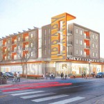
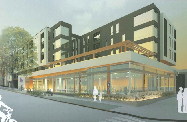
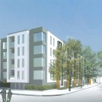
Blair Williams, of WiRED Properties, led the presentation for the HSI team (the confusion between the two developer’s partnership was addressed later). The team also includes Engberg/Anderson who designed the Villard Library (as well as the Bay View Library and over 90 other libraries). Williams began by noting that he lives only a few blocks away, and that this is the library he brings his daughter to. He stated his believe that a market rate project is the best fit for the neighborhood. Like the other teams, he indicated this was a challenging project, stating that the “biggest challenge is you extract no value from the land the library sits in.”
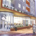
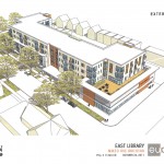
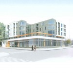
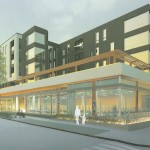
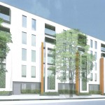
Mark Ernest from Enberg Anderson noted that his firm did the 1999 master plan for North Avenue, and that the design follows the proposed architectural review board (one can rest assured there will be more on the proposed board in future articles). He also noted that his firm proposing using the existing stained glass in the building (if you look close, it’s there), more prominently in the facade of the new building.
Blair Williams highlighted that the development would include an option 2,500-5,000 of retail space on North Avenue, set back slightly so that the library was the most prominent feature. He noted that they were open to deed restrictions on the retail stall.
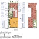
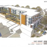
The HSI proposal includes two unique aspects, developing the building with only market-rate units (through HUD financing support) and surface-level library parking. The U.S. Department of Housing and Urban Development (HUD) financing support, something Williams noted HSI has experience through a recent project in Wauwatosa, would come in the form of a loan guarantee from the Section 221(d)(4) mortgage insurance program. Williams noted that while the loan guarantee is not a for sure thing, there is a very good reason to believe the outcome of the process will be positive. He stated that the guarantee’s are awarded as part of a competitive scoring process, and that one of the criteria is density. Noting that “the least expensive floor you build is the next one”, he explained that since their initial proposal they added a floor to increase the density of the building. Williams did state that the HUD process could take 10-12 months, and that final design would need to be completed before the final application was made.
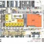
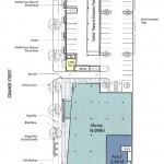
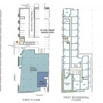
The library parking is proposed to be located at the surface level behind the library, as it is currently. Similar to WiRED’s development in Shorewood (The Cornerstone, noted for its most visible tenant, Alterra), the parking entrance will be located in the middle of the building, and the building will span the entrance. The decision was made have street-level parking based on a perceived preference of Milwaukeean’s to park at street-level, as well as the ability for library officials to keep watch over the lots, and the ability to avoid any takeover by default of underground library stalls by residents.
Paul Kiely asked about the two developers, to which Blair noted they both “block and tackle”, but that they each bring their own specialties. HSI brings a lot of financing experience to the table, including experience with HUD, and WiRED brings multi-family experience. He said they are in many respects “co-developers”. The HSI representative in attendance nodded in agreement.
Nik Kovac asked about the surface parking being a design or finance decision. Williams indicated that although it was marginally cheaper (the length of the property is still residential parking underground), it was a design decision. Anticipating a second question from Kovac, he also noted that they didn’t use town houses because they are loss leaders, and there is a security problem “perception” of having your front door right at ground level. Williams noted that many of the homes of the East Side do not have entrances only a step or two off the street.
- HSI Revised Submittal (PDF)
- HSI Revised Budget and Financial Projections (PDF)
- HSI Original Proposal (PDF)
Moving Forward
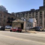
Following a closed session to deliberate on the proposals, the Building and Development Committee voted to move forward the HSI Properties proposal. This proposal will now go before the full Library Board. It would have been interesting to be in the room to listen to the deliberations over the Gorman proposal, who appeared to be sounding an alarm about the financial viability of the project as conceived. If the project fails to get off the ground, it will be interesting to see if a revised RFP will emerge with terms similar to what Gorman proposed.
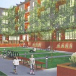
It is important to note that the HSI design is not final, and is likely to be slightly adjusted as the project moves forward. There were, however, no significant reservations about it raised, although there was debate about the lack of green space. Also noteworthy, under HSI’s timeline the new library would not open until 2014.
Best of luck to HSI, WiRED, and Engberg Anderson as they move forward.








Thank you so much for providing this summary- great to understand all of the proposals better. It will be interesting indeed. The disparity in financial projections is somewhat alarming and does raise viability concerns. That said, WIRED has done some smart things in Shorewood, so I am hopeful they will be successful in moving this forward and I appreciate their willingness to take it on.
It’s difficult to be objective about this because it’s like a hungry person going to a buffet dinner, everything looks good when you look at the God-awful building that’s there and the poor use of the space.
Nice job of informing us. Thank you
Knowing that the committee met behind closed doors… Did they give any statements or insights as to why they went with HSI?
I always hate being a “negative nancy” but it seems to me as if they went with the worst design, so I would have to agree with Gomez in wondering about any statements regarding the decision process.
And by worst design, I mean that the building kind of turns a cold shoulder to the street. Stonehouse and Gorman both have interactive designs with green space and townhouse type units to provide something to Cramer and Thomas besides a cold wall and parking lot.
I think, overall, we all would have liked to see something a little bit more interesting for our neighborhood…
I agree that this is the worst design of the three. Their first design was a concrete wall along Cramer. Now they have added windows to that wall. Hardly a great solution to criticism that the building failed to be interactive with the street. The other two designs has green space and townhouses to provide this interaction. I also take offense at HSI saying there is a “security perception” of having town houses at street level. We do not need another building in this neighborhood which literally “turns it back” to the neighborhood with a concrete wall and fake window. I am also concerned about the project taking until 2014 to be completed! This is a very disappointing decision by the Library Board.
I don’t see how they could easily compare all three financing packages to determine which was the most likely to move forward. So that leaves desig or tenant type. Stonehouse was the only one pushing “affordable” housing and I wonder if that turned people away to the other proposals. Both Stonehouse and Gorman appear to have provided something interesting at street level… where the HSI team provides just a two level parking ramp.
I think this is the best design of the three, espeically from North Avenune. Not thrilled really with any of the choices and believe we can do better with another round of proposals. But out of the three, HSI is the best. The other two lack imagination. Gorman’s looks like a generic middle school gymnasium from North Avenue and Stonehouse’s four story “Library” billboard is at once childish and insulting. The colors, materials and form of the HSI proposal in my opinion will set a better tone for future development in the area, while providing a quality setting for a new library.