
What Can School District Report Cards Tell Us?
Despite an improved score for MPS, many problems remain.

School classroom. (Pixabay License).
Nearly every year since 2012, the Wisconsin Department of Public Instruction has issued “School report cards“ that rate Wisconsin schools (and school districts) using a variety of measures. The measures are grouped under achievement, growth, target group outcomes, and on-track to graduation.
The weighting of the measures in calculating an overall score varies from school to school, and district to district. For example, MPS makes achievement contribute to 5% of the final score versus 45% for growth. Scores for wealthy suburban districts, by contrast, may have weights of 42% for achievement and 8% for growth.
When COVID-19 hit in March of 2020, most schools closed and then went to virtual learning. As a result, the report cards were skipped in the 2019-20 school year that started in July 2019 and ended in June of 2020. Despite some grumbling from educators, they were resumed for the following school year, that which ended last June.
How consistent were the new scores with those two years earlier? The scatter plot below compares school scores throughout Wisconsin in 2019 with those for the same schools two years later. The 2019 scores are on the horizontal axis, and those for 2021 are on the vertical axis.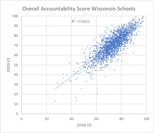
The coefficient of determination (R2) is commonly interpreted as showing the percentage of variation in one variable (the 2021 scores) that can be explained by the variation in the other variable (the 2019 scores). Thus, about 66% of the variation in 2021 school scores reflect variation in 2019 scores.
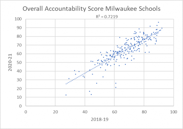
The next graph compares the scores for schools located in Milwaukee over the two-year period. The coefficient of determination, at 72%, is a bit higher, suggesting that schools that were doing well before the pandemic were still succeeding after a year of living with the COVID-19 pandemic. Likewise, schools struggling before were still struggling after.
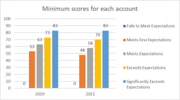
 DPI converts the total score for each school and district into an Overall Accountability Rating. In response to the pandemic, it lowered many of the scores needed to achieve a given rating. The graph below shows the minimum scores needed for each rating before, on the left, and after, on the right. For example, a school with a 71 score would “meet expectations” under the old cutoffs but “exceed expectations” using the revised versions.
As Terry Falk points out, for the first time, MPS is reported as meeting expectations. However, its score declined slightly, from 58.4 to 58.1.
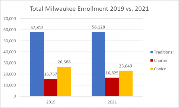
 Data used in the school report cards can also be used to estimate the enrollment trends in the three major categories of Milwaukee schools: traditional public schools under the control of the school board, charter schools under their own boards, and private schools whose students may have received financial support under the Milwaukee Choice program.
This calculation, as shown below, suggests that both the traditional and charter schools had enrollment growth, but the choice schools had a 2,500 decline in the number of students. This would suggest a reversal of past trends.
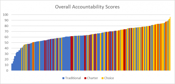
 The next graph ranks the schools in order of increasing overall score. While there are exceptions in both directions, the left side is predominantly blue, suggesting a predominance of traditional public schools, while the right is predominantly yellow because of the large number of choice schools. (Click here for a critique from City Forward Collective of some of the design decisions made by the DPI with regard to the school report cards.)
The bottom 14 schools are all traditional MPS schools. The large comprehensive high schools are particularly challenged.
Conversely, of the top 20 schools, three are traditional public schools and three are charters. The remaining 14 are private schools that participate in the school choice program.
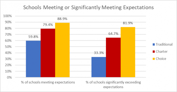
 The next graph, showing the percentage of schools of each type rated as “meeting expectations” or better (on the left) or “significantly exceeding expectations” (on the right) tells much the same story.
 Consider the Marvin Pratt School on Milwaukee’s north side. Demographically, it is the perfect model of MPS’ struggling inner city schools with a student population 91% black and 93% of its students “economically disadvantaged.” For years, under the name Silver Spring School it performed about how one would expect. Then it gradually climbed up (under a principal who has since been hired by Shorewood) until it has the highest score of all MPS schools and the fourth highest of all schools in Milwaukee, driven by the highest possible score of growth. Studying what happened at Pratt might be a place to start.
One place to start might be an intense study of what happened at Pratt.
Part of a strategy for a more effective MPS is for it to become a data-driven organization. But that is not enough. It is very hard for children to concentrate on learning math or reading when there is not enough to eat or their parents cannot pay the rent. Thus, the economic parts of legislation in President Joe Biden‘s Build Back Better are also pieces of the puzzle.
Clarification: The state DPI website for the Milwaukee Parental Choice Program reports flat enrollment over this period: 28,343 in 2018-19 and 28,454 in 2020-21. That discrepancy from the numbers reported is this column has two main causes:
- The analysis above was limited to schools within the city of Milwaukee. Thus, Choice enrollment in suburban schools was not included in this analysis.
- For some reason, DPI did not create a 2020-21 school report card for the St. Augustine. Thus, its 1,300 students were not included in the 2020-21 data.
If you think stories like this are important, become a member of Urban Milwaukee and help support real, independent journalism. Plus you get some cool added benefits.
Data Wonk
-
Who Do You Trust to Conduct Elections Fairly?
 Apr 6th, 2026 by Bruce Thompson
-
Is Non-Citizen Voting a Real Threat to Elections in Wisconsin?
Mar 18th, 2026 by Bruce Thompson
-
How Global Climate Change Affects Milwaukee
 Mar 11th, 2026 by Bruce Thompson


One point in defense of MPS traditional schools is that this data is largely about the response to COVID-19. It is not entirely fair to compare smaller, more independent and more nimble charter and voucher schools to the more massive body of MPS traditional schools. However, this ability to react to change might be something to consider in the future.
These numbers are unfortunate and overwhelming that MPS must be broken up. The children must be allowed to attend charters and private schools using vouchers from the taxpayers. This is the civil rights movement of our time!
What is the source for choice enrollment? Not in synch with DPI data. https://dpi.wi.gov/sites/default/files/imce/parental-education-options/Choice/Data_and_Reports/2020-21/2020-21_mpcp_facts_and_figures.pdf
The State of Wisconsin has had to send hundred of millions of dollars to choice and charter schools under the proposition that “competition” will improve school outcomes even when choice schools are not transparent like public schools and public schools get the more challenging students. Educational outcomes have not significantly changed over the last two decades. Marvin Pratt School is regularly recognized for its achievement but no educational or media entity has gone to the school to find out what is working. The State should finance a review of all schools with high achievement levels in areas of high poverty that do not have an enrollment bias that intentionally recruits high achieving students and report their findings.