
The Scott Walker Economy
The final data on GDP, jobs, unemployment: how we did compared to nation, Midwest.
Scott Walker speaking at the 833 East groundbreaking event in downtown Milwaukee in 2014. File photo by Jeramey Jannene.
Forty years ago, in the early days of the Ronald Reagan administration, a new economic model emerged full force. Called “supply side economics” by its supporters (and “trickle-down economics” by its detractors), it argued that the key to economic prosperity lies in lower taxes, especially the taxes paid by very wealthy people. It was asserted that lower taxes lead to more economic activity by freeing funds for the private sector to invest and by making those investments more attractive.
In its most aggressive form, supply-side economics claimed that tax cuts pay for themselves, that a more dynamic economy would generate new tax revenue to completely replace the lost taxes. The economist Arthur Laffer demonstrated this with his “Laffer curve” aimed at demonstrating that taxes collected fell as tax rates rose. This theory attracted followers because it promised a sort of free lunch: no longer did government leaders have to choose between low taxes and good schools.
While possible in theory, in practice examples of Laffer-curve tax effects are very hard to find.Yet, although it was solidly debunked, this supply side economics theory remains widely influential, especially on the right. Treasury Secretary Steven Mnuchin insisted that President Trump‘s tax cut would pay for itself by sparking economic growth. Contrary to Mnuchin’s claim, Trump’s tax cut substantially increased the federal deficit.
Two governors, Sam Brownback in Kansas and Bobby Jindal in Louisiana, took their states down the supply-side rabbit hole. The subtitle of a Forbes article, “The Great Kansas Tax Cut Experiment Crashes And Burns,” sums up what happened there. An account by the editor of the American Conservative describes the collapse of Louisiana’s economy along with Jindal’s political ambitions. Here is a look at what happened to jobs in those two states: they badly trailed the U.S. growth in jobs (the top line) as did Wisconsin (red line).
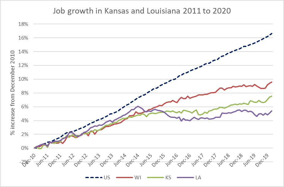
Job growth in Kansas and Louisiana 2011 to 2020
Despite these debacles, Laffer and his colleagues remain widely influential on the right. Every year, the conservative American Legislative Exchange Council (ALEC) publishes its Rich States Poor States report in which states are rated for their “economic outlook.” States are downgraded for having progressive taxes, inheritance taxes, high marginal tax rates, and so forth. Arthur Laffer is the lead author. Here is how Kansas, Louisiana, and Wisconsin fared over the years in this rating system (note that the vertical scale shows ranks, so 1 is highest, 50 lowest): Wisconsin suddenly gets much higher rankings after Scott Walker takes office in 2011.
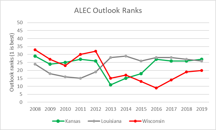
ALEC Outlook Ranks
Walker won the 2010 governors race in part by promising to add 250,000 jobs by the end of his first four-year term. While it is well known that Wisconsin fell far short of the goal, adding about half the promised number, the more interesting question is what effect, if any, did Walker’s administration have on the Wisconsin economy?
In defending his jobs record while governor, Walker would often compare current job numbers to those at the start of his term or at the height of the Great Recession. Not surprisingly, they were up—but so was everyone else’s, as shown in the table below. This compares Wisconsin’s jobs since 2011 with neighboring states, Michigan, Minnesota, Illinois, and Iowa, as well as the US as a whole.
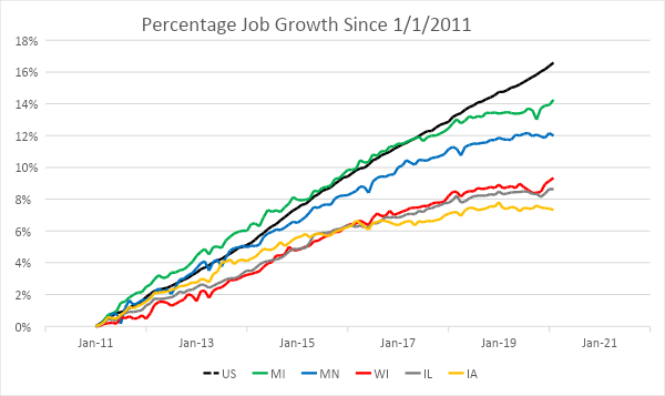
Percentage Job Growth Since 1/1/2011
Here are a few observations from this chart:
- Wisconsin (in red), with a Republican legislature and governor for most of this period, presents a tempting contrast to Minnesota (in blue), with a Democratic governor and legislature for most of this period. How much can be attributed to the difference in policy and how much to differences in the state economies?
- For much of this period, Illinois (in gray) has closely tracked Wisconsin. Yet Illinois has been plagued by the nation’s worst funded public employee retirement plan, resulting in threatened college shutdowns among other problems, while Wisconsin’s retirement plan is considered one of the best funded. Why isn’t Wisconsin doing substantially better than its neighbor?
- The auto industry’s near death in the recession, and recovery since, likely accounts for Michigan’s (in green) outstanding apparent performance on the chart. Employment at the beginning was depressed but bounced back as the automakers recovered.
- Iowa’s (in orange) performance is likely explained by the relative prosperity of agriculture during the recession with strong exports to China, followed by the farm crisis exacerbated by Trump’s trade wars.
- Job growth in all five states seems to have flattened in recent years, even as growth has continued nationally (in back dashes). Perhaps all five share Wisconsin employers’ complaints about the shortage of potential employees. Thus, the limiting factor has switched from jobs to workers. (Note that these counts run through February of this year so that they don’t show the effects of the developing coronavirus recession.)
The next chart shows the growth of real gross domestic product for six Great Lakes states: Wisconsin, Illinois, Michigan, Minnesota, Indiana and Ohio. Wisconsin’s GDP growth lags that of Michigan, Minnesota, and Ohio, but exceeds Indiana and Illinois.
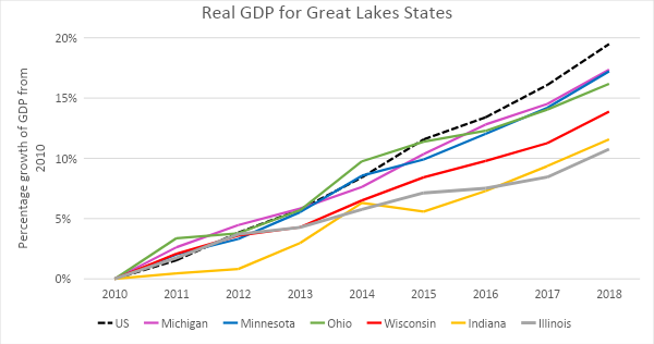
Real GDP for Great Lakes States
The next chart shows unemployment rates in Wisconsin, Minnesota, Michigan, Illinois, and nationally since January of 2011. All four states, and the nation, seemed to be converging on unemployment rates around 3.5 percent on the eve of the the latest downturn.

Unemployment Rate Since 1/1/2011
The next chart shows manufacturing jobs in the upper Midwest over the period starting in 1990. Recent recessions have hit those jobs hard. Again, it would appear that Michigan’s sharp increase following the last recession reflects the auto industry’s near-death experience.
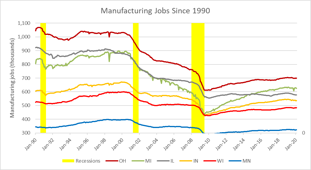
Manufacturing Jobs Since 1990
While no two states are identical, the upper Midwest states share similar economic characteristics. While some are more industrial than others, historically industry was very important, as was farming. In general, during the Walker years, Wisconsin performed near the bottom among its peers. Near, but not at the bottom: that role was played by Illinois by most measures and it’s easy to point to a likely culprit: a historic unwillingness to fund its public employee pension.
Instead of picking one or another state to model Wisconsin’s economy with a different governor and legislature, we can use regression analysis to model Wisconsin’s economy in the pre-Walker era and then apply that to the era after he took office. The underlying assumption is that while the other states don’t act exactly like Wisconsin, they do respond similarly to similar pressures. When Minnesotans lose their jobs, so do Wisconsinites, but not necessarily in the same amounts.
The figure below shows the actual Wisconsin jobs (in black) in the years since 1990 as well as Wisconsin governors in those years. The regression model (shown in yellow) was aimed at getting the best possible fit to the Wisconsin jobs in the years from 1990 through 2010, using only jobs data from six other states.
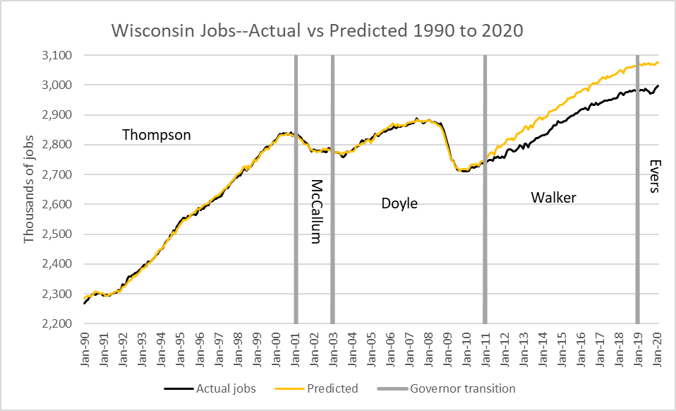
Wisconsin Jobs–Actual vs Predicted 1990 to 2020
As can be seen in the figure, the predicted jobs closely match the actual jobs in the pre-Walker era. This visual impression is confirmed by the coefficient of determination of .999, meaning that 99.9 percent of the variation is explained by the model.
It turns out that two of the states are not needed: Illinois and Ohio fail the test of statistical significance at a 95 percent confidence. The states that do go into the prediction are Minnesota, Indiana, Iowa, and Michigan, in order of importance.
Using that model, we can then project jobs in Wisconsin for years following 2010. Like any model applying this to future events assumes that the fundamental relationships between Wisconsin and the other states does not change. If, for example, oil were discovered in Wisconsin, and not its neighbors, one would first look at the oil discovery when trying to explain why the model no longer works. The Great Recession, by contrast, affected every one of the seven states and generally in the same direction.The most obvious explanation for the gap between the prediction and the actual Wisconsin job numbers is that Walker and his associates rode into town and radically changed the relationship between Wisconsinites and their government. This would lead to the conclusion that Walker’s policies depressed Wisconsin jobs.
In preparing this column, I had hoped to find an analysis by one of the several Walker supporters that took the available data to show that Walker left Wisconsin a better place. I failed. Simple assertions, such as “the statistics of Wisconsin’s economy are quite impressive, and we must thank Gov. Scott Walker and the legislature for their hard work in turning this state around. The reforms put in place have created an environment that is richly successful for businesses of all sizes” doesn’t prove anything. Neither do comparisons of recent job numbers against those at the height of the Great Recession.
The myth that Walker’s policies turned Wisconsin around still evokes emotional support among many ideological conservatives and is therefore dangerous. The more likely story is that Walker took power in the national recovery and rode it all the way up, yet trailed both the nation and nearby states in economic growth and job creation.
If you think stories like this are important, become a member of Urban Milwaukee and help support real, independent journalism. Plus you get some cool added benefits.
Data Wonk
-
Who Do You Trust to Conduct Elections Fairly?
 Apr 6th, 2026 by Bruce Thompson
-
Is Non-Citizen Voting a Real Threat to Elections in Wisconsin?
Mar 18th, 2026 by Bruce Thompson
-
How Global Climate Change Affects Milwaukee
 Mar 11th, 2026 by Bruce Thompson


Another great analysis by Bruce Thompson. I am always amazed at how voters in rural areas are so loyal to the Republican Party even when economic develop in rural areas is ignored at the same time their schools are underfunded. Of course the Republican leadership will have some mythical elite to blame for their situation.
Good article. The segment data matters. It is enjoyable to have restaurant and microbrewery options, but the economic value creation is in other sectors that create real sustainable GDP to spend money in the others. An example is technology driven industry development which takes time. Assessing investment in this area and comparing that to other regions would be helpful. Thank you