‘Attractive’ Facade Changes for Historic Tied House
Also, more on the coming Streetcar Smart Kiosks.
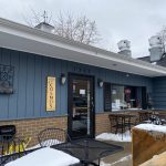
The spread of COVID-19 has shut down much of the activity in Milwaukee, including that in taverns like the Tied House, which occupies a historic 1904 former Pabst Brewery Saloon building at 124 N. Water St. Likewise, the statewide restrictions on gatherings of more than ten people led to limited attendance at the Historic Third Ward Architectural Review Board, which met at its offices at noon on Wednesday, with a few members there in person, while others, including this observer, participated via telephone.
After a few formalities, including a roll call of the seven members (all present by one means or another) and the approval of the minutes of the previous meeting (held in November), the first order of business was to review proposed modifications to the Tied House facade.
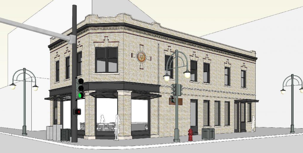
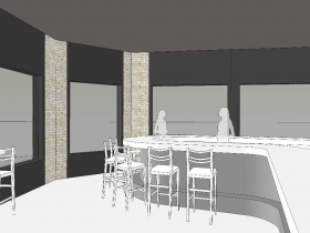
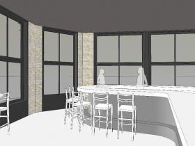
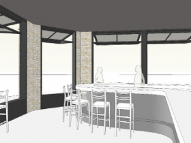
John Vetter, the principal of Vetter Architects represented Alliance 37, an Illinois company that bought the building in December, 2017 for $1,158,100. His charge was to “make it more attractive physically and visually. … enliven the corner. … create a visual connection,” with the street and interior of the tavern.
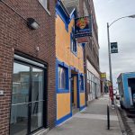
His solution: A fully openable window assembly of bronzed aluminum. During summer the windows would open to their full height of about 11 feet. They would be glazed in clear glass, rather than the existing tinted windows. Currently more than one-third of the original opening is closed with plywood panels above and below. Currently, “the blackened glass does not allow transparency to the interior of the building.” His plan would open them up to their historical size. … When closed, the windows will be much more in keeping with what the building was originally,” he said.The classic Pabst tavern originally had its door on the corner of the building, as was customary for such places. The door has not been in use for decades. By the 1970s or earlier it had been bricked up. A renovation in the 1980s replaced the bricked up door and boarded up windows with the current configuration. Then the M&M Club, it was the first gay bar in the city with windows, albeit tinted.
Architectural Review Board members asked if the door could be returned to the corner. Vetter said it would be impossible to do so, due to the configuration of the bar within, which runs to within a few feet of the corner. The current door, which is solid and located on the E. Erie St. facade would be converted into a glass storefront door, and would have an enhanced canopy. The building would also have LED lights projecting up and illuminating the facade of the structure. After further discussion, the proposal was approved unanimously.
Renderings:
New Storefront for Renaissance Building
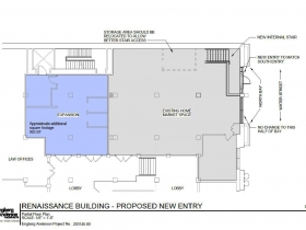
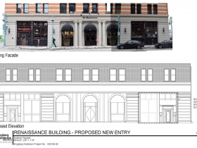
The second order of business was also a facade change, this time for the Renaissance Building, a former 84,000-square foot factory at 300 N. Water St. that now is mostly offices with retail on the first floor and a riverfront event space in the basement. The building lobby is accessed via an entry in the center bay of the building, while the southernmost bay has a separate street entry for the retail space there. A similar modification is to be made for the retail space on the north bay, now accessed only from the lobby.
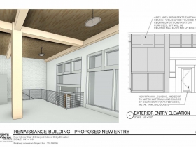
Jeff Hanewall of Engberg Anderson Architects represented the owner of the $9,773,600 (assessed valuation) building. Hanewall is a former member of the Village of Shorewood Design Review Board, so he was familiar with the drill. The new entry, he said, would match the existing southmost bay. “Visually there would be very little change to the building other than this new door. Materials will all be the same — untinted glass. The existing sign will not change, there would be no added lighting. It is conceivable that we won’t even touch the south half of (the north bay). … It may be required that we have to take some of it away to do the work, but would be restored as is. It might be touched if we have to, but it is not our intention to touch it.” The building would ultimately have a symmetrical facade. The new entry would be a stained wood door, like its neighbor to the south. “Literally a duplication,” he said, with little enthusiasm about that particular detail, which predated his involvement with the structure. He would have preferred something a bit more in keeping with the character of the building, “but that’s what they have.” The motion for the changes was approved unanimously.
Designs:
“Smart Kiosks” to Provide “Wayfinding” Near Third Ward Streetcar Stops
The third and final item on the agenda was an informational presentation by Jeff Polenske, the City of Milwaukee Commissioner of Public Works. Polenske oversees The Hop streetcar system, which has three stops in the Historic Third Ward on E. St. Paul Ave., one of which, while located on the west side of the Milwaukee River, outside the Pritzlaff Building, is nonetheless within the borders of the district, and thus under the purview of its Architectural Review Board.
“It was always intended to have some form to communicate with the public the next vehicle type information and other pertinent information. We saw what Kansas City did, and that’s exactly what we are doing here. Start with kiosks at the stops, and then add others in walkable distance off the route,” he said.
“Finally, it certainly provides a revenue source for us to support our streetcar operation. There is definitely an option through the smart kiosk for advertisements. We landed on Smart City Media as the best option for us. … These are digital kiosks, fully interactive with the public. So it is like a large smartphone. You will be able to go up and touch the screen. Not just the streetcar information, but what’s around you. We intend to have 35 installed in the initial phase, early summer. The intent is to have these things installed sometime in the spring or early summer.”
The kiosks will have event calendars, allowing local businesses to be on the kiosks for free. They would coordinate with similar kiosks proposed for downtown, north of the Third Ward. “A visitor would know it is a way-finding sign. It would have a voice-activated option and be of the same color consistently.” Members were shown confidential illustrations of kiosk proposals, the design of which was not yet finalized according to Mark Rosenberg of 2-Story, a Milwaukee design and advertising firm that is working on the project. As this was an informational presentation only, no vote was taken.
There being no further business, the meeting was adjourned at 1 p.m.
If you think stories like this are important, become a member of Urban Milwaukee and help support real, independent journalism. Plus you get some cool added benefits.
Plenty of Horne
-
Peter Mahler Leaves MSO Board
 Feb 23rd, 2026 by Michael Horne
-
Epstein Was Invited To NYC Fundraiser Featuring Scott Walker
 Feb 7th, 2026 by Michael Horne
-
Milwaukee Man Cited 393 Times in Epstein Files
 Feb 4th, 2026 by Michael Horne


