
The Problem of Low Wage Workers
The data is very revealing. Can it point to solutions?

Burger King
For the last few decades, economic inequality has been growing in the United States. A large number of employed workers receive pay that leaves them scrambling to support their families. Without changes in government policies, such as raising the minimum wage and expanding the earned income tax credit, this situation is likely to persist and get worse.
A recent report from the Brookings Institution Metropolitan Policy Program helps to quantify data on America’s low-wage workforce. Although the report itself does not mention Milwaukee, an accompanying database gives information on 373 metropolitan areas, including Milwaukee and several other Wisconsin cities. Note that the Milwaukee metropolitan areas encompasses four counties—Milwaukee, Waukesha, Ozaukee, and Washington.
Martha Ross and Nicole Bateman, the authors of the Brookings studies, defined “low-wage” as those making less than two-thirds of the median wage for full-time/full-year male workers. They adjusted this number for the local cost of living, so that the average threshold of $16.03 per hour in 2016 real dollars ranged from $12.54 in Beckley, West Virginia. to $20.02 in San Jose, California. The distributions of thresholds for large metros, including Milwaukee at $15.34, and small metros is shown below.
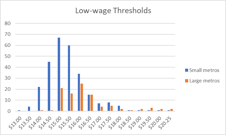
Low-wage Thresholds
The variation in cost of living helps explain why more low-wage people don’t pick up and move to somewhere that pays better. The authors refer to a study that found that a janitor in New York City earns nearly 30 percent more in nominal pay than one in Mississippi, but the New York janitor has 7 percent less buying power when housing costs are considered.
The Brookings study makes other choices about who to include and who to exclude from the sample. It restricts its focus to people between the ages of 18 and 64 and excludes graduate and professional students as well as most traditional high school and college students, as well as self-employed people. However, it included groups excluded from other studies, such as people who may have worked for only part of the year.After the various inclusions and exclusions, the study found 122 million workers in the US. Of these, 69 million (56.3 percent) are mid to high wage and 53 million (43.7 percent) are low wage. The proportion of low-wage workers varies from one metropolitan area to another, from a low of 29.7 percent to a high of 61.9 percent of workers. Conversely, the proportion of mid to high-wage workers varied from 38.1 percent to 70.3 percent.
The vertical scale in the graph below shows the percentage of mid to high wage workers in each of the metropolitan areas, with cities in this state noted. This is compared, on the horizontal axis, to the percentage of residents with a bachelor’s degree. The black dot shows the national average.
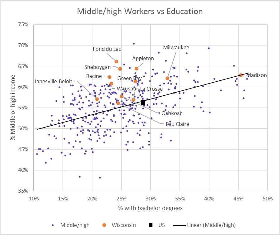
Middle/High Workers vs Education
The black line is the trend line, showing that, in general, metros with a higher education level also have a higher proportion of workers with middle to high wages. However, the wide scatter reflects the weakness of the relationship.
Wisconsin metros, shown with orange dots, have a proportion of middle to high-wage workers substantially higher than their education level would predict. Clearly, education does not tell the whole story.
The next graph compares the percentage of low-wage workers to the fraction of the population between 18 and 64 in the workforce. The down-sloping trend line implies that the higher the rate of employment, the smaller the size of the low-wage segment. The black dot shows the average, meaning about 44 percent of workers in the country are in the low-wage category.

Percent of Low-wage Workers vs Employment
The next chart blows up the lower right-hand portion of the previous chart to allow space to label the Wisconsin metros, shown in orange. Notably all the Wisconsin metros fall in this section, with a larger than average employment rate and a smaller than average low-wage worker segment: all have lower percentage of low-wage workers than the national average of 44 percent.
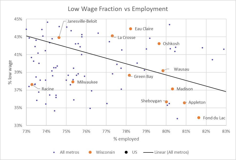
Low Wage Fraction vs Employment
The next chart compares the percentage of workers in the low-wage segment to the population of the metropolitan area. The trend line suggests a weak negative relationship between the size of the city and the proportion of low-wage workers. The Wisconsin metros fall below the trend line, meaning that their low-wage worker segment is smaller than in other cities of their size.
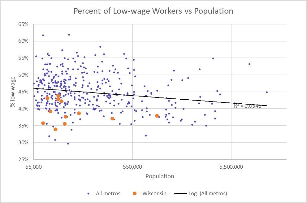
Percent of Low-wage Workers vs Population
The Brookings report divides low wage workers into nine clusters, based on age and education. These are summarized in the table below.
| Clusters | Education | ||
| Age | Nothing beyond high school | Some post high school | Associate degree or higher |
| 18-24 | 1. Not in school, no degree | 2. In school, no college degree | 3. Associate degree or higher |
| 25-50 | 4. High school diploma or less | 5. Some post high school, no degree | 6. Associate degree or higher |
| 51-64 | 7. High school diploma or less | 8. Some post high school, no degree | 9. Associate degree or higher |
The next table shows the most common jobs, and the next most common, in the Milwaukee area.
| Cluster | Most Common | 2nd most common |
| 1 | Retail sales workers | Food and beverage serving workers |
| 2 | Retail sales workers | Food and beverage serving workers |
| 3 | Retail sales workers | Information and records clerks |
| 4 | Other production occupations | Material moving workers |
| 5 | Retail sales workers | Food and beverage serving workers |
| 6 | Preschool, primary, secondary, and special education schoolteachers | Information and records clerks |
| 7 | Building cleaning and pest control workers | Retail sales workers |
| 8 | Information and records clerks | Retail sales workers |
| 9 | Preschool, primary, secondary, and special education schoolteachers | Retail sales workers |
The next graph shows the growth in jobs since the bottom of the Great Recession (shown as a solid blue line). For comparison, I have added US job performance in the previous three recoveries (shown with dashes). While the current recovery has outlasted its predecessors, it has been notably weaker than the recoveries of the 1980s and 1990s. It seems likely that this weakness contributes to the persistence of jobs that pay poorly.
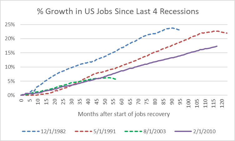
Percent Growth in US Jobs Since Last 4 Recessions
The data suggest that the challenge for many Americans is not the availability of jobs. Instead, it is the paucity of jobs that offer a living wage, a wage that supports a family and that offers their children the prospect of growing up in an economically secure environment.
Increasing the earned-income tax credit would be a first step towards assuring that holding a full-time job doesn’t entail economic suffering. And raising the minimum wage would help assure that the tax credit would be captured by the worker rather than the employer.
Data Wonk
-
Who Do You Trust to Conduct Elections Fairly?
 Apr 6th, 2026 by Bruce Thompson
-
Is Non-Citizen Voting a Real Threat to Elections in Wisconsin?
Mar 18th, 2026 by Bruce Thompson
-
How Global Climate Change Affects Milwaukee
 Mar 11th, 2026 by Bruce Thompson


And we also need to go beyond increasing the earned-income tax credit and the minimum wage — Also see the MIT Living Wage Calculator. From the MIT website: Families and individuals working in low-wage jobs make insufficient income to meet minimum standards given the local cost of living. MIT developed a living wage calculator to estimate the cost of living in your community or region based on typical expenses. The tool helps individuals, communities, and employers determine a local wage rate that allows residents to meet minimum standards of living.
Check out the figures for Milwaukee County at https://livingwage.mit.edu/counties/55079
These figures begin to give us a sense of how woefully inadequate local efforts like begging Straus Foods to come to Century City are.
So, how do you control wages paid and prices charged for goods and services??
Would be interesting to see crime and poverty rates overlayed on these charts.