
Behold the Elephant Chart
It shows global and U.S. changes benefit 1%; who are the losers?
Those trying to understand why Wisconsin went for Donald Trump in the 2016 election, or the sudden popularity of semi-fascist candidates in the developed world, could find the “elephant chart” helpful.
What is the elephant chart?
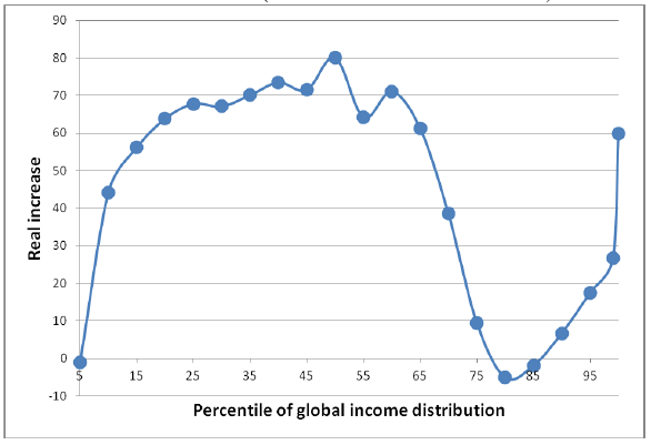
Branko Milanovic, the Chief Economist at the World Bank research department, used surveys of household income to calculate the changes in income for people world-wide between 1988 and 2008. On the horizontal axis he plotted the percentiles of global income distribution, from the poorest on the left to the wealthiest on the right.
The vertical scale shows the percentage growth in income for each income percentile over that 20-year period. As the chart below shows, the greatest income growth came in the middle incomes, with a peak of nearly 80 percent growth around the 55th percentile. Continuing up the income axis, there is a sharp drop-off in growth, resulting in zero or even negative growth around the 80th percentile.
In other words, people whose income put them at the 80th percentile were making about the same income—or a little bit less—as people at the 80th percentile 20 years earlier. Those in the top 1 percent of income, however, enjoyed an income about 60 percent higher than in 1988.
The resulting chart has a certain resemblance to an elephant raising its trunk on the right, leading to its nickname. Here is a version taken from an article by Milanovic.
Percentile of global income distribution
One common misinterpretation of the elephant chart is that membership in each percentile is static. In fact, individuals—or their children—may have moved up or down during the 20 year period.
For those concerned about global income inequality and poverty, the elephant chart contains mostly good news. Viewed globally, lives for the vast majority of people have gotten better. While much of the improvement occurred in China and India, improved incomes were not limited to those two countries. Milanovic notes that
The largest increases … were registered around the median: 80% real increase at the median itself and some 70% around it. It is there, between the 50th and 60th percentile of the global income distribution that we find some 200 million Chinese, 90 million Indians, and about 30 million people each from Indonesia, Brazil and Egypt.
He notes that these weren’t the only beneficiaries:
The surprise is that those at the bottom third of the global income distribution have also made significant gains, with real incomes rising between more than 40% and almost 70%.
As a result, “the proportion of what the World Bank calls the absolute poor” has gone “down from 44% to 23% over approximately the same 20 years. … “The only exception is the poorest 5% of the population whose real incomes have remained the same.”
The other group benefitting from these trends is the top 1 percent, the folks at the top of the elephant’s trunk which have seen “real income rise by more than 60% over those two decades.”
The losers in these trends are those poorest in the world and those “just below the richest 1 or 5 percent.“ While on a global level the losers in wealthy countries could be considered upper middle class, when looked at in the context of the United States or Europe, they include people who are in danger of shifting out of the middle class or whose communities are losing out to global competition. In the United States and in much of Europe, these are the whites without college degrees who constitute much of the Donald Trump base.
Why has recent history been so favorable to the wealthiest 1 percent both in the United States and globally? Some of the explanation may be government policy. Both Wisconsin and Washington DC offer examples. As I noted last week, the so-called Tax Cut and Jobs Act that recently passed is heavily skewed to benefit the wealthiest Americans: while the lowest paid quintile of taxpayers gets a $60 reduction in taxes and those in the middle get $930, the top 1 percent get $51,000.Similarly, changes in Wisconsin have helped make the overall tax scheme more regressive.
However, broader economic changes may hold the bulk of the explanation. For example, depopulation of much of rural America may be largely driven by greater agricultural automation, which reduces the need for agricultural workers, which drives down, in turn, the number of customers for main street businesses in those regions.
One can look at the evolution of global supply chains over the past few years. They include several flows—of information, of money, and of material goods. Both information and money flows have become mostly electronic and essentially instantaneous. Even when product delivery has not become electronic (for example, songs or written material), delivery costs have gone down.
A recent New York Times article argues that not only are economic trends favoring cities, but increasingly they favor very large cities. Additionally, those cities are looking not to other American cities, but to other cities in other countries such as China.
There are no guaranteed solutions for these challenges. However, next week I look at steps that may help improve things in Wisconsin.
Data Wonk
-
Who Do You Trust to Conduct Elections Fairly?
 Apr 6th, 2026 by Bruce Thompson
-
Is Non-Citizen Voting a Real Threat to Elections in Wisconsin?
Mar 18th, 2026 by Bruce Thompson
-
How Global Climate Change Affects Milwaukee
 Mar 11th, 2026 by Bruce Thompson


Bruce T., terrific work, many thanks.