JS Critic Likes New Art Museum Addition
Schumacher gives it thumbs up but big issues remain.
On Sunday Milwaukee Journal Sentinel critic Mary Louise Schumacher weighed in on the revised design for the Milwaukee Art Museum‘s addition and called it a big improvement. “A design disaster was averted,” she writes. After numerous stories by Urban Milwaukee reporting that architect Jim Shields had left the project, and questioning the design for the addition, the museum brought him back and released his new design. “This turnaround speaks volumes about the museum’s seriousness in correcting the blunder,” Schumacher writes.
“There is so much to recommend in Shields’ newest design, with an upper floor dramatically cantilevered over a subtly angled, all glass first floor,” Schumacher notes. “Clad in resilient zinc (or perhaps copper) that will have a weathered patina in time, the upper floor is set atop a subtly askew, glassy first floor. Windows are set deep into the upper form with faceted frames (that) direct views sharply toward the lakefront or the Calatrava. That gentle twist of the first floor creates a perspectival illusion that adds to the cantilever’s sense of heft.”
But Schumacher had previously argued the museum would be better off trying to restore the old Kahler addition, so her column also makes one more attempt at this. But the reality, as I’ve earlier noted, is that you can’t sell the community on simply restoring an old building, all the more after all the hoopla about a new addition. As Schumacher concedes, “donors are more inclined to write checks for new buildings than for fixing old ones.”
She makes a good case for respecting the old Kahler addition, prior to its defacement, but also notes how Shields would improve on it: “One thing that Shield’s transparent ground floor does, too, is bring the art and activity of the museum to the lake’s edge in a way that the Kahler never did. In fact, it offers a place for people who may or may not be interested in art to simply come inside, look at the lakefront and have a cup of coffee.”But it does more than that. It also addresses the Calatrava in a way that Kahler didn’t, because it wasn’t there when he built his addition. As the photo of the original Kahler addition makes clear, it walled museum goers off from the world to the south, while the Shields addition has a glassy south face on the first floor and windows on the second floor that look on the Calatrava, the Kiley landscaping, Discovery World and the lake, connecting viewers to the entire museum campus. To throw out this smart design in favor of pretending its 1975 all over again, seems foolish on numerous counts.
The big issue that still remains, as Urban Milwaukee critic Tom Bamberger has noted, is the interior of the addition, where Milwaukee Art Museum director Dan Keegan wants to eliminate the Kahler staircase. And will the new addition leave enough space to create logical passageways?; that’s an important issue Schumacher has raised. I hope she returns to the issue as the design for the interior becomes clearer.
May 2014 Renderings
Back in the News
-
Live Nation Must End Deals with Summerfest?
 Mar 11th, 2026 by Bruce Murphy
-
Trump Obsessed With Milwaukee Shoes
 Mar 10th, 2026 by Bruce Murphy
-
Children’s Museum Looks to Double Its Space
 Feb 26th, 2026 by Jeramey Jannene



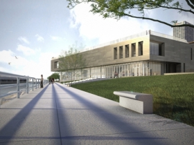
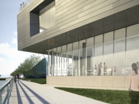
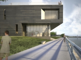





It’s great news that renowned architect Jim Shields has been brought back on board to design the proposed addition to the Milwaukee Art Museum. His design concept for the museum addition is a marked improvement over the previous nondescript architectural rendering which reminded me of a warehouse. The Milwaukee lakefront is a crown jewel and it requires imaginative architecture that links the building to the environment and uplifts the human spirit.
It has been some years since I lived in Milwaukee and visited the art museum. I recall that most of the art was displayed in the so called Kahler addition. Even at that time the lack of maintenance on the building was appalling; one area of the wood floor had buckled and the area was cordoned off. Although I enjoyed the art I don’t recall there being any natural light or views of Lake Michigan – something that will be corrected with the new addition.
The Eero Saarinen designed War Memorial Center and the Kahler addition are both boxy type structures. The Santiago Calatrava designed building addition is almost ethereal and it’s not too much to ask that the new addition have a similar visual impact. The cantilevered upper floor, glass first floor with views of the lake and zinc/copper cladding are all well and fine. But I would like to suggest to the architect to break away from the boxy design and instead give the addition a curving front end with panoramic views of the lakefront including the Calatrava addition and Discovery World. And yes, don’t give up on the concept of an interior staircase!
When the project is complete I hope to return to Milwaukee for a visit to enjoy the revamped Milwaukee Art Museum and War Memorial Center. It is an environment that is unique to American cities.
Best that can be said is that it is functional.