Banish the Freeway’s Gloom!
Design winners attempt to brighten the gloomy passageway between downtown Milwaukee and the Historic Third Ward.
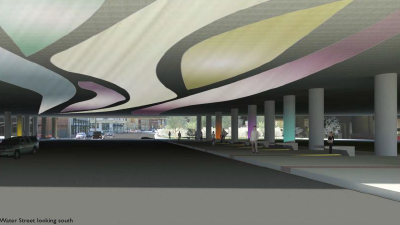
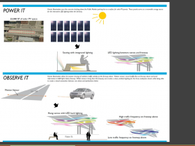
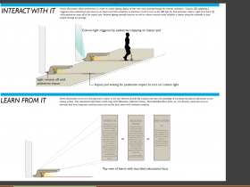
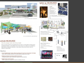
Kinetic Illumination – Design by Craig Huebner
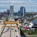
The physical separation between downtown Milwaukee and the Historic Third Ward is a problem: it makes it more difficult to knit the two together. And walking from one area to the other can feel intimidating and unfriendly, especially at night. Responding to this issue, The Historic Ward Association conducted a design competition, Brighten the Passage, that challenged participants to develop designs that would improve the pedestrian experience. The competition primarily involved the areas underneath Interstate 794 along Water St., Broadway, and Milwaukee St.
Seven teams submitted proposals in the competition, with the top three to receive recognition by the Historic Third Ward Association. The selection panel consisted of Alderman Robert Bauman, Ghassan Korban, DPW Commissioner, Carolynn Gellings, Wisconsin Department of Transportation, Whitney Gould, Milwaukee City Plan Commissioner, and Greg Uhen, CEO / Design Principal for Eppstein Uhen Architects. The panel considered a variety of factors, but “in the end the winning submission focused primarily on the principal goal of brightening the passage, while the runners-up focused more on design and programming ideas. ”
First Place – Kinetic Illumination by Craig Huebner
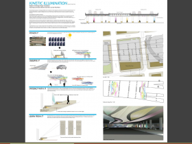
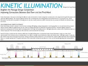
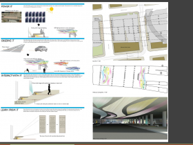
The winning design, by UWM graduate student Craig Huebner, kept the design focus on the “brighten the passage” concept by featuring a variety of passive and interactive lighting options. The most visible feature of the design focused on the underside of the Interstate 794, which would be illuminated with light patterns projected onto hanging fabric based on traffic flowing along the freeway above. Additionally, lights located next to benches underneath the freeway would turn on and illuminate the columns as people walk through the passage.
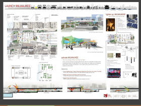
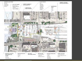
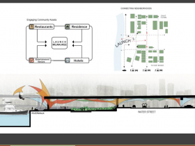
Second Place – Launch Milwaukee by Bray Architects, Matthew Wolfert
This design worked to activate the space underneath the freeway with both design elements and urban activities. To enhance the pedestrian experience the design included the installation of lighted “umbres” to create a visual, almost festive atmosphere. The proposal also featured ways to activate the space, including commercial boat piers, a local art garden, a performance stage, and streetcar stops on Broadway.
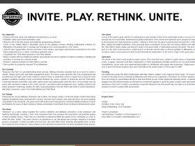
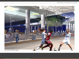
Third Place – Interpass Futsol Milwaukee by Chris Socha, AIA and Scott Schwebel
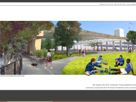
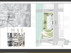
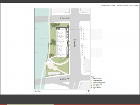
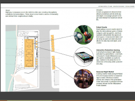
Here the focus was on the Water St. connection, and, much like Launch Milwaukee’s proposal, included attempts to activate the space with both design elements and activities. This design involved creating Futsol, a version of soccer, courts underneath the freeway, and included seating areas to watch on-going matches. Some of the seating areas, which resembled “campfires,” were designed to allow people to play a variety of games projected on the underside of the freeway. (Full disclosure: I was a project consultant, along with Juli Kaufmann, President of Fix Development, for Interpass Futsol Milwaukee; more disclosure: we’ll probably end up spending our portion of the winnings at the Nomad).
Other Submissions
Four other teams submitted creative designs as well, and those concept can be seen here. On a side note, Urban Milwaukee contributor and, MSOE Professor of Architecture, Matthew Trussoni was also part of a team that submitted a design in the contest.
Political Contributions Tracker
Displaying political contributions between people mentioned in this story. Learn more.
- February 17, 2016 - Robert Bauman received $500 from Greg Uhen
- March 27, 2015 - Robert Bauman received $40 from Ghassan Korban
















The restoration/repair of the Hoan Bridge is going to be taking place in the near future, would these designs be affected by the process? Realistically, I am not sure any of these could be done until the Hoan is finished since the ramps could change. Maybe the extra freeway space over Water street will be removed after the Hoan is completed, this would create more natural light. All the ideas are great and very forward thinking.
@getch My bad I should have explained a little more. Yes all of this has to wait until the freeway is rebuilt and then fundraising will be needed as well.
Fabulous, fabulous designs!
Excellent… Personally, I would combine the three ideas in some shape or form… I love the interactive lighting on the winner, but it would be slightly dull during the day unfortunately. Number two would solve that problem, and both ideas turning the Third Ward into a vibrant destination as well as the sad properties on the north side of the freeway. Additionally I love #3’s idea of turning the blighted parking areas into an active area which would vitalize the area even more, created a connecting space. Great job!
@CJ Thanks! And yes it is our hope (oh boy something for me to work on!) many of the ideas can be combined…..