How the Moderne Lost Some of its Swagger
Value engineering made it stouter, but it’s still minor miracle a building this good was created.
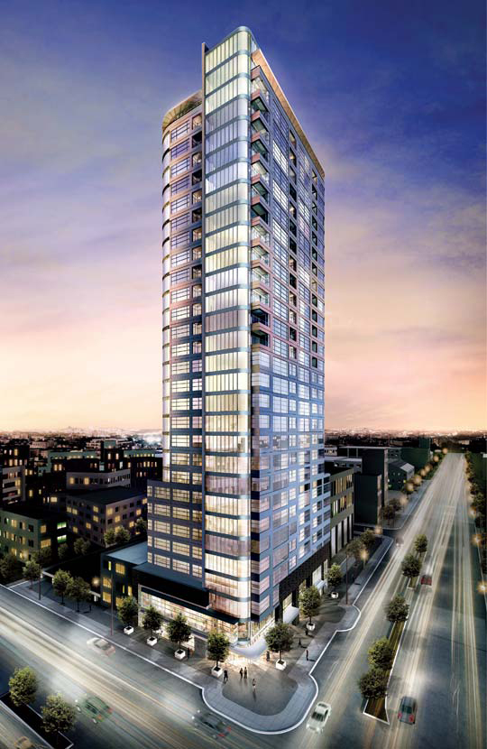
The Moderne Rendering
This early conception of The Moderne lived up to its name. Like its predecessors, Art Deco and Art Nouveau, Moderne design exuded taste and refinement. Think of James Bond entering a room in a well-tailored suit: The Moderne started out sleek. Its 30 floors, high ceilings, wrap-around windows, and graceful curves were poised to soar into the Milwaukee skyline.

Rendering (left), and finished building (right).
This more mature rendering of The Moderne at 1141 North Third Old World Street (on the left), was the template for what was built. Like a well conditioned body on the beach, tall buildings need to be in shape to stand up and command our attention.
You may notice the finished building from the Moderne’s website (on the right) looks a little stouter than the last rendering. Sleekness does not figure into profitability because buildings are sold by the square rather than cubic foot. The Moderne’s developers shaved 5 percent off the top to fit the building into the budget, according to the architect Matt Rinka.
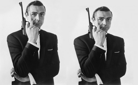
Bond, James Bond.
Tall buildings are like cattle, they get fattened up for the market. That 5 percent difference in height is not as small as it sounds. Here is James Bond, “value engineered” roughly proportional to the Moderne. You can still pick Sean Connery out of a lineup, but he wouldn’t get the part. All the James Bonds are over six feet.
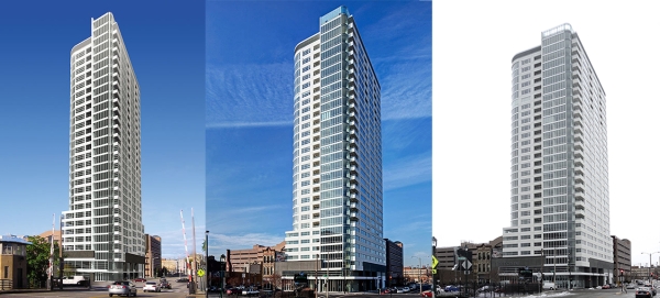
But a little shrinkage doesn’t explain why the building looks more ordinary in the snapshot on the right. Professional photographers are paid to shine the best possible light on their subject. The “best” photograph of anything is always too good to be true. An “iconic” photograph is supposed to stick in our mind and delete less desirable views of a subject, such as these of the Moderne.
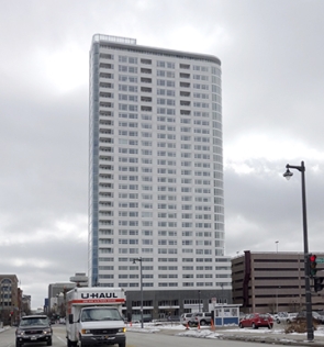
The Moderne flattens out from the west.
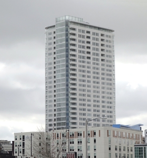
Here it looks boxy.
It wasn’t that long ago that when the skyline was a sacred space, and buildings looked better than their pictures from all four sides. The Ulm Minster in Germany, which broke ground in 1377, was the tallest structure in the world when it reached its adult height of 530 feet in 1891. The Washington Monument, at 555 feet, was the first secular structure to top church spires in 1877. Then the Eiffel Tower soared to 989 feet in 1897. (Our City Hall at 354 feet briefly held the title of the tallest secular building between 1895 and 1899.)
Monuments to modernity, like the Chrysler, Empire State, and Sears buildings dominated the skies of the 20th century. When King Kong climbed the Empire State Building in 1933, 1976 and 2005, he wasn’t just blocking somebody’s view — skyscrapers were America’s greatest public art.
It wasn’t until the 21st Century that a residential building exceeded the height of the Eiffel Tower on the planet earth. We looked up to towers until their biggest selling point became looking down on us. The trend is unmistakable. For the last few decades residential towers have reshaped the skyline in Milwaukee. While the towers of old were about creating powerful religious, civic or commercial symbols, the residential ones show what people are willing to pay to live above the rest of us.
At their worst, these high-rises are just a stack of units, a housing development with porches and granite countertops. The market produces a void when a building depends on only what the residents value.
Unlike so many residential towers in Milwaukee, the Moderne tried to fill this void. It’s a miracle anything as good as The Moderne was built, with HUD money no less. No one expected this much architecture in the middle of the worst real estate economy since the Great Depression. Its apartments start at less than $1,500 a month and set a new standard for a room with a view in Milwaukee.
So it’s fitting the Moderne’s architect/developer team, Matt Rinka and Rick Barrett, landed an even bigger project — a 44 story centerpiece to the Lake Front Redevelopment plan overlooking the lake at the end of Wisconsin Avenue. Let’s hope The Couture will not live up to its name — a tall closet for fancy people.
This majestic site demands more than what the housing market will bear. The Couture is being built on public land. It’s our land, our city, our view. We should set our sights higher. Build something we all can look up to.
In Public
-
The Good Mural
 Apr 19th, 2020 by Tom Bamberger
-
Scooters Are the Future
 Dec 19th, 2019 by Tom Bamberger
-
Homeless Tent City Is a Democracy
 Aug 2nd, 2019 by Tom Bamberger








Good analysis… at the end of the day, I’m still pretty happy with it. It’s not a bad building. Will be good for the city… if only those jokers at Kohl’s hadn’t dropped the ball on their HQ decision!
@Tyrell Yup. The first floor works well, Carsons will help to activate the street, it adds much needed density and tax base, brings residents to Westown. A clear win. As far as Kohl’s, their loss.
Well done Mr Bamberger , smashing critic from all angles literally and figuratively . You added to the landscape .
It’s not being built on public land.
@Michael The Couture proposal is on public land… The transit center site to be specific.
To put a finer point on it…. it is my understanding that the transit site (public land) will be sold to a private individual. So technically, it will be built on private land that regardless has quite a bit of public interest.
I still don’t see how the city and county will end up backing this guy for the transit site when they the city has millions at stake on the condominium units at The Moderne. I don’t believe lease-up at the Moderne is ahead of schedule either…
John G: I don’t follow why the city & county would shy away from developing this, do you think they’re worried about competition? The competition isn’t just between a couple buildings Downtown, people are looking all over the metro area. More high-quality buildings in Milwaukee means a larger overall share of the market, not slicing up a small piece of the pie.
@Jesse H. Yup… It looks to me like the city / county picked the best project of those submitted… I’m looking forward to seeing The Couture go up.:)
They may have picked the best project on paper but my point — that is not the same as producing the best project.
If the Couture is just another market rate housing tower (for the most part), we are likely to be disappointed with the end result.
@Tom I understand that is your point, but I don’t believe so. The Couture designs look pretty good to me (and yes I know they’ll have cut backs as all projects do), with the exception of the parking garage situation which can be improved (the street level is what matters here). As far as the other proposals there is little need for new office use in downtown Milwaukee (what were they thinking) so those projects had little to no chance of ever happening. And quite frankly just because those would have had a different use certainly is no guarantee of better design. In fact I’d say that most office building proposed lately have been pretty awful really, with most ignoring the pedestrian level.
Great piece. The building was certainly compromised by being made squatter. It now looks a bit pedestrian and the original rendering does have far more retro elegance for sure. I’m amazed that anything of quality gets built at all.
If only the rendering told the whole story. This is a pretty ordinary, actually less-than-ordinary, design which will intrude on Milwaukee’s skyline for decades to come. What a shame and lost opportunity. Sad.
Please tell me you understand how photoshop works. Renderings and reality are two different things. Notice the ridiculously blue sky that matches no real sky ever? Frankly, we are lucky to get anything built in that horrendous location – park east, bradley center, etc etc. You cannot tell anything from a rendering. They are, however, idiots for not shooting the picture on a sunny day and doctoring it.