First Look at NML’s New Skyscraper
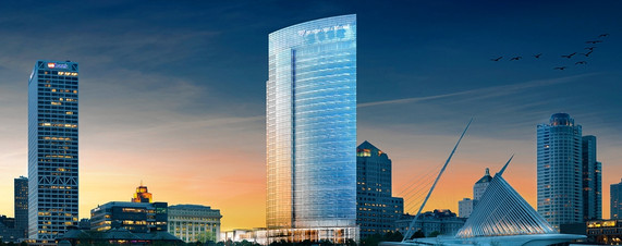
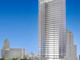
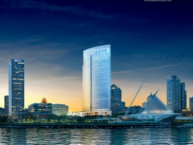
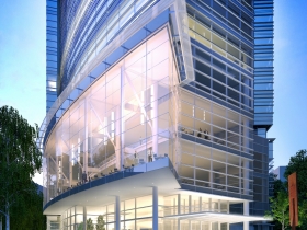
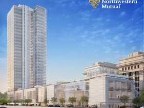
The stunning, curved glass design for the 32-floor tower is by Pickard Chilton of New Haven, Connecticut.
UPDATE: Additional renderings were added to the story at 12:10 pm.
Plans for Northwestern Mutual Life’s $450 million, 32-story, 1.1 million square-foot office tower were revealed by the company today and additional details will follow at a ceremony to be held at the company’s headquarters this morning. As promised, the new NML skyscraper will be the largest building under one roof in Wisconsin.
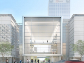
The curved glassy design by Pickard Chilton of New Haven, Connecticut, shows the tower portion of the structure pushed to the eastern edge of the site helping, it to be the “iconic statement about Northwestern Mutual,” that NML CEO John E. Schlifske promised at the initial project announcement. A three-story section running along Mason St. will house a visitors center as well as a publicly-accessible restaurant with an outdoor cafe dining area.“This significant investment in our downtown is a great step in the right direction toward bringing more job opportunities to the city – more specifically 1,900 jobs by 2030,” Common Council President Willie Hines said in a press release. NML has pledged to pay 100 percent prevailing wages, meet the city’s 40 percent residential preference program, and meet a 25 percent emerging business enterprises goal.
Financing
A City of Milwaukee tax increment district, TID 78, will fund an annual payment to Northwestern Mutual for up to 25 years. The total payment will be equal to 70 percent of any new property taxes and capped at $54 million. The funds will be used to demolish an existing office building on the NML campus and help cover the difference in cost between building in an urban environment versus building a similar sized project on a suburban greenfield. During the January 17th meeting of the Redevelopment Authority of the City of Milwaukee, which approved the TID boundaries, Jim Scheer, of the Department of the City Development, explained that unlike many TIDs in the city this project will be developer financed, meaning ”we [the city] don’t borrow,” and “we don’t take the risk.”
An additional, $19.3 million from the TID will be used to construct public infrastructure as part of the Lakefront Gateway Project, help pay for a workforce development program, and administrative costs.
Timeline
- In January the Redevelopment Authority of the City of Milwaukee unanimously, and with no opposition, approved the boundaries and plan for the tax incremental district that will supply funding for portion of the project.
- In April the Common Council approved Tax Incremental District 78 to help fund the project and associated infrastructure projects. Mayor Tom Barrett signed off on the TID shortly thereafter.
- Demolition of NML’s existing 16-story, 451,000 square-foot building on the site will begin within the next two months.
- Construction should start in the middle of 2014.
- The new skyscraper should be completed in 2017.
Renderings
Political Contributions Tracker
Displaying political contributions between people mentioned in this story. Learn more.
- November 6, 2015 - Tom Barrett received $500 from John Schlifske










That’s a fantastic design and project for Milwaukee! Proud to be a Policy holder.
Save this date October 28th 6:30pm, Discovery Worl.d
Historic Milwaukee will be holding a panel discussion about the development on our downtown skyline. Moderator Jeramey Jannene will ask all of the questions that will flesh out the benefits and ripple effects of these new buildings.
I’m curious as to the reasoning behind not building the tallest building in the city. Clearly the required square footage would have allow it to be. $?
Thanks to NML for creating something that fits nicely into the space. NML is a true citizen of Milwaukee and of downtown. This will be a welcome addition to the Milwaukee skyline.
I have to say, I had my hopes set exceedingly high for something truly iconic. This is not the really bold statement I was hoping for. If fits well within the Pickard Chilton oeuvre. Perhaps I should not have expected something different.
This is my place work….could not be more happy to work here..
Great place to be part of and work for.
UPDATE: The story now includes 12 renderings of the building.
https://www.google.com/search?q=333+wacker+drive&client=firefox-a&hs=QUu&rls=org.mozilla:en-US:official&source=lnms&tbm=isch&sa=X&ei=DR5DUpHlLYn52AWITQ&ved=0CAkQ_AUoAQ&biw=1307&bih=914&dpr=1
I like it.
Personally I am disappointed with this project. I was expecting an iconic skyscraper. A skyscraper that is very unique and that when people see it they remember it. This skyscraper looks like you could place it anywhere in the country. Yes it is a big improvement but I am not blown away by it. Also I am disappointed it will be shorter then the US bank building. While it is only 5o feet shorter the ground is about 20 feet taller then the US building. It will end up to look about even to the US bank building but a little shorter. I wish they would have pushed it an extra four stories which would have made it taller.
Wow, the lake front is looking to be a busy place. I do agree that it would have been nice for the building to aspire a little bit higher, but it will look great by the lake nonetheless. I wonder if anyone has done any accurate renderings of what the skyline will look like with both this and the Couture building.
I’ve had a bit more time to check out the renderings (during my busy work day!).
I do like that it is glass, which is different than most other large downtown buildings. I really like the bottom floors–that they include transparent glass you can look into as well as out of, very important for a nice street-level experience. No one enjoys walking along a wall of opaque glass–really popular in the Sunbelt in the 80s and 90s. And, I like how it ties in to the old neoclassical headquarters building. That whole base flush with the street along Cass and with similar, transparent glass, is very attractive.
One thing I wish Milwaukee would deal with is the matter of company names and logos at the top of buildings. (The “US Bank” name at the top of the “First Wisconsin” Building is absolutely horrible. Ugly. It simply looks like crap.) I see “Northwestern Mutual Life” will be at the top of its new building. Nicer presentation, but still. I know that some cities like San Francisco (which perhaps has a bit more leverage with all the development going on) have banned most all such signage unless the company was founded there. Of course, NML is homegrown, and I get that. But it’s really not necessary and is cheap promotion that detracts from the architecture.
“Skyscraper” at 32 stories high?! How is that ‘iconic’?
I absolutely agree with Josh. It looks like something from any city, hardly iconic. And it is not even tallest building in the city!
Lighted glass towers along a migratory bird fly way can kill thousands of birds annually. More thought is needed on this design. Wind turbines take more care in siting and careful placement results in 1-2 bird deaths per year. There is usually little thought in buildings provided in design for protection of the environmental impact and a flawed design and operational characteristics. Many architects like to place their so-called master piece in place without these considerations. I would be interested in the building efficiency, especially with vast window solar collector being displayed, and storm water planning.
I am so happy to see this building going up but I really wish it was taller… That MASSIVE footprint and only 32 stories. A very good thing for the city and skyline, but hardly iconic.
Size does not make something iconic and can be prideful action that can be easily overcome by something taller. To be iconic the building should represent the Company, surrounding buildings, and the city. I think the design fits “The Quiet Company” and its surroundings. Humility is not one of our cultural strong points at this time but the design shows strength, fits in with its surroundings, and shows soundness. All representative of a great city. Job well done.
I think Jim’s point about the design fitting NML is right on. It certainly is a substantial improvement over either of their more recent towers along Prospect Avenue. As one who will greatly miss the soon-to-be demolished plaza fountain area, it appears as though the new green space will be even nicer than what currently exists there. While it won’t be the tallest structure downtown, I would be surprised if it’s not the one that people and visitors are aesthetically most drawn to. Kudos to NML and the City for getting it done and I look forward to the subsequent improvements to the lakefront and our access to it.
What are the TIF boundaries? I went back to the earlier articles about it, but they were not listed.
As for the design, I was hoping for more, but can live with this. I am not one to get obsessed with skylines, because it is just something to look at, and from far away. I am more concerned about how I will live/exist within the space created by this building. It will be an improvement if the space surrounding their campus is somehow utilized more frequently and is a pleasant experience. My concern is that the need for parking for this new building will lead to a loss of more buildings surrounding the campus. I mean look at the block that is home to the scottish rite cathedral. The rest of the entire block was demoed for a parking garage. Ouch! Hopefully we have learned how to do urban design AND urban ergonomics and can mask the need for parking with developments that create value for citizens, users, and residents.
@Forward.. The TIF description:
“Tax Incremental District No. 78 (the “District”) consists of a site of approximately 4.44 acres at 800 and 900 East Wisconsin Avenue that includes a 451,000 square-foot office building.” Essentially just the property the building is on.
Looks great. It will be a finally make that part of Milwaukee’s skyline look less . . . mono-towered. Combine this with the Couture, 833 East, Art Museum renovations, reconfigured freeway ramps, and the streetcar, and we have a totally updated lakefront! Let’s get it done!