
What Do the NAEP Tests Tell Us About Student Achievement?
Both nationally and locally a notable decline since 2017. Why?

dcJohn (CC-BY)
The recent NAEP test results have caused major angst among people who track student achievement. NAEP stands for the National Assessment of Educational Progress and is typically given at two-year intervals to a random sample of US students.
This graph illustrates several of the reasons for concern. For one, after steadily increasing over time, the median turned downward after 2017, and especially after 2019. At the time this downward trend was widely attributed to the COVID-19 pandemic that hit in 2020. In response, most schools moved online to try to halt the spread of the disease.
The hope was that once schools reopened, the downward trend would stop and even reverse itself. Unfortunately, so far at least, that hasn’t happened. In addition, those in the bottom 10% lost 10 points compared to one point suffered by those in the top 10%, suggesting greater inequality.
In addition, the fact that the decline started before anyone had heard of Covid, resulted in a search for other causes, including the rise in social media.
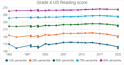
Grade 4 US Reading score
The next graph shows 8th grade reading scores. Their behavior is quite similar to that of 4th grade scores, with most of the recent decline occurring among students who are already at the bottom.
Students taking the grade 8 NAEP in 2019 would have been members of the cohort who took the 4th grade test in 2015. In 2015, reading scores were near their maximum. Yet they declined in 2019.
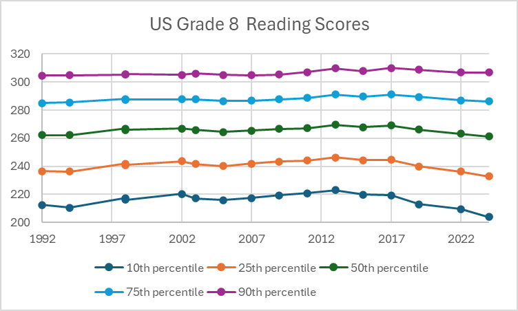
US Grade 8 Reading scores
The graph below offers a picture of the likely impact of poverty (called “economic disadvantage”) on educational achievement. Using data on 12th grade math exams, the solid red line shows the average scores if none of the test takers were economically disadvantaged. The average score on the 2024 test in that case would be 157. By contrast, the dashed red line shows the average scores if they were based on the scores of students considered economically disadvantaged. The average 2024 score would be 132. (To avoid having the scores conflict on the graph, scores if no students were economically disadvantaged are shown above the dot; if all students were economically disadvantaged, the score is shown below the dot.)
Likewise, the two green lines contrast the 75% percentile levels if all students were — and were not — economically disadvantaged. And the blue lines show the same story for the 25% percentile levels. In all cases the average scores for students in poverty were much lower.
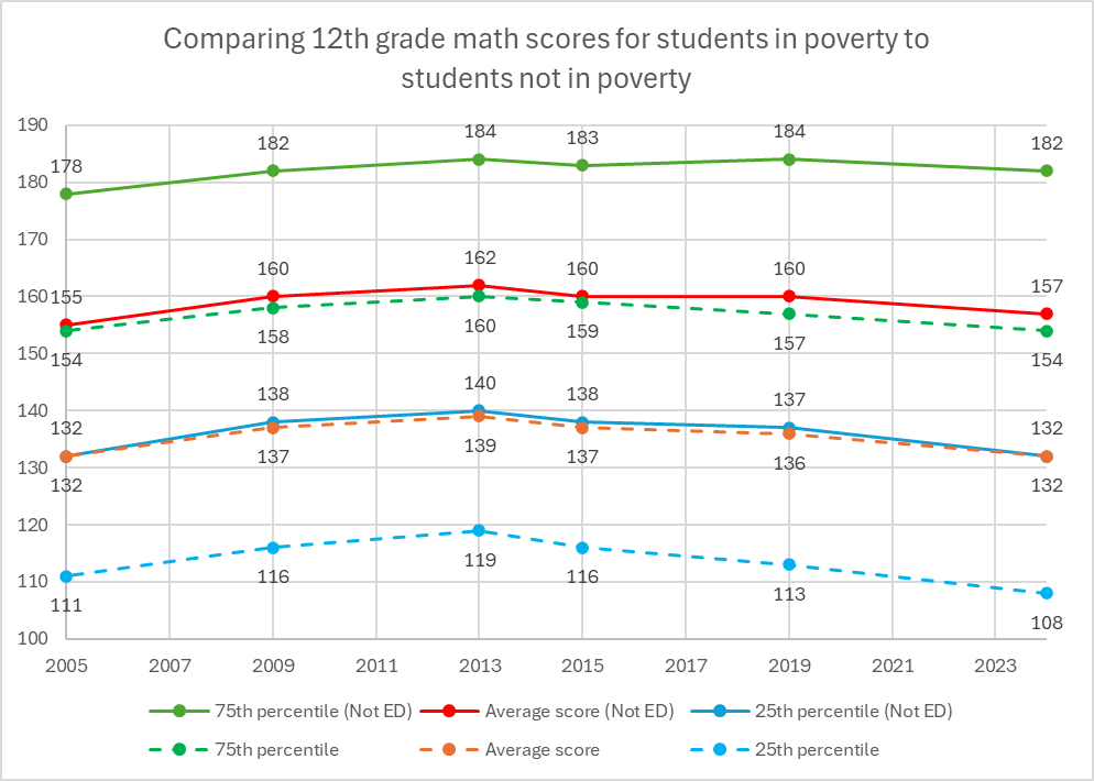
Comparing 12th grade math scores for students in poverty to students not in poverty
Milwaukee Public Schools is not immune from these trends. The next graph shows the district’s Grade 4 and 8 math scores between 2009 and 2024. Both scores max out in 2013 and have declined since then. The decline started well before the pandemic and before the national decline began.
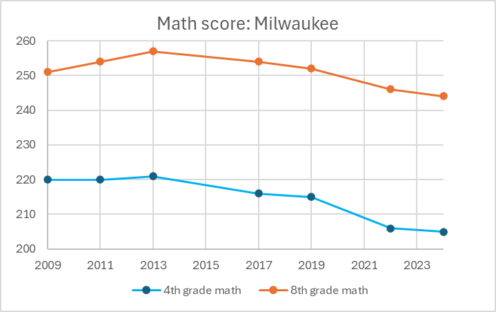
Math score: Milwaukee
The next chart shows MPS fourth and eighth grade reading scores. Notably the 8th grade math score is an exception to the decline in outcomes over time.
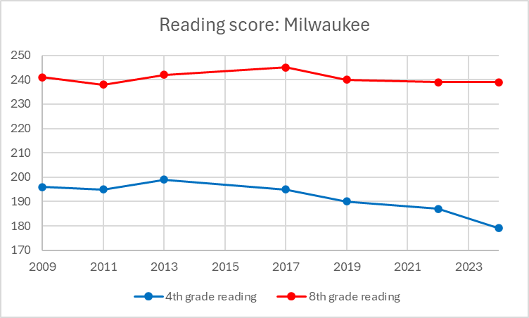
Reading score: Milwaukee
The next chart also provides a view of the connection between poverty and academic achievement. Using data from the 4th grade reading test, the orange bar shows the likely score received by each school if it only included students who were not economically disadvantaged. By contrast, the blue bar represents the likely score if all students were economically disadvantaged.
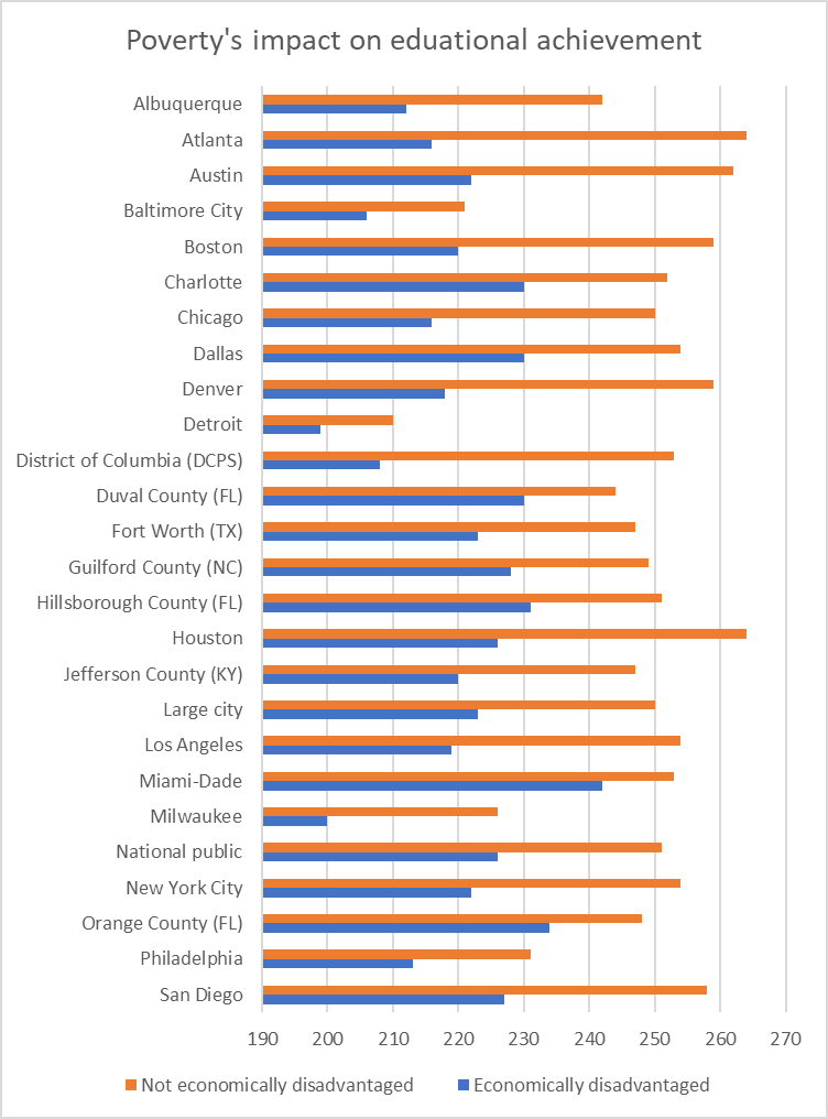
Poverty’s impact on educational achievement.
Certainly, poverty is not the only factor that explains differences in educational outcomes. But it is a major one, underlining why efforts to reduce poverty are highly important.
If you think stories like this are important, become a member of Urban Milwaukee and help support real, independent journalism. Plus you get some cool added benefits.
Data Wonk
-
Life Expectancy in Wisconsin vs. Other States
 Dec 10th, 2025 by Bruce Thompson
-
How Republicans Opened the Door To Redistricting
 Nov 26th, 2025 by Bruce Thompson
-
The Connection Between Life Expectancy, Poverty and Partisanship
 Nov 21st, 2025 by Bruce Thompson


After spending four decades working in education, I believe that the obsession with test scores and using them to compare one school district/one state to another is part of the problem. Standardized tests were used historically to help schools see where their students needed extra help and not seen as numbers through some statistical voodoo claims to accurately reflect the quality of a school district’s educational program. For school boards, they are force to adopts the “miracle curriculum” which turns over every few years. Following the miracle curriculum force a rigidity in to the curriculum with quite often innovative programs/teaching methods are not supported or punished. These school district scores should be seen as a rough indicator. I always wonder why educational researchers do not look at why there is a high correlation between family income and test scores?
Mingus: The last graph is literally called: Poverty’s impact on educational achievement.
* isn’t that an example of educational researchers looking at correlation between family income and test scores?
Only Detroit’s poor kids are doing worse than Milwaukee’s poor kids. Why are so many other cities doing better educating children from poor families? Are Milwaukee’s poor children experiencing more severe poverty? Is it culture? Is it $’s? Is it MPS?
I have found in Milwaukee that schools with high levels of poverty and are dong significantly better, neither the MPS administration or the media go out and find out why. When achievement collapses in schools like this, most often with a new administrator who wants to change curriculum radically without input from the staff, again MPS administration and the media do not go out and ask how it happened. Clarke Street School is a good example of this. Education reform needs to get out of the mentality of looking for the “miracle” curriculum and see what is working in other urban areas and in schools which have report out all of the test data of public schools.