State’s Leadership Vacuum Is Killing People
Deaths per day will double by Christmas. And red counties are getting hit the worst.
Wisconsin State Capitol. Photo by Dave Reid.
Since March, cases of COVID-19 in Wisconsin have reached several peaks, each followed by a period when numbers declined. This may have led to a belief that Wisconsin had gained control of the virus. For example, during July and August there were two months of gradual decline, as the next chart shows.
In late July, Wisconsin’s daily rate of cases per 100,000 of residents crept up and passed 15, triggering Chicago’s requirement that travelers needed to quarantine themselves. In August, the rate declined, almost dropping low enough to meet New York’s limit for travelers of 10 cases per 100,000 residents.
Then came the surge, as new cases exploded in Wisconsin in September. By early November daily new cases hit 120 per 100,000 residents—ten times the September 1 number. Every day, one of every thousand Wisconsinites was being told that he or she was infected with COVID-19.
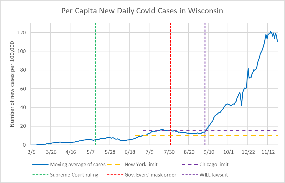
Per Capita New Daily COVID-19 Cases in Wisconsin
Roughly 2% of the people identified with COVID-19 die from it. Using regression analysis, I find that the lag time is around five weeks. In other words, it takes about five weeks for an increase in cases to be reflected in the death statistics.
The graph below plots the actual deaths per day from COVID-19 in Wisconsin starting on September 1, shown as a solid blue line. These are the result of averaging over seven days.
The forecast numbers of deaths for the next four weeks are shown using a dashed red line. Using the regression model, average deaths per day around Christmas is projected at just under 140. This compares to about 60 now, a doubling of today’s death rate.
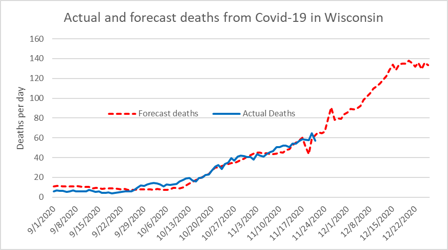
Actual and forecast deaths from COVID-19 in Wisconsin
Oxford University’s Blavatnik School of Government has been building a database of measures that governments around the globe have taken to “break the chain of infection and manage the broader impacts of the disease.” Recently it added a similar database of actions that states in the United States have taken. These fall into three broad categories: containment (e.g., closing businesses and schools), economic (e.g., income support), and health systems (e.g., testing and contact tracing).
To quantify the extent each state was actively attempting to mitigate the virus, the Blavatnik School created four indices, one for each of these three categories and a fourth incorporating the other three. (Somewhat surprisingly, it did not include a mask mandate among the indicators.)To explore the relationship between the indicators and the ability of states to reduce the impact of COVID-19 on the state’s population, I created scatter plots comparing states’ COVID-19 cases with the four indices.
Below is the plot comparing each state’s Government Response Index (on the horizontal) to the average number of new cases per 100,000 residents between November 14 and November 21 on the vertical. Overall, residents of states with of higher indices of government responses—those on the right–fared better against the disease, as shown by the downward sloping trend line.
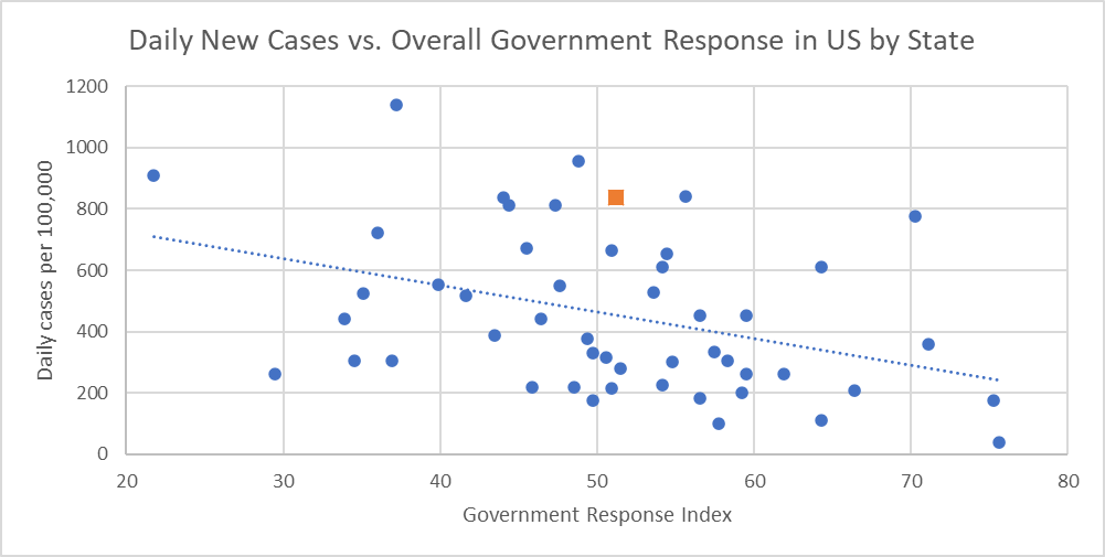
Daily New Cases vs. Overall Government Response in US by State
However, as often happens, there is considerable scatter. What can be said about all states as a group does not necessarily apply to each and every state. Consider Wisconsin, shown as a rust-colored square in the scatter plot. On Blavatnik’s Government Response Index, Wisconsin falls in the middle. However, its daily cases are substantially higher than the average state.
The database collects items in which a state government acts to mitigate the virus. For example, on the Wisconsin database for April 29, there is this item:
Emergency Order #34 Interim Order to Turn Down the Dial went into effect 8 AM on April 29. The Order iterates that Safer at Home and Badger Bounce Back remain in effect.
This and many of Governor Tony Evers’ other actions served to improve Wisconsin’s score. And during the spring, Wisconsin did fare quite well in protecting its citizens.
But then, on the line for May 13, this note appears:
On May 13, Wisconsin Supreme Court ruled that Wisconsin’s extended Safer at Home Order, Emergency Order #28, which was scheduled to expire May 26, is unenforceable.
Essentially, the court eviscerated the powers the governor had used to mitigate the virus in the spring. When the virus resurged in September, these powers were no longer available to the governor.
In a report, the Blavatnik School of Government places Wisconsin among the “rapid rollback” states, which “adopted a robust response initially, but then began to roll back policies relatively quickly.” When the need arose in the fall for more discipline, there was no one who had both the desire and the authority to do what needed to be done.
It is not clear that the court majority’s intention was to create a leadership vacuum in Wisconsin. Their opinions seem to assume that the legislative leadership would develop a plan for controlling the virus. This was reflected in their confusion as to whether the decision was to take effect immediately or after a delay to develop a substitute plan.
In the end, the Republican leaders of both houses, Robin Vos and Scott Fitzgerald, decided no plan was needed. Why was this considered smart policy or smart politics? Were they afraid of crossing President Donald Trump?One reason, I believe, is an issue that Trump so successfully exploited—the rural-urban divide. During the spring, large cities were particularly hard hit by the pandemic. As a result, the opinion arose—and was exploited by politicians—that small towns and rural places were being asked to sacrifice for the cities by adopting emergency measures.
The lawsuit that the Wisconsin Institute for Law and Liberty brought against Gov. Evers’ mask mandate was filed in Polk County, with about 43,000 inhabitants. At the time, that county was running an average daily COVID-19 case rate of about 6 per 100,000 residents, allowing the argument that the county was being burdened by something it did not need. That Polk County was surrounded by counties with much higher case rates might have served as a warning against complacency.
Sure enough, rates in Polk County have surged precipitously this fall, rising much higher than in Milwaukee County, as shown in the next chart:

New Daily COVID-19 Cases in Polk & Milwaukee Counties
Increasingly, Wisconsin’s leadership failure—particularly among the Republican legislators and the Supreme Court’s conservatives and egged on by right-wing groups–is costing Wisconsin lives. And the burden of that failure is increasingly shifting to Wisconsin’s less populous counties, those leaning “red” in the recent election. Partisan ideology is killing their residents.
Data Wonk
-
Who Do You Trust to Conduct Elections Fairly?
 Apr 6th, 2026 by Bruce Thompson
-
Is Non-Citizen Voting a Real Threat to Elections in Wisconsin?
Mar 18th, 2026 by Bruce Thompson
-
How Global Climate Change Affects Milwaukee
 Mar 11th, 2026 by Bruce Thompson