Suburban-Style Store for Walker’s Point
Sherwin Williams paint store with ho-hum design will be plunked next to Cermak Market.
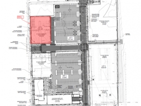
The second phase of the Freshwater Plaza complex is poised to get underway. A Sherwin Williams paint store will soon join the Cermak Fresh Market grocery store and Freshwater Plaza apartment building at the northeast corner of S. 1st St. and E. Greenfield Ave.
The store, which will target contractors, is expected to be Sherwin Williams’ highest grossing store in Wisconsin according to Michael Cockroft of Wangard Partners. Wangard is developing the 3,614-square-foot store for the paint giant. The company previously had a paint store just a few blocks north at 515 S. 1st St.
According to Cockroft, the 26,076 square-foot site was most recently a gas station. Much of the Freshwater Plaza complex was previously covered by a large foundry complex.
A new 9-foot tall “monument sign” advertising the entire complex will be installed along S. 1st St. as part of the development.
Suburban Design
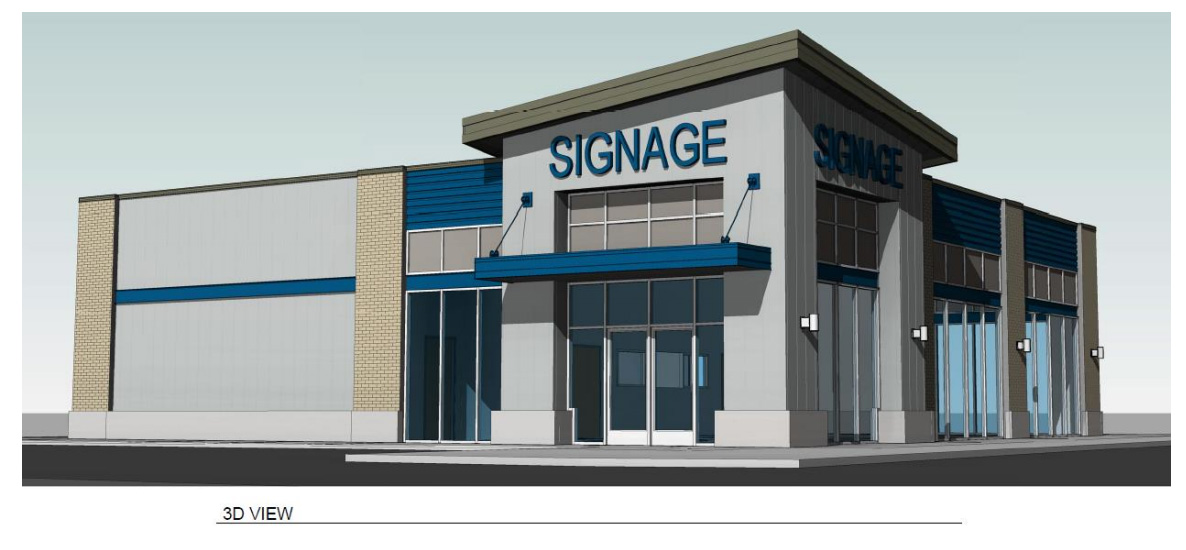
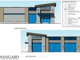
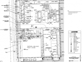
The building at 1278 S. 1st St. won’t win any design awards. It’s a slight cut above the standard suburban store, but still includes a single-use, largely fenced-in parking lot. Further compounding this, it backs up to the surface parking for the Cermak Fresh Market grocery store. Once the second suburban-style outlot building is complete, it will also connect with the surface parking lot to the north of the Freshwater Plaza Apartment building.
Given its suburban design on a heavily traveled corridor, the comments from Zoning, Neighborhoods & Development Committee chair Jim Bohl after the design was presented to the committee seemed a bit out of step. Said Bohl: “This I think is one of the next hot spots of development. It’s located between Downtown, the Third Ward and the continued booming area of Bay View.”Bohl is certainly correct that this is a hot spot for development (see my article: Walker’s Point Boomtown), but not for a development like this, which would never be approved on a main street in any of the three neighborhoods he mentioned. Surely S. 1st St., which connects the Historic Third Ward‘s N. Water St. to Bay View’s S. Kinnickinnic Ave. should be held to the same standard.
Kudos to Wangard Partners for continuing to land commercial tenants at a rate faster than any other multi-family developer in town, but it’s a shame they can’t all be in buildings like the firm’s Freshwater Plaza or Avenir apartments.
Both the Common Council’s Zoning, Neighborhoods & Development Committee and the City Plan Commission unanimously endorsed the project’s design.
In a follow-up email, Cockroft notes “All primary design characteristics of the Sherwin Williams project were dictated by the requirements of the Freshwater site GPD (General Planned Development) that was created jointly by Wangard and city planners and then approved by the City of Milwaukee Common Council. The design guidelines of the GPD were mostly driven by the City of Milwaukee zoning requirements and the City of Milwaukee Design Review Team. These elements include but are not limited to determining: master site design, exterior materials (brick, metal panel, concrete with minimal stucco/EIFS), building height, building frontage, clear glazing requirements, taller element at the building corner, articulated bays/piers, setbacks, parking, landscaping, parking lot screening requirements, et cetera – all of which the proposed design is compliant with.”
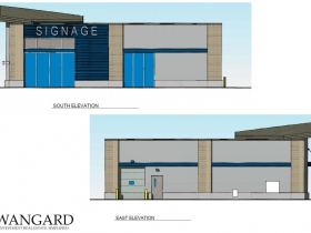
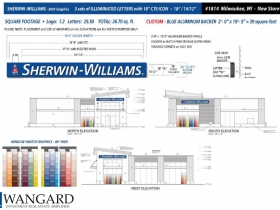
Renderings and Site Plans
If you think stories like this are important, become a member of Urban Milwaukee and help support real independent journalism. Plus you get some cool added benefits, all detailed here.
Political Contributions Tracker
Displaying political contributions between people mentioned in this story. Learn more.
Eyes on Milwaukee
-
Church, Cupid Partner On Affordable Housing
 Dec 4th, 2023 by Jeramey Jannene
-
Downtown Building Sells For Nearly Twice Its Assessed Value
 Nov 12th, 2023 by Jeramey Jannene
-
Immigration Office Moving To 310W Building
 Oct 25th, 2023 by Jeramey Jannene







Yeah, pretty bland design, hopefully the Walker’s Point Architectural Review Board will come together soon to stop these types of developments. With the success of the Freshwater Plaza apartments, I would think Wangard would want to keep the momentum going and develop additional mixed-use projects on the outlots, instead of single use buildings. The sites are rather large, and in my opinion could accommodate higher density projects. I’m sure there are some zoning limitations, but I’m also sure he could obtain the needed zoning changes for the right project. Such a high-profile site deserves better.
I’m not sure nicely designed buildings would make a difference on that corridor. It’s a pretty ugly street in most regards. Once you get to the river and points south, it’s a mess.
Yeah, Freshwater Plaza’s design is pretty f-ed up, and this single-story building adds nothing to the mix. Seriously. Surface parking in a rapidly growing area? This is laziness coupled with lack of vision. Disappointing.
This is the kind of lazy, careless design that I expect to see from Wangard.
Milwaukee needs better developers. There’s a handful that understand how to build lasting value, but so many just do the lazy Wangard thing.
And I take issue with the notion that 1st Street is somehow a throw away corridor, therefore crappy suburban design is OK. This street and the built fabric is by design. You can start to heal it, or further erode the urban character. Wangard choose the latter. Shame on the City for letting this happen.
I don’t think S. 1st a throw away corridor, I think it needs a lot of work. scale, traffic speed, setbacks, missing pieces, etc. I don’t believe we do streets/corridors very well in this city. There are a few examples of good corridor design, but they far and few between. We treat that corridor just as the article states, a bridge connecting the cool parts of town.
Can they at least commission a mural for that ugly grey poured-concrete canvas on the north side of the building?
The whole development there is rather suburban in design. I don’t think you can expect much in this exact location because of the towering Rockwell (Allen Bradley) building across the street that can’t be activated from the ground. It doesn’t lend itself to designs that work elsewhere. Perhaps, north and south of this is area will have better integration.
South 1st street (County Hwy 32) functions as more of a highway between the Third Ward and Bay View than a “neighborhood street”. That’s okay, as 2nd street and west of there have more of a neighborhood feel. Hopefully, east towards the harbor will develop in a similar vein.
I’d be happy if some of the intersections were changed to slow traffic (maybe some medians and tree planters, but I don’t know if that is feasible).
I’ve spoke with multiple business owners at freshwater plaza that indicated they want storefronts to open to 1st Street, but it’s deaf ears at city hall. They are making the storefronts face the cermac parking lots for various nonsense reasons. It’s really awkward for anyone arriving on foot – i.e. the residents of walkers point like me.
Not surprised we’re getting a suburban out lot design for phase 2.
Sam…. I agree with you about the intersections. As the intersections go, the corridor follows.
Jeramey, by suburban design, I think you mean not designed or whatever one does to make a building with some sort of character.
@Mike: Some of the store owners may have wanted a more urban design, but Cermak/Wangard did not. The city pushed back against this outmoded design, but Cermak/Wangard insisted. During negotiations for the site, the then-unnanounced grocer was adamant that their building be visible from 1st Street. The compromise was a more urban design on the southwest corner, with two suburban-style outlots.
It is truly unfortunate and a generational mistake.
Wow. Poised to create a new West Milwaukee 43rd street style corridor. This is egregious.