How Urban is Bucks New Arena?
Not so much. The biggest problem with the new Bucks arena design is the ground floor.
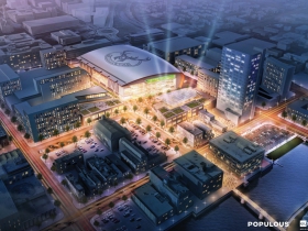
In May of last year, the Bucks unveiled a video titled the “Milwaukee Ripple Effect” about how a new arena would catalyze the revitalization of downtown Milwaukee. A lofty goal, and something that seems almost a necessity when considering the hundreds of millions of private and public dollars that will go into the new arena. The team’s master plan for the area reflects that vision, envisioning a mix of use from office space and bars to apartments and a grocery store. But will the new arena bring vibrancy to a new neighborhood and create a “ripple effect?”
Not as it’s currently planned; pedestrians will find it as much a dividing line as they do today’s faceless BMO Harris Bradley Center. Still, a couple design changes could go a long way to improve things.
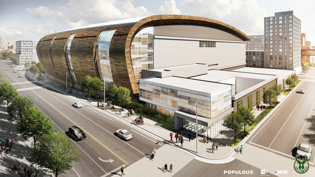
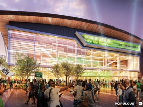
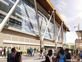
The renderings unveiled yesterday show a bold looking building that appears as if its been designed from the second floor on up. The designs show plenty of windows and design elements on the proposed building, exactly what’s needed to break up a building that occupies nearly two city blocks. Unfortunately they’re just all so high off the ground that even nearly seven-foot-tall Giannis Antetokounmpo won’t see them when he’s walking by.
Yes, the BMO Harris Bradley Center is ringed with blank walls today and is an anti-urban colossus, but the new arena shouldn’t be judged solely against the old one. If the new arena is to have a “ripple effect” as yesterday’s press release again proclaimed, it’s going to want to follow basic tenets of good urban design. It needs to be not just the largest gathering space Downtown, but also an inviting piece of the urban fabric when it’s completely empty.
Think of the best streets to walk down in Milwaukee. N. Broadway in the Historic Third Ward. E. Brady St. on the Lower East Side. The S. Kinnickinnic Ave. around E. Lincoln Ave. in Bay View. The one overarching shared trait they have is they’re activated on the ground level. The most obvious way to achieve this is with retail stores, but a million other possibilities abound from public art and street lights to varying building materials.
The new Bucks arena has almost no activation on three sides. If a great, urban neighborhood is expected to emerge around the new arena, let’s not build a black hole in the middle of it.
Ignore the Social Media Reactions
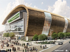
Yesterday, public reaction to the building, which dominated social media for most of the day, was centered around the wave structure that wraps much of the building. The wave is the signature design element that draws much of the polarizing feedback, although most responses seem to be tinted by the commenter’s political opinion about the project’s controversial public financing.
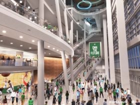
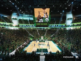
But focusing on the wave misses the most critical part of the new facility, the first floor. As interior renderings show, and as the BMO Harris Bradley Center works today, event attendees are going to spend little time on the ground level once they’re inside. Most will enter and head straight to the upper floors via stairs, escalators and elevators. The end result of such a setup is a design that features vibrancy-killing blank walls on the ground level.
We can all argue about design, a subjective process. What really matters is the more objective measurement of how activated it is on the ground floor.
The East Side is the Best Side
The entire east face of the building seems well conceived. Floor-to-ceiling windows line the eastern facade, while will help draw visitors to the Live Block on to the arena. The design suggests the Bucks arena business plan is for fans to stroll through the Live Block, purchase things and be drawn into the facility. A perfectly rationale plan for the team trying to maximize revenue. But what about the other three sides of the building; they look left out.
Where’s the Skywalk? And Other Rendering Oddities
Renderings are designed to sell the project, and its best features, so it’s important to look for what’s not shown. For instance, a missing skywalk and parking garage. The new parking garage, to be located immediately north of the facility along N. 6th St, will be used by thousands every game. Documents on the arena deal mention a skywalk connecting the garage to the arena, yet nowhere in the renderings does such a connection exist. What affect will that have when it’s built?
In almost every new perspective in the renderings released yesterday, strategically-placed trees block the view of the building’s ground level and soften its blankness. As any Bucks season ticket holder can attest, the games are more often played in the dead of winter. Trees are virtually non-factors at those times. I’ve walked from East Town to the Bucks games on many cold nights and what does make the walk more appealing is the activated spaces such as Upper 90 Sports Pub and the lights in Cathedral Square Park. Street trees can help, but the design needs more ground level activation.
Most notably missing from perspectives rendered is what’s certain to be the ugliest side of the complex, the southwest corner. There you’ll find what appears to be a one-story building matching up with the blank wall that runs along the W. Highland Ave. pedestrian street.
Compromise is Necessary
Arenas are inevitably not perfect urban buildings. Their sheer size and unique uses requires a substantial amount of loading dock space that in most cases can’t be well hidden. It’s unreasonable to expect the arena to be completely wrapped in street-level retail. Likewise, it’s unreasonable for the Bucks to think the arena could be three-fourths covered in blank walls.
Hidden behind those blank walls is in most cases not the arena concourse area, but instead back-of-the-house arena functions. The walls hide storage, control rooms, kitchens, locker rooms and more. It’s not like the team could simply replace the blank walls with windows and have a visually inviting scene for pedestrians to walk by.
But a compromise might be reached. The Highland Ave. pedestrian block looks forlorn, but isn’t worth fighting over. It’s a side street. W. Juneau Ave. and N. 6th St. are the key streets.The plans eventually call for redevelopment of nearby areas (the site of the BMO Harris Bradley Center and the Park East), but can future residents be reasonably expected to walk by loading docks and other windowless buildings along N. 6th St? No. Find a way to do some simple interventions to activate those buildings. Those trellises and vines shown in the rendering aren’t going to cut it.
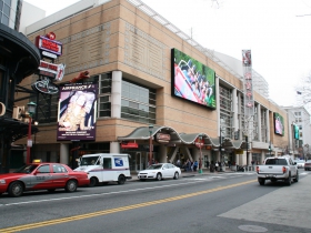
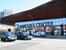
W. Juneau Ave. is the biggest problem. It’s the longest side of the building and has virtually no windows at street level. The new Barclays Center has a Brooklyn Nets team store to mitigate this situation, but the Bucks are presumably going to locate that in the Live Block. The Verizon Center in Washington D.C. has a number of first-floor tenants, but that area of Westown likely can’t support a number of new stores at this point.
What about a small television studio or two for nearby Milwaukee Public Television (MPTV)? A number of non-profit or government institutions in the area could likely use the street-front space and make the area feel more active. If new apartment buildings are going up in the area, and The Brewery continues to expand just up the hill, there is no reason the western half of the building couldn’t support some kind of small restaurant. Even a Subway sandwich shop would provide a source of activity. If all else fails, turn to the most sustainable Milwaukee business, a tavern.
Four Simple Fixes
What interventions can be easily inserted into the building? A number of examples are strewn about Downtown.
- When US Bank rebuilt their parking garage behind the US Bank Center, they fought back against the city’s desire to have first-floor commercial stalls built into the garage. A compromise was reached by having display windows that highlight student work from the Milwaukee Institute of Art & Design. The arena could similarly display team merchandise in displays along the Juneau Ave. frontage.
- In 2014, when Interstate Parking took over the former Milwaukee Athletic Club parking garage at 777 N. Milwaukee St. they partnered with NEWaukee and Reginald Baylor Studio to add a substantial number of automobile-themed lights along the north N. Milwaukee and E. Wells streets. While not terribly engaging, this was a low-cost intervention that enlivened the street. The new arena could use similar design techniques, perhaps going as far to include concepts from Reginald Baylor‘s design for a new Bucks court.
- The UWM Panther Arena includes the Wisconsin Athletic Walk of Fame, a series of plaques featuring Wisconsin sports legends. It’s a neat idea in theory, but stuck in the no-man’s land that is N. 4th St. The Bucks could honor their own legends with digital displays built into the new building to create a more engaging facade.
- Many people hate it, but it’s hard to deny the success of the Bronze Fonz on the Milwaukee RiverWalk. Tourists are drawn to it, and locals can use it as a wayfinding point. It’s a little early to make statues of Giannis and Jabari Parker, but the team could commission some more temporary art pieces that could be installed around the exterior to liven up the area.
What’s Next?
The arena will soon make its way to the City Plan Commission as well as the Common Council’s Zoning, Neighborhoods & Development committee before being voted on by the full Milwaukee Common Council. From there, it’s off to the mayor’s desk for a signature. Once that’s complete the Bucks will head to the city’s Development Center at 809 N. Broadway to pull permits, after which they’re clear to begin building. It all sounds like a labyrinth of government to work through, but it’s likely to all happen it the next two months. This provides some time for the Bucks to reconsider and make sure the proposed design has a true ripple effect on the area.
More about the New Bucks Arena
- Murphy’s Law: Bucks Violating Promises on Unions? - Bruce Murphy - Jun 5th, 2025
- Back in the News: Bucks Owners Continue to Cash In - Bruce Murphy - Nov 28th, 2022
- Murphy’s Law: Bucks Subsidy An Issue in US Senate Race - Bruce Murphy - May 9th, 2022
- Murphy’s Law: Bucks Franchise Worth $1.86 Billion - Bruce Murphy - Jan 25th, 2021
- Op Ed: County Parks Lost Funding to Bucks Arena - Patricia Jursik - Jul 7th, 2020
- Eyes on Milwaukee: Fiserv Forum Workers to Get $15/Hour - Jeramey Jannene - Jan 29th, 2020
- Eyes on Milwaukee: Bucks Beat Hiring Targets on Fiserv Forum - Jeramey Jannene - Nov 20th, 2019
- Murphy’s Law: Taxpayers Make Bucks, Brewers Rich - Bruce Murphy - Apr 16th, 2019
- Eyes on Milwaukee: Bucks Unveil Master Plan for Park East - Jeramey Jannene - Mar 15th, 2019
- Eyes on Milwaukee: Bucks Plan Massive Arena Signs - Jeramey Jannene - Feb 12th, 2019
Read more about New Bucks Arena here
Eyes on Milwaukee
-
Church, Cupid Partner On Affordable Housing
 Dec 4th, 2023 by Jeramey Jannene
-
Downtown Building Sells For Nearly Twice Its Assessed Value
 Nov 12th, 2023 by Jeramey Jannene
-
Immigration Office Moving To 310W Building
 Oct 25th, 2023 by Jeramey Jannene









Some great ideas for improving the design. I love the idea of having a small television studio on the highland street side. People LOVE to watch broadcast through the windows at the NBC studio in Rockefeller Center. And, down here in Chicago, its the same for the WLS-TV studio on State Street.
Frankly, I’m so in love with the roof it was easy to ignore–for a while–the street abuse committed by the ground floor design. The roof is truly iconic (it will be immediately recognizable as Milwaukee) and I think the curve and patina are just so darn handsome as design elements.
*** I rarely use the word “love” in describing anything, so get it while you can! Three times in one post! 😉 ***
I agree with you Jeramey. Accessibilty and engagement at a human-scale is critical to activating the area and to adding value to this signature section of our downtown urban fabric. I think you offer many good ideas. While visual engagement is key, part of the strategy should also be about making the area generally friendly to bikes and pedestrian interaction. The building itself has opportunity, but so does the immediate footprint adjacent to the building. How about lots of spaces where people can sit, rest, and view some of the art you suggest. How about lots of bike parking and bikeshare stations right up front – creating both better scale, accessibility and an environmental statement all at once.
While I agree trees don’t replace engagement, trees do represent environmental impact and, if there can’t be windows and displays, I’d argue to actually double down and add more trees, more paths and more natural amenities that create perhaps an uncommon feel of naturalness in such an otherwise unnatural space. I recognize there are limits to such elements in a place designed to take peak crowds, but I still think it would add termendous value.
That leads me to the other key element I think may be missing – environmental sustainability. I’d also argue for more intentionality about environmental impact in general. Its hard to know whether or not environmental impact is being considered in the design and construction at this early stage, but I hope the Bucks organization makes this a signature priority. It would be truly a mark of a the Milwaukee I think we want to be. Imagine if we are not only known for the signature roof, but for the rainwater the roof captures – perhaps recirculating it into an innovative water feature. Are they contemplating other energy systems, reclamation from the facility to be demolished, integration of natural light, reduction in toxic finishes, what else? What if we built the most visually stunning arena that had the most minimal environmental impact while the maximum engagement into the urban fabric. That would be a win.
Excellent points about street level activation. I have raised this same issue from day one and in response to the most recent renderings. The explanation I have been given is that the basketball court and all back-of-the-house facilities (locker rooms, training rooms, offices, storage rooms, kitchens, electrical lockers, loading docks, etc.) have to be on the ground floor since there is no basement due to a very high water table. I was told that digging a basement and locating the main floor and all back-of-the house functions below grade would significantly increase the cost and require 24-7 de-watering equipment. I was told that the Bradley Center had the same challenge and it does not have a basement for the same reason.
Having met with the local and national architecture teams on several occasions. I think they are highly competent. I would even go so far as to say that they would agree that street level activation is not ideal. Again, their explanation is that soil conditions and engineering challenges preclude the kind of activation that would be ideal.
I offer these comments for what they are worth. I think the critique about street level activation is still valid.
As far as environmental sustainability, these are also valid comments which I have also raised. I am told this aspect of the project is still a work in progress.
I recommend “hoops” cages (like batting cages) located around the perimeter but attached to the building, oh, and beer cages too.
According to a Milwaukee Journal article, the zinc panel roof was inspired by the Taubman Museum of Art in Virginia. Here’s an aerial photo showing the location of that museum, note the industrial vibe:
http://www.architravel.com/architravel_wp/wp-content/uploads/2013/05/Taubman_Museum_of_Art_Roanoke_2.jpg
The same article mentions that the KFC arena in Louisville, also designed by Populous, has a similar roofline design as to that proposed by the Bucks. Here are some photos of that building, which is far more engaging then the Bucks’ design:
http://populous.com/project/kfc-yum-center/
Populus says this about the CONSOL Energy Center in Pittsburgh, “Steelcity”: “And just as Pittsburgh has gone through a stunning transformation from a 20th century industrial center to a 21st century leader in technology and professional services, the arena looks to the future.” Again, a more engaging design:
http://populous.com/project/consol-energy-center/
Lastly, there was a design competition, public comment period, and stakeholder panel for the $30 million Lakefront Gateway Project. In comparison, for the new publicly owned arena, the purposed design has been presented four months before groundbreaking.
“How Urban is Bucks New Arena?” What is needed to make the proposed Bucks arena an urban destination is to build a Milwaukee streetcar station next to or under the facility. The Verizon Center in Washington, D. C. is served by the D. C. Metro Gallery Place/Chinatown Station (Red, Green and Yellow Lines). Milwaukee Streetcar service will be important to the success of the proposed arena and to the emerging streetcar system. The planned Couture residential tower and streetcar station can serve as a model. Link it to the successful Pabst Brewery redevelopment and unexpended convention center.
Next to the Verizon Center is an “alley” with an upscale Clyde’s restaurant and small kiosk style eateries. Perhaps, this type of intimate urban, almost European, design could be incorporated into the Bucks Arena to activate street level activity?
Good urban design should include state-of-the-art environmental features. Will the structure have a green roof? What is the planned LEED certification level?
Typo correction: “unexpended convention center”
Change to:
Expanded convention center
Good feedback, may I suggest if we have the “Bronze” Fonz, why not homage too “Laverne & Shirley” as well. And what about the cast of The 70’s Show as well. A great way to attract celerity & attention for tourism in our TV Walk of fame maybe even a “Liberaci sitting at a piano” with interactive music and sound tracts for pedestrian enhancement alsomany other noted celebrities with a Milwaukee connection.
Urban? Not very. In fact, it looks like a pre-fab outbuilding from Menard’s that you can put up over the course of a weekend. Another lost opportunity to build something noteworthy in Milwaukee. Sad.
I’m fairly disappointed with the design to this point on a big conceptual level (is a big, brown, wave truly the image we want to project for Milwaukee in the 21st century?), and at a ground level detail level. Three sides of the building aren’t up to snuff at ground level. Not to mention any details about sustainability are still a work in progress.
It would be bad enough if it was all private money, but it’s unacceptable to be at this point with public money on the table.
This is a building that needs to work. If no changes are required to the design, then everyone involved in the process has failed the City of Milwaukee and the State of Wisconsin.
J Koch – really? Please post a link to a pre-fab building that looks like this. I’ll wait.
Here’s the arena that is moving forward in Seattle. The design is based on the city’s glaciated terrain and coastal location, and the site’s proximity to an industrial area – an operational port. Capacity: 19,000. Cost: $490 million. Certainly more of a “wow” factor.
http://www.seattle.gov/dpd/cityplanning/designcommission/cs/groups/pan/@pan/@designcommission/documents/web_informational/s048681.jpg
https://search.yahoo.com/search;_ylt=A0LEV2BY_u5W_yEAqwWl87UF;_ylc=X1MDMjE0MjQ3ODk0OARfcgMyBGZyA3NmcC15ZmYyNgRuX2dwcwMxMARvcmlnaW4Dc3ljBHF1ZXJ5A3VyYmFuIG1pbHdhdWtlZQRzYW8DMQ–?p=urban+milwaukee&fr=sfp-yff26&fr2=ond_moz_off&iscqry=
Here’s an article that contains a view of the proposed Seattle Arena’s “backside.”
http://www.djc.com/news/ae/12083022.html?query=arena&searchtype=all
Corrected link to the Seattle arena design review submission:
http://www.seattle.gov/dpd/AppDocs/GroupMeetings/DRProposal3014195AgendaID4538.pdf
@MidnightSon Looks similar to the Bucks’ practice facility.
http://www.bizjournals.com/milwaukee/news/2016/03/17/first-look-milwaukeebucks-unveil-plans-for.html
Rather than a “fin” roof, the Bradley Center’s roofline could be adopted, which would be a nod to the past.
Jeramey & commenters raise many crucial points about how to keep the arena and related structures from creating another black hole in Westown. The project’s success and future of this whole neighborhood are at stake.
To Juli Kaufmann’s concerns about environmental sustainability, one key step would be for the Bucks to become a member of the Green Sports Alliance and publicly commit to sustainable practices. Many of their peers are members. Mayor Barrett, MMSD and others are striving to make Milwaukee a highly sustainable city. Civic leaders could insist that publicly subsidized projects make a real effort to live up to the city’s growing reputation as a green city. We don’t have to reinvent the wheel.
http://greensportsalliance.org/about/
The closing of 4th Street to all but pedestrians, and maybe a future streetcar, may also end up actually reducing vibrancy and connectivity, as has happened with most other pedestrian malls. Some say many new pubs will draw people to the Bucks “entertainment center” (4th Street “Live” block). However, Ald. Bauman and others have noted that such developments are often dead in the middle of the day and even on nights when an adjacent arena is dark. That’s all the more reason for design elements and uses that draw others to the area and connect to existing and potential enterprises. It’s good to hear these designs are evolving. I hope those involved take the time and creative energy to make this project sustainable and reflective of sound urbanism.
Nice discussion. I appreciate Alderman Bauman’s comment about back-of-the-house functions needing to be on the first level due to lack of basement levels. However, what’s wrong with windows on back-of-the-house functions? Many places allow you to see in from the outside to restaurant kitchens, office common areas, even infrastructure. I remember as a young kid walking past the MJS building on my way to the Arena and being able to see the presses running.
In Lambeau Field there are lots of offices with windows overlooking the very public Atrium area. I’m sure there are blinds that staff can use when privacy is needed. If the Bucks arena had some windows into its back-of-the-house functions and one could see team paraphernalia, kitchens preparing food for concert artists, even the storage areas for equipment it could help the street vibe.
@ Virginia Small A partial solution might be using the south side of Highland Ave. between 4th and 6th Streets as a significant public space/green space, and moving back the building setbacks from Highland for high density development occurring at the Bradley Center site. A basketball legend sculpture park could be placed, outdoor seating, and a bike station.
James,
Yes, a real park/green space would povide relief from all the massive buildings and concrete and boisterous bar scene. There needs to be human-scale development that helps open up all these superblocks and make this some place people would want to be. UWM students have done some design concepts for that space and the Bradley site
And Jeramey’s right to push for truth-in-design about that massive new parking structure (it’s much bigger than the one being torn down) and skywalk connecting it to the arena across Juneau. Surely those designs are well under way since that garage is one of the first structures being built. And what about the wrap-around housing meant to disguise that Parking Hulk?
Virginia, GRAEF was announced as the parking structure design firm only 3 weeks ago, and requests for proposals are now going out as to the residential component. As a result, overall design of key structures is going to be accomplished on a project-by-project basis. The chief review team coordinating overall design of the entire area will be the City Council.
http://www.nba.com/bucks/release/city-bucks-announce-construction-manager-and-design-team-new-arena-parking-structure
Has anyone pointed out that it looks a bit like the Bel Air at Water and Humbolt. https://www.instantstreetview.com/@43.056169,-87.898083,-16.42h,4.53p,0.67z
Our esteemed arbiter of architectural good taste county exec Chris Abele called the Milwaukee Dome McDonaldsy,well this beer barrelly arena design is sucky
disgusting anaphylactic design. Paying for the monstrosity is bad enough but having to look at this is indecent.
The wave concept should be blue or teal in color; the curve should be an s-shape and not look like a *%#* beer barrel.
Wait, Milwaukee’s getting the KFC Arena? The roof looks pretty similar. And based on Populous’s renderings, Louisville’s premier sports complex will have the better bars.
I love tapas. Did anybody even ask Calatrava for a sketch?
Calatrava might not even want to compete with himself in Milwaukee. Best to leave well enough alone.
And the Wall Streeters/Bucks owners may have known of massive problems with Calatrava’s $4-billion folly (a “transit center” boondoggle) at Ground Zero in NYC. It has not gone well nor been well received. There’s plenty of blame to go around, but things got so bad with his World Trade Center project that it opened recently with no fanfare.
Like many who achieve fame for a signature style, Calatrava’s taken to simply doing variations on a theme, as illustrated in these photos…
http://www.nytimes.com/2016/03/03/arts/design/santiago-calatravas-transit-hub-is-a-soaring-symbol-of-a-boondoggle.html?_r=0
http://nymag.com/daily/intelligencer/2015/03/santiago-calatrava-world-trade-center-path-hub.html
Sure, Populous also recycles its own designs too, but they’re in other cities. The Bucks Arena will have only a 25-30-year lifespan anyway, so why worry about whether it’s ugly, boring, a knockoff, turned-over beer barrel or whatever? After drinking enough Bucks beer while perched on the sports-bar “public” plaza (now 4th Street), the Arena might start to look as good as the other inebriated patrons.
Dudemeister, word on the street is that Milwaukee already has better bars—everywhere you turn.
Beer-googles will never make Milwaukee’s shed look like this, note that zinc panels are also used:
http://populous.com/news/2016/04/07/t-mobile-arena-officially-opens/
I want this to be building in Canada