The ultimate trip
Daisy, Daisy, give me your answer do.
I’m half crazy, all for the love of you.
(from “A Bicycle Built for Two”)
Recently I watched Stanley Kubrick’s 2001: A Space Odyssey (1968) for the umpteenth time, and it’s as fascinating as it was 40 years ago — perhaps more so after the 2001 unveiling of the Calatrava addition at the Milwaukee Art Museum. It’s remarkable how the architect echoes the film’s images of whiteness, light, spiraling forms, tunnel-like views and vaulted spaces punctuating long narrow halls. Kubrick’s icon arrived in the age of space exploration when the young Spanish architect was seventeen and likely exploring his own version of space. On a cloudless day when the sun floods Windhover Hall, it creates a field of blinding white, but from the first day I stepped into the area, it seemed oddly familiar. I was drifting through the film.
All of this pondering about an exceptional filmmaker and equally exceptional architect made me wonder if Sensory Overload (now – October 2009) would be better if installed in the addition’s marbled halls rather than in the severe contemporary galleries in the “old section.” Perhaps, though, all the light, motion, sound and optics would battle with the Calatrava; maybe overloaded art is best sensed where there are no additional distractions.
 As I write at my EV730 computer, the words of HAL, a 9000 computer, bother my head the way that Stanley Landsman’s “The Magic Theatre (Walk-in Infinity Chamber)” haunted me after I sat in it in 1968 when it was first exhibited at MAM. In 1967, Stephan Antonakos shaped “White Hanging Neon,” and a decade earlier, as the United States entered the space age, Josef Albers painted “Study – Homage to the Square (Lighted from Within).” It speaks of alienation, the expansion of time, and certainly the orange-brown square centering the painting (the source of “light”) suggests something beyond the sun as it must have seemed in the era when prehistoric man both wondered about sunrise and feared the dark. Fast forward to the evolution of the tool (where would artists be without it?) and future trips into space where gravity demands Homo sapiens must learn to walk again. I re-visited Sensory Overload on a marrow-freezing February 10, passing by “Alfred Leslie” (1970), a portrait of the artist looking like Neanderthal Man. He was holding a hammer.
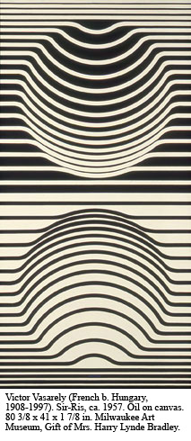
In order to thoroughly explore Sensory Overload, visitors may need to learn to walk again, if only to view “Sir-Ris, 1957” by op artist Victor Vasarely. Two globes, suspended in time (one black, one white) defy gravity and confuse the eye. Are we being tricked by the artist, sucked into a void that defies reason? Is man the “tool” rather than the force controlling the tool? Kubrick’s film emphasizes this dilemma, as do many great works of art incorporating a push-pull of tension, but where do we fit in a global culture that’s going to need more than a screwdriver to set it right?
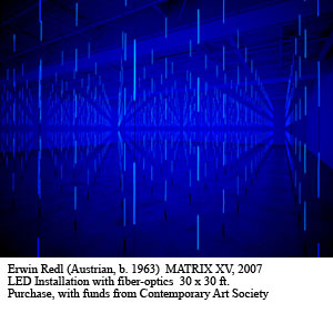
Open the pod bay door, HAL. Let me in. I need to explore closer to 2007 in the zone conceived by Erwin Redl in “Matrix XV, 2007.” My senses remind me it’s illusion behind those black curtains, but the LED and fiber-optics installation is more than a work of art. Inside are mathematical concepts bathed in blue light, concepts about perspective reaching a final point. But where is that point? Walk to the end (but is it the end?) toward a rectangular negative space, literally and figuratively the end of the line(s). To my mind, it resembles the monolith in Space Odyssey or a door yet to be opened. The pathways are narrow and dangerous, but curiously reassuring, as if science will win out in the end. But will it? Science could be leading us astray. HAL learned that lesson the hard way.
 In Space Odyssey’s final scenes, astronaut Dave hurls into a mélange of hot colors melting in an exploding spectrum where landscapes morph into panoramas of abstract expressionism. Imagine Gerhard Richter’s oil painting (“Breath,” 1989) magnified millions of times and combined with Arthur Dove’s “Sunrise” and “Shades of Violet” by Frantisek Kupka, and you’ll get my drift. In an earlier piece for VS, I wrote that MAM’s curator of contemporary art, Joe Ketner, encourages visitors to connect with various pieces in MAM’s contemporary collection. I did, and wondered how many years had passed since I’d admired Seymour Lipton’s “Marquette for the Voyage,” a bronzed metal grouping of figures and objects straight out of Stonehenge. In the Bradley Collection of Modern Art, two stories above, several works are a nice fit with Sensory Overload: “Sphere, No. 5,” Pomodoro’s 1965 bronze, and a grouping of Bertoia sculptures standing guard over the lake view to the east. I miss the kinetic aspects of these sculptures, but Howard Jones’ “Sonic II” (1967-68), smartly placed in the Sensory exhibition, makes up for the silence of the formerly active Bertoia pieces.
On February 7, the shuttle Atlantis blasted off from Cape Kennedy, bearing a load of equipment – perhaps even a screwdriver. Far below on planet earth, folks wander the halls of MAM. Some will say, “My kid could do that.” Others will purport to understand. But those who experience the Milwaukee Art Museum at its fullest will be those who expand their personal universe. VS


