What Explains the Decline in Bus Ridership?
An interesting debate was covered by the Journal-Sentinel the other day about why bus ridership in Milwaukee County was dropping.
Politics are at work, given the election season. Milwaukee County Executive Scott Walker blames the economy and is downplaying his decision to raise fares over the past several years, and transit advocates are saying that the drop is due to large fare increases and service cuts (fewer routes).It’s a finger-pointing situation I really hate, so I decided to go straight to the data, presented for you here to make up your own mind.
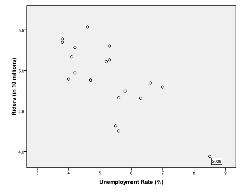
First, here’s data associated with Walker’s argument: that the declining economy explains the downturn in ridership.
Stats geeks will want to know that the correlation is indeed significant and negative. But taking a closer look at the data makes me wonder if unemployment really drives less ridership. Take a closer look at the graph. There’s a pesky outlier on the bottom right hand side of the graph. That’s the 8.5% unemployment rate in 2009, and it’s most likely skewing the correlation.
Translation: while there might be a relationship, Walker’s overemphasizing the impact of the economy on bus ridership. More on this point later in the post…
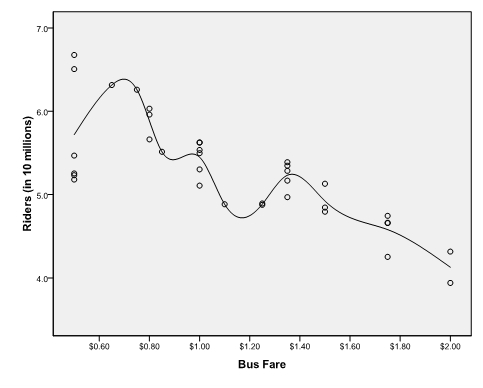
Next, take a look at the relationship between fare prices and ridership. Here, we’re testing the assertion that fare increases and service cuts lead to drops in ridership.

As evident from the graph, the relationship between fares and ridership is significant and negative. That is, as fares go up, less people decide to ride.
While both the economy and fares have a statistically significant relationship with how many people decide to ride the bus (even in the regression models I ran), if I had to bet on either I’d bet on fares as the major factor in play here.
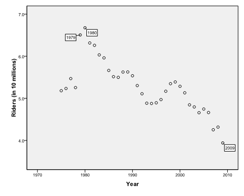
Why fares? It’s because when you look at the historical data, there’s a massive spike in ridership in 1979 and 1980 (see graph below).
Remember in 1979 the Iranian Revolution led to an energy crisis and recession – high gas prices, long lines at gas stations, cats and dogs living together, etc. If Walker’s argument is correct, then bus ridership in 1979-80 should have dropped precipitously. Instead, during hard times, people turned to public transportation.

Today, during hard times, people might be using transit more if County government reduced fares.
Of course, this doesn’t mean we should slash prices either. If we look again at the graph with fare prices (the middle graph), it shows that there is an ideal price at which to charge riders, around $0.75-$1 (the point at which ridership peaked). In theory, this price should maximize ridership, and bring in additional revenue to the transit system to cover costs.
Bottom line: Walker has evidence to back up his bad economy claim, but he shouldn’t be ignoring the fact that fare prices have a more important relationship with ridership totals. In other words, Walker’s budgeting decisions have led to less ridership.
Guest post by: John Kovari
John Kovari is a Ph.D. student in political science at the University of Wisconsin-Milwaukee and the 2008-2009 Norman N. Gill Fellow at the Public Policy Forum. Additionally, he has served as a legislative assistant to city of Milwaukee Alderman Michael Murphy.


I agree with route cuts and fare increases causing a decrease in riders. I use only a selected number of routes, but as bus frequency decreases and prices increase it does give me pause when considering bus vs. car when going out. It would also interesting to see a chart of ridership and gas prices.
Nice use of the data.
@Bill- I originally tested gas prices but left it out of the post. Specifically I looked at the correlation between avg annual gas prices in US cities and the ridership figures (between 1975-2004) and found no statistically significant correlation. However, the gas prices data is national, not regional, so I can’t say Milw gas prices and ridership aren’t related. Good comment.
BTW- Carlson’s got a funny editorial cartoon about this topic at the new milwaukeenewsbuzz.com.
If you’re just looking at the cost of fares vs ridership, you’re missing the picture of the relative cost of that fare. Changes in inflation over the years have altered the value of that fare and will distort its effect on ridership. The same can be said for looking at the cost of gasoline over time, the cost has generally decreased over time while accounting for inflation, which would explain some of the changes in ridership.
Another interesting analysis would be to compare the mileage of bus routes in operation vs ridership. While this wouldn’t account for quality of the bus line (40 vs 10 minute headways) this would offer a general comparison and probably show that more service = more ridership.
@Jesse- Great minds think alike. Although I didn’t post it, I adjusted the fare and gas data to account for inflation using the CPI. After adjusting into real dollars, the data smooths out (for both gas and fares) and actually strengthens the relationship with ridership as described in the blog. In short, fares are important even when accounting for inflation.
I also investigated the two others variables you brought up: miles travelled and hours of operation. You have it right too, as those two variables (miles and hours) drop, so does ridership. Walker’s route cuts led to decreased ridership.
Very cool John, thanks for following up. I’m sure a lot of time went in to putting this info together.
COOL! Transit geeks unite!
There is no question that ridership declines as fares increase. Transit planners often use a generalized rule of thumb for fare elasticity that says for every 1% increase in fares, ridership drops about 0.3%. So, if you have a 10% fare hike, ridership will probably drop by 3%. One of Walker’s past budgets made the mistake of estimating that there would be no drop in ridership after a fare increase, showing that he or his aides did not understand the law of supply and demand when it comes to fares. (Also, in the future, you really should use the CPI-adjusted fares, otherwise you leave yourself open to criticism.)
Likewise, ridership will of course decline as service is cut. I don’t have any rules of thumb handy but it makes sense that as hours are cut on a bus route, a certain percentage of people (even transit-dependent people) will be forced to not make a transit trip at all. As frequency of service is cut, a certain percentage of people (particularly “choice” riders) will decide not to use transit.
However, you have got to admit that unemployment and a weak economy IS in fact a factor–and a strong factor–in all travel demand (not just transit). Your first chart shows a clear downward relationship, even if you take out the outlier (which I would argue is actually not an outlier). An investigation into the ridership trends in a variety of cities (including cities where fares have not been increased) would prove this to be true. I can attest to the fact that ridership on many of the transit systems in southeastern Wisconsin has dropped, including the shared-ride taxi systems in Washington and Ozaukee Counties, and Waukesha Metro Transit, and Kenosha Area Transit.
In short, the question of “which factors influence ridership the most” seems like a perfect candidate for a multiple regression equation: R = CoefficientA(fares) + CoefficientB(Annual Hours of Service) + CoefficientC(Unemployment Rate).
–S. Dubielzig, Transit Planner for SEWRPC.
The health of transit services and the economy are intertwined. Cutting bus routes or making the bus too expensive means people who are dependent on those routes may lose their jobs. Raising bus fares and cutting routes makes it more difficult for people to look for work.
I agree with you in that ridership can be affected by both economy and fares, and in fact, by more factors including social, cultural, and behavioral. Your tried to argue that fares played a more important role than economy by using the second chart. However, the chart has a fatal flaw in that it does not take into account of inflation. I found the U.S. historical inflation rates from http://www.usinflationcalculator.com/inflation/historical-inflation-rates/ and made a chart of equivalent prices based on the 1980 rate, which shows a growth in straight line. Specifically, $1.80 in 2009 is equivalent to $0.60 in 1980. If you adjust fares in your second chart by the inflation rates, the chart would display a perfect flat pattern. By pointing out this flaw, I am not trying to deny the influence of fares on bus ridership but to emphasize the complexity of the problem.
@Ray- You’re absolutely right about adjusting for inflation. I did that earlier (using CPI rates) but didn’t want to make my write-up to nerdy. So at first glance you’re right – after adjusting, we find that 50 cents in 1975 is roughly equal to $1.99 in 2009 dollars. But be careful. The fare price trending is NOT a straight line as you suggest; it shows statistically significant variation. When I reran the graph correlating ADJUSTED fare prices with ridership, the trend is an even sharper decline than the graph I posted. Prices are still critically important in determining ridership rates, even after accounting for inflation. If you want me to email you the adjusted data and graph let me know – jpkovari@uwm.edu.
I would think that the number of jobs in Milwaukee that people rode the bus to would be dramatically different in 1979 vs 2009. Most of those jobs are either overseas, out of state, or in the burbs now. The population of Milwaukee has been declining since 1979 and there are more cars on the road now than in 1979, all of which would take away bus ridership. The population goes down and a bigger percentage of those who are left are now driving their own car. Prices have gone up since ’79, but the demand for mass transit has gone down through factors other than price. As time goes on, more and more people choose to own cars when left to their own devices. The only time any mass transit makes sense for people with cars, is if parking and traffic are too painful to deal with. Simply lowering the price to get more customers is what people who go out of business do. You need to understand the fixed and variable costs of the bus service in order to make that call. If your variable costs are out of control, adding more riders and routes will make you lose money even faster.
Well, that’s not really fair. I could go arnoud proclaiming that light rail technology inherently makes it cheaper (heck, it’ll even pay for itself!), but I’d get laughed out of the building. And then kicked off the transportation commitee. It sounds to me like the only thing inherent about anything having to do with this situation is the gullibility of morons.Responding to your earlier comment about the speediness of light rail: come on, give me a break. You know what else can technicaly go 55-65 mph pretty easily? My car. Technically. Too bad I’m stuck in traffic half the time. But, whoops! So is light rail. Okay, not exactly, but at least in Houston the train is going to have to wait at several traffic lights. And you’re probably not going to want it zipping through any urban areas at 60 mph anyway. I mean, there are kids out there. And dogs. That’s the great thing about light rail done right: it’s right in the middle of everything. Easy to get to. Unfortunately, that also keeps it from ever going as fast as it technically can.So that’s where monorail comes in: pure grade separation. It fills a different niche. If I’m going downtown from my house (like I will be in 2012, if things go as planned), then I’ll hop on the local light rail line. Even if it’s only going an average 15 mph, I’ll get to my job in a handful of minutes.But if I’m going to the other side of town, suddenly light rail is not so appealing. I want something faster subway fast. Or, barring that, monorail fast. This doesn’t have to be (or, at least, shouldn’t have to be) an either/or thing.(Oh, by the way, I REALLY HATE how your preview option centers my message and puts it in black text on a dark green background. I might as well just push post and pray that I haven’t effed something up)