Magical Thinking Transforms Parking Garage
How artist Reginald Baylor and others re-styled a longtime eyesore, the Milwaukee Athletic Club's parking garage.
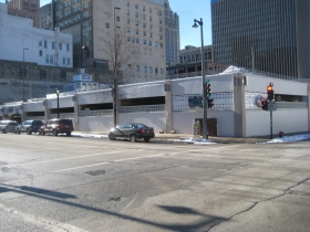
The Milwaukee Athletic Club‘s concrete-frame parking structure on the southwest corner of N. Milwaukee and E. Wells streets was built in the 1960s, in an era when “security” was the paramount issue in urban planning. It was designed to keep the cars and parkers safe and served its purpose in as unattractive a fashion as was conceivable.
By 2014, as it neared its half-century mark, the building manifested nearly everything that was wrong with mid-sixties urban planning. When the building was surveyed by the Wisconsin Historical Society Wisconsin Architecture and History Inventory in 1984 the reviewer was hard pressed to describe the style of the structure, settling on the term, “Astylistic Utilitarian Building.”
Yet, with a little prodding from the city, some clever suggestions from Newaukee, collaborative efforts from Plaid Tuba and a new, accommodating, deep-pocketed landlord, this parking structure, which represents the very pinnacle of “astylism” as an architectural form has evolved into much less of an eyesore.
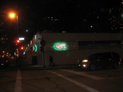
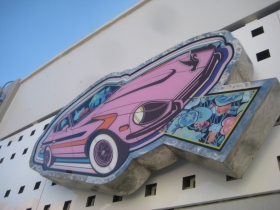
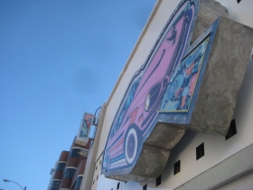
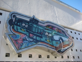
This is in large part due to two, sizable, illuminated murals of automobiles mounted on the northeast corner of the building. They are arresting, whimsical, utilitarian and bear the unmistakable stamp of Reginald Baylor, artist and former truck driver whose fancy often turns to the 1970s automobiles he loved as a kid.
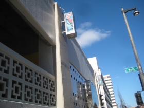
Not only did Reggie Baylor, Lydia Jarvis, PCI Group and others on the Plaid Tuba team put lipstick on this pig, they also dressed her up with a garland of LED lunettes repeating a fanciful floral motif that brightens up the stark facade and helps distract the eye from its tedium.
The lights are backlit, also have LED downlighting and are an elegant way to break up a monotonous space. The two automobile signs, a good five feet wide and three feet high, are mounted on brushed stainless steel frames cut to shape and fabricated with some considerable effort and skill by the PCI Group, Baylor said in a telephone interview with Urban Milwaukee.
The images are printed on translucent plastic sheets which are lit from behind. Additionally, colored lighting highlights and backlights the displays. The automobile images are mounted on a grid of punctured squares on a metal sheet, which is affixed to (and successfully obscures) the dreadful latticed concrete block of the structure. The white enameled sheets alone, even without the enticing automobiles, enhance the building and should be continued throughout the facade if city code permits. (You need a lot of airflow in parking structures, due to exhaust and carbon monoxide concerns.)
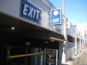
Another notable element in the building is so discreet as to possibly escape detection, and is something usually simply selected from a catalog, as Baylor mentioned, and this is the building’s signage.
Contrasting with Baylor’s subtle pastel motifs, the directional signs are hand-lettered in white on a no-nonsense blue background in a sprightly, yet not whimsical, script. The signs are embellished with little stars to lighten them up, and are very attractive, easy to read and well-placed.
This little grace note of introducing art into utilitarian places like parking garages represents the best of current practices in urban planning and its sometimes-derided cousin, urban placemaking.
This is the domain of Jeremy Fojut, the Chief Idea Officer for Newaukee, a group founded by Ian Abston in 2009 that seeks to “include artists at the center of community and economic development.”
Fojut’s work with the Night Market as part of the Creational Trails project attracted the attention of Tony Janowiec, the principal partner of Interstate Parking Company, which bought the parking garage and an adjoining surface parking lot from the MAC in March, 2013 for $1.7 million.
Major changes were immediately initiated at the building, including a new elevator, first-ever street access on N. Milwaukee St. to allow public as well as club parking, major structural enhancements and the new signage and lighting.According to Fojut’s account, “because of the work on the night market, typeface project and a couple other public projects [by Newaukee], Tony [Janowiec], the owner of the garage, reached out to set up a meeting… about doing something differently with a parking garage.
“We had a couple meetings about specifics and the need in Milwaukee to include and compensate artists in new design from parks to even parking lots. Tony absolutely agreed. … So I connected Tony with Reggie and they took over the creative process from there.”
Fojut added: “We receive a lot of calls asking for certain things and we make sure that 100 percent of programs come with a budget that pays artists as they would have paid anyone else to do work. Tony understood and believed in that concept and that is why this project came together.”
Baylor said his studio was “in the dialogue on renovations for the site and beautifications” for nearly a year. The building renovations offered “a special scenario that the city allowed, and a decision was made to use public art to meet the criteria” set by the city to make the structure somewhat less godawful as it transitioned from private to public use.
Baylor said he told Janowiec and his team that “I already have automobiles in my work, and that’s what you need for a parking lot.”
They agreed, and the work began.
Fojut said the group collaborated and came up with a consensus on the garage enhancements.
“We took into consideration a few things initially:
“1) The harsh reality parking lots can have to the urban landscape and a way to soften the curb appeal
“2) People always are looking for parking in that area. Now they will know exactly where to park as a meeting place. (The place with the pop art cars on the side)
“3) It was more than one piece we were interested in. We wanted the entire parking lot to have an artist touch (Reggie helped in the creation of a lot of way finding signage)
“4) It’s a great example of creative freedom and the ability to incorporate that creativity into a business model for artists in Milwaukee that work in this realm. ”
The changes to the parking garage’s structure made by Interstate Parking opened the building to the street on the Milwaukee street frontage, and permitted public parking in the building for the first time. However, a deed restriction maintains perpetual rights to the club for parking in the structure, or in whatever building might replace it one day. Eighty spaces in the structure are reserved for club members and guests. The remaining 120 are for daily public parking.
The new entrance considerably lightened the look of the building, and especially enhanced it from the alley perspective. You can now see clear through the place all the way to the Broadway Cleaners across the street. It also provides a lovely pedestrian shortcut to and from the MAC and the other neighborhood delights that lie to the west.
We should note that in addition to generating serious cash, parking lots are also sometimes used as placeholders for future urban development. This site is certainly on the redevelopment radar, and has been for decades. The Milwaukee Streetcar will run along the Wells and Milwaukee street frontages of the garage, which should prove quite handy for those who will chose to park and then ride the rails to their downtown pursuits.
According to the October 2010 Milwaukee Comprehensive Plan, issued by the Department of City Development, a key downtown recommendation is to “encourage redevelopment of the Milwaukee Athletic Club parking garage at Milwaukee and Wells Street.”
In the meantime, the garage has been deftly re-styled, one more victory in city redevelopment that may serve as a model for other such changes in the future.
777 N. Milwaukee St.
Plenty of Horne
-
Peter Mahler Leaves MSO Board
 Feb 23rd, 2026 by Michael Horne
-
Epstein Was Invited To NYC Fundraiser Featuring Scott Walker
 Feb 7th, 2026 by Michael Horne
-
Milwaukee Man Cited 393 Times in Epstein Files
 Feb 4th, 2026 by Michael Horne














To me, this tacked-on “art” barely rises above those ugly ladybugs on Water Street. But it’s better than nothing. Too bad the proposed MAC residential tower, to be built on that site, never went anywhere.
@Jeff Agreed I’d love to see that site redeveloped already… That said the art installation looks best at night, then it is pretty slick.
Another nice reporting job, Mr. Horne!
a couple cartoon cars & retro signs is “Magical Thinking”…. oooooookay.
A full-monty mural would’ve been more effective. Makes me wish I was a skilled graffiti artist.