Would Neon Colored Ashtrays Have Been Acceptable?

Janet Zweig’s Public Art
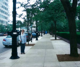
In case you missed it, at yesterday’s Public Works Committee meeting a previously contracted public art project was halted, because some of our Alderman didn’t find the art to their liking. The art in question would consist of five kiosks attached to light poles that would contain old fashion flip machines displaying uniquely Milwaukee scenes. Maybe some would prefer a serious of neon colored ashtrays or a bunch of automobile parts lining the pedestrian walkway. I don’t know, but that really isn’t the point. The point is, public art is supposed to add some interest or intrigue to a street, sidewalk, park, or public place that helps create a novel experience and encourages more people to utilize the space which in turn creates a better city. It’s unfortunate, no it’s shameful, that a few Milwaukee Alderman have halted yet another improvement to our city and find art “ridiculous” because clearly they aren’t seeing the forest through all of their smoke.
I am no art critic, this isn’t an art blog, so I couldn’t tell you if Janet Zweig‘s work is a master work or not, but again that’s just not the point. For example, I love the Calatrava wing of the Milwaukee Art Museum, arguably a piece of art in its own right, but there are certainly detractors in the architectural world that think it is more a monument to ego than anything particularly timeless. And there are others who thought the Bronze Fonz was the end of all art in Milwaukee, but again to each their own. What matters, is that it is time for Milwaukee to recognize that we have to value, we have to be open to, we have to be tolerant of, creativity, if we ever want Milwaukee to move forward.It seems that anytime art is brought up in Milwaukee it is immediately tarred as “a waste of money,” or “ridiculous” whereas in cities like Portland and Seattle public art moves ahead with creating a vibrant urban environment, that in turn helps grow their city. To be clear, no one small public art project is going to attract thousand of new visitors or residents to Milwaukee, but by creating a vibrant and unique environment, that is open to creativity, we can eventually grow our city. So the question really is which way does Milwaukee want to go?
For me, I hope it is to move forward.
Political Contributions Tracker
Displaying political contributions between people mentioned in this story. Learn more.


I was embarrassed, as a Milwaukeean, reading Alderman Willie Wade’s comment, “I am just not feeling it. But then I wouldn’t pay 50 cents for the Mona Lisa.” Why is public art such a bone of contention in Milwaukee? The Blue Shirt fiasco, the Bronze Fonz controversy…to me, art is something that pulls you out of yourself, into a different mental place, or something that you can get lost in- and find yourself thinking about long after you are done actually looking at the piece. Something that changes your viewpoint, even a little bit, whether it fits your definition of “beautiful” or actually think you like the thing.
In Alderman Wade’s defense I really think he was saying he was no art expert, to me Donovan storming out of the meeting was far worse.
looks like art and mass transit have something in common here. Its bizarre and unfortunate they are viewed as luxuries by many.
I agree. Art generally is something that ought to be taken more seriously by these aldermen. It can help bring out the “cosmopolitan” in the city and can help sell the city to outsiders/tourists. I’m disappointed by people who are reflexively anti-art, it makes them look close minded. And when “they” are city aldermen, it makes the city look close minded.
At the same time, there are people who are reflexively pro-art, and have no tolerance for anyone who says anything bad about any public art. Some art is good, some is bad. Some is worth a public investment, some is not. I’m no art critic, but I sure am willing to judge art when my tax dollars are involved. Zweig’s work seems really unique and has potential. I hope the scenes are better than the one with the guy pacing though.
There are plenty of things my tax dollars go to that I don’t agree with and that I don’t like. At least art, whether you like the specific piece or not, it will drive press, open dialogue, and give my friends and I something to talk about. For my money, I’d love to see something like St. Paul’s peanuts characters, Green Bay’s butterflies, or Bratislava’s bronze bulls…something that will showcase all of our local artists and create a unique way to tour the city.
My first impression, and keep in mind it’s a first impression and not the result of detailed study, is puzzlement. We already have enough problems with a behind-the-times city image, we don’t need mechanical flip-books on the street corner reinforcing how low-tech and lackluster the city is. To be completely honest, when I heard about it I flashed on the Big Blue Shirt.
That’s probably unfortunate, because perhaps if she has a chance to bring this through to fruition the artist could convince me that posting a mechanized equivalent of something was on my refrigerator when my daughter was in the third grade is, actually, art worthy of the name. When my third-grader did it, a flip book was charming. It’s really old technology, and to be brutal, the demo piece would have been boring back when the tech was new, much less today.
Public art does enhance the environment: Portland, for example, has sculptures based on the stones that marked trails through the region. I’d like to see Milwaukee underwrite something similar, calling upon the history of the area and bringing it into our daily experience, hopefully in a new and innovative way (somehow, the landing of Jean Nicolet as a flip book just doesn’t do it for me).
Seattle’s process, whereby the artist essentially collaborates with the city commission and several review boards, is probably a good method. Historically, “art for art’s sake” has been a non-starter, MGM not withstanding, and the artist has always been at the whim of the patron who pays the bills, and this simply extends it into today’s scene.
This is ticky tacky, but I have to correct your syntax. Your headline should read “Would Neon Colored Ashtrays Have Been Acceptable?”
shh nobody caught that one:)
These alderman should be embarrassed by their actions. To halt a thoughtful, pedestrian-scaled piece of art is a sad statement for where we are as a city.
If we will be putting art on our streets, please lets make it contemporary art and not that classic old style. Its 21st century out there. In Europe there is everything contemporary and looks nice. When you walk down their streets you feel like there is life going on because everything is blinking and bright and modern. Lets make our cities modern as well.
@Alex I just disagree. Why not have a diversity of art. All sorts of different references and ideas. The jumble the mixture to some extent is part of the fun, part of the intrigue, part of the vibrancy.
I caught the grammatical error, but couldn’t find a way to PM Dave (so I could tell him without embarrassing him).
Just for the record. 🙂
@Suzanne Oh it wasn’t the first time, and likely won’t be the last:) But this one’s on Jeramey for missing it during the proofread:) ok 50/50 fault!
On quite a few occasions I’ve seen the argument that Janet Zweig’s public art project will reinforce the negative image of Milwaukee as backward and lackluster because it’s retro and not “contemporary” enough. I couldn’t disagree more.
Whatever gets built will have to stand the test of time. Anything “cutting-edge” will, by definition, cease to be so almost immediately after being built. I therefore believe that any public art project should be evaluated on its merits rather than simply by novelty factor. In my opinion, Zweig’s project is interesting, human-scaled, and will almost certainly liven-up areas for pedestrians (isn’t this the goal of the federal project?). If this gets built, I look forward to stopping at the various installations and admiring and examining the animated scenes.
What I find particular particularly bothersome is that over $800,000 dollars gets spend on lighting a free interchange with no controversy (or any perceived need for public input), while a thoughtful public art project made in consultation with the local art community causes such a furore and is cited by many as an anachronistic waste of taxpayer dollars. Perhaps it is the prevalence of parochial attitudes like these (and senseless grandstanding by politicians who seek to halt a project on which much time, consideration, and public money has already been spend) that is more responsible for Milwaukee’s image as backwards and provincial.
Why don’t we stop calling it “art”, most of which is really bad, and call it good urban design.
Can you blame the alderman for being skeptical?
Look at Gordon Park or the ring at the footbridge overlooking Lincoln Memorial Drive.
Art advocates should figure out a way to remove these before arguing that “art is good”.
@Tom oddly I think you prove my point. I like like the “ring,” I think it looks nice there. Not everyone is going to agree on each individual item but the idea of improving public spaces with unique items, art, is what is important.
Well, Dave, that is really THE problem.
I can’t think of anything that would be somehow accountable to all of our collective whims or fancies that would end up being really good in the long run. Can you?
Why subject “public art” to this?
Of course some people will like X and some will not. What does that tell us? Nothing about work in question and perhaps a little about us.
@Tom No, I think the problem is that a we need to recognize the value of art to public space even if it doesn’t fit my own tastes.
Since when did lightpole mounted peep shows constitute art? One day maybe this city will have some REAL public art proposed instead of silly projects like this or the Big Blue Shirt or the orange asterisk.
For once our Alderman made the right call.
Boo-yah. You hit the nail on the head. As an artist and a Wisconsinite turned Seattleite I feel I should have something to add, but I don’t.