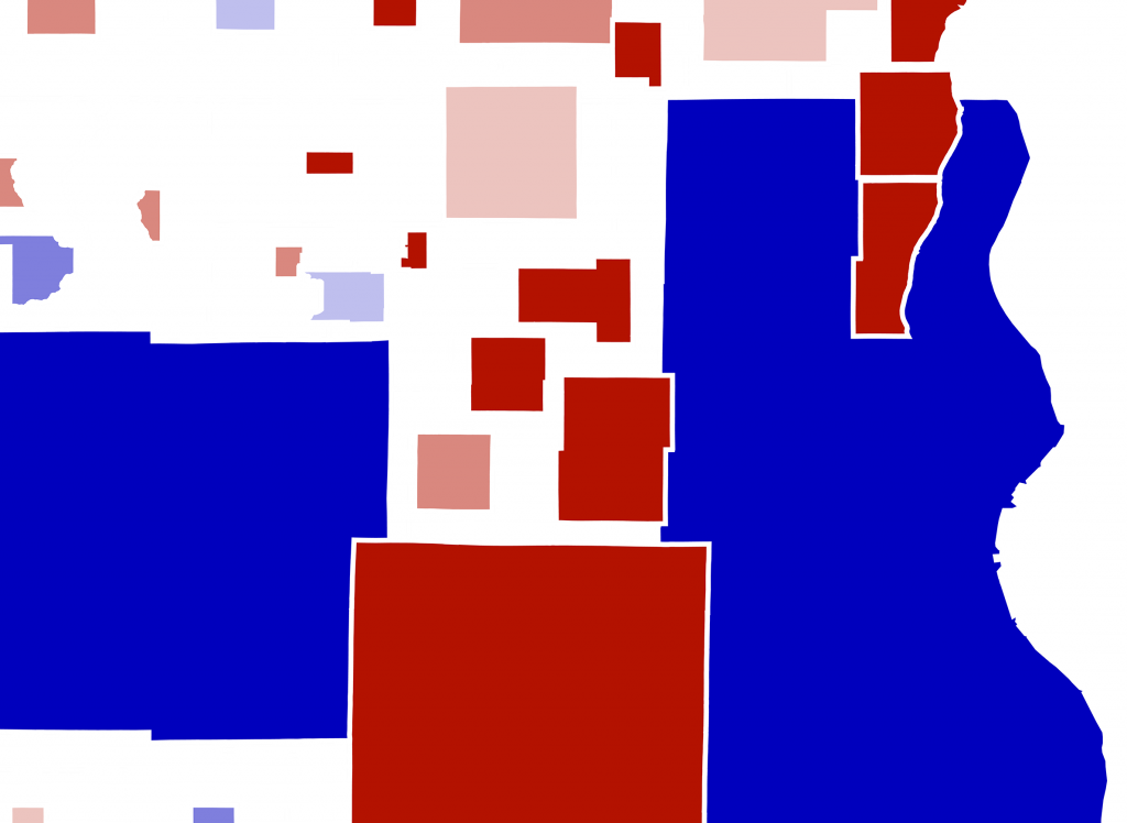
Cartogram Makes Last Election Look Different
Mapping by people rather than land creates very different picture of the state.
Gov. Tony Evers carried Wisconsin’s 2018 election for governor by a narrow margin of 1.1 percent, or just under 30,000 votes statewide. However, a glance at the county-level map of these results shows broad swaths of red. A majority of voters in around three-quarters of the state’s 72 counties cast their ballots for Scott Walker. This apparent divergence stems from a common ambiguity with election outcome maps that use counties to visualize data which are actually counted at the individual level — like votes.
An area cartogram is a special type of data visualization tool in which the shapes of a map are scaled by some variable other than square miles. Cartograms can highlight differences between places with high population density and places with large amounts of land and/or water but smaller populations. In other words, a cartogram shows population density in a graphical format. These differences can be dramatic.
The traditional county map of the 2018 gubernatorial election results, with shapes that represent land area, features color gradients showing the margin of votes for the Democratic candidate Tony Evers and the Republican candidate Scott Walker. This is called a choropleth map. Clicking on the “Total Votes” button a converts the map into a cartogram.
Transforming to a cartogram rescales each county according to the total number of votes cast in it for governor in November 2018, with results data from the Wisconsin Elections Commission. The individual county shape remains the same, but its size relative to all of the others grows or shrinks. The cartogram highlights a dramatic distinction between land area and votes cast in many Wisconsin counties, particularly those that are most densely populated.
Evers carried Milwaukee County — which contributed by far the largest number of votes in the state — by a wide margin of over 35 percentage points, about 138,000 votes. Evers carried Dane County even more strongly, by over 50 points and about 150,000 votes. On the other hand, Walker carried Waukesha County, the state’s third-largest by votes cast by a margin of 34 points, close to 75,000 votes. Although the vote across much of the northern part of the state leaned towards Walker, the relatively small voter population sizes of those counties added up to a smaller share of the overall vote.Cartograms are useful tools for visualizing data when the individual numbers are more important than the area that serves as their containers — as counties do in this example. The 2018 election for governor cartogram highlights just how significant the most heavily populated parts of Wisconsin are to statewide election outcomes.
Cartogram: Wisconsin’s 2018 Election For Governor was originally published on WisContext which produced the article in a partnership between Wisconsin Public Radio, Wisconsin Public Television and Cooperative Extension.


The cartogram at the top has a major error–Sheboygan, Ozaukee, Waukesha, and Waukesha counties are placed partly ON TOP of Milwaukee county, obscuring the point of the map itself. Why? Could this map be republished with corrections? It seems like the intent of the map is lessened by this obvious error.