
A New Way to Map Wisconsin
Introducing the cartogram, where people count more than land.
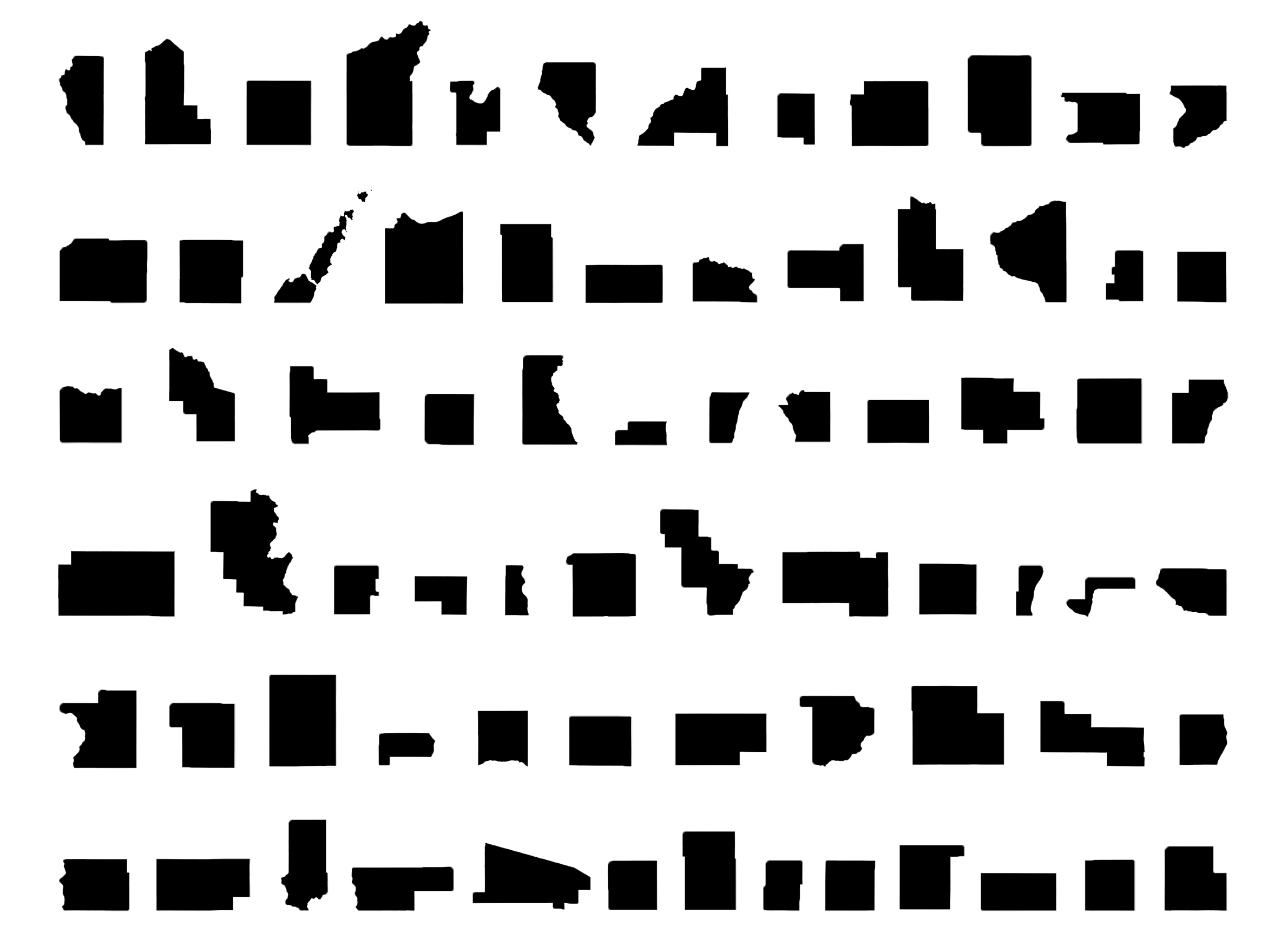
Cartogram. Illustration by Kristian Knutsen.
Maps are an indispensable tool for outlining natural features, human boundaries and transportation networks. But when it comes to depicting how many people are in a given place — how populations are distributed —a traditional map has distinct drawbacks. Mapmakers have sought to offset this limitation through an innovation that’s known as a cartogram.
There are two types of cartograms. Distance cartograms are often used to show stylized bus or subway routes. They depict networks without strict adherence to location or range. The other type is called an area cartogram. In these graphics, the size of each shape making up the map — like counties, states or nations — is adjusted to represent a different variable, often the number of people living there.
Cartograms can highlight the difference between places with large populations (or large amounts of whatever variable is replacing area) and places with large amounts of land and/or water, but which have small populations. In other words, a cartogram shows population density in a graphic format.There are many different ways to develop an area cartogram. In a contiguous cartogram, the shape of a specific area is altered to account for differences in population (or another variable), but shapes retain their positions relative to one another. This approach leads to distortion of the basic shapes. Another is a non-contiguous cartogram, which means that the shapes can move and resize without remaining in position with their neighbors. Rather, the shapes keep their usual form, and are scaled in size based on population (or other variable).
Cartograms can be helpful in interpreting data when the number of people is important. For example, area cartograms are often used to display election outcomes when the variable of interest is total number of votes —not some rate or percentage. An election results cartogram is an increasingly common tool used to help highlight dynamics related to population density. In conventional maps showing election results large areas that are sparsely populated take up the most space, and thus have the most visual impact, while more densely populated areas that take up very little land area have far less visual impact despite representing many more people.
In an non-contiguous area cartogram of Wisconsin, the state’s counties have been resized according to their their populations. Counties with large populations grow bigger than they would appear on a standard map, and counties with sparse populations shrink in comparison.
These two maps of Wisconsin’s counties highlight a few key points about the distribution of the state’s population. First, the cartogram emphasizes how overwhelmingly large Milwaukee County’s population is, relative to all other counties in the state. Dane and Waukesha counties stand out as the next two largest after Milwaukee. In addition, the other counties on the southern and eastern edges of the state together represent a preponderance of Wisconsin’s total population. Another takeaway is just how different an area-based map and a population-scaled map look. It’s easy to think of Wisconsin’s rural areas as making up a lot of the state, but in terms of population they are quite small.
A cartogram can help make sense of any topic where the important information is in the number of people, and there is wide variation in population density in a region. For example, cartograms can be useful illustrations of economic activity, immigration, school enrollment, votes, jobs or housing numbers.
Mapping Wisconsin In A New Way was originally published on WisContext which produced the article in a partnership between Wisconsin Public Radio, Wisconsin Public Television and Cooperative Extension.


You could refine the cartogram even more by adding the dimension of population density. As shown now, the Population cartogram shows a large Milwaukee County (most populous) and a smaller Dane County. Dane County’s population draws from a land area that is so much bigger than Milwaukee County’s. The land area of Dane County is 3101 square kilometers (it has a water area of 106 sq km). In comparison, the LAND area of Milwaukee County is 625 sq km. (Milwaukee County is listed as 3081 sq km in area, but its water area is 2456 sq km). Only Ozaukee County with 603 sq km of land area is smaller than Milwaukee County’s land area. Therefore, Dane County’s larger population comes from a much larger land “basket” than Milwaukee County’s — more than five times the land area. The density of Milwaukee County = 952,085/625 sq km = 1523 people/sq km. The density of Dane County = 536,416/3101 sq km = 172 people/sq km. SO: Milwaukee County is more than 8.8 times more densely populated than Dane County. The cartograph could include a shading intensity or color coding to indicate not just a larger population, but the density of this population.