
Who is Leaving Wisconsin?
And why?
Wisconsin’s economic performance is dinged in a report put out by the American Legislation Exchange Council (ALEC) because more people leave the state each year than enter it. What can we learn about this migration and which states share residents with Wisconsin?
The migration data are a by-product of the US income tax system. Each year at the end of tax season the Internal Revenue Service reports on the number of taxpayers whose addresses have changed from the previous year. The most recent data compare addresses on 2015 and 2014 returns. Did the state change—or the county within the state?
Before jumping into interpreting this data it is worth pointing out two observations:
- Only people filing returns in both years are counted.
- When it comes to moves between states, this is a zero-sum game. A gain for one state is a loss for another.
Which states are the primary Wisconsin migration partners?
As can be seen from the chart below Minnesota and Illinois are the two largest sources of new Wisconsin residents (shown in green) and also the primary destinations for former Wisconsinites (shown in yellow). The net migration is shown in red, pointing upward if the net flow is into Wisconsin and downward if it is out of Wisconsin.
In the case of Minnesota, more people leave Wisconsin than enter it. The opposite is true in the case of Illinois.
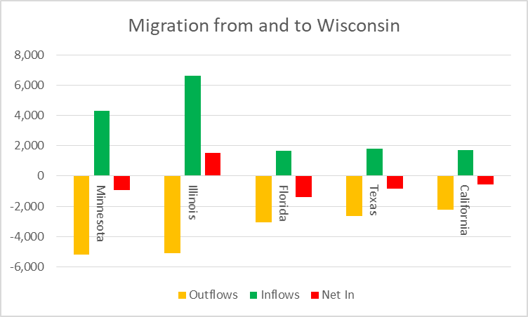
Migration from and to Wisconsin
The next three biggest flows are between Wisconsin and Florida, Texas, and California. While the net migration in each case is outward, the inflows are also the next three largest. As with trading partners, where Canada, Mexico, and China are the largest importers of Wisconsin products and the largest exporters to Wisconsin, larger inflows seem to be associated with larger outflows.
Which counties are Milwaukee’s primary migration partners?
The IRS also counts moves between counties. (New addresses within the same county are counted among the non-migrants.) The next chart shows the in- and out-flows between Milwaukee County and its six largest migration partners. Except for Cook County (Chicago), all are in Wisconsin. Three are within the Milwaukee metropolitan areas. Waukesha County is by far the largest partner.
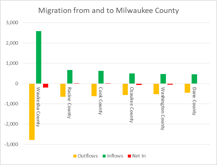
Migration from and to Milwaukee County
Is higher pay driving migration?
One reason to move is for higher pay. The next chart shows the pay for Wisconsin and its five largest migration partners. To check for consistency, I calculated it two ways. The first is the adjusted gross income (AGI) per year, shown with a yellow line and using the scale on the left. It was calculated by dividing the total AGI for a state by the number of returns for that state.
The second was the state’s average weekly wage, as estimated by the Bureau of Labor Statistics. I included them both because they show a remarkable consistency despite being calculated using very different methodologies and data sources.

Average AGI for Wisconsin Migration Partners
Here is a second way of showing the same information, showing the income clusters among Wisconsin and its migration partners. Now the story gets complicated. Minnesota and Illinois have about the same average pay, both substantially better than Wisconsin. Yet their net flows run in opposite directions.
One can speculate that government dysfunction in Illinois—the inability of the governor and legislature to agree on a budget and how to solve the state’s pension shortfall—helps explain the difference. However, this is a dangerous and well-trod path, leading to finding reasons to explain away data that does not fit a hypothesis.
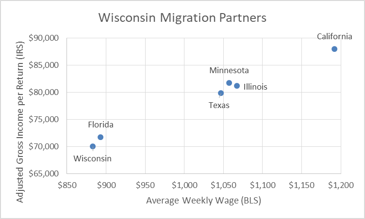
Wisconsin Migration Partners
Another problem with going this route is that it assumes that a new resident in a state with higher average pay will personally benefit from that higher average. That may or may not be true in a particular case.
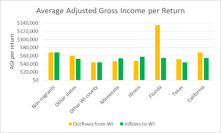
Do people move because they are suffering financially?
This asks a slightly different question. Do people leave a place because they are not doing well where they are? If this were true, one would expect the non-migrants to report higher average AGI than the migrants.
The next chart offers limited support for this hypothesis. It shows average AGI for those who had the same Wisconsin address both years (non-migrants), followed by those moving to or from other states and those moving within Wisconsin. This is followed by income for moves to or from Wisconsin’s 5 largest migration partners.
Average Adjusted Gross Income per Return
On average people who stayed put in Wisconsin did better than those who moved from or to other states and especially better than those moving within Wisconsin. One has to be careful with this conclusion, however, because it does not control for the stage of a person’s life among other possible factors. For example, perhaps the results for the migrants is heavily influenced by the inclusion of young people just starting their careers. The fact that the migrants have fewer exemptions on their returns suggests that this is a factor.
As with always there are exceptions to this rule. People moving to Florida and, to a lesser extent, California show higher income than the non-migrants. Perhaps this spike reflects retirees who sell their Wisconsin assets and get a boost in AGI.
The average AGI is for the second year—in this case 2015. This means we cannot check whether the move improved a person’s financial situation.
One oddity in the state data is that in-state migrants seem to be poorer not only than non-migrants but also those moving across the state line. Perhaps this reflects moves between rural counties where average income is lower than in the cities.
Why does moving within Wisconsin seem to hurt financially?
The next graph shows moves from and to Milwaukee County. As with moves to and from Wisconsin, people who move show lower average income than those who stay put. This is particularly true of people who move into the county.
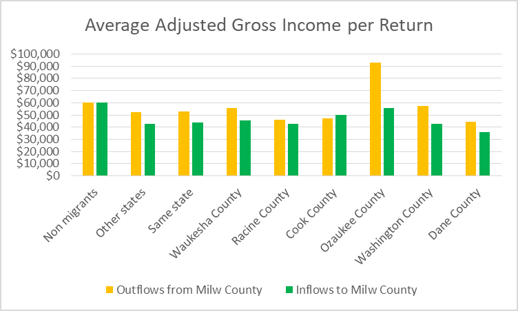
Average Adjusted Gross Income per Return
Again there are exceptions. Notably those moving to Ozaukee County seem especially prosperous.
Is moving an advantage?
The next chart shows the average AGI per return for Wisconsin based on the primary taxpayer’s age. This is based on another IRS data set, which does not show which state was also involved in the move. The solid lines are for 2014; dotted lines are for 2015.
The blue lines are for people who did not move. The yellow is for people who moved from Wisconsin; green for those moving into Wisconsin. The brown line is for those moving within Wisconsin, from one county to another.

AGI per return for Wisconsin
Again, interpretation is tricky. A superficial conclusion is that for a middle aged Wisconsinite, moving out of Wisconsin is a good career move. More likely, executives moving up in their companies bias the data.
Is net migration a good measure of effective state policy?
Much more is needed to know about the reasons that people in various stages of their lives decide to move from one state to another before concluding that the reason people move is because of the presence or absence of a particular state policy.
After studying the IRS migration data from various angles, I find that the broad patterns are not easily explained. For individual states, constructing a plausible story is often possible in individual cases: for instance why there is net migration from Wisconsin to Minnesota or from Illinois to Wisconsin. But so far there are more mysteries than answers.
Data Wonk
-
Who Do You Trust to Conduct Elections Fairly?
 Apr 6th, 2026 by Bruce Thompson
-
Is Non-Citizen Voting a Real Threat to Elections in Wisconsin?
Mar 18th, 2026 by Bruce Thompson
-
How Global Climate Change Affects Milwaukee
 Mar 11th, 2026 by Bruce Thompson


Unable To Pay Bills, Illinois Sends “Dear Contractor” Letter Telling Firms To Halt Road Work On July 1- (Zero Hedge) As- Illinois’ bond rating careens towards junk, Illinois Unpaid Bills Jumped to $14.3 Billion. Today, the state told contractors to halt roadwork other than that required for safety.
Interesting article Bruce! I like the fact that your inquiry is not trying to prove a point, but to ask what the data is, and what problems does it explain or fail to explain.
In the last set of comparisons (in vs out of Milwaukee county) I wonder if the somewhat turbulent patterni is just due to small sample sizes, especially Ozaukee County.
One issue on these discussions of “net migration” is the time frame for analysis. Milwaukee County, for example, has had negative total net migration since the 1960s! There has been negative net migration of African Americans from Milwaukee County since the 1990s. Why didn’t anyone notice? Because “natural increase” (births minus deaths), either swamped the net migration numbers or offset them. See http://www.netmigration.wisc.edu/ for details by county for the nation by decade since 1950.
I’ve been interested in this topic for a while. I think the reason you see people move from Illinois, then Wisconsin, then to Minnesota is the tax burden on lower and middle class residents. Most tax rates are highest in IL, then WI, then MN. The biggest consideration from my perspective is property taxes. WalletHub’s 2017 ranking listed Illinois as 2nd highest, Wisconsin 5th highest, and Minnesota far lower. The same is true for Gas taxes per gallon, vehicle tabs(Minnesota’s rate varies greatly being as cheap as $35+wheelage from $5-$20 to as high as several hundred on brand new vehicles with wheelage costs although the cost of tabs fees can be written off on taxes. But most people will pay around 100-150 on newer vehicles that aren’t brand new. Income taxes overall are highest in Wisconsin, followed by MN(the amount varies widely due to income level, status and head of household. Illinois is slightly less currently although could be subject to going up with the budget issues. Sales tax is also highest in overall in IL with rates ranging from 6.25%-11% depending on local taxes, followed by Wisconsin(lower rate at up to 5.5 but applies to nearly everything compared to Minnesota that has rates starting at around 6.875-max to 8.375(Duluth is the only city that can charge the highest amount of 8.375% written into the state constitution beyond items like eating out/lodging that can have higher rates but remember, food, clothing, shoes and some other services are not taxed at all unlike both IL and WI). Housing costs are far higher in IL and fairly similar in WI And MN depending on where you look…Rent also varies by market. Wisconsin might be slightly less expensive to initially buy a home but property taxes cost far more in the long run. Utility rates vary by location so hard to compare in all three states(some areas have the same providers in multiple states aka Exel).
My point with all these figures and how it relates to population movement is that lower and middle class earners move from Illinois to Wisconsin to Minnesota and in some cases even the Dakotas(Fargo/Sioux Falls although less earning potential and jobs to pick from due to smaller markets). So if you want to make more income and pay the least taxes if you are lower or middle class(which far more people are than in rich tax brackets), then moving west makes a lot of sense. If you add all the different tax/fee burdens up, Illinois and Wisconsin cost more for lower tax brackets overall. The difference in property tax rates alone more than makes up for any tax/fee that may be higher in the other two states. Minnesota taxes more based on big earnings or luxury items, or wants vs needs….when you’re broke, do you want to be forced to pay tax on food and clothing, or would you rather pay more eating out at a restaurant when things are good. Most lower and middle wage earners aren’t going to have new cars…if you buy an expensive new vehicle, you can probably afford the highest tab fee. Most people who are broke drive cars that are 10+ model years old…so the $35-$55 is more affordable for them. Pay rates in IL and MN are fairly similar, depending on profession…Wisconsin pays less, thus housing can be a bit cheaper with more homes/rentals to choose from in big markets. Property taxes in MN are the lower for residential because businesses pay higher property taxes(and can normally afford to pay more). With by far the highest minimum wage, would you rather get paid 7.25 hourly in Wisconsin or 9.50 an hour in Minnesota? That difference adds up to nearly $5000 a year for someone working full time at a fast food place. Most businesses in this job market can’t find anyone to work in larger areas but in small areas with less opportunity, $5000 a year is a lot. The challenge for Wisconsin is too many residents are working in Illinois and Minnesota to get paid better, and it’s costing the state a lot of money in the border city areas. All of this is just general observations I’ve noticed living near the MN/WI border and occasionally traveling to Illinois. When you drive between all three states, you start to notice big differences in quality of life. I’m sure someone can pick apart some of these stats, but the population movement stats I’ve been seeing continue to back up this line of thinking. I think they are definitely telling us what’s working and what’s not working. Unfortunately for those living in Illinois, the costs are going to get a lot higher before the budget issues are said and done.
People are leaving because of Walker and how he has destroyed the state. Poverty rates are at 30 year highs in Wisconsin thanks to career politician Scott Walker. But unemployment is low they say…I agree, people are working, for slaves wages with no benefits. Poverty andbhopelessness abound in.much of rural and urban Wisconsin thanks to Big Government moocher Walker. Pack your bags and get out people! All the young educated people are moving to states where cannabis is legal and abortion rights and gay marriage rights are respected. Solution?
Dump Walker!