Is The Central City Economy Improving?
Black employment has risen. Why?
Milwaukee and its suburbs have a small industry of people committed to proving that Milwaukee is a terrible place. Some are well-intentioned, hoping that pointing out the problems will bring resources to bear. Others, obviously, have different agendas—seeking support for their hostility to cities or the people who live in them.
It is useful from time to time to do a reality check. What do the data show? In this column I look at what unemployment rate data show for the city of Milwaukee and for African Americans in Wisconsin.
It is useful to note that the Milwaukee metropolitan area is often described as one of the most segregated in the country. This is largely due to the ongoing opposition to affordable housing in most Milwaukee suburbs. The result is that the story of Milwaukee closely tracks that of minorities and low income people in southeastern Wisconsin.
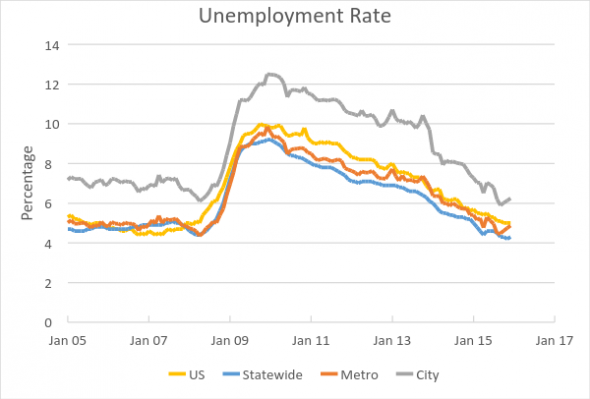
The graph to the right shows the unemployment rate for the US, Wisconsin, metro Milwaukee, and the city of Milwaukee. The figures run from 2005 (when the local series of data starts) to December 2015. Prior to the Great Recession, unemployment gradually declined in Milwaukee. It then peaked at over 12 percent, reflecting much higher peaks among the minorities and poor people who are concentratied in Milwaukee.
Following the peak, the Milwaukee rate declined in a parallel fashion to—but above—national, state, and metro rates. Recently the gap between Milwaukee’s rate and the others has been narrowing. By the end of last year, the Milwaukee unemployment rate had returned to its pre-recession level.
Interpreting unemployment rates can be tricky. At least three issues can cause misinterpretations: sampling error, seasonality, and who is counted in the workforce.
The calculation of the unemployment rate is based on surveys of a sample of households. As populations get smaller so do the sample sizes. This is reflected in the much more jagged plot for the city of Milwaukee than for the US as a whole. As a result, one must be far more cautious in interpreting the results at the city level.
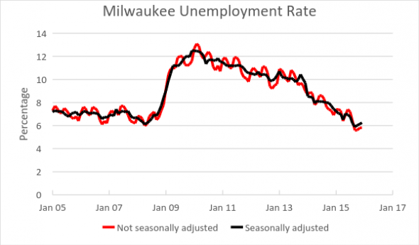
All else being equal, some months have higher unemployment rates than others. For example, unemployment peaks in February and reaches its lowest level in the fall, as shown in the plot on the right.
For the nation and states, the Bureau of Labor Statistics offers statistics that have been seasonally adjusted and those that have not. For metropolitan areas and cities, however, only unadjusted statistics are available. As a result, I calculated seasonal factors for Milwaukee and the metro area.
The effect of the seasonal adjustment is shown in the next graph. Milwaukee’s unemployment rate before adjusting is shown in red and that after adjustment is shown in black.
The third problem is most serious. It is not obvious who should be counted in the workforce. Unemployment is calculated from a survey of households. People are asked whether they are employed or, if not employed, are looking for a job. The workforce is the sum of the two. The unemployment rate is calculated by dividing those not employed but looking by the size of the workforce. This calculation acknowledges that many people who are not employed are not unemployed—students, retirees, or stay-at-home parents, for example. When Donald Trump claims the unemployment rate might be as high as 42 percent, apparently he is counting those people as unemployed.
Other situations are more ambiguous however. What about people who have given up on finding a job? Sometimes an improving economy will lead to higher reported unemployment if discouraged workers decide it is worthwhile to look for a job. Conversely, lower reported unemployment may reflect good news—more hiring—or bad news—people giving up on finding a job.
Reflecting this, there are several unemployment rates. The most common one, called U-3, which counts only those actively looking for a job in the previous month, was 4.9 percent nationally in January. It is the one used here. Adding those who once in the last year looked for a job and the part-timers who want full time gives an unemployment rate of 9.9 percent nationally (called U-6).
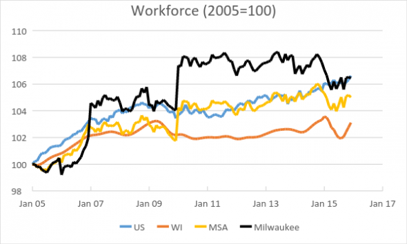
One way to separate out possible explanations for changes in reported unemployment is to look at the workforce. Is it growing or shrinking? There are many factors, both positive and negative, that can affect the workforce. The seasonally adjusted national, Wisconsin, and Milwaukee workforce are shown in the next plot. To fit them on the same chart, I compared them to the January 2005 values. Not surprisingly the workforce is higher in the summer than the rest of the year, presumably because of summer vacation.
Consistent with the jobs figures (calculated from a different survey—of business establishments), the national workforce has grown faster than Wisconsin’s.
The behavior of Milwaukee’s workforce is somewhat puzzling. For instance that data show substantial jumps in January of 2007 and 2010. Perhaps they reflect the small sample sizes.
Another approach is to look at Milwaukee’s largest ethnic groups. The Bureau of Labor Statistics does not publish unemployment numbers for African Americans in Milwaukee. However it does publish annual tabulations of state employment, broken down by age, ethnic group, gender, and other factors. Since two thirds of Wisconsin’s African Americans live in Milwaukee, the state figures are driven by what is happening in Milwaukee.
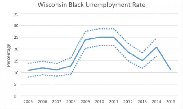
The next graph summarizes the unemployment rate for African Americans since 2005. The dotted lines show the confidence interval.
The black unemployment rate peaked at 25 percent during the Great Recession. Thereafter it dropped, but remained high.
In 2014, there was another peak. 21 percent of Wisconsin’s African Americans were unemployed. The 2014 figures led to a rash of articles declaring Wisconsin—and Milwaukee by inference since it has such a high portion of the state’s African Americans—as the “worst state for African Amercans.”
The 2015 figure puts Wisconsin (and Milwaukee) in the middle of the pack. However it is preliminary, reflected in the lack of confidence interval. A note accompanying this table states, in part: “This table will differ from the final table in a number of ways, but it is expected that the data—particularly for labor force participation rates, employment-population ratios, and unemployment rates—will be little changed for common State-demographic groups.”
Without further information it is difficult to assign causes to the apparent improvement in the economy of the inner city. Clearly Milwaukee is experiencing a building boom, the largest I have seen in the 40 odd years I have lived here. To what extent are inner city residents benefitting from the construction jobs?
An earlier Data Wonk column on the possible effect of the streetcar project on inner-city employment pointed out that downtown Milwaukee was far more accessible by public transportation than suburban office parks. One would hope that inner city residents would be among the beneficiaries of this increased economic activity.
Data Wonk
-
Who Do You Trust to Conduct Elections Fairly?
 Apr 6th, 2026 by Bruce Thompson
-
Is Non-Citizen Voting a Real Threat to Elections in Wisconsin?
 Mar 18th, 2026 by Bruce Thompson
-
How Global Climate Change Affects Milwaukee
 Mar 11th, 2026 by Bruce Thompson


