Milwaukee Art Museum Unveils New Addition
Glassy new addition to museum also creates more exhibition space. Here's a tour.
The Milwaukee Art Museum held a preview on Friday of the new addition to the museum that has replaced much of the East Wing of the museum, created a new lakefront entrance, added exhibition space and facilitated the-reinstallation their collection galleries.
“We believe it sets a standard for 21st century museums,” says Daniel Keegan, director of the Milwaukee Art Museum.
The project, which took six years and cost $34 million, required the museum to move 30,000 works of art in and out of the east wing during the remodeling. Funding for the project consisted of $10 million from Milwaukee County, which also owns the two buildings that underwent the construction, and $24 million raised through the Museum’s Plan for the Future Campaign. The buildings that are the site of the new project are the Eero Saarinen-designed War Memorial Center built in 1957, and the 1975 David Kahler-designed addition.
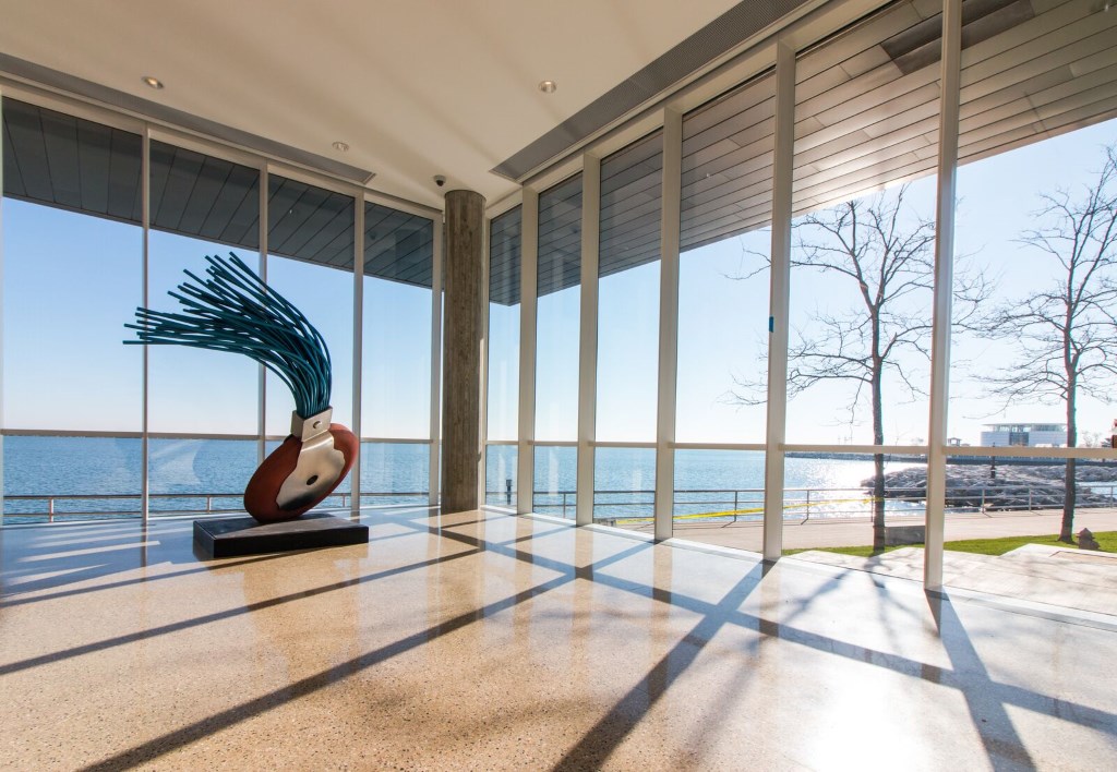
The new addition to museum created an expanded 150,000 square foot space that can display 2,500 pieces of art, which is 1,000 more than it could previously. The east wing also features a new entrance with sweeping glass walls providing a panoramic view of Lake Michigan. The windows, which were formerly black glass, now allow people on the lakefront to look into the museum. The new entrance will also feature a coffee shop and lounge area.
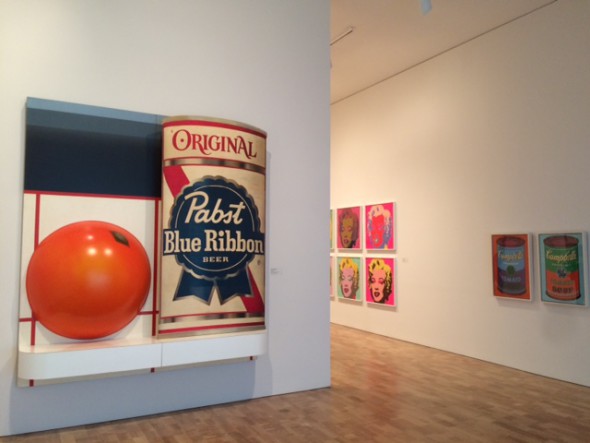
As visitors approach the freshly re-modeled east wing of the museum from the museum’s main entrance in the Calatrava addition, they will see at the end of a long glass windowed, arched hallway a massive can of Pabst Blue Ribbon beer — a nice touch of Milwaukee — next to a similarly large orange piece, called “Still Life #51” by Tom Wesselmann, both part of a new exhibit which also which marks the beginning of the new galleries.
The new galleries feature long, open corridors, which create longer sight-lines and easy passage through the museum’s new installation of the permanent collection. This design is supposed to create an east-to-west flow that naturally guides visitors through the galleries. The galleries themselves have been adorned with cues to changes in the style of each collection. Even the patterns on the floor change as visitors pass between the various collections within the new galleries.
Visitors first enterthe museum’s contemporary art gallery, which spans four massive high-ceilinged halls. The halls are painted white and feature white finished ceilings that bounce light around the rooms. The floors were sanded to remove the many years of discoloration beaten in the wood. This better reflects the glowing-white light of the new contemporary art galleries, which Keegan describes as a ”beautiful white-cubed space.”
The rolling corridors open up the inside of the museum, giving visitors space to survey the galleries from far away. From one vantage point, a person standing in the middle of the contemporary art gallery can look down a passageway and see the famous painting, “Saint Francis of Assisi in His Tomb” by Francisco de Zurbaran on one of the far western walls of European gallery in the East wing.
The folk-art gallery located on the mezzanine was painted and lit in order to entice visitors out of the contemporary art sections and up onto the next level, which features a Haitian Art exhibit hosted by the Kohl’s Art Generation Lab. It also features a balcony overlooking the contemporary sculpture gallery.
“Within the cube, you see a bright color,” Keegan says of the area where the folk art exhibit can first be seen.
As a visitor travels to the second level, they will enter the American Art galleries. Once again the space is divided by long passages that run though the galleries. Visitors to this level can take-in the centralized Frederick Layton collection and poke their head around the corner to spot the the second level European gallery at the west end of the open corridor. The Layton collection is also hung salon-style. This was done to intentionally pattern the way the work was hung in the original Layton Art Gallery, which was built in 1888 on Jefferson Street across the way from what is now Watts Tea shop, says Brady Roberts, chief curator at the museum.
Also on the second level are some new American Art galleries exhibited in partnership with the Chipstone Foundation. These Chipstone galleries feature a carved-wood furniture exhibit, one that Jon Prown, the foundation’s executive director and chief curator, says is among the best in the country.
“This is as good a room as you’ll see,” he says of the carving exhibit, which features ornate and detailed hand-carved furniture. The Chipstone foundation does not abide by traditional labeling techniques; they instead offer quotes and videos to immerse the viewer in the art. As Prown says, “Just look at it, take it in.”
Also in the Chipstone galleries is an exhibit called the Dave project. This hall features work done by a potter who was a slave from South Carolina and created work while in bondage, so only his first name is known. The hall serves as a tribute to African-American art and history. The room also features work by Thomas Day, a successful 19th century cabinet-maker and business owner. Day was African-American who was both an abolitionist and slave owner. His work displayed in the hall is aimed at conveying the complexity and tragedy of African American history, says Sarah Carter, curator with the Chipstone Foundation. Local artist Mutope Johnson was commissioned by the foundation to do paintings that contribute to the narrative of the gallery and contextualize the pieces of art within it, Carter says.
As museumgoers make their way down from the second level, they can continue past the first level down the stairs and take in the Herzfeld Center for Photograhy and Media Arts. The center is a 10,000-square-foot space dedicated to photography, film and media art. The newly painted white walls of the center replace the former gray walls of the museum basement. The exhibit juxtaposes traditional photography — a great strength of the museum’s collection — with new-media and film. The goal of the exhibit is to channel the inner-photography in each of us, so we can more closely identify with the pieces, Keegan says.





What is the background of the chap who wrote the “review” of the new MAM galleries? Let’s have something by local artist and architectural critic, Tom Bamberger. And at last, a genuine area for showcasing photographs, etc~
This is a news story and does not claim to be a review. It is also a very good news story by a skilled UWM student.
your review encouraged me to put “going to the art museum” on my activity list!
thanks!
I think its a fine story written quite well. What a weird comment from Judith??? My only issue is that I would love more pictures of the addition. The ones posted are quite lovely and it would be nice to see more! Guess I’ll have to go see for myself 🙂
Yeah, what the hell? It was a fine article about the renovation; gives a good overview. Makes me want to go see it.
Finally, the “museum” portion of MAM is up to the standard of the “entrance.” I think the addition to the east end does a spectacular job interweaving the interior and exterior. It’s almost Miesian. Better job capitalizing on the lakefront than the rather simple Khaler expansion, and a swell idea (if a little commercial) putting in a coffee shop by the new entrance.
All in all, this is exactly what we needed to make the art museum the appealing cultural centerpiece of the Lakefront Gateway. Not that it wasnt already . . .
Especially since reading your article, I can’t wait to see the new MAM addition!