Why the Milwaukee Art Museum Changed Its Design
Museum staff wanted more gallery space, even if it meant ruining Jim Shields design for the new addition.
However beloved the Calatrava addition to the Milwaukee Art Museum, it provided very little new exhibition space. That was a major error by the museum’s leaders and the main reason the addition was panned by some of the country’s leading architecture critics, even as it has continued to wow visitors.
A decade later, the museum’s leaders want to swing in exactly the opposite direction, creating a new lakefront entrance long on gallery space and short on architectural statement — so short that the original designer, the highly regarded Jim Shields, has withdrawn from the project. This has left museum officials scrambling to assure the community they are not slapping on a blandly pedestrian east entrance to their internationally celebrated works of architecture, the War Memorial (built by Eero Saarinen) and the Calatrava. But so far, the explanations by MAM Director Dan Keegan haven’t made much sense. And that’s worrisome.
Keegan’s original plan seemed a good one. The other problem with the Calatrava was that its spectacular entrance way for the museum was about a half mile from the main parking lot, located north of the War Memorial. Added to this was the fact that the War Memorial (which houses some of the MAM’s art galleries) and the Kahler addition to it were both deteriorating badly (with a leaky roof, mold infiltration, broken concrete, leaking windows, foundation seepage, etc.), which was endangering the state’s greatest collection of art works. So Keegan announced a very smart, $25 million project two years ago that would repair the two buildings, and would also create a new lakeside entrance for the museum.
Keegan at that point was not proposing a new building or even a new addition, but “just a refurbishing of two parts of the Kahler addition: the open air sculpture garden in the middle will be given a roof, to end water seepage problems,” as I wrote in May 2012, and “the renovation will also give the (Kahler) building a new East face, a glassy atrium that will replace the old glass wall that has leakage problems and allows no entry for visitors.”
As Milwaukee Journal Sentinel reporter Mary Louise Schumacher wrote back then, the only new gallery space would be created by enclosing the outdoor sculpture garden, yielding 5,000 square feet of exhibition space.
But as they began meeting with Shields and HGA Architects and Engineers, the firm he has long worked for, the museum’s staff began to see the new project as an opportunity to add still more gallery space and to correct this shortcoming of the Calatrava. As one source close to the project told Urban Milwaukee, “the museum is ravenous for exhibit space, and is obliterating its architectural heritage (and common sense) in pursuit of more floor.”
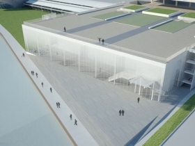
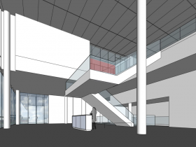
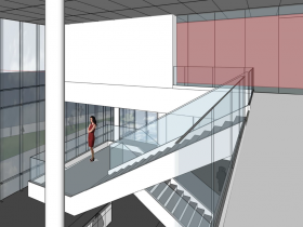
Keegan and his staff, another source says, had changed from a plan that would create a glassy new atrium/entranceway for the Kahler addition to treating it as a “big warehouse” to get as much additional floor space for art as possible. In essence, the original design of the Kahler would be completely overhauled. Keegan now tells me the reconfigured design will somehow create another 11,000 square feet of additional gallery space. Where will this come from? The museum hasn’t explained this, but here are some educated guesses:-Keegan’s team wants to eliminate or enclose in dry wall the signature staircase in the Kahler addition, a source told Urban Milwaukee.
-Keegan’s team all but eliminated “One of Shields’ core ideas,” as Schumacher has recently reported “to create east-west passageways that would allow the museum to present art history coherently and would end with views of the lake. These passageways, called “enfilades,’ would anchor the visitor’s experience in a consistent way on each floor, like a visual cue, Shields has said.” In fact, I’m told, the passageways were perfectly aligned with “holes” in the War Memorial Saarinen had drawn up in his original plan in the 1950s, in anticipation that there might some day be an addition to his creation that would need logical passageways.
-The new design appears to eliminate part of the high arching entranceway at the east end of the Kahler and divides it into floors, though Keegan says this is not the case.
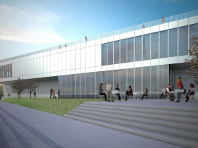
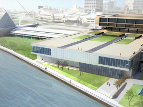
-The second floor is now cantilevered out to reach closer to the lake, also creating more space (and cutting back the lakeside plaza/walkway area). This change, as critic Tom Bamberger has written, replaced Shields idea of “a diaphanous cloud with gradated transparent glass” that “softened…the bulk of the Kahler addition… and provided a lovely contrast to the density of the War Memorial and the figurative whimsy of the Calatrava.”
Last week, in response to my emailed question, Keegan denied that Shields had withdrawn from the project and insisted the revised design was by the architect. Schumacher went along with this and did a story saying the design was by Shields, even though she had read (and linked to) my story where Shields said the design was not his.
Five days later Keegan had changed his tune and Schumacher did her new story with Shields repeating his statement to me that it’s “not really” his design.
Last week, I reported that a source “told me that the David Russick, who joined the museum in August 2012 as its exhibitions’ designer, is now the key person overseeing design changes. Keegan said this was untrue.” And Schumacher’s story, in essence, backed up Keegan’s version and didn’t even mention Russick. Yet in in her story five days later, she told readers that Russick was having a big influence on the building’s design.
In short, it appears that Keegan has become an unreliable narrator of what is really happening regarding the morphing of the museum’s design, and Schumacher has, for the most part, uncritically repeated his changing story line. For instance, her latest article suggested Russick’s flamboyant sense of design was in conflict with Shields, which may have led the architect to withdraw from the project. A more significant source of conflict, I suspect, is the museum’s push to grab every inch of gallery space it can.
After first insisting that Shields was the designer of the new addition, Keegan and Schumacher have now offered the community a different story: “David Lang is now leading the team” from HGA. Lang is much younger than Shields, with far less experience, and assisted him on the creation of the Museum of Wisconsin Art. But if the museum staff wasn’t willing to listen to Shields’ design ideas, what chance does Lang have?
All museum professionals, of course, inevitably want more gallery space. But the Milwaukee Art Museum was a relatively late starter when it came to building its collection. One museum insider tells me the MAM’s current gallery space, relative to its total collection, would compare favorably to the ratio you find at other museums. The museum now has 128,000 square feet of gallery space, Keegan says and will add 5,000 more by enclosing the sculpture court and another 4,000 square feet by converting office space in the War Memorial. That brings the total up to 137,000 square feet of gallery space. In addition, Keegan plans to somehow squeeze an additional 11,000 square feet of exhibition space into the reconfigured Kahler addition.
Is worth destroying Shields design to yield this extra gallery space? These are questions that the museum’s trustees must ask. Their role is to protect the community’s interest here. The Calatrava, after all, has become the icon used by the city’s tourism bureau to sell Milwaukee to the world. That addition, and the Saarinen, together represent two of the most important architectural treasures in this city. They have become a part of the heritage of every citizen of this city, if not this state.
Do we really want to create a “big warehouse” that becomes the main entryway to these two masterpieces? This is a hugely important question, one that every member of the museum’s board of directors should seriously consider. As should any potential donors to the project. If the issue concerns you, I suggest you contact the trustees, who are listed here. The community deserves full transparency here, and an open discussion of these issues.
Who to Contact
If you do have concerns, the art museum’s board chair, Raymond R. Krueger, is an attorney whose email address is listed here and its president, Kenneth C. Krei, can be reached at Third Ward Records here. You can also contact Dan Keegan at mam@mam.org.
Proposed Addition
Murphy's Law
-
The Surprising Campaign of Rep. Francesca Hong
 Mar 9th, 2026 by Bruce Murphy
-
How Wisconsin Money Funded Trump’s Policies
 Mar 5th, 2026 by Bruce Murphy
-
Trouble at the Milwaukee Symphony
 Mar 3rd, 2026 by Bruce Murphy


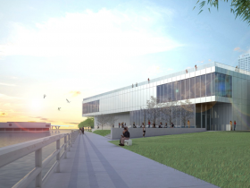
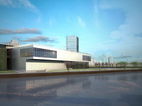


This is a superbly disappointing design.
Even if the MAM was looking to add as much square footage as possible, it would seem to me that there are some fairly simple ways to add interest to the outside of the building so that it doesn’t look like we have a Walmart of art sitting on our beautiful lakefront.
You gotta do SOMETHING to bring the Calatrava and the Saarin together and you gotta do SOMETHING with that Big Box Store wall on the north side.
Please don’t allow this atrocity of a design to remain the final version. This horrible box is an insult to the great opportunity that comes once in a generation. The building should be part of the great art that lies within. This is a glorified office building/warehouse that betrays the beauty of the lakefront.
No one should listen to the above commentators because obviously they’ve never actually been inside the museum, where gallery space is cramped and inadequate for larger pieces and installations. As a member whose gone on popular event day’s, it is almost impossible to view art properly due to the sheer numbers of people and the often compromised and tight quarters in which to have viewing. I could care less if it was in a box, just as long as I can see the art properly.
How interesting that neither the usually astute Bruce Murphy, nor people quoted, nor comments on this piece deal with an aspect of this story that, to thjs observer, is at least as important as the exterior and interior desgn elements.
That is, how much more of the permanent collection will be come out of storage and onto the walls of the final structure? And, is this warehoused art worth all the fuss?
I suspect that the answers are quite a lot, and yes. The planned photography gallery will fill a major void.
The MAM is way more than a regional museum not solely because of the Calatrava, but at least as importantly, because of what’s hanging in the Bradley wing, the contemporary art and the museum’s shamefully overlookled and, arguably, strongest collection: 19th and 20th Century European art, much of it from the Layton museum and our legacy from platoons of wealthy industrialists. I, for one, am drooling to see what’s been buried in basement dust.
It’s interesting, we have 2 comments calling the design ugly and 2 others saying ‘but we need more space’. It’s too bad that there can’t be a design that’s both beautiful and functional… or is that too much to ask?
Putting up an art warehouse on the lake, is just another short-sighted and stupid decision that I thought Milwaukee had learned to reject.
Mike Drew: yes, and the photography gallery is long overdue. for years the collection has been shuffled first here and then there, and sometimes nowhere. does MAM have a curator of photography these days? bring back Tom Bamberger. during his tenure at MAM, he was the guy behind some major photography exhibitions.