Mercy Housing Lakefront Presents Updated Design to East Side Residents (Renderings)
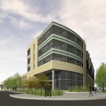
Corner Perspective
At last night’s East Side town hall meeting Mercy Housing Lakefront presented a further refined design for an $8.5 million apartment building to be constructed at the corner of N. Farwell Ave. and Thomas St. on Milwaukee’s East Side. The original designs, presented last March, called for a 9-story, 75 unit building, but the original proposal faced opposition from the neighborhood residents in a large part due to its height. In response to those concerns the proposal presented last night had been considerably scaled down.
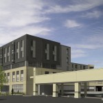
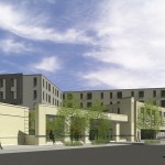
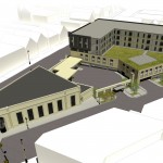
Mercy Housing Lakefront is now proposing a 5-story, 54-unit, 55-foot-tall building. The design places the mass of the building along N. Murray Ave. and Thomas St., completing the urban form along those streets, while setting back the upper floors along N. Farwell. Ave. The new design ties together the existing US Bank building with the new structure by matching the masonry materials along the first two-stories of the new building with the US Bank building, and sets the building apart at the upper floors with a change in brick color. The site was chosen in part because of Mercy Housing Lakefront’s desire to provide workforce housing on the East Side of Milwaukee, and in part because US Bank is a long-term investment partner of Mercy Housing Lakefront. The plans include creating a third floor green roof, if an MMSD grant can be obtained, and applying for LEED certification. The plan includes 48 public parking spots accessed at-grade, and one parking spot per unit for apartment dwellers. Additionally, the new design will have curb bump-outs, a garden wall to mask the US Bank drive-thru, an additional 13 on-street parking spots, two fewer curb cuts, and a parking garage hidden by backlit storefront style windows.
The questions raised at this meeting weren’t all too different from what are faced by many East Side proposals. Though, in this case there was a consistent theme regarding the number of East Side apartment vacancies, and whether or not this was “needed.” Residents questioned why the parking wasn’t underground, the project’s density, impact on congestion, the use of WHEDA tax credits, and its design. Sandra McSweeney went so far as to state “I think this building is not consistent with the neighborhood.” The most heated topic of the night seemed to revolve around parking, despite the facts that this building replaces all of the existing public parking, adds on-street spots, and has one parking spot per apartment.Despite the opposition, there was some support for the project. One resident referred to the parking lot as a blight. Jeff Jordan argued that hospital staff often have to take bus rides for over an hour to get to work, and car ownership costs between $6,000-$8,000 a year, so having the option to live across the street would help many potential residents. Another resident, in fact a landlord in the area, made a passionate speech saying “if we open our minds and hearts then we have to support this project.”
Alderman Nik Kovac laid out the process for approvals involved in the project. It would need to go to the Public Works Committee on January 6th, the Zoning, Neighborhoods & Development Committee on January 11th (he didn’t mention but it will go through the City Plan Commission as well), and the full Common Council on January 19th.
- West Elevation Perspective
- SE Farwell Perspective
- SE Aerial
- Corner Perspective














Really hope this one happens. I like how they were sensitive to how the building looks with US Bank, how it does its best to hide parking and the drive-through, and the design isn’t bad at all. For the residents who are against this, I really wonder what they think would be better to put in that ugly vacant lot that isn’t necessarily in high demand for development. Of course it’s out of character compared to houses to the north, but that’s not a bad thing at all given that it’s right off of North. As long as the people’s voices who are completely afraid of new development altogether aren’t enough to stop a quality development like this, then let ’em chirp away all they want. Sorry for sounding off.
@Peter I hear ya. It looks to me like the developer has worked very hard to refine the design to meet the requests multiple times and the goal posts keep moving. I do hope this one gets the green light soon.
Dave, your post implies that there will be retail space on the ground level. Is this proposed for the Farwell side or the Murray side?
David, I know that I, along with many in that room last night, was touched with the passion and courage that the woman, you referred to in your piece exhibited, when she spoke out. As a landlord with 66 units, she admitted it might impact her business, but she insisted that there was room in the market and that we had to welcome this project, because it was the right thing to do.
All the blah blah about how many parking spots and balconies v. green roof’s fell off the table. To me, the color of the brick and the blending of the architectural details is like my wife asking me if I like her new outfit. Of course I do because I love her and I know she’s got far better taste than I do. If she asked me if she should wear clothing or go naked, I’d be more insistent.
@Benjamin Oh I didn’t mean to imply that. What I was saying regarding the store front windows, is glass that resembles store front windows will be backlit and used to hide the 1st floor parking.
would be a great addition to east side. As a suggestion try to make the building a bit more colorful. Usually modern bright red and yellow make good combination. Maybe instead of brick use the new material. I dont know what its made of but looks like plastic. They usually come in colors.
Who is the architect? It’s too bad the project lost nearly half its density but the new design really looks much nicer.
ps I’m a fan from Minneapolis – this blog rocks!
@Alex B. Korb Tredo http://www.korbtredo.com/ I agree, too bad about the loss of density but the design has improved. And thanks!
Thanks for the clarification. Having lived just north of this site for a couple of years, I think that it will fill in the neighborhood nicely.