
Summerfest Plans Bang-Up Banner
The huge 50th anniversary sign is unique. "Horrible," says Ald. Bauman.

Summerfest 50th Anniversary logo design. Photo by Michael Horne.
Summerfest is celebrating its 50th anniversary this year and hopes to unveil a huge banner on the side of a Historic Third Ward building to show off a special celebratory logo at a public event March 8th. The chosen spot would be the north wall of the Renaissance Building, 309 N. Water St., and the banner is to remain up until the end of the festival in July.
The banner unveiling will take place at a ceremony to be held in the parking lot to the immediate north at 333 N. Water St., which sold for $5.6 million on February 10th, or $4 million above its assessed valuation.
Such a banner as proposed requires the assent of the Third Ward’s Architectural Review Board, which granted its conceptual approval for the plan with final determination of the design to be done in consultation with staff.
The logo, designed by Cramer-Krasselt, was the subject of much discussion by the committee members. The word “Summerfest” is composed of fanciful letters of blue and orange on a white background. The letters are composed of typographic and figurative elements, a sort of a hybrid rhebus.
The initial “S” is a skateboard, the “U” is a bent Allen-Bradley clock tower, the first “M” includes an inverted guitar … it goes on, using such elements as an accordion, sunglasses, pick-ups and frets from a dismembered guitar, a pitcher of beer and a bratwurst.
The familiar Summerfest smile is incorporated into the “5” in “50.” A Miller Lite logo is in the corner of the proposed banner.
Milwaukee, you see, is so much more than beer and brats.
The logo could appear on the banner in a linear fashion, or in a stacked version.
The logo design drew a number of comments from committee members. “It’s a horrible sign, a horrible sign,” Chairman Bob Bauman said. Board member Greg Patin, on staff with the Milwaukee Department of City Development, noted the stacked version of the logo was particularly hard to read. That could be a plus, he said, since it could put the sign into a category beyond mere commerce.
“If you can’t understand it, it’s public art,” Patin mused.
All agreed that the Lite beer logo must not be included in the banner. The committee instructed the applicant to work with staff to create a suitable display to be unveiled at the event.


Signs of the Times
The Third Ward ARB also has purview over signage in the historic neighborhood. It heard a presentation from Vaishali Wagh with Continuum Architects, who has been busy renovating an old produce warehouse at 325-29 N. Broadway into condos and retail space.
The old brick row buildings are fronted with an original canopy that gives the street much of its character. Wagh presented a plan to hang identifying signs from the existing canopy. They would be of simple block letters cut into sheets of metal. The committee generally favored the presentation, and gave its assent with the caveat that it was not “an implied approval of people hanging things off of balconies” in the neighborhood.
Tower Power
With development and density comes demand for telecommunications infrastructure, and Eric Lennington made a presentation on behalf of Verizon Wireless for the installation of cellular towers atop a building at 511 E. Menomonee St. The ARB has authority over such installations. This installation would have minimal visibility from the street, the committee members agreed, approving the installation.
Lennington said that when the new tower installation is complete, the firm will remove a temporary tower that it erected on the grounds of the Italian Community Center. He added that he will be back in a few months to ask for approval of a tower on N. Water St.
There being no further business, the meeting was adjourned.
Plenty of Horne
-
Villa Terrace Will Host 100 Events For 100th Anniversary, Charts Vision For Future
 Apr 6th, 2024 by Michael Horne
-
Notables Attend City Birthday Party
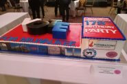 Jan 27th, 2024 by Michael Horne
-
Will There Be a City Attorney Race?
 Nov 21st, 2023 by Michael Horne


Considering that Bauman voted in favor of a zoning change for the atrocious Hammes development, he has no standing to criticize the design of virtually anything for the remainder of his career in Milwaukee.
I like the sign. It’s fun (like summerfest), creative, and accurate.
“HOW DARE THEY TAKE A NEW, FUN, CREATIVE APPROACH TO THE LOGO. I WANT TO LIVE IN A PLAIN AND LINEAR WORLD. MAKE IT BLACK AND WHITE. WE WILL EVEN PUT IT IN COMIC SANS TO GIVE IT SOME PERSONALITY. BUT NOT TOO MUCH!”
– Bauman & Patin (Probably)
Ha ha.