Top Architect Quit Project for Museum Addition
Architect Jim Shields had falling out with Milwaukee Art Museum; new addition was designed by committee, not Shields.
Two years ago, when the Milwaukee Art Museum announced it would be building a new $15 million addition along the lakefront, the plan boasted the pedigree of a top designer — Jim Shields. For many years, Shields has been the go-to architect in the metro area for high profile projects, particularly involving museums. He designed such highly regarded buildings as the Discovery World Museum, the Museum of Wisconsin Art, and the Milwaukee Public Museum’s Butterfly Vivarium, not to mention the De Vos Art Museum at Northern Michigan University.
For the Milwaukee Art Museum, Shields would be creating a new lakefront entrance that would replace the old Kahler addition to the museum and better connect the museum to its famed Calatrava addition and the War Memorial Center built by internationally esteemed architect Eero Saarinen. Earlier today, the museum released an updated version of the design and it was credited to Shields by the Milwaukee Journal Sentinel. But it is not Shields’ design.
“I kind of exited the project back in February,” Shields told me.
So is this your design, I asked. “No, not really,” he said.
Why did he withdraw from the project? “I’m not sure I want to get into it other than to say that as (Milwaukee Art Museum Director) Dan Keegan brought in other staff to work on the project we just had some basic disagreements. It just wasn’t a good fit for me.”
So who, then, is the architect for the newly released design? That seems to something of a mystery. The company Shields works for, HGA Architects and Engineers, is still working with the museum, but without his involvement. Jim Vander Heiden of HGA tells me he is overseeing the project, but is not the designer.
“I’m the principal responsible for the project,” Vander Heiden says. “We have a team that’s responsible for the design.”
As to who is leading the team or who has become the designer in Shields’ place, Vander Heiden said I would need to talk to Keegan about that. Keegan emailed me to say that “HGA is the architect of record who has designed the building addition. There is a team involved that includes architects, MAM curators and designer, and the construction manager.” Notably, his comment left out Shields’ name.
One source told me that the David Russick, who joined the museum in August 2012 as its exhibitions’ designer, is now the key person overseeing design changes. Keegan said this was untrue and that Russick is “responsible for the design and layout of the reinstallation of the collection” which will be part of the new project.
In releasing the revamped design, museum officials told the Journal Sentinel it differs “minimally” from previously released designs, according to reporter Mary Louise Schumacher, but her story says the revised design has been split into two floors and yields 8,000 square feet of additional gallery space. The original rendering by Shields had a glassier, more transparent look, and an entranceway featuring a high, dramatic pavilion.Schumacher’s story credited Shields for the design, quoting him to the effect that the structure was designed to avoid “the pitched battle between the two masters on the lakefront,” Calatrava and Saarinen. But Shields says this quote was from a year ago, back he was still involved in creating the design. The new design, as Sean Ryan reported for the Business Journal, now seems to lean toward the Saarinen, given its cantilevered look. (It’s not clear whether this conclusion was Ryan’s or was suggested by Keegan.)
Needless to say, there is no architect on staff at the Milwaukee Art Museum. As for Shields, he has received over a dozen Design Awards from the American Institute of Architects in Wisconsin, including for Discovery World, the DeVos Art Museum and the Butterfly Vivarium. Shields has also received a number of National Design Awards for religious architecture for such works as the St. Boniface Church in Mequon, the St. Norbert’s College Chapel and the Milwaukee Catholic Cathedral. Shields is an Associate Professor of Architecture at UW-Milwaukee, where he has served as curator of more than 25 exhibitions on contemporary architecture in the Upper Midwest. He is the author of two books: “The Cities of James Duane Doty,” and “Architectural Representation.”
Shield says it’s not unheard of for architects and clients to part ways. “The relationship between an architect and a client isn’t an easy thing,” he says.
So how often has he had such disagreements as this? “It’s rare,” he says.
Update 9 p.m. April 8: In response to my story, Keegan contacted me to offer a different take on what happened and Schumacher rewrote and expanded her article. Schumacher’s story, which ran on the Journal Sentinel’s front page, top-of-the-fold, announces to the world in the second paragraph that Jim Shields designed the new addition. Some 15 paragraphs later, deep into the story, Schmacher lets slip that Shields “left the project team in February.” That’s called burying the lead. She quotes Shields saying “yes, I was involved in that scheme,” but this cryptic comment is never explained. Meanwhile, Keegan emailed me to insist that Shields “created the design for the east addition used as the basis for the renderings released today” and that “Jim was the conceptual design architect on retainer with HGA hired to help the Museum and HGA with the design concepts” and “he finished that work which has now advanced to the design implementation phase with HGA’s architect team.”
But this revisionist view of how the design happened falls apart in the face of a blizzard of contradictory facts:
-Shields says flatly it’s not his design;
-Jim Vander Heiden of HGA, who is overseeing the project, could not tell me who the designer of the new addition was. Given that he works in the same office as his colleague Shields, I think he would have known if Shields had designed the addition.
-In his original response to me, Keegan avoided naming any designer of the addition and instead said “There is a team involved that includes architects, MAM curators and designer, and the construction manager.” Translation: it’s a design by committee.
-In Schumacher’s revised story, Keegan is quoted rhapsodizing about how wonderful the design is. Shields offers not one word of praise or defense of the design. His use of the word “scheme” to describe the revised design tells us what he thinks of it.
-Keegan dances around the question of why Shields left the project. To Schumacher, Keegan said “In my role as the museum’s director I didn’t want to delve too deeply into that.” So the town’s top designer of museums leaves the project and you don’t want to ask why?
-Keegan offered a slightly different take to me, saying “I do not control HGA’s decisions regarding how they choose to work with contract employees, which Jim Shields is” and “I can’t speak to Jim’s dissatisfaction with HGA but we feel very good about his design work.” So Keegan is now implying either that HGA dismissed Shields from the project or that Shields was unhappy with HGA rather than with the museum and therefore left the project. That’s extraordinary.
-As to Shields statement that he left the project because he had basic disagreements with Keegan and his staff, Keegan just ignores this.
The only reasonable interpretation here is that Shields was pushed into changing the design in ways he disagreed with, finally had enough of it and withdrew from the project. Precisely how much of the current design he created may never be known, but it’s clear Shields doesn’t consider it his design. All of which is embarrassing for the museum, which is working hard to downplay or deny that he had a falling out with the organization.
A final note: this controversy would be a problem even if Shields was an average architect, but he’s a national award winner and an expert on creating beautiful museums whose work speaks for itself. The fact that he was supplanted by the decisions of a huge team, including unnamed architects, does not seem like a small problem that you bury in the bottom of a story. The readers — and this community — deserve better.
Short Takes
-I have previously written to urge support for the Art Museum project, whose full cost is $25 million and includes repairs and restorations to the War Memorial. That building and the Kahler addition have together suffered from a leaky roof, mold infiltration, a failed HVAC system, broken concrete, leaking windows, and foundation seepage. The problems have endangered the art at the museum, which is the state’s greatest collection of art works.
-The new design has been compared to the old Milwaukee convention hall, MECCA, in comments at the Journal Sentinel and at Urban Milwaukee’s Facebook page. In comments after the Business Journal’s story, Justin Racinowski of The Kubala Washatko Architects said this: “Wow that is horribly bland. The designers gave up before they even started, the art museum certainly deserves better.” The art museum, it appears, disagrees.
Current Renderings
Murphy's Law
-
The Surprising Campaign of Rep. Francesca Hong
 Mar 9th, 2026 by Bruce Murphy
-
How Wisconsin Money Funded Trump’s Policies
 Mar 5th, 2026 by Bruce Murphy
-
Trouble at the Milwaukee Symphony
 Mar 3rd, 2026 by Bruce Murphy


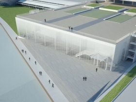
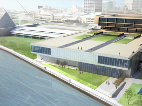
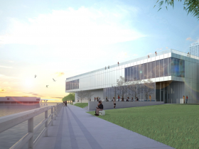
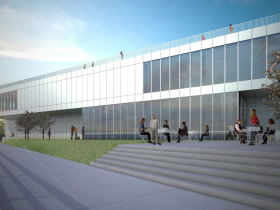
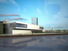
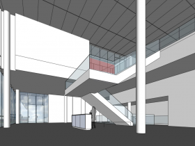
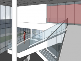


The interior looks great. However the outside looks very basic and doesn’t seem to mesh will with the Calatrava. I feel that the exterior needs more glass and more than a rectangular look. There is a lot of potential to be had here. This is the lakefront we’re talking about and there should be a lot of time and consideration put into this with different ideas.
Picture the lakefront in your mind. Compare this expansion to the Calatrava, the discovery world musuem, and the Northwestern Mutual building. I don’t feel it’s goes together. This looks like the 90’s boxy architure. If they want to stand out then they’ve achieved that and will have be awarded with having the biggest eyesore along the lake (in this area). Anyone else agree?
It looks like this will block some of the view of the MAM from Veterans Park. If you’re going to block the view then at least give me something nice to look at instead of a banal warehouse. I’m surprised an architectural firm wants to put their name in this.
The addition should be a background building to the existing structures. That said, it should also be better than what is being offered. Could it step down to the lake? Could it respond to the diagonal of the lakes edge?
Team work = the abdication of personal responsibility.
The newly-designed exterior looks like a big-box warehouse in a suburban office park along I-94.
Good morning Bruce,
One thing is certain at this point. Jim Shields has such a low opinion of the changes that were forced on the project by the “team” (read Dan Keegan), that he could not risk his reputation by being associated with it. In my 35 years of working with owners and architects, it is almost unheard of for a design architect to leave a project during the conceptual or schematic design phase. Owners are usually not architects and architects are not curators of art. It would probably be good if each would stick to their area of expertise and appreciate the other for their talents. Design by committee? Name one outstanding building design that was created by committee. So let’s ask ourselves; What would Santiago have done?
I read that confusing story this morning, and the first thing I thought was “who is going to get behind on what really happened first, Urban Milwaukee or OnMilwaukee.com?” Almost there; nice job so far!
This design is both breathtakingly disappointing and flaccid. Whatever happened to “make no little plans”? May the design gods intervene and create something much more inspiring and worthy of being a neighbor of the Calatrava. Our art museum, much less our lakefront merits something much better. What can we do to stop this and inspire a better design?
The original design was more appealing. The design allowed for more transparency from the inside and outside. This design reminds me of the old MECCA convention center’s second level.
I find it the museums lack of answering the glaring question very upsetting and worrisome.
I have worked with Jim on many occasions. Not only on a professional level but he has been my mentor for many years. There is a reason he has received awards from local groups as well as nationally known groups for not only his aesthetically pleasing designs but also for his designs that keep the user in mind. He is a median between people and their buildings-he understands both well.
I also have a good understanding of his professionalism and presentation. Not only are the illustrations shown not a Shields design, even if they would be, he wouldn’t release drawings like the ones shown above. Their inability to capture any essence of the building is very clear. The renderings are undoubtedly incomplete.
As Aaron stated above-
‘The original design was more appealing. The design allowed for more transparency from the inside and outside. This design reminds me of the old MECCA convention center’s second level.’
This couldn’t be more true as well as an indicator this is not Shields work.
This is nothing but a copy of a big box retail with some more glass. A great school art class could probably come up with a design the fits in with the surroundings and is compatible with migrating birds along the shoreline. Too much glass will kill more birds. If this current design proceeds, it may be tagged as “mistake on the Big Lake”.
Looks like the rear end of an airport terminal (minus the loading ramps).
I think a very fundamental error was expanding toward the lake rather than adding to the north, and possibly incorporating the slope of the embankment.
In any case, this current design would be a monumental embarrassment if built.
I like CA’s comment above (#5). Maybe the design committee decided that suburbanites would be more willing to visit scary downtown Milwaukee if it more closely resembled a Brookfield strip mall. Maybe that K-Mart over on Bluemound will be empty soon and they could just move it to the Lakefront to save some money.
I love Jim Shield’s brilliant work on the.Museum of Wisconsin Art in West Bend, too, which is worth a mention on that list of museums with which he has been deeply involved. I have known Jim always to be collaborative, smart and principled.
Thank you for your coverage on this topic.
Thanks, Bruce, for calling them out. Normally we get the warehouse look when builders have a need to scrimp, and simply “house” the merchandise. “Keep moving; nothing going on here.”
An opportunity to knit the two soaring structures would be lost if this design carries the day. It was unfortunate that the original Saarinen, reaching for the sky, was crudely amended with a crutch, a box, and that flying buttress appearance of the original was buried in the haste to receive a (magnificent) private legacy. Given a chance to redeem that mistake, we muffed it.
The Saarinen museum is a tribute to Corbusian Modernism and Lake Michigan, the Kahler Addition is a competent 70’s ‘brutalist’ expression respecting Saarinen’s masterwork. Calatrava’s landmark building is a world class monument honoring Corbu, Saarinen, and Kahler while celebrating Milwaukee and the lake. The HGA addition defaces the Kahler’s work and is an insult to all the previous architects. This sad and misguided addition is a cultural disgrace.
Bland is the word, definitely seems to be trying not to distract from either the Calatrava or the Saarinen.
What a great story Bruce. Fascinating and enlightening and about a thousand times better than what the Journal and Business Journal have reported on the topic. This is why urbanmilwaukee is on must read list everyday..
wake up folks! Better yet, come help celebrate the Museum of Wisconsin Art, now one year old and looking great thanks to designer Jim Shields…
It’s very disappointing that museum was not able to keep Jim on their team. I don’t understand the reasons behind his separation from the project, but I do know that to lose him as the designer is a loss for the museum, the city, and the lakefront. The amateurish renderings provided by HGA of this iteration are so basic and un-relatable, that naturally the reaction to the project has been negative. The quality of design that Shields brings to his project is unmatched in the state. He’s a master at creating evocative spaces. Unfortunately, it sounds like that bridge has been burned; hopefully the museum opens this up to other architects.
Awesome, they’re building a Best Buy on the lake front!
Oh, wait…
Shields can distance himself if he wants, but in my professional eye, it differs only in minor ways from Discovery World, a project he proudly takes credit for.
The biggest differences are these:
Discovery World had a world class free and clear site oriented E-W with an unbelievable and long south facing waterfront opportunity that was woefully underdeveloped and underutilized. MAM has a pinched parcel with an awkward angle and is sandwiched between the existing MAM and the bike path.
In my opinion, DW falls FAR shorter of excellence than does his completely mediocre MAM addition. It had far better opportunity squandered, wherein the MAM project looks to be a significant challenge, that the designer, Jim Shields, wasn’t quite skillful enough to rise above.
MECCA? Perhaps. But Discovery World is the real comparison, its right there, and its designed by the same hand.
Jim Shields described the Kahler addition as set between a “pitched battle of the two masters on the lakefront.” This is an excellent reason to keep the new addition as simple and beautiful as possible. Top rate materials and simplicity can go a long way.
The rendering that appeared in the 2012 JS article showed that Jim Shields was using a similar language of white fenestration prevalent on the Calatrava building. This similar language would have provided an elegant solution that would have created more continuity between the three buildings. Instead, the latest rendering shows a building created without reason. A new material is presented in the form of some metal panel that only convolutes the relationship between these three buildings.
The Milwaukee Art Museum is on its way to creating a disjointed montage between itself, the county and the War Memorial without any cohesiveness or identity. How will this stand in the future if these organizations are to become united? What good will this gray metal wall provide to the lakefront? How will light penetrate and give relief to the current labyrinth of gallery space? Where is the transparency? Call in national architects and open this project up because I don’t think Shields will come back when Keegan realizes how much he screwed up.
The comments here are an inspiration.
Maybe the world is the world is not going to hell.
Why would anyone donate to this thing? It is embarrassment. Where is Calatrava when we need him?
This is so ugly. Where are our lost protectors of the lakefront, Betty Quadracci and John Norquist, when we so need them?
For those who are interested in pursuing this issue, tomorrow, Tuesday, April 15, the MAM will present the design to the Milwaukee County Parks, Energy and Environment Committee at the County Courthouse, 901 North 9th St. This presentation is number 8 on an agenda that begins at 9 am. (http://county.milwaukee.gov/ImageLibrary/Groups/cntySupervisors/cntybrdstandingcommittees/PEE/2014/PEEAgenda041514.pdf)
It is so disappointing to see a beautiful idea [2012 concept] being chopped up into something that could have been thought up using MacPaint. Maybe they should just chuck the whole idea and buy a couple of really terrific pieces of art.